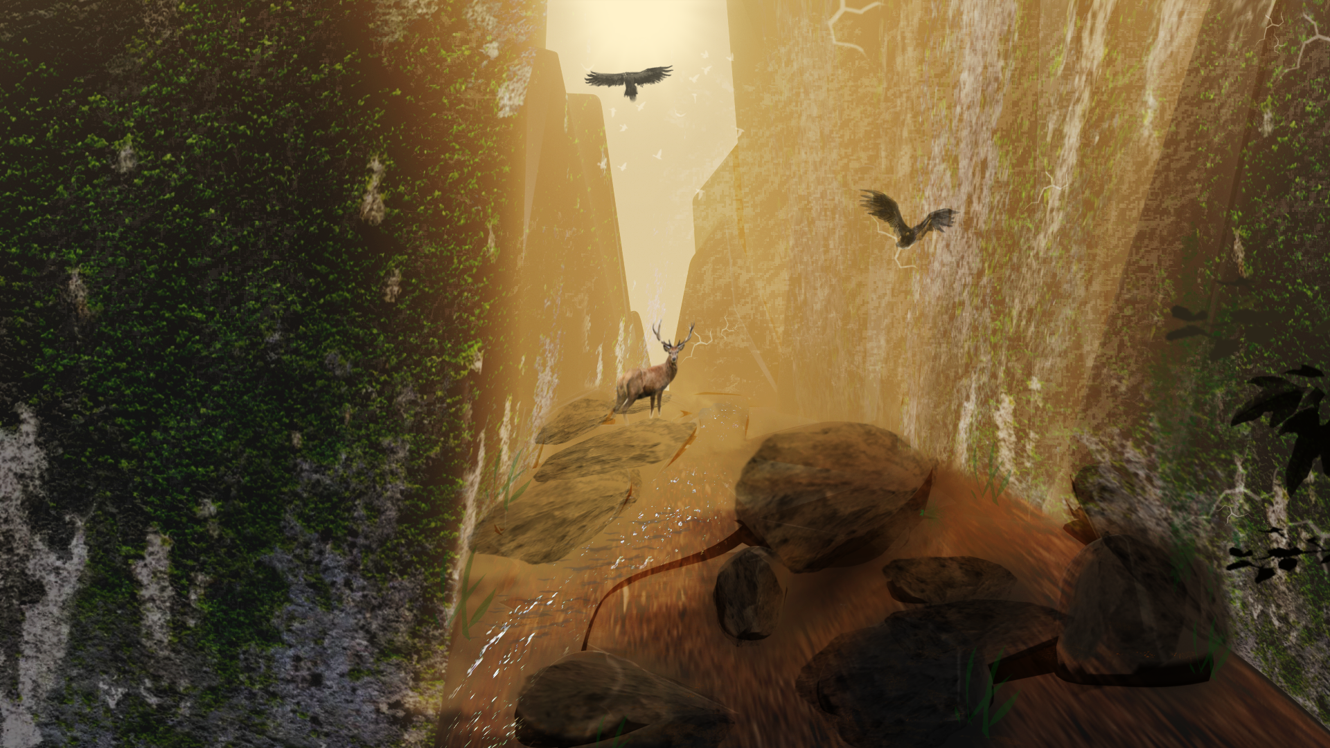
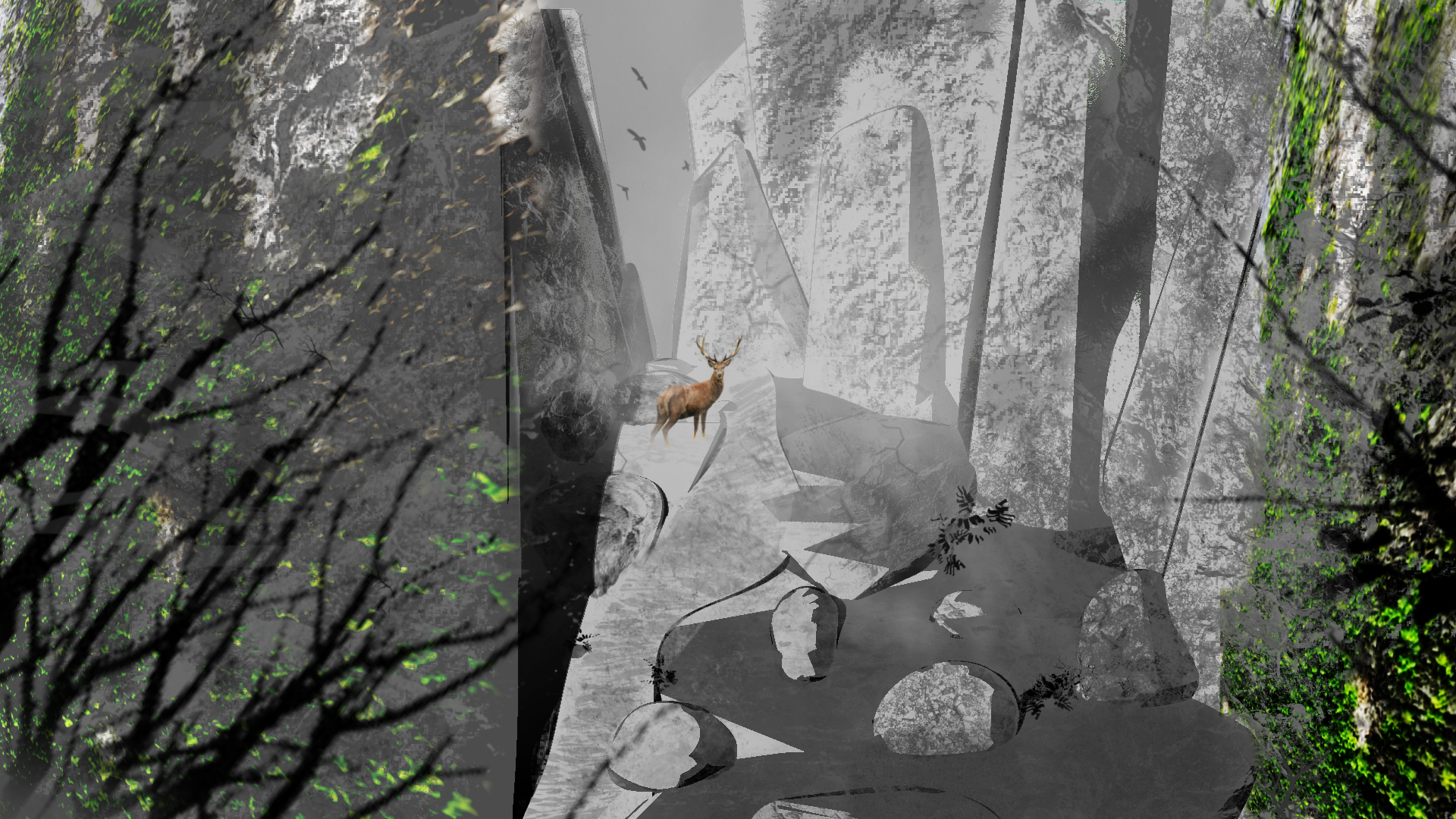
The BRAWL² Tournament Challenge has been announced!
It starts May 12, and ends Oct 17. Let's see what you got!
https://polycount.com/discussion/237047/the-brawl²-tournament
It starts May 12, and ends Oct 17. Let's see what you got!
https://polycount.com/discussion/237047/the-brawl²-tournament
Best Of
Re: Can't wait for April 1
Lol I can’t get to the theme setting on mobile. Oh well.
 Eric Chadwick
1 ·
Re: Building a Free Library of Images for Everyone
Hey Everyone,
Another busy week, but I did manage to create and upload some new textures here:
TXR – Bark – Seamless
https://soundimage.org/txr-bark-seamless/
As always, my images are completely free to use in your projects with attribution, just like my music and sounds.
OTHER HELPFUL STUFF:
https://soundimage.org/ogg-music-packs-2/
https://soundimage.org/ogg-game-music-mega-pack/
I sincerely hope some of my assets are helpful! :-)
1 ·
Excited to Join! Beginner Seeking Concept Art Journey
Hi everyone!
I'm really excited to be joining this amazing community. I've recently started learning concept art, and I'm eager to improve and develop my skills. I wanted to share some of my work here and would love to hear your thoughts and feedback on how I can get better.
As a beginner, I’m open to any advice—whether it’s about fundamentals, design choices, or workflow improvements. I’m looking forward to learning from all of you and being part of the community!
I design everything in Gravity Sketch and use Blender and Affinity Photo. I am still very new to this and would love any advice or support I can get. I hope to regularly share my progress.
Thanks in advance for your time and feedback!


1 ·
Re: Man I'm sometimes freaking the fuck out
My recommendation is to set yourself projects with the idea of practicing or learning something specific. Like as a character artist if I want to practice making hair for example I'll focus on a project based around that, or if I want to practice human anatomy I'll make a character that requires good knowledge of that. If you want to make hard-surface stuff then make projects based on different aspects of hardsurface art, like learning to model specific machinery and weapons, vehicles, texturing them, etc.
Also the stuff that you see on most people's portfolios is usually like 1% of the work that they have done and put on display for others to see, so don't get demotivated by judging according to what you see on Artstation because inbetween those amazing pieces there are lots of small projects and time spent grinding without anything great to show for it.
Also the stuff that you see on most people's portfolios is usually like 1% of the work that they have done and put on display for others to see, so don't get demotivated by judging according to what you see on Artstation because inbetween those amazing pieces there are lots of small projects and time spent grinding without anything great to show for it.
 Ruflse
1 ·
Re: Can't wait for April 1
haha I did not expect to feel so seen today! Happy bday Polycount!Eric Chadwick said:Hmm I think I messed up the lightbox, sad. When you click on an image to make it bigger, it just disappears.
Like, clicking on JStins image here https://polycount.com/discussion/115824/what-made-you-feel-good-today/p21
 jStins
1 ·
Re: Marmoset UV Channels
We changed up how this works for Toolbag 5. You can set the UV channel for the material in the Texture panel.

If you need different maps to use different UV channels, you can do that with layered materials. There's a ton of additional flexibility in this case too, you can use blend modes to multiplity , overlay, etc multiple maps on different UV channels. Each layer can have different UV transforms and so forth. You can use this to build really complex tiling detail (detail normal etc) effects.
 https://www.youtube.com/watch?v=J7t-llWjYy8&ab_channel=Marmoset

If you need different maps to use different UV channels, you can do that with layered materials. There's a ton of additional flexibility in this case too, you can use blend modes to multiplity
 , overlay, etc multiple maps on different UV channels. Each layer can have different UV transforms and so forth. You can use this to build really complex tiling detail (detail normal etc) effects.
 https://www.youtube.com/watch?v=J7t-llWjYy8&ab_channel=Marmoset
 EarthQuake
2 ·
Re: What about bringing back the Brawl Contest?
are there links to the SDKs somewhere ?
30 seconds googling just took me to linkedin
30 seconds googling just took me to linkedin
1 ·


