Search
-
Re: Animating a logo along a path
 Sorry I don't think I explained myself particularly well. The shape I want to create is like a knot but unlike string it has bulges and a unique shape. Last night I ended up creating a shape from an edge loop and skinning the mesh to the spline and path deforming the spline by another spline which got me the sliding off…
 -
Is there a maxscript to do this?
 Hi guys, Just thought of something i have to do quite often, and i was wondering if it wasn't possible to scriptify it :D . whenever i make reference planes in max this is what i do: -create a material (basic) with the reference file in the diffuse slot. -look at the dimensions of the image -if it's let's say.. 700x650…
 -
Re: zbrush 4 r2 dynamesh sub question.
 cyrid, thanks for the reply what i am trying to do instead is to use the insertmesh button so that the mesh is placed at its origin first, for some things this type of placement is more exacting then using the insertmesh brush. **edit** side note, can anyone else do symetrical curve slices ? when i go to do a ctrl shift…
 -
Re: [FINISHED] Stylized Witch House
 Hi there, I want to say I love all the very detailed props! Great job on those, I feel a sense of continuity within the props! As for the outside, the island I feel should have a little more level or flat space around the building. The immediate slope downward gives an uncomfortable feel like you'll just slide and fall off…
 -
Re: Awesome Wacom Stand
 As long as we're talking about ergonomic setups here; what would be the reason that most people seem to completely avoid using a slide out drawer for the keyboard/mouse with the tablet on top of the desk? Any other option I've found places everything in crazy and uncomfortable/dangerous positions. Even if you get a curved…
 -
Re: Feedback - Walk_Cycle
 Hi Gewarzed, welcome to the animation forums! I'm liking the secondary action that the cigar brings to the cycle. It gives him some pretty solid appeal. Some problems I noticed pretty quickly would be to check the curves on your feet sliding. They look possibly splined, it should look pretty close to linear while the foot…
 -
Re: Hand Painted Assets. Critique/Help Plz!
 You shouldn't make a crate with the same texture on all sides. Instead, slice up the texture in to 4 squares and get some variation in there: And I agree with laurens that the unwrap for the head isn't great. But there's more than that. The spheres/domes you've used are flat out the worst (for lowpoly modeling, anyway).…
 -
Plexus - Unity Procedural Node Editor

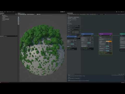 Plexus - Procedural System for Unity ( 6.1+ ) * Node-Based Procedural System - Visual graph editor for creating procedural content using nodes * Terrain Generation (Altura) - GPU-accelerated heightmap generation with Ridge/Simplex noise and terrain manipulation * Point Scattering & Sampling - Generate and distribute points…
 -
Re: Zbrush Boolean?
 Yea, I tried that but then you get a cut with the same mesh, so jaggy edges based on the polys. But apparently using the polish slider will make that smooth. That looks great! Should be then the best for slice cuts. Still boolean subtraction would be nice to have, for instance for making perfect eye sockets so I can print…
 -
Re: and another website...
 Pretty good site overall, but I can offer you a couple of observations right off the bat. Please keep in mind that I'm pretty 'art-school' about my critiques, so I'm trying to offer constructive tips, not hurt your feelings. First of all, the yellow and green color scheme is too saturated, from the logo to the side…
>30789 results