Search
-
Re: PAnick's Sketchbook
 I like it! Although I feel like you need an official logo now. Panik spelled out in a basic Helvetian font with huge kerning like that just isn't hitting that sweet spot that all this awesomeness is deserving of. GIT DAT LOGO BUTT
 -
Re: Portfolio etiquette and copyright concerns
 After looking at your portfolio I would recommend that you do remove the logos off of the works. A lot of other artists put up logos and it indicates that they actually worked on the project like on here http://racer445.com/ It can be misleading and it's just to not do it.
 -
Re: Cancelling AOL
 Yeah, I had a scenario like Sledgys recently (month or so ago). I took a call from a vendor of a biz partner. (one of our partners had hired a web firm to develop a new website for them, and one of the web developers called me). So this lady starts telling me how we need to re-code our website to provide them with all of…
 -
Re: Lost: Season 2.... O M G!
 The symbol in the center of the different Dharma logos are related to the different bunkers around the island. The main group of Lost has discovered the Swan post - hence the little swan in the middle of the logo around their stuff. The tail section survivors were occupying the Arrow hatch - the same symbol on the shark…
 -
Re: [Portfolio] - Swizzle
 clean and simple site, great stuff :) If I was to be critical I'd really encourage you to remove the side logo and center the content. The logo is nice and all but really doing nothing for the site and having a detrimental effect on the content. When I loaded the page i figured the layout was broken.
 -
Re: Student portfolio critique needed
 ditch the logos, just include your name , email and website. The artsi fartsi logo is unecessary imo. The work is pretty cool ! this last render i would include a shot of the whole ship instead of just the bottom , its way too dark to shocase anything properly modeling wise !
 -
Re: Have anyone figured out how new Curvature Smooth node works in Designer?
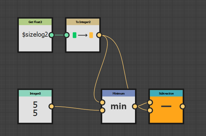 I (naively) assumed they'd done it properly Hacks like that explain why it breaks down under some circumstances edit: ok so I've had a look . Hopefully this helps with some of the weird bits The only variable they seem to be using is the builtin $sizelog2 -which is log2(pixel size of the input) == log2(512, 512) == (9, 9)…
 -
Re: Canada has no illnesses.. so they've gone after us
 The 'red cross' doesn't mean "THE RED CROSS" in the military it technically denotes a mobile or temporary hospital, they use different logos for different areas, in saudi it's the star/moon combo.. afaik, we never had anyone from red cross in our hospital and use that logo when I was on active duty.
 -
(3DS MAX) Material Help - Opacity Map Confusion
I'm trying to achieve this look: (Just taken to serve as an example from google) Layering Text/Logo over a Vans paint job. So far I've attempted UVW Unwrapping the Van, loading MR 'Car Paint' into the Diffuse Channel, then loading my logo into the Opacity Channel (Saved as both png/gif). Cheers -
Combo Splash Art
 Hi guys, working on Ui parts for a project at the moment (Some kind of third person brawler) Edit: Did a logo now This is what Ive got so far The game logo: And flashy combo text art! What do you think ? Inspiration is definitely Castle Crashers/Battleblock theater and that typical Flash style which i really like.
>5371 results