Combo Splash Art

interpolator
Hi guys,
working on Ui parts for a project at the moment (Some kind of third person
brawler)
Edit: Did a logo now
This is what Ive got so far
The game logo:
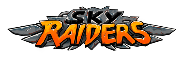

What do you think ?
Inspiration is definitely Castle Crashers/Battleblock theater and that typical Flash style which i really like.
working on Ui parts for a project at the moment (Some kind of third person
brawler)
Edit: Did a logo now
This is what Ive got so far
The game logo:
And flashy combo text art!
What do you think ?
Inspiration is definitely Castle Crashers/Battleblock theater and that typical Flash style which i really like.
Replies
Awesome stuff though man, I really like these
looks like its for a circus
and depending on the size you are going to display these, they might hinder the sight
usually these combo "popups" are right in the center and cover half of the screen, therefore they have no real background, but letters
yours is a blob (from a screen coverage point of view) whre you cannot see through
if it makes sense ?
well, like i said, it really depends how you implement them
They will be smaller and displayed aside the playerframe, they wont obstruct too much of the sight, your point
is totally valid when displayed in middle of your screen of course @Snow
I dont really get the hard edges thing. They are as hard as it gets , I used no gradients for the shapes or transistions because they are meant to imitate vector art more or less. (I use a 100% hard brush for all the painting, only Selections are sharper and I use them for most of the things (if you ignore the pencil tool obviously)) This variation of really simple rough round painting and hard edges makes that style.
The lines are comic style and "crazy", so they have varied shape which is intentional. But I dont really understand what exactly you mean.
They are a little blurry since they are over 100% the usual size, maybe its that what you notice - An example would be nice @Add3r
For the first one, I heard something similar already, I guess I gotta rethink on it then
(first post)
Reworking the nice one now
The idea was that you only see the eye/s of a character in a thin bar
which gives a really strong impression
http://i40.tinypic.com/9l934k.png
There is no character artwork yet, so only placeholder / noone
(image is cropped 4:3 for polycount)
What do you guys think ?
Also: Solid work, I love the design + colors!
Made a logo however! (first post)
Inspiration for all this:
Battleblock theater
http://glitchcat.com/wp-content/uploads/2013/04/BattleBlock-Theater-Cat1.jpg
Castle Crashers
http://alive-ua.com/uploads/posts/2012-09/1348731618_castle-crashers-1.jpg
Homerun in Berzerk Land 2
http://www.newgrounds.com/portal/view/608040
I like it, but it dosnt go with the new style of the game so Im gonna remake that now
http://hostr.co/file/uphokcR1wUst/Playerframe-and-Hit-Combo.png
Any crits on the logo ?
What do you think ? I dont like my character selection at all anymore, gonna remake that as whole I guess
Background is that they are cartoonish pirate-raider like animal/people and they just steal random stuff and take it to their place in the sky. Hence the many objects and improvised style. Its really unserious and should just look amusing.