Search
-
Re: What Are You Working On? 2010 Edition!
 this was an exercise to get more comfortable with subd, baking, and using normals and specular effectively. so far i still really can't get past cylinders before i get frustrated and stop :( but this doesn't seem to have come out terribad. normally i would spend a lot more time doing more damage and making the logos look…
 -
Re: BRAWL2 [Character] Aiur survivor, shark2003

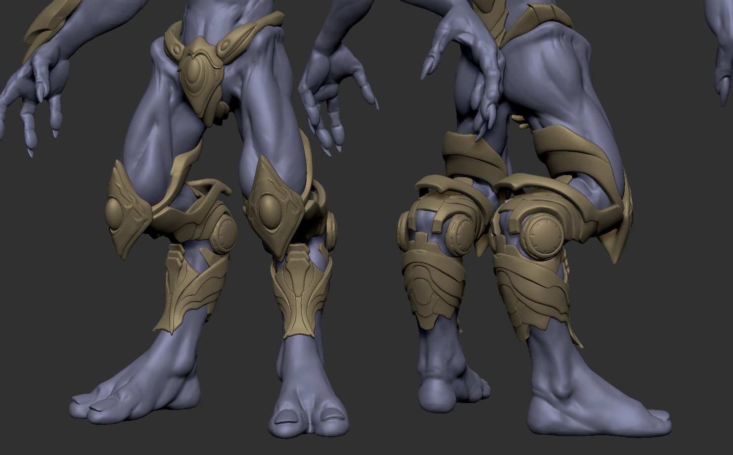 Hey! Super small update on the legs. Im kinda stuck on the chest area.
 -
Re: WIP - Skater Next Gen
 Looks pretty good. The face is nice, has a certain amount of character and doesn't seem generic like a lot of faces can be. The clothes seem a bit boring right now though. No logos or damage on his hoody? Also I'd suggest using a few more polys in the mesh to really pump up the volume here and there, for example around the…
 -
Re: Middle of Concept Art Project - i need your thoughts
 Hi ! Great concepts these have really interesting ideas, i think it could get better with more visual cues about their function , make it really clear to the viewer "this device clearns air" this could be combining the antena design with other more function recognizable devices like conditioner airs and dehumidifiers, Also…
 -
[FULL TIME] [Canada] Gameloft MTL - UI Artist (Relocation assistance is offered)
You can apply here : https://smrtr.io/8-Y23 Are You Looking for a Great Place to Work? Join the Game! Gameloft’s mission is to amaze the world, so everyone can enjoy a moment of happiness. We have been proudly crafting games since 2000, two of which are featured in App Annie's “Top 10 iOS Games by All-Time Worldwide… -
Re: Bake issue: High res is mirrored in one place?

 So, you're saying crotch-leg 2 has a separate material entirely than crotch-leg 1? I'm not familiar with UDIMs so can't speak to that part of your story, but for a traditional workflow, the 0-1 space (the lighter gray square where most of your UV elements are) is the only space that gets unique texture information-- it…
 -
Re: Futuristic Soldier - Second Attempt.
-Make sure to take my advice with a grain of salt. I haven't done much in the way of feedback in the past but I've decided to change that and am starting with you.- First, it might be the angle of the model but the armor doesn't read right to me. I think it's partially because it's such a smooth transition from armor to… -
Re: Writing Letters
 Couple ways I can think of doing it. 1: animated displacement map. Just make your logo into a grayscale image. Start with an all 50% gray image and create a number of further frames where your logo is revealed bit by bit in black. As the animation plays through the map will "carve" out the logo from the object it is…
 -
Re: What made you feel good today?

-
Re: UT3 project - Predator
 you gotta letgo of this whole dainty approach. wheres the beef? If you look at any pred images, you notice large bulky teeth, and theres not many of them either. Like sectaurus said: two up top, four down bottom is the norm. 4 up top would be okay too :P looking at the sculpt though, I think your mesh might be limiting…
>12305 results