Search
-
Re: Getting creative with your resume; yes or no?
 First off, a strip of green isn't creative. Secondly, it is too much, that neon green makes my eyes bleed and pulls my attention AWAY from the primary element of this document, your work history. Your typography work is pretty busy and hard to focus on as well, with too much text crammed into too little space. Seriously…
 -
Re: UT3 Environment inspired by WAR
 hey there, sorry if the explanation aint up to much, forums and beer... im nt sure if UT3 can use this technique so it may be redundant, but basically your using max, in the maps menu(the render mapping not nessecrily the realtime depending on the shader), there will be tiling options (a number) if you make that 2 in both…
 -
Re: [MAYA] Creating straight uvs in maya for pixel art texture , cant get straighten uvs to work
 Generally ive found straighten uv's to be only helpfull at bringing into alignment a selection thats almost aligned but just slightly off (ex: unfolding a pipe usually has some distortion that can easily be fixed this way) Id recommend using the allign tools instead since they allow you to select a boundary uv to align…
 -
Re: How can I model this ruin?
 Im sorry but you totally did come off like that. Its specially bad if you`re a student... This is the time to cemment good "habits", and properly studying links that a seasoned vet told you has the answer ( it literally "solves" it to you in that thread ). You only found it valuable when someone did "all the work" and…
 -
SBSAR in Photoshop?
 I am trying to do a sort of grand comeback to Photoshop. Blowing dust off my sub I am still paying because of old habit. Chat GPT script writing + Photoshop event listener made it super capable again. Chat made me super helpful one click "crop from master file and export material channels from layercomps " script working…
 -
Re: .-| Week 8 - The Weekly Hard Surface Challenge |-.
 How are you meant to wrap around the pistol grip patterns without using an ffd modifier? Having a hard time finding any info on that, and the use of skin wrap modifier in max. From the examples it looks pretty easy to do with ffd modifiers because the grip is sectioned off into almost planar surfaces. Although what if I…
 -
Looking for Feedback for Anime Face Anatomy
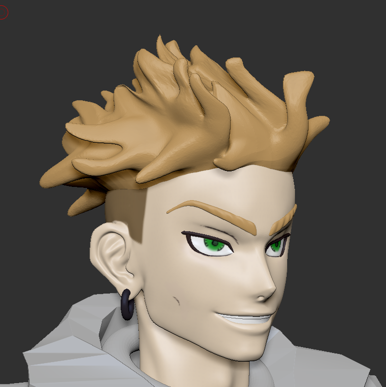 Hey lovely People, I am currently working on making Enjin from the Anime/Manga Gachiakuta in ZBrush. However I find myself having problems with getting the Face Anatomy right. My reference image is this panel from the manga However i also really like how this figurine displays his Face I recognize that my face has some…
 -
Re: Is there a specific rule regarding the length of a wall, or can it be any dimension for modular
 No need to snap to a grid for a 1-off asset. You really only need to use gridded modular meshes if you are making a whole town of buildings, and want to leverage a library of reusable parts. For example: https://polycount.com/discussion/144838/ue4-modular-building-set-breakdown/p1
 -
Sci Fi Enviro off Deus Ex concept Progress thread.
 Just got back from a 3d animation job overseas and thought I'd start a game environment, as I eventually want to work in games and not animation. Normally, I don't use other people's concept art as reference, but I think I might give it a go this time. I'm really looking forward to the new Deus Ex. Really loving its sci-fi…
 -
Re: Any tips on how to make UV edges not look off when baking a high poly mesh onto a low poly?
 You need to do a better job of explaining what you mean by "look off". Probably best to just post an image of the issue you're describing. There really shouldn't be any issues with details being baked across UV seams... Edit: It will also help if you give more information about what exactly you're doing. What are you…
>28362 results