Search
-
Re: Vintage Gas Pump
 - The yellow font is kinda hard to read, and if read quickly it looks like it says "chank" at the bottom :F Maybe move the dirt stain a little? - Or change the font to something heavier and then add some wear'n'tear to it? - Those square-font things pop out from the overall look of your texture. They look too sharp to fit…
 -
Re: Converting a Word doc to Html... any good editors?
 The <span> tag is used to group inline-elements in a document. Use the <span> tag to group inline-elements to format them with styles
 -
Re: ♣ Toronto Meetup ♣ Friday, May 6th ♣
Cool. See you guys there <span>:smiley: </span> -
Re: With so many programs out there which ones do I actually need!?
 feel your pain ,' paddington bear reboot' is a pain
 -
Re: WIP Rat King (Looking for feedback and advice)
 Ah, I see. Is on left lowpoly with normal map applied, on the right lowpoly mesh shading? Personally, like to reduce the mesh shading gradients for such objects so that the normal map has less to compensate, keeping its limited bit depth in mind. Whether mesh gradient will actually come through also depends on the final…
 -
Unreal Tournament DM-Chill Art Dump
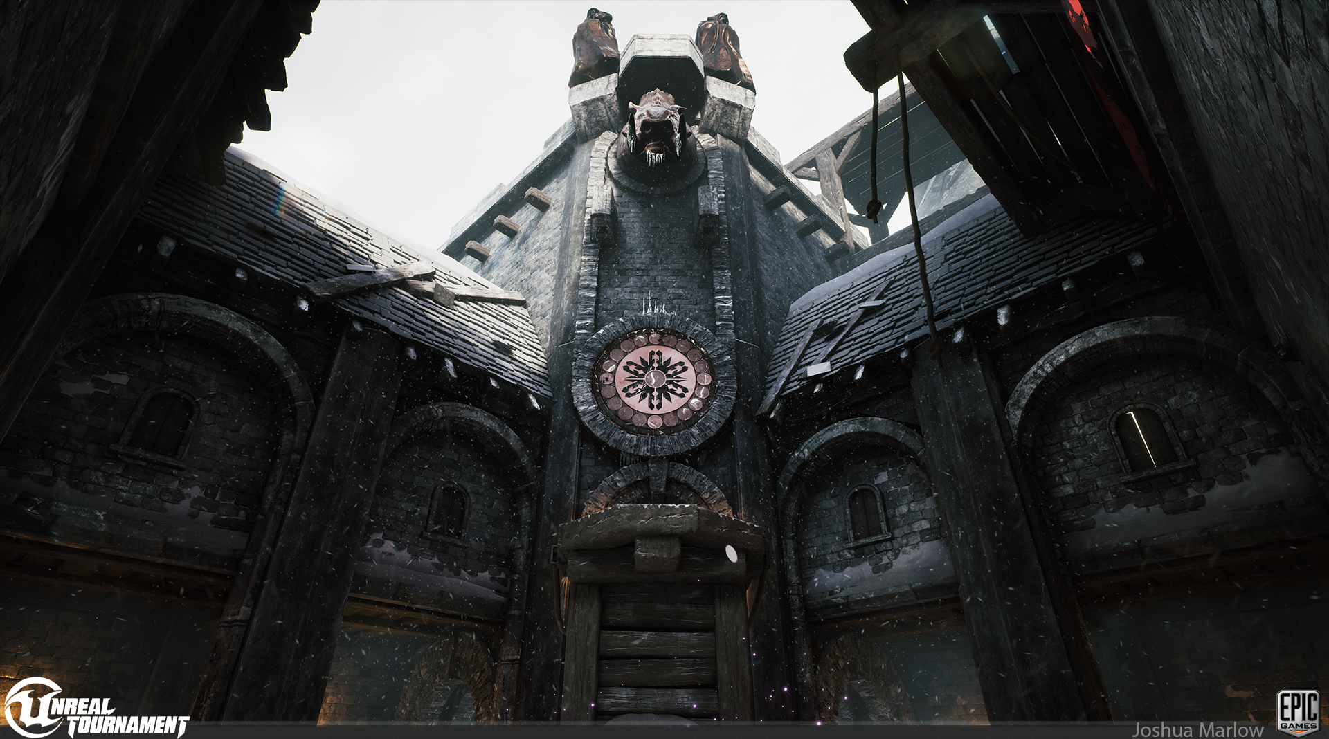 Howdy folks! Here are some screenshots of our new Unreal Tournament level coming out in the next week or so , DM-Chill, as well as some art I did for it. These are not screenshots of the shipping level, but my personal lighting/post pass. ;) Level Credits: Map Design and Blockout: Stu Fitzsimmons Meshing and Lighting: Rick…
 -
Map: Great Heights
I'm not sure if I'm settled on the title of the map but I suppose it doesn't matter that much either. Most map names aren't that great, really. I really do hope people provide some input. I would like to know what people think about the distance between the bombsites and the spawn points. I would like to know if the… -
Re: Sketchbook: Funky_President

 Tried to go digital with my daily Sketches now as well, i didnt spend much time with the face <span>:worried: </span> :
 -
Re: My brain = broken
Both ways are possible. Kinda like that spinning human gif, except my brain only sees that one spinning right to left. -
Re: The Dream Thread
WOW you can actually feel pain in your dreams? /me has never ever felt pain while sleeping :S
>11196 results