Search
-
Lit UI material possible?
 Is it possible to make a UI material (screenspace) that is lit? Looks like the UI present for material type can't be lit, is there any work around?
 -
Grooms are badly lit, and don't deform correctly [Solved]

 Hi, and welcome to my ever expanding list of problems I create for myself in Unreal Engine (5.2) by being unbelievably stubborn and unwilling to turn around and doing things in an easier way! Lately, I've been experimenting with grooms, as part of a character redesign I'm working on, which used to have sculpted fur…
 -
UE4 Lit Mode is Pitch Black, HELP PLEASE!!!

 Hi all. I have been using UE4 for a while now and everything was working fine. The other day I started it up and the perspective view-port was black while in LIT mode and I could not see nothing. I thought it was the updated version of the engine, so I rolled back the engine to 4.9.2 but the perspective view-port was still…
 -
Re: Sketchbook: Tim Smith

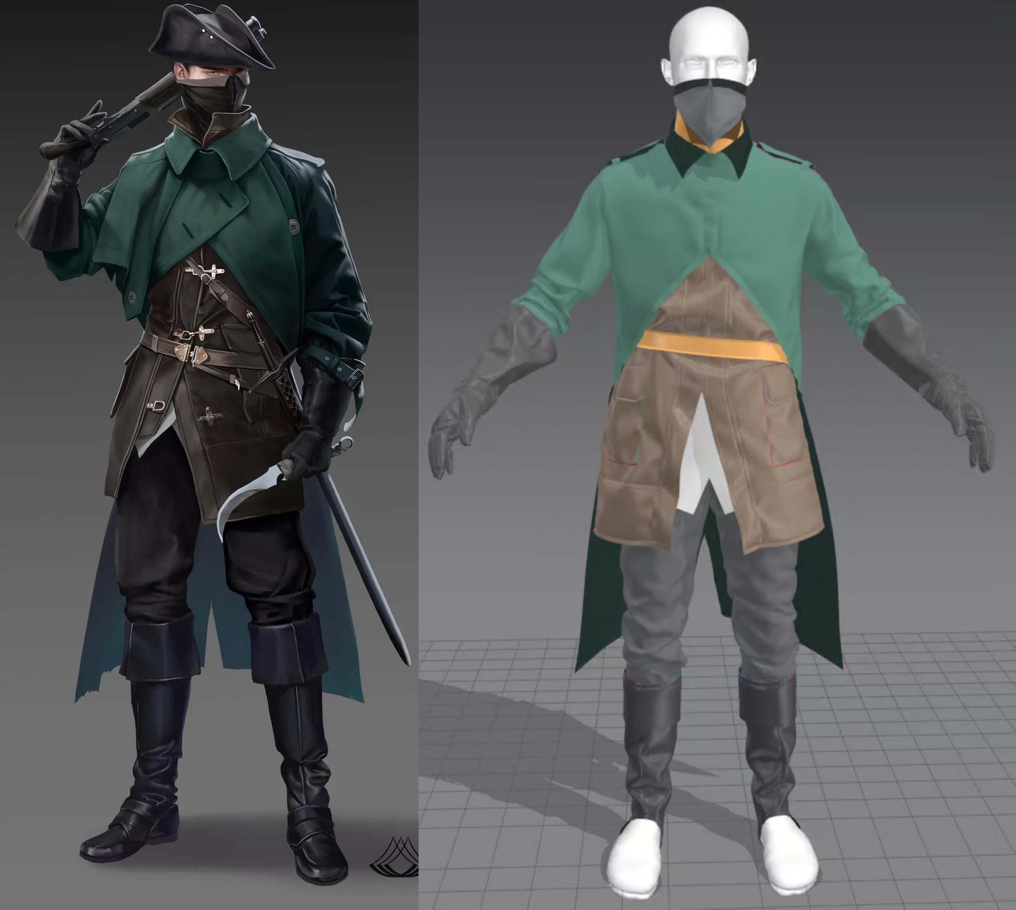 Thanks. ^_^ Well, for the leather, I used Leather Lambskin and setting the Type to Leather. Some areas, like the borders, I froze and then let the simulation do its thing. And when some nice compression folds came out of it, I captured them using pins. Also, any trims/borders/internal lines, I add a bit of fold strength…
 -
No Lights, lit mode is super dark.
 I had some lights , a few spot lights and a dominant directional, as well as a few meshes that had emmisive enabled. I was getting some issues so I decided to delete all my lights and turn of the emmisive meshes and start over. When Irebuild my scene with no lights in it, its all dark or almost black when in lit mode. If I…
 -
Re: ZBrush - Hypothetical ultimate feature list
 default startup document can be changed and you can delete/add matcaps, brushes, etc in C:\Program Files\Pixologic\<<your version of Zbrush here>>\ZStartup yea basically what other people said. I haven't found a way to close individual subtools to save on memory, I need to close zbrush entirely if I want to have less…
 -
Re: Can you bake and texture in 1024x2048?
 To flip individual channels, hit the lil cogs icon next to "Normals" in your last screenshot. Y should be green unless you're mistaken. Please be patient while I practice my gas lighting effects. As for the idea itself of using non-square textures generally, TIL it's no longer a bad idea to do as long as you stick with…
 -
Substance Designer 3D Viewer not being lit correctly...
 Hey fellas, quick question. For some reason, my model in substance designer isn't being lit by the environment map anymore. When I go to scene -> reset and change it back to a regular box, everything is fine, but just when I drag my model into the 3d viewer again, it isn't lit by the environment map again. Any idea how to…
 -
Modular kit for a rural medieval village
Hello everyone! Im a final year student at my uni and currently I am making a modular kit for a rural medieval village. Im looking for some feedback for my modular kit, any feedback in general is appreciated, but if you want me to be more specific then here are some that I would like to have feedback on: * The layout of… -
Re: [WIP] Mavica FD71 - Floppy Disk camera

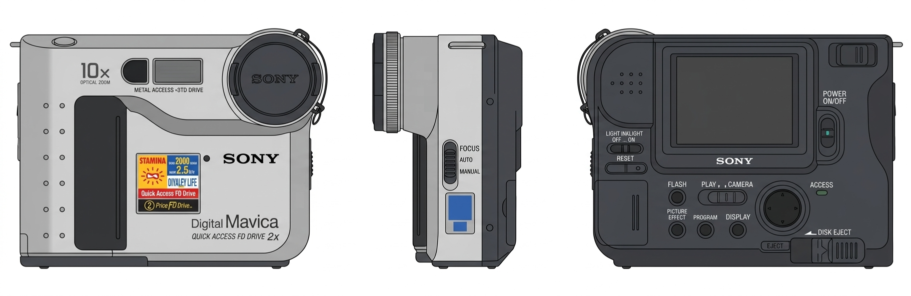 Great progress @illumisanic! Love to see it textured and thank you for the breakdowns for others. Once you add the stickers as the little pops of color I think it will definitely feel ready. It's obviously a bit late but I made a made reference board tool that will automatically generate modeling sheets for you. They are…
>89333 results