The BRAWL² Tournament Challenge has been announced!
It starts May 12, and ends Oct 17. Let's see what you got!
https://polycount.com/discussion/237047/the-brawl²-tournament
It starts May 12, and ends Oct 17. Let's see what you got!
https://polycount.com/discussion/237047/the-brawl²-tournament
WIP: NOD light Infantry, Thrice revamped
polycounter lvl 20
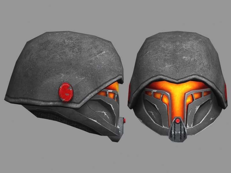
I think maybe a few over the passed 5 or 6 years have probably seen one of my GDI or NOD models, and I think it's safe to say this is a complete upgrade from the past two. Right now I finally got photoshop working (got a laptop) and im trying to texture it. Now, I have a flatscreen, LCD true-life screen, and apparently the texture was a LOT darker on my computer than it appeared as i was making it on my laptop, so ive had issues but im pretty sure i got an accurate working version now. I'd appreciate ALL critiques as much as possible, seeing as this is definitly going to be a portfolio piece. I've already got one critique that i should shrink the head a bit
Anyway, enough talk, hopefully enjoy
http://i8.photobucket.com/albums/a32/SpartnII/1-7.jpg
http://i8.photobucket.com/albums/a32/SpartnII/2-7.jpg
http://i8.photobucket.com/albums/a32/SpartnII/3-6.jpg
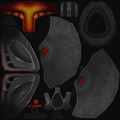
And heres the texture file
http://i8.photobucket.com/albums/a32/SpartnII/Helm22teeest-2.jpg
As you can see the texture image is REALLY dark. Should I turn off the lighting in max and brighten the image up? Those first two renders are with the max lighting on, however, if I were leave it on and brighten the image, it loses its dark color armored look and the faceplate turns a bright yellow instead of a fire orange
I think im going to add a few paint dents to the helmet, nothing too major. I've also had a considerable frustrating time working on that "rounded" appearance at the lip of the helmet. Any help would be awesome
--Edit
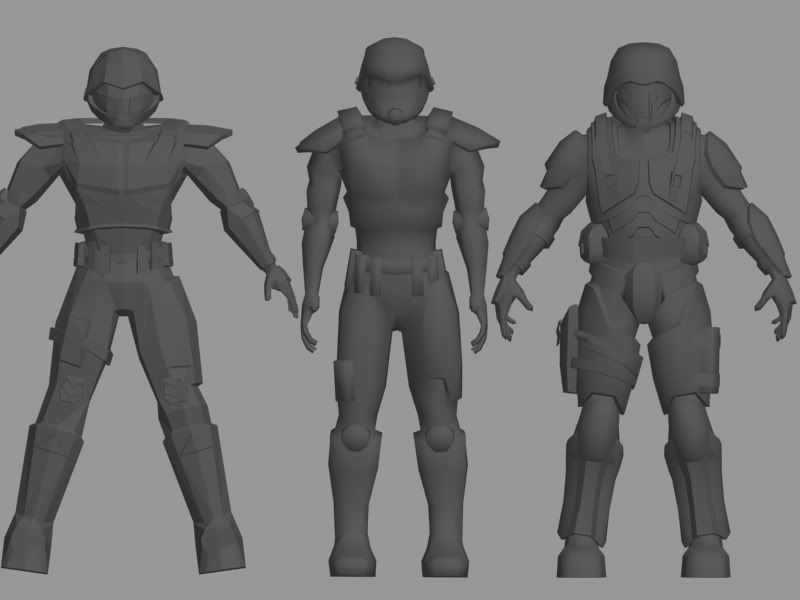
Figured I'd post these...as I mentioned, I've made this guy twice before...just look at the difference and improvement I've made. The one of the left I probably made about 5-6 years ago...the one in the middle i made about 3-4 years ago...and the one on the right, dur, current
http://i8.photobucket.com/albums/a32/SpartnII/6-2.jpg
http://i8.photobucket.com/albums/a32/SpartnII/5-2.jpg
Anyway, enough talk, hopefully enjoy
http://i8.photobucket.com/albums/a32/SpartnII/1-7.jpg
http://i8.photobucket.com/albums/a32/SpartnII/2-7.jpg
http://i8.photobucket.com/albums/a32/SpartnII/3-6.jpg
And heres the texture file
http://i8.photobucket.com/albums/a32/SpartnII/Helm22teeest-2.jpg
As you can see the texture image is REALLY dark. Should I turn off the lighting in max and brighten the image up? Those first two renders are with the max lighting on, however, if I were leave it on and brighten the image, it loses its dark color armored look and the faceplate turns a bright yellow instead of a fire orange
I think im going to add a few paint dents to the helmet, nothing too major. I've also had a considerable frustrating time working on that "rounded" appearance at the lip of the helmet. Any help would be awesome
--Edit
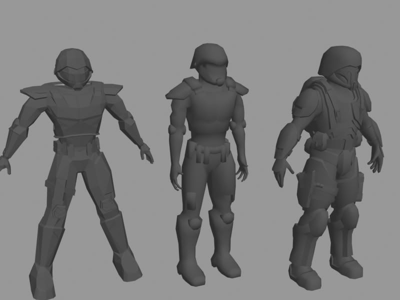
Figured I'd post these...as I mentioned, I've made this guy twice before...just look at the difference and improvement I've made. The one of the left I probably made about 5-6 years ago...the one in the middle i made about 3-4 years ago...and the one on the right, dur, current
http://i8.photobucket.com/albums/a32/SpartnII/6-2.jpg
http://i8.photobucket.com/albums/a32/SpartnII/5-2.jpg
Replies
Now as far as the texturing goes, what is your end target for this guy?
Are you putting him into a game or just going to get screengrabs from max?
If its the former, then do a test now and see how it looks in the engine, then adjust your texture, and or max's lighting to get what you want.
If you are just going through max then keep it dark.
Working on unwrapping the body, renders within the next 4-5 hours hopefully
I like the metal scratches, it reads as scratched metal, but again a bit more color in the dark areas. KEEP IT UP! HE'LL BE COOL!
"your helmet...it's so,...big"
Definitely a great idea about more color...I'm always thinking about just using dodge and burn and color overlays to get what I'm looking for rather than other actual shades of color...could be good to add some grunge and dirt too, thanks!
Not really much of an update...I'm taking way too long to work on this
****pictures below*****
I'll go ahead and post the texture maps, I'd like to know if I've made fairly good use of the space or not
http://i8.photobucket.com/albums/a32/SpartnII/Body.jpg
Also, is anyone familiar with Battlefield 2142? Because I've kind of ran into a problem. I have one texture map for the head(512x512), one for the body(1024x1024), and I still have un-unwrapped stuff. I was thinking about making another for the backpack and bags as the "kit" texture (probably 512x512, or possibly a 256x256 if it would work, but probably not).
Does anyone know if 2142 also uses a third texture map for the kit? seeing as they are replaceable in the game? Because If I shrink the current UVW's on the BODY, it'll make the texture detail a lot more pixelated.
Any information or advice on what I should do would be GREATLY appreciated
**Edit******
After looking over the texture map again I think when I get home I'm going to try and move things around a bit and try and tighten it up a bit
still need advice about a third texture map being a smart or bad idea
Turns out 2142 does use three texture maps for the shoulder. One for each head(512x256), One for each Body Character(1024x1024), and one for ALL kits (backpacks) that a user picks up. I'm not quite sure how EA planned it, but theres one texture map thats 2048x2048 and contains every backpack model and other unique character appearances on it, so I'm sticking with that
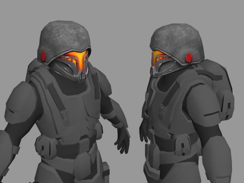
The soldier is unwrapped, (except for the pack) and I'm applying quick textures to the model, after that I'll update with a post, and get to work on texturing him up solid
****pictures below*****
I started detailing the chest then changed my mine to get a layout going for the whole guy. Don't worry, I know the scratches are waaaay too bright
BTW, I tried scaling the helmet down a bit and it didnt look right at all, even a slight scale
And I'm going to go back and add more color to the helmet too, i haven't forgotten
fi-na-ly
gogogo!
Only been able to put a couple extra hours into it, not really much to update with...ill have something tonight. Hopefully the entire upper body done with texture
I think I might try that after I'm done with this texture...and end up re-texturing it, or just touching up new-made areas.
So im too obsessed with pimping up...heres a small update
http://i8.photobucket.com/albums/a32/SpartnII/1-9.jpg
http://i8.photobucket.com/albums/a32/SpartnII/2-9.jpg
http://i8.photobucket.com/albums/a32/SpartnII/Body2.jpg
I'm also starting to regret mirroring the chest
****pictures below*****
I brighteneed up untouched stuff so it can be seen better, and other details too
I'm still truck'n...determined to make this look nice
Crits are MORE than welcome
Yes I did plan on adding red elements to the armor, however that is not going to be his primary color, just the detailing of the armor
I'm definitly thinking about the colors I'm wanting to use...I'm thinking about going with red/blue/yellow understones to add some flavor. Do you think it's a better idea to add them in as I go? or rather get the armor done in "greyscale" and add in later?
Alright, I added two color tones to the armor which I think really helped bring it out. Let me know if I did a good job with that. I have a blueish hue added in the brighter areas, with a red tone to the darker areas
Also, I realize I probably emphasized shadows too much, I'll be toning those down a bit
And I also realize that the faceplate is too bright and the red on the helmet is the wrong color, I haven't messed with the helmet texture since I started the body, I'll change it soon
PLEASE crit away
I have the curse and gift of an artist...I'm a perfectionist...After looking at other people's work, the screenshots of Halo 3, and glancing at my own texture, I'm becoming less and less proud of what I have produced. Seeing as it IS only like my fifth real texture I've done, I think it's damn good. I just expect professional quality
So please, tell me what I can do to improve this texture, I know it needs a lot of work
http://i8.photobucket.com/albums/a32/SpartnII/Body2-2.jpg
I don't want to beg :x, but I'd really like some critique on this
also, certain lines [like the one in the front of the helmet] should be straight. hope ur using paths in photoshop?
but honestly, i really like it! i dunno why ppl have to compare themselves with others and get depressed cuz of that. i've tried comparing myself to others, but i found that it just does me harm. getting inspired by others is a different thing.
try finishing the texture, and then in later 'passes' modifying certain things might make it really nice. but i honestly wanna say 'nice job.' i was actually loving the thing since the beginning!
Yea, I kinda agree about the overdone wear-and-tear I've done so far, I'll try lightening it up a bit, especially on the right shoulder pad (the one that says NOD).
Also I'm not really sure what you meant by the line on the front of the helmet? and no I dont think I'm using paths?
scratches on plates corners are ok.
lighting, shading etc
so, pimping away
This last picture has omni's in the scene
BTW the "fabric" texture is only a stand-in at the moment...I originally wanted to use it because thats what it was like in the TS cutscenes, but I really don't see how texture worked out for a good under-lay fabric...I'll probably go more of a rubber-type material
ur edges are too white, and there is still too much damage. Lessen the whites, give subtle highlights. I'm no pro at handpainted diffuse-only models, but.... just my thoughts. Compare my img with ur image.
idk, I'm not sure what I really want to do with the dmg, because so far i have you saying theres too much, and another saying it's fine
What I might try and do this weekend is make a second skin with less dmg and compare the two
OH! and the issue you corrected on the helmet, I was experimenting about a week and a half ago or so on the scratches on the helmet "jaw line"...decided i didn't like it, and only had one side done. I guess that layer got flipped on and was in the render, I'll have to fix that
here's what I would do with the scratches. It looks like you really want a base metal underneath to shin through, so I went ahead and bonded a krylar coating to the metals, which can unfortunately get chipped by bullets and wolverines and wolverine-bullets. Try and think of what took off each bit. You can't have a corner beat to hell and have the metal right next to it pristine as my real dolls. it breaks the fiction. I also added some very subtle color hues to the different panels to help break up the shapes... little orange here, little bluer down there. not every batch of krylar coating is created equal. we just haven't perfected it yet. sharpen up those details you put in there, they're making it look much lower rez then it is. a nice reflected glow from the red safety strap lock mechanisms, and my paint-over is done. I hope it was as good for you as it was for me.
I greatly appreciate that and it's very helpful
Unfortunately, I have a 14 hour work day tomorrow (two jobs ftw?) and I work the next morning, so I won't be able to do anything of what you suggested until tomorrow, unless I feel like staying up too late and doing it tonight
so, updates soon
Any other crits are MORE than welcome, I appreciate any and all advice
lol, sorry. i think i should go to sleep now!
but yeah, notice the type of damage in that paintover. feels/looks much nicer than only dents and scratches. _definately_ take sectaurs' advice.
I'm taking way to long on finishing this texture
after still being frustrated i mirrored the chest in the middle, I took advantage of one or two small spaces left on my UVWmap, AAAND put part of the left chest on there
you don't have to follow my scratches to the letter, but I'm glad you got the over-all gist. now go in with the one pixel brush and tighten up those edges!
http://i8.photobucket.com/albums/a32/SpartnII/1-18.jpg
http://i8.photobucket.com/albums/a32/SpartnII/2-17.jpg
http://i8.photobucket.com/albums/a32/SpartnII/3-10.jpg
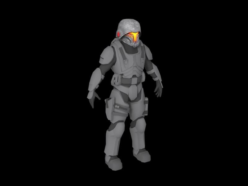
Renders have been updated since previous post
Also just realized the red on the thigh is waaaay too saturated compared to the rest of the coloring...I'll fix it this weekend
Thank you for showing us the evolution of the Nod Soldier.
There is a big empty space on his forehead, that can be used for something.
Also the "soft" part of the suit, the bodyglove. It has a simple pattern to it, and could use some folds in the fabric to break it up a bit.
Thumbs up!
maybe I should explain better...on the arm, I'm trying to add a realistic fold/crease/"constantly-bended" area to the front of the elbow. All of my ways I've tried to get this effect look kinda silly...the one I currently have on it looks alright but def needs some work
Also the none armour bits are bit balcnd right now
Can someone point me into the right direction for either a crease tutorial, or a good reference for a crease?
[/ QUOTE ]
Start With This and then I would suggest getting one of these 2 books, I personally like Dynamic Wrinkles & Drapery. Your material under the armor definitely needs more love.
Drawing the Draped Figure: The Seven Laws of Folds
Dynamic Wrinkles & Drapery
As a disclaimer though, The elbow pad is a new addition and I'm still working on blending in the texture to the rest of the armor, and the rubber texture isn't completely done yet on the arm, adding finishing touches and trying to blend it together more (especially the "sandpaper grip" on the hand
Poly: thanks so much for that link, it's pretty helpful. I'll see about checking into one of those books once I get paid
Ruz: Really? I'm really not sure what might be causing that. He looks like a perfect height to me. About 5'9-6'2. I really don't know what could be causing that appearance. If you can help me spot it I'll work on that
http://i8.photobucket.com/albums/a32/SpartnII/1-20.jpg
http://i8.photobucket.com/albums/a32/SpartnII/2-19.jpg
http://i8.photobucket.com/albums/a32/SpartnII/3-12.jpg
http://i8.photobucket.com/albums/a32/SpartnII/4-4.jpg
Here is a closer up image for the forearm texture
http://i8.photobucket.com/albums/a32/SpartnII/5-3.jpg
Might as well go ahead and post my texture file so far. I'm still messing around with the dirt texture on the bottom of the shin armor. I'm going to bring up the dirt a bit farther on it too. I just found a GREAT reference picture of Master Chief from Halo 3 with an exact example of dirt affect I wanted to apply to this guy, so I'll try and study that image and apply it to him. The reason I'm going with a yellowish hue dirt is because the setting for Tiberian Sun deals with mostly desertish, sandy areas, so a regular yellow hue dirt would apply nicely
http://i8.photobucket.com/albums/a32/SpartnII/Body2-3.jpg
I think Ruz has a point in that he does look small. You're probably following some reference you have of a nod solder as i am not a CnC buff myself... However, typically a heroic character would be something like 8 to 9 heads tall... So! Making the head smaller would make him look like a larger man all together.
Just my 2 cents.
hmm...you know what...I think Ruz was right now that you mention it...I'll see what I can do
I'll take off some of those previous images at the beginning of this page later
http://i8.photobucket.com/albums/a32/SpartnII/2-21.jpg
http://i8.photobucket.com/albums/a32/SpartnII/3-13.jpg
***Updated renders with hopefully a better lighting scheme.
FYI, the butt plate has not been textured, ignore it's blandness
btw, do you guys think I'm posting too much? :x
I'll update the post tonight with a better render
its an amazing improvement, i kid u not.
and i'm really glad that u finally got rid of the symmetrical damage on the armour. my only complaint/crit atm is that the type of damage to the leg-armour makes it painfully obvious that it's symmetrical. and it feels _really_ weird. If u wanna save tex space by doing that, its all good, but then i'd suggest making the damage look like that which doesn't make it _obvious_ if u understand what i'm saying?