Portfolio advice and critique
looking for critique and advice on how to improve and better focus my portfolio.
Previously, my portfolio was quite scattered, as I included everything I worked of environments, props, product visualization, characters, and animations. I’ve taken on a wide range of freelance projects wherever possible, but lately I’ve been trying to narrow my focus toward game art, which I genuinely enjoy the most.
Work has been coming in, but consistency has been an issue, so I’m aiming to strengthen my portfolio with more focused game-ready assets.
At the moment, I’m working on a low-poly, hand-painted hen, which I also plan to animate and add to the portfolio soon.
I’d really appreciate feedback on:
Overall portfolio direction
What to keep, remove, or expand on
What studios or clients might expect at this stage
Portfolio:
https://www.artstation.com/jamalbukhari92
Thanks in advance for your time and feedback.
Replies
Thanks for the feedback, I appreciate it. I’ll simplify the portfolio and keep everything on one page.
I also plan to highlight animation alongside my work,at what point (number of pieces) would it make sense to split into two sections, one for meshes and one for animations? or is a single combined display generally better.
Also make sure to keep pushing overall presentation skills and thumbnails. Look at other artists frequently how they present their work, how they render and how they structure their posts. It's a skill in itself but extremely important! A lot of your images seem too dark, especially the thumbnails. Make sure they pop more.
Personally I don't even use the crop tool for my thumbnails. I make a specific thumbnail render to really get what I need.
Keep at it, you're on the right track!
Regarding the direction, my long-term goal is to work as a 3D generalist, which is why my portfolio currently includes both characters, props and animation. That said, I completely understand your point about it looking scattered and I think if I add a decent number of assets for each side and divide them in section, then they would not look so scattered.Right now the number is too few to divide them in different sections.
I do observe and study other people work on a regular basis. I personally like darker theme renders so I guess my portfolio got naturally filled with such. I'll definitely make the new ones brighter.
The mesh density on some of these pieces is unbalanced for what you're calling "low poly". You have areas that are sparse and very low poly, and then other areas that are so dense that they're black. Optimisation will be a massive priority in your work when you land a job in games. Part of that is not wasting triangles, and making sure every triangle is appropriate for its intended purpose.
You need to optimise your meshes and UVs before showing off wireframes and flat textures, otherwise they'll be seen as a red flag to the people doing the hiring. The polycount wiki has a lot of good info on this stuff IIRC
Yes, that was an oversight on my part. I was focusing more on making the assets animation friendly for cutscenes like intro scene or chest opening, and wasn't thinking of in game performance. Should I change the title of these? For optimization part I can do it up to the karen girl I made. Let me know if that needs any improvement?
Regarding UVs, I tend to prioritize minimizing stretching than their placement. Adding more seams and straightening UVs often creates challenges for me later during the texturing phase. If you could point me toward any tutorials or resources that address this balance, I’d really appreciate it. Always happy to learn more.
True, straightening UVs does cause some stretching, which can be difficult to work with when painting textures in 2D, but you can mitigate stretching by spreading it across a surface and by painting your textures in 3D using industry standard tools like Substance Painter/Mari/3DCoat.
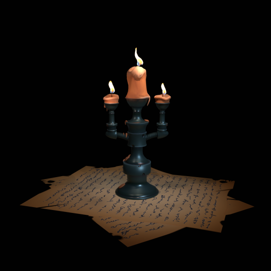
https://www.artstation.com/artwork/0Zxoy
https://www.artstation.com/artwork/x3nnAX
https://www.artstation.com/artwork/JbLvz