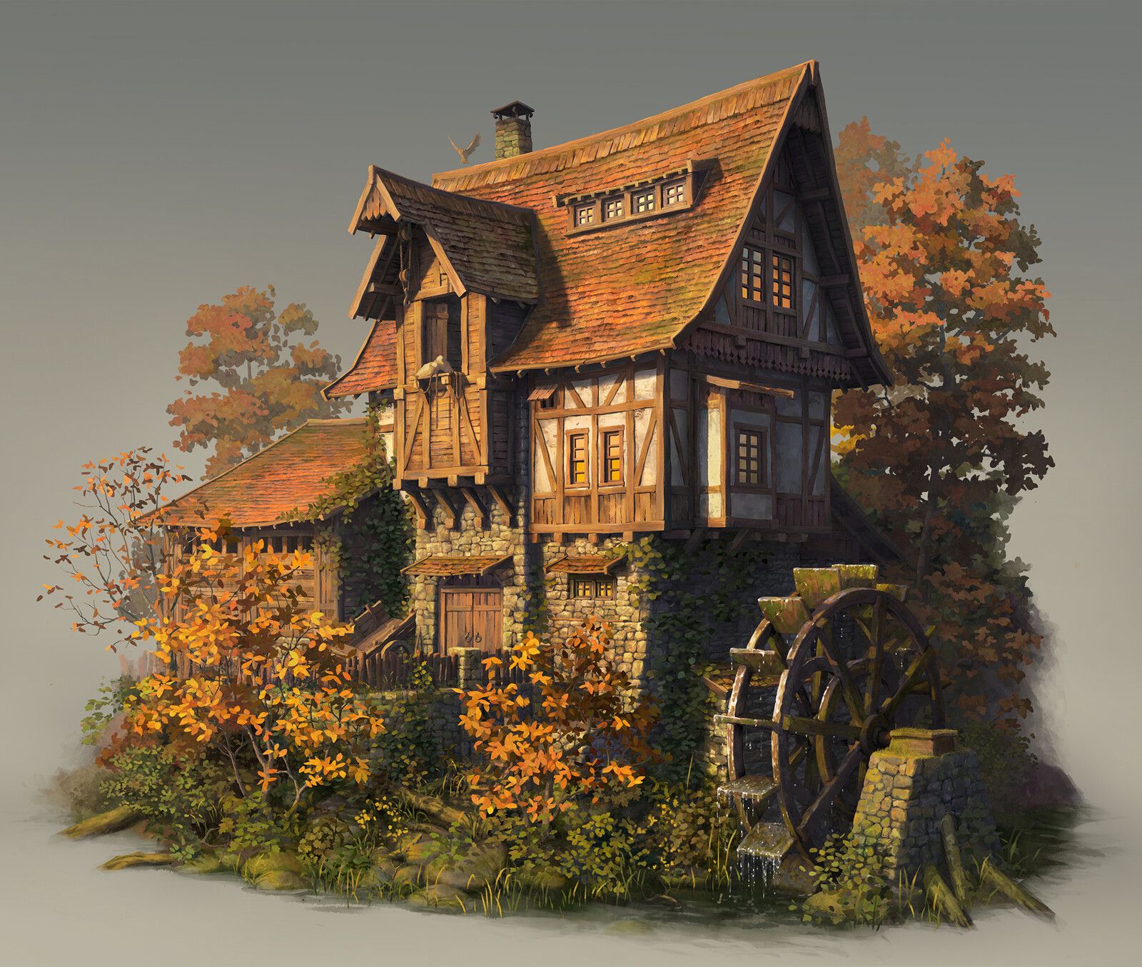
[UE5] Stylized watermill

interpolator
Hi!
I have been working on this project to start seriously getting my hand at UE5 since we will probably switch really soon at work, and it has been a lot of fun so far!
First of all; here is where I am at now:

And here is the first ref that inspired me, the amazing artwork of Yusuf Artun ( https://www.artstation.com/artwork/EL4Bo4 )
I am not going for 100 percent likeness and change the overall style as you can see, but here you go that's where I am so far!
Here is a lill close up on the textures; a big dose of quixel mixer or full zbrush for some:

Crits and feedbacks needed, thanks for reading!
Replies
Quick update on the compo: realized I was missing some verticality and a really important aspect of the concept so I tried a first pass with water to help me build that side wall, next to the wheel
This is lookin' solid! Keep going!
Hey, looking good!
I think the some surfaces are starting too look a bit busy (e.g. stone wall) partly due to exaggerated shading of the surfaces (displaced mesh + normal map?), which swallows some of the primary shapes (undefined edges). Transferring the normals from the original shape to displaced mesh could help to counter this. Reducing normalmap intensity would be another way (although more eyeballed). Adding details to simple meshes with detail meshes and transition meshes (edges, corners, skirts) is another option.
But maybe you are already doing this kind of things or are planning to, or you simply prefer this look.
Looking forward to updates. Keep it up!
Hey!
Yeah that's a really valid point, I constrained the normals to point frontward because I had exactly the effect you are mentioning (exaggerated shading due to the normal of the mesh + normal map). Here is an early test example: top part being non constrained normals
but it is still looking slightly over the top maybe.. It might come from the Albedo having a bit too much lighting or AO baked in there, I will try to reduce it a bit and see how it looks! It ight also be the scale (lill rocks making it look a bit noisy) but I will definitely have to take a look :)
Ah I see, cool to see the comparison.
Looks like with the edge meshes you get well defined edges, nice!
Keep it up!
Hello!
I started to tweak some luminosity and contrast and also started the work on the foliage; still a lotttt to go but I really like that first pass altough mayeb a bit too cartoony! I think some more grass variation with details and flowers, plus little rock will help to unitize a bit everything.
For anyone that might be interested, the account and videos of Victoria Zavorodhnia is a real gold mine! ( https://www.artstation.com/akbutea )
Stones are looking better, Are you using modular pieces & trim sheets? Would love to see wireframes and texture flats.
I see a bit of weathering on roof edges and above the door, vertex color? This could be added elsewhere for better cohesion between neighboring surfaces, for example on the stone under the big dormer window, and on the triangles of wall plaster between the wood beams. It would depend on the look you;re going for though, might be too much weathering.
Not sure if you've seen this tutorial, but some of it might prove helpful https://medium.com/@legacykraft/trim-sheet-detailed-breakdown-bd35c78d16c3
Also this project might provide some ideas. https://polycount.com/discussion/comment/1465422/#Comment_1465422
I am working with modular pieces but avoided trimsheet this time, instead I am having my set of wooden beams with normal map and textures (all on the same atlas) + a couple of tilable textures!
Sorry the lighting is pretty messed up so far I just realized.. I also slightly vertex painted the bottom vertices on the tilables plane to show the blend.
As you can see I went pretty heavy on the polys, I wanted to go full on with UE5!
Here is also a close up on one of the modular with vertex paint applied
You are totally right about the vertex color as well, I use it to have nice gradient in the albedo as well, and Indeed it is not really nicely setup on the door part (Stone and wood, both) as you can see in that unlit view:
Definitely something I will change right away!
Thanks a lot for the project and tuto, there is some really good stuff in there! Really like the way he bakes some more AO on the final mesh, I think I might try that. And that pirate castle is also a perfect inspiration, really similar stuff (I am jealous of his stone wall texture 😅 )
Little update on the tree background: still trying to get something not too eye catching but still pleasing or the background! I got rid of the color variations for now but they will definitely be back, to get some yellow ish or red ish trees as well back there
I think if you pushed the directional light to have a warmer tone, as well as hue shifted the trees to orange, it would really nail that fall vibe the concept is giving. Hoping you're going to throw some orange bushes and plants in the front too?
It's lookin awesome, keep it up :)
This looks fantastic so far! look forward to seeing the final result :)
this is f*cking gorgeous, man.
Thank you so much for the kind words, it's always good for motivation!!
Yeah I definitely will do!! The lighting in general still needs a lot of love, but I will also add some more variety of plants and bush to populate the front part as well :)
First of all,I really like how it looks!
As for what * I * feel is missing: the textures seems a bit too washed up,I mean all of them.Like no saturation variation,the all seem same -low- saturation.Maybe try to add some more intense colors on the roof for example,make some tiles more coloured.Note that this change will naturally draw the eye,so maybe do this trick on your area of interest.Or maybe put something in the scene who naturally has a more saturated color,like a shovel with a bright red paint handle in front of the mill,I don't know...I think you need to create a point of interest.
Another issue I see is low roughness variation,is like it's the same material all over.Especially where the meshes have contact with water,not only roughness,you can add a darker tint too,it will make the scene more belivable-i.e. the sand should be more darker near water,but the rest of meshes too.Try to play with the roughness of the wood planks too,even if it's not really real life like you want to get an interesting image;real life is boring most of the time.
Hope I helped you and keep it up!
Hi there!
That's a really good feedback, a friend of mine suggested me to have some colorful element to pop out a bit indeed, I was thinking about opening up one of these window and hangout some fabric, but some tools like you suggest might be good as well I definitely have to try.
For the roughness and the saturation, that's true as well and I am working on it. Definitely have to do something for that sand too!
Thanks a lot for these advices, they will come really helpful to continue that project
I oppose introducing a saturate new focal element but hope you do attempt it, I am curious what effect this course will have and how you approach it.
If you'd like you can watch the course on Marco Bucci about color & light. What I've learned is values & contrast, readability of an image is what makes it stand out, without it colors cannot make the image beautiful by itself. \\
You can see how much of a difference just playing around with the values & contrast affect's the image. You can view in black & white so that you're not distracted by colors to see the contrast of your image.
Ho man that's a hella good feedback!! The course looks really really nice, and that quick pain over is really indsightfull, will definitely keep that in mind to start working on the lighting
The spacing between the bricks and the depths of them is adding a fair bit of visual noise. There isn't much in the way of rest for the eye in the scene currently. When I work on materials I generally try to vary up the normal instensity or height depth along surfaces to get a bit more variation and rest
Yup I feel like there is smthing to fix yet to these bricks, I ll take a look at having some more flat area in the texture!
i like how you did the river, did the river affect your framerate?
Hi!
The river was really easy to do, I just used the built in plugin of UE4, really easy and no hard impact on the perfs for me, altough I didnt really focus too much on perfs here :D
So I started to work again on the good old watermill; tried to apply all the good feedbacks I received, worked on the noise of the stones and the lighting focus. Still lot to do but we are getting there!
The blue square will be cloth (next step is marvelous) to add some colors points.
Edit: the camera work isnt the best yet, might be a bit blurry so here is a quick closer shot:
Hi everyone!
Decided to wrap up the projects, and move on another. Thank you so much to everyone for the precious feedbacks, learned a lot on it really!
If you wanna see more in depth details, I just posted everything on artstation as well:
https://www.artstation.com/artwork/d0z9qJ
Thanks!
This looks very GOOD!
Could you explain a little on how you have created moss on your roof? Is it vertex painting with moss roof tiles or decals or a mesh?
Are you also using a tileable texture for the roof?
Thank you!