Looking to improve my character art - In need of critique!
Hello! I'm starting a new personal project, and as per my usual process trying to identify the areas I want to improve upon. Thing is, whereas usually I'm fine with just analyzing my previous work retrospectively (the lack of tunneled vision and the honeymoon effect does wonders), I'm having a bit of a hard time right now: aside from usual misses stemming from laziness I don't really hate my previous character artwork. So the best course of action I could come up with is to be more thorough and use tools better suited for the job... Which is not good enough since aside from having fun I want to also get better at it.
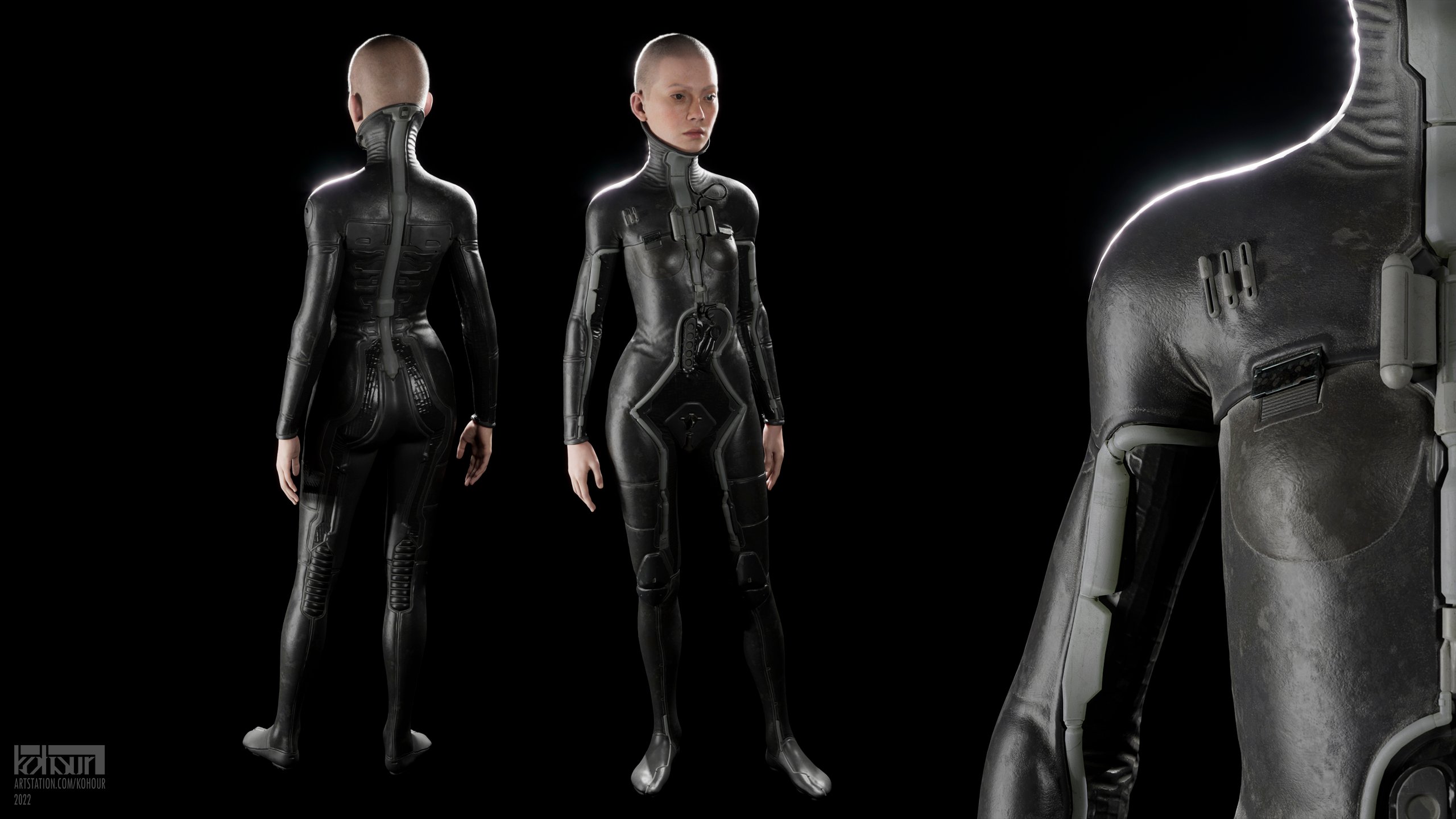
I would really appreciate any criticism, especially regarding the design and texturing! Oh and the actual human parts were generated by the wonderful Metahuman Creator, so pay no attention to those.

With this one I was going for a kind of life support space wetsuit look; an old and worn out type, something like you'd see in a run down Soviet museum or something.
Plain modern wetsuits were the starting point in the design. Them being plain and rather detailless though I've also used a bunch of fictional stuff as references: ranging from David Lynch's Dune costumes to Mass Effect characters. Other than that there were some other things like old ball computer mice with this ugly yellowish plastic that I used for... ugly yellowish plastic parts. Or cat tongue spikes for the bottom of the shoes (that I ended up not including in any character renders).

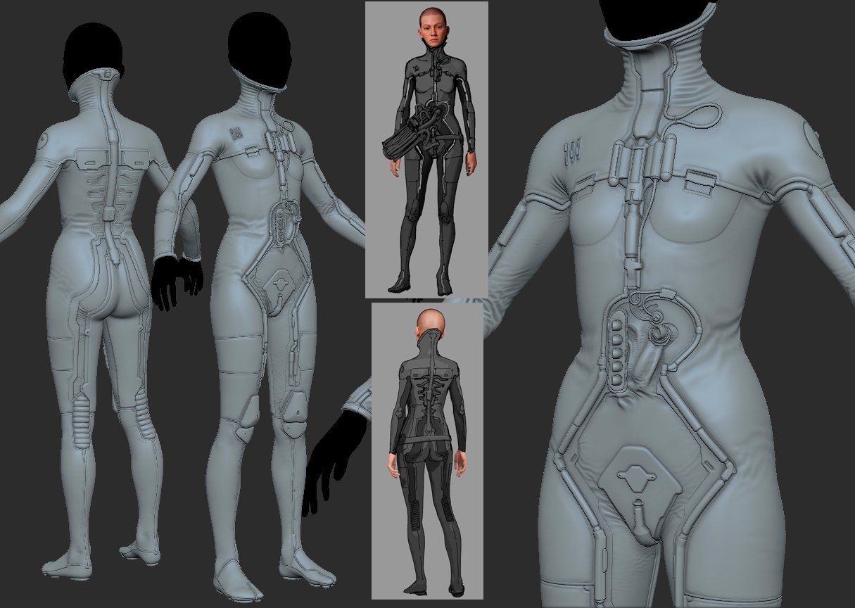
Some early WIPs
The idea with the tubes and everything here is that in the grim, dark, transhumanistic future you want to optimize (and dehumanize) your alien starship pilots, so you design them and their equipment to not leave the chair, ever. Thus you remove most of the pilot's internal organs and let the life support do the job. It's also a great excuse to not include any movement-induced wear and keep the dust uniform...

How it ended up looking in the final scene

The next thing is just a bunch of messy doodles so far, but why not.
Initially I was going for a somewhat utilitarian-looking space explorer suit; something more like Denis Dilleneuve's Dune (wait a minute...), with the design centered around a repeating horizontal motif. Later though I've moved to more of a goofy space adventurer vide, with a lot of inspiration drawn from Victorian era military outfits. I don't intend to go for the old and gritty look this time; only factory new looking plastic and rubber.

Anyway, I'd be happy to hear any critique, and if anyone has read through all this nonsense thank you for your attention.
Replies
Ok There are few things that stands out to me :
-round shoulders probably a little gift from rigging/posing
-costume is mostly round shapes and diamond shape in the middle doesn't work for me if turn that in to company logo or round shape then you could tell a better story as shes female but have no female parts so you gave her external womb -> round/egg is universal symbol for new life Also this wavy things on the torso are very strange and doesn't work I guess they must be wrinkles but it doesn't read as one
-on concept art all this horizontal lines somehow works fine but on the model you have emphasize them too much and that create effect of border or separation you cant appreciate the whole thing as this line are forcing you to stop
-for a young female forehead is way way too flat
-arm and hands on finale comp look very unnatural and broken , probably too much noise on the rest of details if they build space ships to fly for thousand of years they will probably use high quality materials otherwise ship will fall apart and they will lose cargo
-I think final comp lack depth and contrast probably lack of AO or too close values
-as for texturing and materials rubber material need some more love I have found this image below see how roughness grunge and finger prints bring it to life also wide high light give it unique look
Looks really cool though I guess the biggest room from improvements are on the micro-details, folds and material definition side.
I would say there could be more folds all over and they could also be more defined in sharp micro memory folds.
The material of the suit looks more like painted metal a bit too rough with macro noise but would require more the aforementioned micro folds and fabric or underlying material structures.
I quite like it. Reminds me a bit of the suits they wore in Gantz due to the high neckline I think :) My only question upon looking at it, is how the hell does she get in and out of that thing? Those central lines don't really look like they would conceal a zip. I mean, hardly the biggest issue, but that's the first thing I thought of 😂
Overall look is cool, but head feels out of proportion with body and turtle neck portion of suit. Torso is also very straight where meeting hips...might just need adjusting material folds. Biceps/triceps having some more definition could also reduce some of the angularity and enhance flow. Keep grinding and looking forward to seeing your finish line result...as if we ever hit a finish line with our designs 😉