2D Game Art - Critique Appreciated!

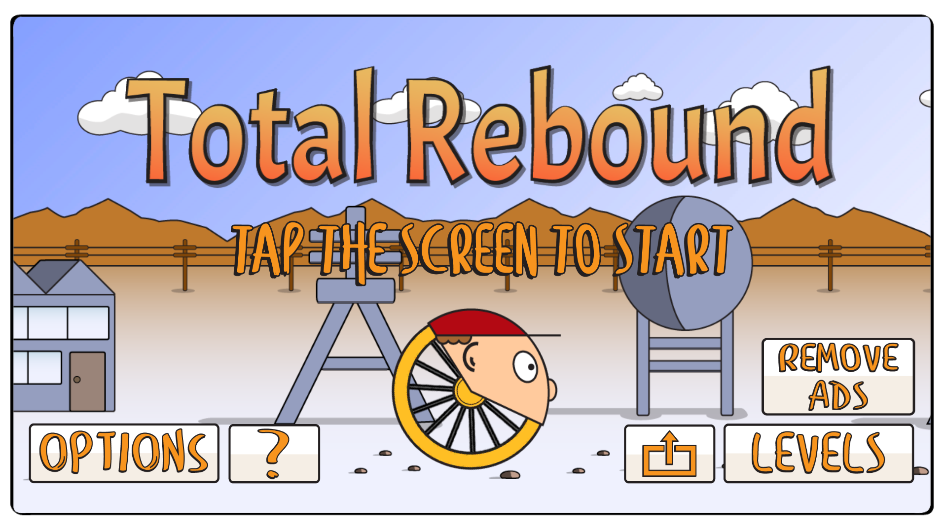
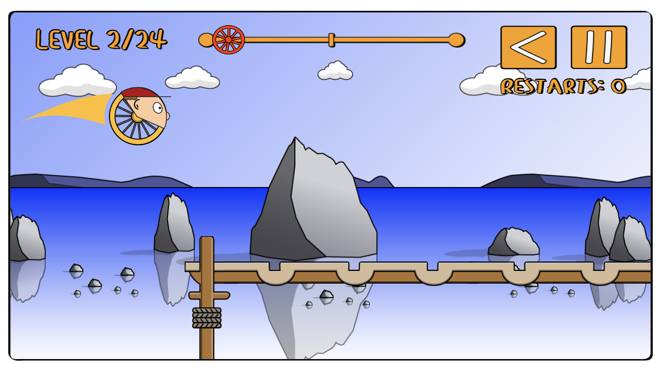
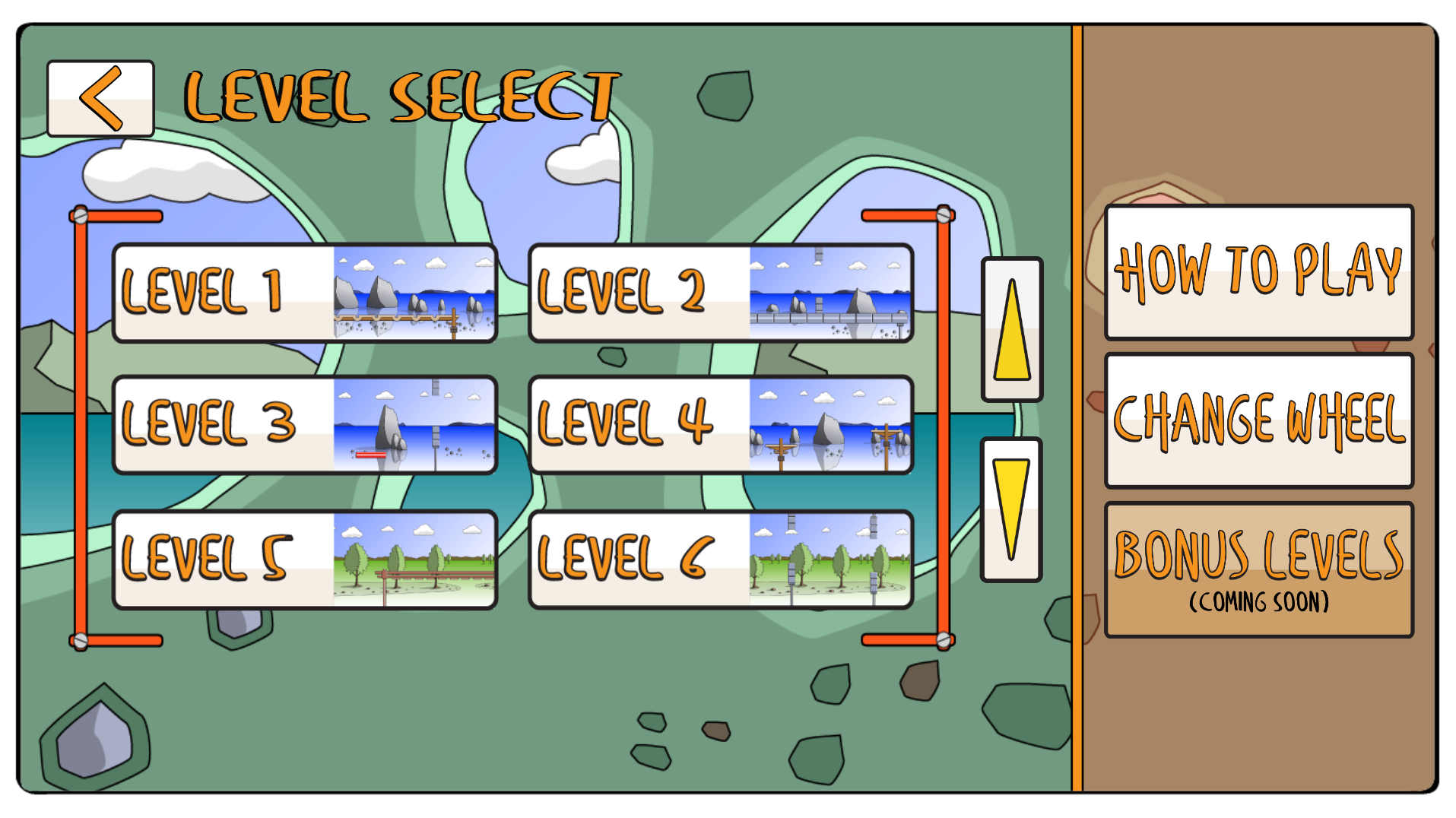
Hi, I was wondering if anyone could give some feedback on these screen shots from my mobile game? Art isn't my biggest strength, but I've given my best shot as none of the 2D Game Packs I saw were the style that I wanted to go for.
I think they're ok, but maybe another layer of refinement and I think the App will look really good and professional.
Thanks


Replies
congrats on creating a functional game.
pleasing art absolutely appeals to consumers.
i'd advise you continue to improve your skill set and avoid a very large chasm that is art and consider hiring an artist that may help sell your game.
i do believe very clever content can stand on its own. this art style isn't really too far from Rick & Morty.
I agree with @killnpc that having an artist to deal with all of this could help. Art is a big selling point to games, and I'm afraid all the work you've put in developing the mechanics of the game might not shine as it could.
However, if it's a passion project and you don't have more than your time to invest in this, then I'd suggest you study some examples of similar styles, like Rick & Morty (but not only).
Try and make the character and UI always stand out from the background, by brightness or at least hue (on the first screen you have orange text on orange mountains). You can try lighter colors for some of the outlines, so that details and background elements don't stand out as much, and save black mostly for the foreground. In Rick & Morty sometimes they apply a slight blur to the background to help the characters stnd out and add depth, but they tend to avoid it. Also, I'd probably remove the outline of the shadows in the trees and rocks.
For the style you went for, I think it's important that the outline thickness is consistent across all the elements (in the third image it's noticeable that the smaller trees have a thinner outline for example).
Maybe also use the same font you used for the UI for the title as well?
These are just things off the top of my head, of course take them with a pinch of salt, but I hope it's all helpful. Good luck!
I think that the screen text could be darker in order to help it stand out from the background, so that when the player is moving all around, if they jump up and the text ends up directly in front of the mountains, it will still be visible and not blend in, potentially throwing them off. It would help if the background was made less saturated and very pale, to show it's distance. Real mountains look like this, as opposed to getting darker.