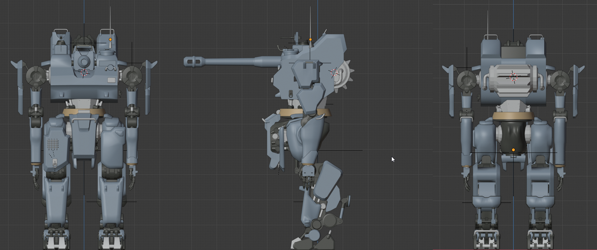
Tankhead Stug V Destroyer - Completed
My next work after the mammut tank head which you can find here https://www.artstation.com/artwork/vJ4xXO
Another concept of Emerson Tung https://www.artstation.com/artwork/aRwvYk
It is one thing to know you need to do blockout, it quite another to understand and do it right. I disable all modifier and bevel/chamfer edges so I can make sweeping and big changes fast that doesn't bog down my PC too much. Once the proportions are in place, it is much easier to do clean up and refine, with small changes on the joints.
The previous work help me a lot on making joints easier and understand form and function better.
The back give me a bit of trouble, so I look up some tank references and analyze videos. Instead of hanging the engine on the outside, I decide on a much more simple less is more approach, with an engine compartment and a couple of plated shield. This is the final base model with some refinement on the arms and legs.


Replies
After everything was finished, I have to go through piece by piece to clean up topology. Previously I used a lot of sharp edge to clean up the model but since I have to cut seam on every edge with sharp it made the uv map into quite a mess. This time I use a combination of sharp edge and chamfer/bevel to create a more natural look with transitions between them. The clean up is complete, it is time to uv
Make a lot of progress, from high poly to baking, texture and finally render, I decided to make a little scene this time around to convey sense of scale and the mech movement better.
My latest portfolio piece, concept by Emerson Tung https://www.artstation.com/artwork/PeqOLL
Looks great!
I would suggest turning off depth of field. I want to see those details!
The wear seems to be very evenly distributed, but I would expect some parts to show more damage/scratches/dirt than others.
It is also tough to judge the scale of this. How big would a human be? Some mud splatters on the lower legs might help with conveying scale.
Thank you! Yeah the wear always get me since I don't want to overdo it. will find more references and experiment with it in Painter.
I thought adding some props on the ground would convey the sense of scale better. I guess it didn't really do the trick.
As always, thank you for the great advice and feedback!