Condemned Hallway [ WIP - C&C ]

polycounter lvl 16
This is a project I've been working on for about 6 weeks now I think. I've got to the point where I'm getting kind of happy with it but it's not there yet. I have a list of amendments and things I'd like to add to the scene but could really do with some feedback on what areas stand out as being the weakest and in need of improvement.
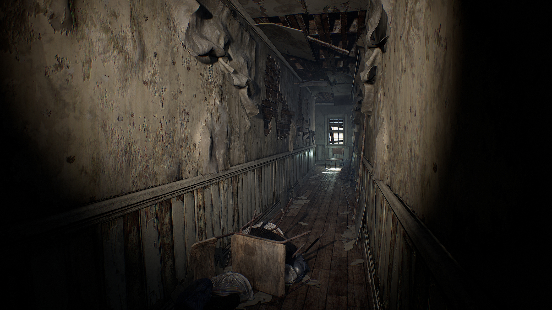


So here is my to-do list:
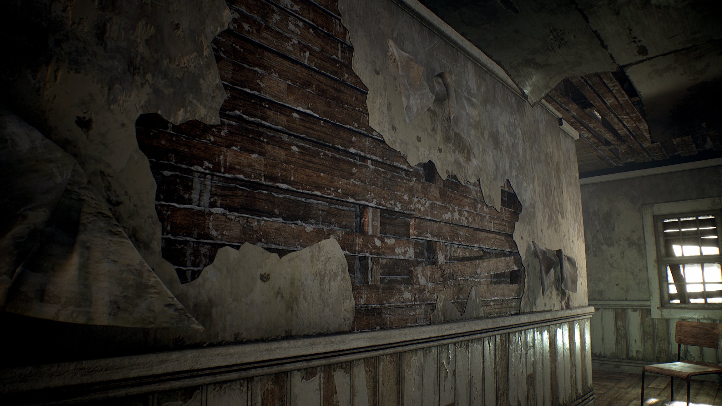
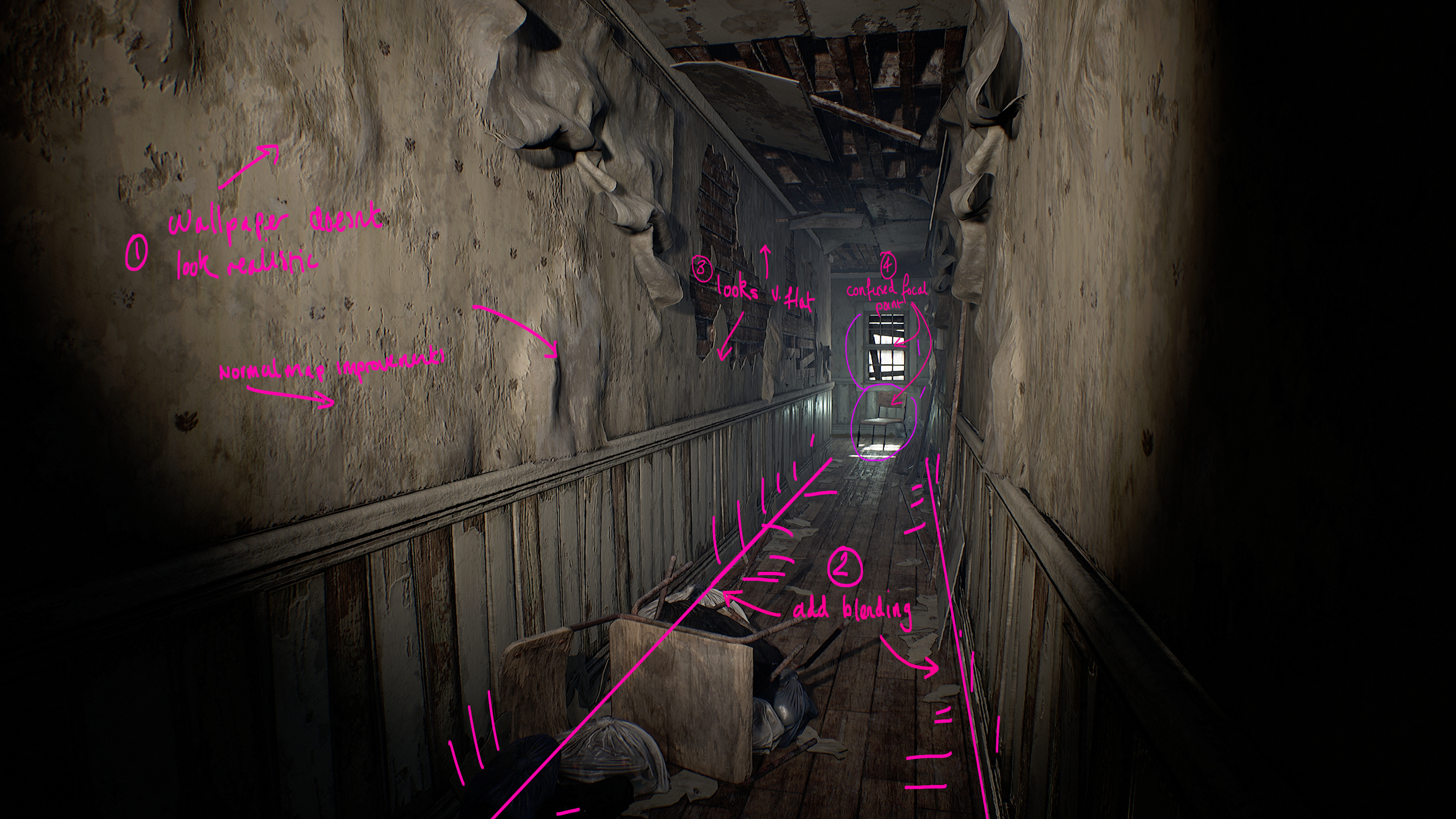
- Wallpaper - The normal really doesn't look good, too strong, and the ripped/peeling shapes don't look right. Also while I like some of the folded/falling wallpaper, I think it's too much and makes other parts of the wall look too flat in comparison. So I might tone this down.
- Edge blending and decals - I want to add some blending along the edges where the wall meets the ground as well as some decals to break up some areas. While I've scattered around some debris, the underlying surfaces look too clean to me.
- These are the areas that I think look too flat especially compared to the areas where the wallpaper is falling off, so I want to try and even out some of that detail.
- I need to sort out the focal point. Originally I had this idea of something floating, or mystical happening at the end of the hallway. Like maybe the chair was floating to imply it's a haunted house. I still like that idea, it adds a bit more story and intrigue. But I boosted the light so you could see the chair, but I've since put the chair on the floor, but it's in front of this bright window, so it now all looks a bit flat and dull. So I'm still trying to figure this out.
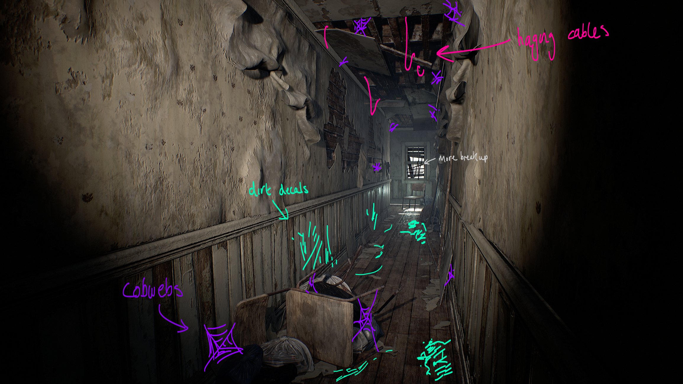
And here are something's that I'd like to add to the scene:
- Cobwebs - I think they'd be a nice micro-detail to add around the place.
- Dirt decals - to help break up some clean patches.
- Hanging cables - I think these would add some weight to the ceiling, to the feeling that this thing could all come falling down.
- Window bars - Something to break up the silhouette f the window, again think it looks a bit too clean.
And here is a little bonus fly through:
Any feedback would be appreciated, thanks for looking!
Replies
You know what would give it life? Vertex paint the wallpaper and add a windeffect to it. Small one, but this will bring it more to life! Also the coloring are very similar everywhere. Maybe mold texture to vertex paint? =
@wirrexx thanks for the feedback. Now that you mention it is all rather monochrome. I think I'll try and work in some spots of colour.
I like the scene so far. Mentioned already, and I agree, the wallpaper looks a bit uniform. And to me also it's too homogeneous with the stucco covering the bricks. At first look I thought they were the same surface, and couldn't understand why some of it looked floppy while other parts looked stiff. I'd say the wall wood boards repetition is also a bit evident, you could cover that up, and maybe add some moisture, or dirt, vertex painted on the lower part near the floor.
Thanks @Klawd
I've started a new wallpaper material. It's still WIP, just testing it in engine to see if it's working.
I've been busy with The Clubs January challenge, so I'm back with a small update.
It's been a long while since I've made decals in Unreal so I spent an hour the other evening downloading a bunch from Megascans to have a bit of a play before I try making my own.
I've also not been terribly happy with the composition, it's just a bit being just a long corridor. So I'm thinking of adding a corner in the foreground, and a doorway partway down to help create a bit more depth
THAT CORNER! Makes such a different great job on that!
@wirrexx thanks!
Started thinking about some cobwebs, tried playing with substance designer but wasn't really getting the 'old-tangled-cobweb' look that I wanted so yesterday I tried Houdini. After an hour or so I got something that I was pretty happy with.
This evening I baked a few variations to a plane in Painter and tested them out in Unreal. They need tidying up and placing with a bit more thought but for a first pass, I'm pretty pleased :p
What is this rendered in?
@HeatherLNunnelly I'm using Unreal Engine 4.
Still plucking away. My aim is to get the scene done by the end of February. Still need to do the door frame and I'm using some Megascan decals at the moment which I want to replace with my own. Then I have a bunch of things I want to tweak, some textures, lighting, etc.
Fascinated by the spider-web generator, if you have the time and are willing i'd love to see your process for that.
How do you bake it down? Surely the source mesh would be composed of very thin and kind of yucky polygons.
@rexo12 Yeh, I made several and baked them to a plane in substance painter, threw on a few quick materials from the library and that's about it. The cobweb models in the scene are just flat surfaces made from a few polygons.
If you want to know more about the generator itself I made a breakdown video last week. I don't cover the baking process. I was considering making a video covering the whole process, though there isn't much to the baking/texturing part.
I worked on the scene some more over the weekend. I had some feedback on the Exp Points discord to reduce some of the visual noise, so I pared back some of the noisy dirt on the walls and tweaked the lighting a bit.
In the previous post, I totally missed that I'd bawked the uvs on the wood panels along the wall, which is why they look alot cleaner and low res. 😅
Today I fixed the UV's and also evened out the paint chipping, so now there aren't some panels that are completely stripped of paint and others untouched. Though looking at it now there are a few parts where the paint peeling could look more realistic. I also made a few more here and there.
And I added some vertex painting to break up some of the clean edges on the peeling wallpaper. After some feedback, I boosted the sunlight so it's now overexposed and looking a bit more realistic.
Very nice, and thanks for sharing the cobweb tutorial
Your techniques are very inspiring and insightful. Thanks for sharing!
Impressive stuff!
Thanks everyone!
And I think I'm done. Been collecting some images for an Artstation post and thought I'd share.
And Artstation project is up! Thanks to everyone that commented, super happy without it turned out.
https://www.artstation.com/artwork/14B8oo
This is excellent. Very nice work!
amazing work
looks amazing how long did it take you?