Throne Room Flythrough, Delving On [WIP][UE4]

polycounter lvl 7
Introducing Delving On! Pre-alpha development in UE4.
HI! I’m Jacob from Lost Day Games. Here are some early screens of the castle tileset in Delving on. Much more work has been done, but this area, while still WIP, is ready to show. All art, assets, and scripting were done by Lost Day Games. Me. No marketplace assets used.
Delving On is a game all about exploration. Learning the world is rewarding. What secret lies around the next corner? Push further, deeper, risk it all just to see what awaits. In Delving On, the world is treated like a character.
Delving On is an action RPG focused less on twitch responses and more on a character’s skill stats.
Thanks for checking it out! More environments coming soon!Lost Day Games
Check out the video!
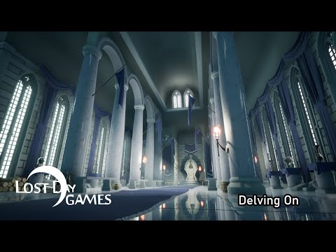 https://www.youtube.com/watch?v=CVl1K0D_pNg


Replies
I also like pristine or almost pristine environments but having almost pure white materials in 80% of the scene looks unfinished or lazy. Add some decals here and there at least. If you dont want or have super realistic materials then do some stylised ones that are subtle but convey what the material is. If you leave it just one colour then it might get interpreted as something else. For example what should be marble instead it reads as white plastic.
About the lighting, unless you are doing a destructible env or a runtime procedural level, bake the lighting. Dynamic lighting doesnt look good in most situations in any game engine. Also, i barely noticed the sunlight on the floor. In an interior environment it is very noticeable in most cases.
The color palette is not very strong either. You have light blue with blueish white and a smudge of orange. Okay, but maybe mix it up a bit. Tint the marble yellow, see if that is more pleasant for the eye.
Best of luck.
@teodar23 Thanks for your comment!
Baked lighting might be in the works. Right now I'm focusing on the environment.
I like your ideas on symmetry and color. The materials will remain relatively similar to what they are now. This will allow me to make loads of environments in reasonable amounts of time
Ok, so I took a lot of the critiques to heart, and this is what I've come up with. I got rid of some of the symmetry. Lighting has been improved. Some very feint decals to kind of dirty things up. More focus on the throne.
Yellow tint did not work for the marble in this case.
Notes: I can easily adjust all the material colors. I want the blue, green, silver that is happening here. It could all be switched to red and gold and a darker brick, for a very different look. The idea of this style is to have something that looks good, but doesn't take forever and a day to make. This way I can make many environments. Think of it as a step up from the poly art style which is all flat colors.
This is proof of concept, modular pieces put together quickly to form the room. Many different rooms can be created.
Did a few more adjustments. Added some details, changed the lighting a bit. Thanks for looking!