[AlmostDone][WattEdge][Critique needed]

interpolator
Been a very long time since i posted anything for feedback so i said why not this.?.!.
Continued this on and off since the entry thread, so coming close - added 2 patterns i like, are the patterns, bad? how do i make them better? I been playing with this for a while especially the lighting.
Wanted the professional help of polycount, tell me what i could possibly do to this to make it more appealing, better, sharper, more interesting. So anything goes from lighting to background, to patterns, to trick tips what have you. Don't like it tell me why, it would help, otherwise enjoy.


Hope to hear from you all, thanks.
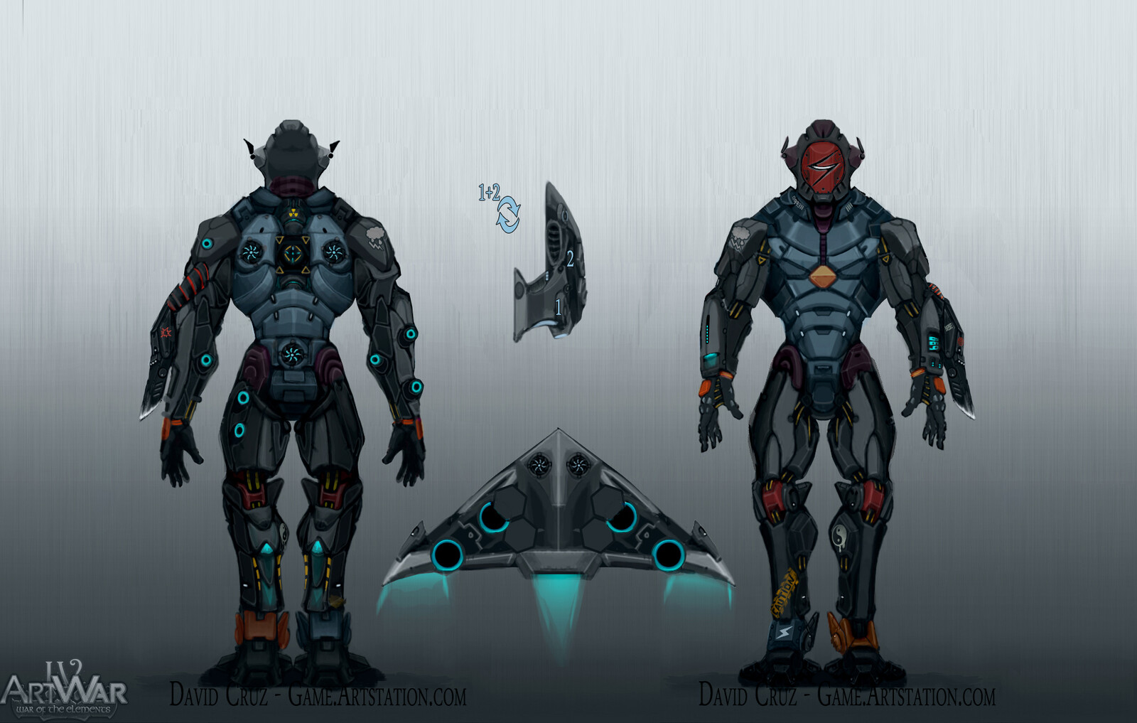
The blues and reds you see are supposed to be oil leaks, grease type leaks, the patterns supposed to look like circuit board tech, if you want resize the orthographic and the pattern will disappear, it happens on the model also at a distance, glow is still wip, character is on 1 map using 2048 only.
My Concept:
Replies