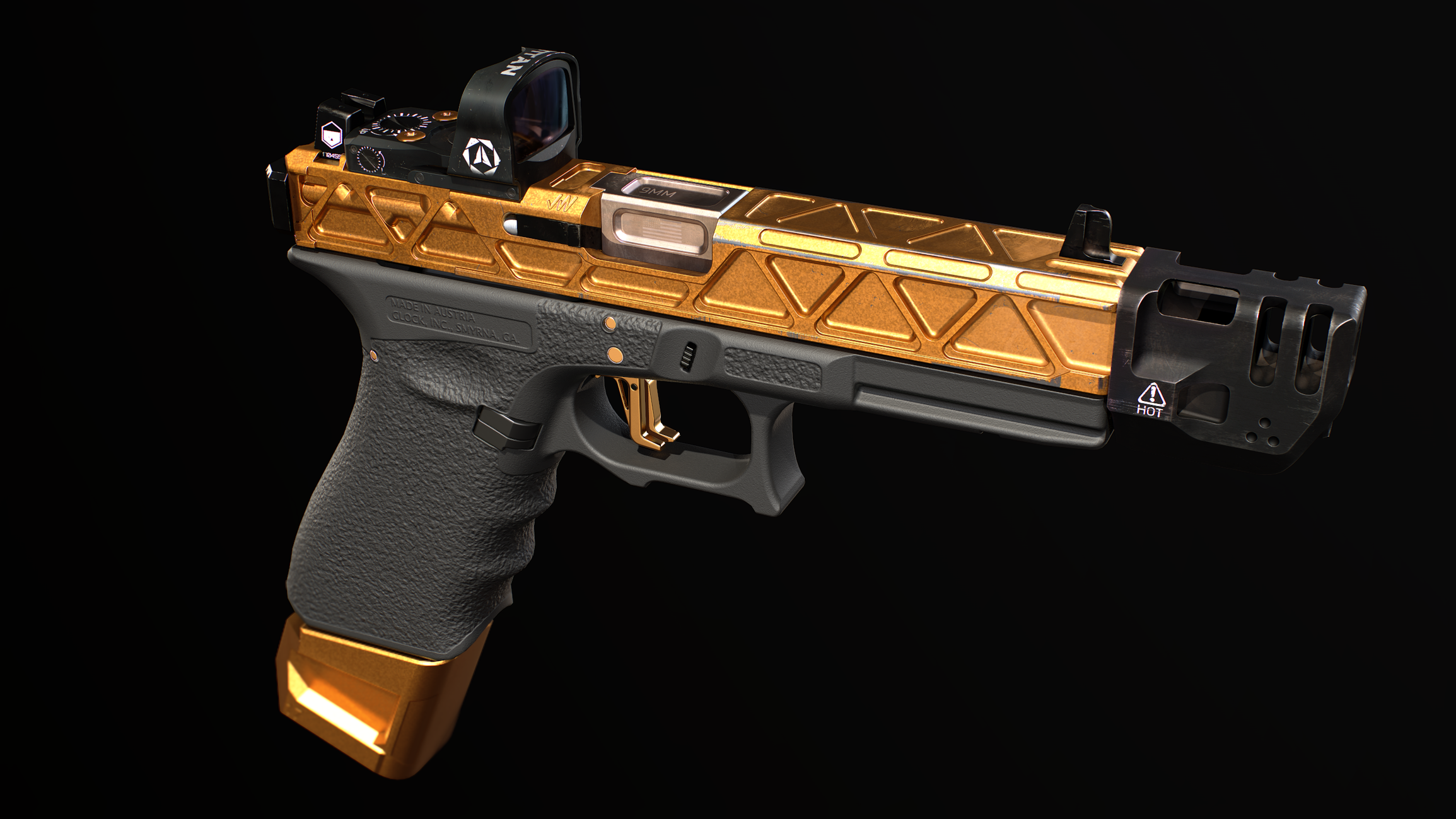
Darker blacks using PBR Metal/Rough?
How can I achieve a darker black plastic using PBR metal/rough? Even if I crank the blacks all the way to 0, (which I should not be doing) I still get a gray result. I have seen some smart materials out there on the market using a simi-metallic value for dark plastics, but I don't know if I'm willing to break that rule without asking around first.
The muzzle device and optic on this glock are metal, while the frame is plastic. They all have about the same black value.

The muzzle device and optic on this glock are metal, while the frame is plastic. They all have about the same black value.


Replies
Dielectrics (non metals) should be no darker than 30 (some say 50) in the Albedo.
Make some test spheres to load in the same scene: black30/rough/nonmetal, gray187/rough/nonmetal, white243/rough/nonmetal. You could also add a white/glossy/metal one, just to see the IBL.
Use these to adjust your lighting to realistic values. Black rough should be barely visible, gray rough should be middle ground lit, white rough shouldn't be blown out.
How do i go about doing this?
The UE4 checker cubes and spheres are present in the standard scene that comes with all the Paragon characters, so that's one easy way to get them.
Your pistol plastic parts looks perfectly fine imo if it's under sun light.
1.You need to check it against actual environment not just black
i keep third picture with gradients on my desktop usually . Once i see colors it's time to re-calibrate .
Can you please explain how I would do this with the spheres? I brought in a sphere into Painter and set it to full roughness and non-metallic but I couldn't find any of those metrics(30, 187 and 243) in the color selection for base color. Also what is IBL? Thanks so much in advance.
Thanks you.
If I recall, Substance uses 0-1 color values in the UI, so you'll need to convert between 0-255 and 0-1. Thankfully we've already done this, see https://github.com/KhronosGroup/3DC-Asset-Creation/blob/main/asset-creation-guidelines/full-version/sec05_MaterialsAndTextures/MaterialsAndTextures.md#pbr-colors-and-values
IBL stands for Image Based Lighting, and it means using a high dynamic range (HDR) panorama as the lighting.
Ideally for material creation you should be using a lookdev IBL, this a studio lighting setup which is optimized for material editing work.
An example: https://polyhaven.com/a/cyclorama_hard_light
Thank you so much.
Substance painter type-in values are in linear space iirc where most basecolor values on charts are given in sRGB space - so you need to do that conversion as well.
See the link my poo-pipe friend. ;)
You don't need to use 0-1 color values in substance. If you set the color picker to "RGB" and then click on the three dots to the right, and deselect "floating point values", you can set the color picker to use 0-255 colors. (see image)
the actual values are still in working color space though right ?
Its been a little while since I last looked at colorspace setup in painter so they might well have tidied it up a bit (cos it was a mess)
I have the latest version of painter installed at home. Below is what the interface looks like in that version. If you set it to sRGB and turn off floating point values the RGB values are the same as the ones in the chart. However none of the floating point values match the chart and also the 0-255 values. You can switch to linear color space at the top of the color picker but that doesn't produce the linear values in the chart.
So to stay physically accurate in Substance painter when using charted values, what is the best practice? Should we stick with 0-255 RGB values and set the color picker to sRGB?
Related to this, any Blender experts care to chime in? The color node in Blender only accepts values from 0-1, and I'm never sure how to convert measured physical values (like those from the linked chart) to this system. I always start a project intent on using strict physical values, but end up just eyeballing everything in the end. I'm never sure if its because my lighting is completely outside of realistic ranges, or if my materials are.
Either everybody everywhere is using different color math, or I just don't understand this stuff as well as I should. (Don't even get me started on the completely opaque and inconsistent triangulation algorithms between software packages [or even within the same one], good god almighty!)
@sprunghunt the linear values on the khronosgroup page don't line up with my calculations from sRGB to linear sRGB either (mine match painter). I'm not sure what spaces they're working in but it's not one I'm used to seeing.
@Brandon.LaFrance
The drop down list at the top of the color picker is the answer.
if you're inputting an sRGB value, set it to sRGB, if you're inputting linear, set it to linear
It doesn't matter which space you enter the values in - as long as the numbers are correct. if you change the setting at the top, it will convert the result into the space you change it to (raw does no transform obvs)
In terms of what it ends up looking like
If your value ranges are correct then your materials will look plausible under "any" lighting conditions (many caveats, but you get the idea)
Don't feel bad if this does your head in - not many people actually fully understand color spaces (I know I get confused all the time). The important thing from an artist's perspective is to make sure the values you input are in the space the application is expecting.
In any sensible software, your color textures (basecolor, emissive) will want to be encoded in sRGB space, anything else will want to be encoded in a linear space - painter/designer etc. do this by default so you can pretty much do nothing
I then I guess the question is what colors are "correct".
I personally would check in-engine that my values are correct. As you say - it's about what the engine you're aiming for expects.
Unity has a material validation tool
Unreal has this list of their recommended values
I do remember that the Unreal PBR values always seemed very bright to me.
indeed - always best to ask the people who made the renderer .
Games tend towards a much simpler pipeline than what's used in vfx because we don't have to worry about film/cameras etc. which may explain the discrepancy with the khronos group link - there's lots of linear color spaces - the one we generally mean round here is linear sRGB
for most situations the only thing we have to decide on really is what our black threshold is for basecolor - that's usually 30 or 50 sRGB depending on who you ask. you want to avoid going past a certain high threshold as well (240 sRGB for snow usually iirc) but I'm told the maths hold up at the higher end so it's not 'wrong' to exceed it as far as the maths go (this was told to me, I cannot prove it)
I'm not clear on what breaks with the maths when values drop too low - what I am clear on is the effect it has when combined with autoexposure. The tendency is for artists to look at their scene, decide the blacks aren't dark enough and darken them, this causes the scene autoexposure to brighten the image and as a result the artist darkens them some more... to compound the problem, this leads to the brighter values blowing out and everything looking like shit because bloom kicks in and, well, you can see where I'm going
there's a few other considerations for basecolor on metals - you shouldn't have a completely desaturated or completely saturated basecolor and also it shouldn't drop below a certain threshold (can't remember exactly what that is but I think it's around 150 sRGB),
The other important thing to remember is that these values are guidelines - they appear to match up with all the existing literature which means they are calculated from measurements taken from pure samples of the materials.
It is very rare that you get a pure lump of anything anywhere so you should be adjusting the values to taste/eye/reference. The boundaries are what's important, not the actual values themselves.
learning some of the science doesn't hurt though I never see brass on these sheets but if you mix the reflectance value for copper with the reflectance value for zinc you get something that looks quite a lot like brass :D (sebastien legarde's orginal paper has a link to a tool you can use to convert spectroscope readings to color values iirc)
For me eyeballing everything have always been an only way. Because it's totally depends on your renderer and default tone mapping , auto-exposure and AO. For example anything brighter than 190 is completely blown away in our engine . In Unreal it would be probably grayish and we use same style of PBR as our programmers say. Under cloudy/overcast conditions of our dynamic sky system anything brighter than 190 looks way more white than any spot on the sky and strikingly unrealistic because our screen AO is not that advanced and doesn't shade enough .
The blacks starts from 15 and yet I have to use darker pixels in textures in cracks and deep shadow areas because even 255 roughness make them reflect too much light so 0 is ok too if it's a hole in something etc. We can't afford Unreal style AO and have to bake in certain amount of shading to color texture anyway.
If you haven't it's probably totally different story.
So I would say it all is totally in context of your game render rather than some reference sources. Have always been for me at least. And our engine guys did it with illuminance meter all the way. I do believe that sort of data is correct for some offline renderers and Unreal maybe but still you always have to believe your own eyes rather than spreadsheets.
As of what OP think about that black plastic if it's actual sun light it might be even not washed enough. Cameras tends to do aggressive tone mapping to make everything look always in a nicely contrast style but direct sun light has a huge color washing nature for our actual eyes. You usually see contrast shadow and light only and everything in lit areas would never be any black and always look in sort of pastel colors.
It looks weird in that screen only because of black background as it would be in outer space . For me the yellow /gold thing looks more off .