Home 3D Art Showcase & Critiques

[WIP] (UE4) The First Temple (trim practice, need critiques)

interpolator
Offline / Send Message
icegodofhungary interpolator
Since the summer I have been practicing trim texture techniques. I drew from The Ultimate Trim Technique and Polygon Academy's Trim Texture videos. More recently I decided to make a small environment to practice.

I created a trim sheet using Max and Zbrush as prescribed in Tim's videos. I generated other maps from Substance Designer and channel packed my roughness, metallic, and AO. Nothing special, pretty generic. I then started making modular pieces from it in Maya and importing them into Unreal. I also created a mud material and a moss material in Designer to use for vertex blending, which would hopefully add variety and interest to generic modular pieces. I used a terrain with a second mud texture on it to add some thicker mud around.

Texture attempt #1:


This mud was created by removing the water puddles from the texture above, and raising the low spots a bit. Then changing the color a little. This was to be used for vertex blending where as the above was used on the terrain.


Environment attempt #1:


I had a few problems with this result.
1) It was too generic. I want to practice pushing trim sheets to their breaking point. I also want to create something that stands out from common generic ancient ruins type stuff. If the quality was higher, I would let the uninspired design slide. But I can't see this stuff being in God of War 4 or 5.
2) I needed more support geometry for the vertex blending. And I was using just color blending, not height blending. This didn't look very convincing as mud build up in this damp environment. The lighting was seriously lacking as well.
3) I wanted to make a pillar just to make a pillar, it wasn't really needed. The environment was cramped enough and the pillars just made it more claustrophobic. So I needed to make the area larger.

I then started re-doing my modular pieces, trying to push the form a bit more. I stuck with an iterative process throughout. I wasn't working from concept art of any kind (which is a mistake I keep making). I was worried about losing focus so I tried to unify the design by picking out a certain motif and just repeating it over and over. I also didn't create any modular pieces unless I needed them. Where as before I was just making stuff and trying to find a place for it in the environment.


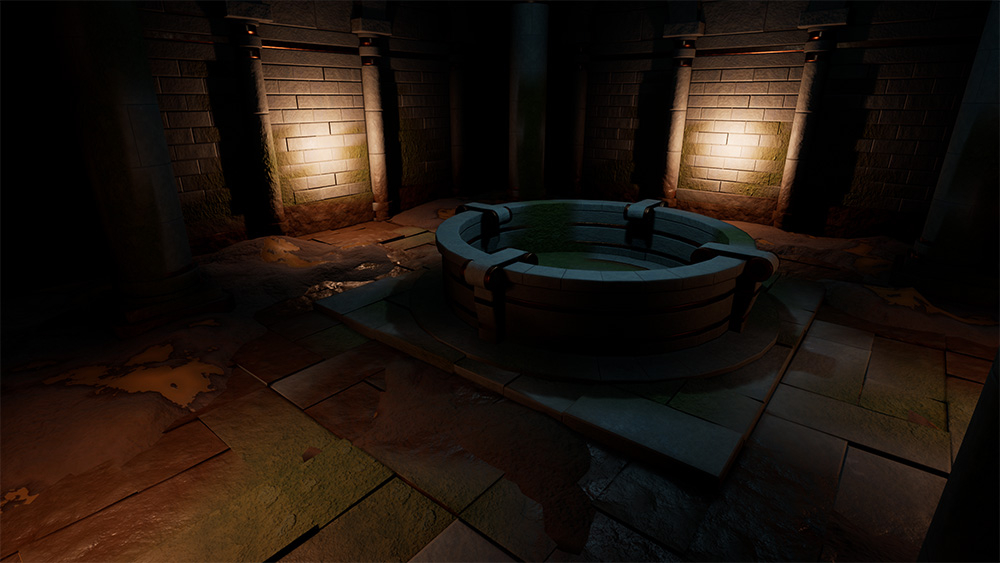
I still wasn't super happy with this. I had pushed it a little but was still sticking to very blocky and simple shapes. The old pillars and new fountain weren't jiving. So I went back to it.


I was struggling to nail down the lighting so I added some volumetric fog to carry the light into darker areas.


At this point I needed a serious lighting overhall. I just couldn't get point lights and a rect light to work properly. The more lights I added, I started getting the dreaded red X. I switched everything over to emissive lighting. This not only gave me a more even lighting, it really brought out the effects of the volumetric fog. May be too foggy though.


You may notice the grunge applied to each object. I was looking at my original texture and felt I could improve. So I re-did the sculpt for the normal to have a little more edge wear. I also noticed that in the old textures, stretching was a little apparent for my tastes. Stretching is something can fix with geometry, but I tackled it from a material standpoint.

I used a clean base normal for the trim. I created a base diffuse texture (grayscale) as well. This way I can customize the colors of the stone and metal in Unreal. I created a tiling normal for the stone details (pits, cracks, rough surface, etc) and then used triplanar mapping for that. I also created a triplanar color grunge for the color/diffuse. That grunge is also tied to object space coordinates so it's always on the bottom (below the pivot of the mesh). I created triplanar roughness maps for the metal and stone, then blended them with a lerp mask. Metallic is just a normal metallic map. This created a lot of shader instructions though, so probably not something that could go in an actual game.


The complex material has it's problems as well, but I think it's a bit better. I'm finding it's very time consuming to add variety to the UVs of just the trim texture. Though it's perfectly possible to knock out some of the repetition of the "all in one" trim sheet. Though if you could afford to spend the memory on a complex material, you could add more variety to the trim sheet. So it's a trade off.

Anyways, thanks for looking. Any critiques will be super helpful. I'm eager to wrap this up and throw it in the portfolio.


Replies

  • icegodofhungary
    Offline / Send Message
    icegodofhungary interpolator
    I suppose I'm at a stopping point now. I would like the make the fountain's water more realistic, but I don't know how to use particles yet.


  • CybranM
    Offline / Send Message
    CybranM interpolator
    Looks good though I wish the last image was higher res.
    The floor feels a bit busy and the tiling might be a bit too apparent but other than that its great
    Trim sheets are something I'm going to have to get into at some point, this gave me some inspiration! :smiley: 
  • icegodofhungary
    Offline / Send Message
    icegodofhungary interpolator
    Thank you for your reply. I think you're right about the floor. I think it's the larger modular floor piece. I will fix it.

    Is there a resolution limit on polycount? I thought I read somewhere that you're not supposed to upload anything larger than 1000x on one side. If not I would have posted the full res images. Here are larger versions of the color variations.

  • Necrodark
    Offline / Send Message
    Necrodark polycounter lvl 4
    I think a small change that could make a huge difference would be to add some more breakup to the trim, especially on the bevels.
    The lighting looks great so far, however compositionally the floor feels a bit too noisy for my taste (areas of rest and all that jazz)
    Apart from that i love the mix of the ancient and metallic elements, its got a very stargate feel. Keep it up dude!  ;)
  • icegodofhungary
    Offline / Send Message
    icegodofhungary interpolator
    Thank you so much. I am working on updates now!
  • CybranM
    Offline / Send Message
    CybranM interpolator
    I've uploaded tons of 1920x1080p images without any issues so I dont know about a 1000px limit. In any case you could upload to something like imgur and link it.
  • Dave Dind
    Offline / Send Message
    Dave Dind polycounter lvl 11
    I totally second @Necrodark's comment on the Stargate feel! This looks great overall and I appreciate you taking the time to document your process up to now so thoroughly!

    I see what the other's are saying about the floor being busy, but that's a pretty quick fix by simply swapping out a couple of the floor sections with a less visually complex piece. However, you could also potentially incorporate the design complexity as a gameplay aspect; you might have spikes or traps of some sort being activated as a player walks certain parts of the floor. Or the complexity of the floor pieces could be part of a puzzle I.E. step on certain parts in a specific pattern to activate the fountain, or open the door, etc.

    Again, really great job on this so far and I'm excited to see what your updates will be!
  • icegodofhungary
    Offline / Send Message
    icegodofhungary interpolator
    Today I learned how to do particles. Now I have a little bit better water and dust motes. I also changed the floor a bit to have fewer large details and have a little less variation in surfaces. I can knock it down some more so please let me know. Also, imgur links to 2k screenshots!


  • Anura_Interceptor
    Offline / Send Message
    Anura_Interceptor polycounter lvl 5
    Is there a resolution limit on polycount? I thought I read somewhere that you're not supposed to upload anything larger than 1000x on one side. 
    The general rules say to make your images reasonably compressed jpegs I believe, but only the sketchbook rules say to downsize to 1600 first. That's because sketchbooks can get huge over the years and they're mostly image posts from the OP, would take forever for people to load them if not for the size limit.
  • icegodofhungary
    Offline / Send Message
    icegodofhungary interpolator
    • Realized my single reflection capture wasn't enough. I was having incorrect shading and reflections before, now that's fixed.
    • Re-scuplted my normal map and made a new texture using a standard PBR maps rather than using any triplanar.
    • Had to adjust UVs for new normal map as it had a much more narrow bevel. Went ahead and tried to minimize any stretching and added variations
    • Re-did the fountain's water so it's more detailed. Combines mesh and particles now rather than only one of either. 
    • While I was UVing I fixed up the light maps to have fewer seams that broke my bevel illusion.
    • Changed the lighting a bit. Fixed some lighting issues from bad mesh design on the light crystal things.
    • Started making some very quick props (pottery, chests) using trim texture. Trying to make the room feel less empty and more functional
    • Added sound for the fountain, maybe will upload video in future.  I'm not trying to get too far into sound design atm.
    • to-do: will probably try out height lerp and vertex painting again just to add a tiny bit of variation and wrap this up so I can move onto other projects.

    Old texture:

    Newest one:


  • icegodofhungary
    Offline / Send Message
    icegodofhungary interpolator
    I tried out some height lerp vertex stuff with moss and a little color. Don't really like the results. The way I textured everything doesn't really support it properly. If I were using tiling stone textures or some kind of terrain stuff, it would be a lot better. Oh well at least I know how to set it up now.

    I also changed the sconces because I realized they were blocking a lot of light and casting too much shadow. I created some little pottery props. Will probably wrap it up by tomorrow evening and update my art station project.


  • icegodofhungary
    Offline / Send Message
    icegodofhungary interpolator
    I added some decals for water stains and grime. I went back and re-did the vertex coloring. I used it to add variety to the pottery and change the color of the stone for the chests. I finished the chests and pottery. Changed the lighting a bit more.


    Detail lighting:


  • DeathstrokeFTW
    Offline / Send Message
    DeathstrokeFTW polycounter lvl 4
    Woah thats a lot of detail but I'm completely lost where the main focus is on the environment though.
  • icegodofhungary
    Offline / Send Message
    icegodofhungary interpolator
    Do you mean that it's too busy and there's no strong focal point? Thanks for your reply.
  • Ashervisalis
    Offline / Send Message
    Ashervisalis grand marshal polycounter
    I think if you kept the detail but used lighting to help point towards a focal point, that might help.
  • icegodofhungary
    Offline / Send Message
    icegodofhungary interpolator
    I'll play with some lighting variations. I think a huge problem with this is that I wasn't working from a plan or anything and just trying to improvise a coherent scene. I don't think I set myself up for a strong composition or focused environment. Thanks for replying.
  • ksjethwa
    Offline / Send Message
    ksjethwa polycounter lvl 4
    The environments nicely laid down. The only thing I can say to improve these environment is to add some decals to break the feeling of repetitiveness. 
  • icegodofhungary
    Offline / Send Message
    icegodofhungary interpolator
    I removed some lights. I originally let the corners be dark but it was too dark and the scene felt a lot smaller. So I added some dimmer lights with a different color at the corners of the room to provide a little light, but hopefully not bright enough to compete with the main light coming from the ceiling. The color may not be right, I was just trying to add some contrast.

    I also re-did the vertex painting to include some texture variation rather than just color. So hopefully that adds some break up of repetition. I also re-did the decals to be a little darker and more apparent.

    Unlit to see the vertex colors and decals better:


    Thank you all for replying and critiquing.

  • garcellano
    Offline / Send Message
    garcellano greentooth
    Nice approach and progress. I like the patterns. The only thing that catches my eye at the moment are just those dripping decals by the hallway walls (or walls). They might look too stretched out? or dripping too far down? but that could just be me. Maybe shorten them or switch it with a different decal? 
  • icegodofhungary
    Offline / Send Message
    icegodofhungary interpolator
    Nice approach and progress. I like the patterns. The only thing that catches my eye at the moment are just those dripping decals by the hallway walls (or walls). They might look too stretched out? or dripping too far down? but that could just be me. Maybe shorten them or switch it with a different decal? 

    I'm so sorry I didn't reply to you! You were right about the drip decals, I do feel they were too big looking back on it.

    So after a bit of time I came back to this environment, kind of unintentionally, and decided to do a little better. As others have pointed out here, and I didn't quite understand at the time, the focal point of the scene and shots were off. The lighting was pretty unfocused and I didn't know how to fix it.

    - The trim texture I used previously was the only thing I used for the scene, and was kind of bland. My brain was stuck and determined to use a single trim, so I neglected other methods and tools that would have made the scene better. Now I am using two trims + tiling textures + unique textures. I also pushed some of the details a bit more on the new textures.

    - I figured out you can increase lighting bounces and indirect lighting influence to add light to dark areas without adding more lights. So now I can have my primary lighting source, the sun from the opening in the roof, provide 70% of the lighting. Darkness isn't totally black, but still provides pleasant contrast. Any secondary lights will just be accents, and not compete for attention. Also the primary light will direct the player through the scene, drawing their attention to a door for the next area.

    - More detail was needed in the roof opening, so I decided to add boulders and roots to give the impression there's an outside world above this temple. They also break up the beam cast by the primary light, making it more interesting and not just a square.

    - The old scene was too symmetrical and plain. Elevated the part the player should focus on, the door to the next area, above the ground. Again, trying to construct the scene with a purpose and a clear focal point.

    - The point of the first scene was for me to learn how to take a trim and make a bunch of stuff from it. The point now is to learn how to contrast lighting and materials to create interest and focus. I incorporated some more natural forms and materials into the scene. There will be rocks and boulders. There are rough cave walls rather than just neatly manufactured stone walls. There is wood, both in the made-structures and in the roots/vegetation.

    - I also really tried to pick camera angles with better composition

    I still have much to do for this, but I feel like I'm far enough that I can post a WIP. Things to do:

    * Sculpt 3 boulders and 4 smaller rocks

    * Create a mud tiling texture for the ground and mud decals

    * Re-do the stone texture for the ground on top if which the mud will sit

    * Fix the roughness of my cave walls

    * Sculpt stairs, I don't want to use the trims on it

    * Create dirt and grime blending textures for objects to break up the repetition

    * sculpt the roots and do some vines vegetation

    * Create a small cave hallway mesh for something beyond the doors

    * torch meshes using the trims and use them for emissive accent lighting

    * create new water material for the fountains, new water particle effects as well

    * do a dust/bug particle pass

    * do a final lighting adjustment and improvement (looking for suggestions)

    * create fog alphas and do a final adjustment on the height fog.


  • icegodofhungary
    Offline / Send Message
    icegodofhungary interpolator
    Update. Got most of the meshes done. Took a critique for someone else in another thread and re-sculpted the floor slabs as they were a bit too straight and clean. Added mud texture and supplement decals for blending. Re-did the rock floor texture and included height map blend puddles. Added grime to the structural objects, using an object-space gradient + mask. The only big things left are vegetation, some more material work (possibly vertex painting), and some particles. Need to find a better image host since imgur seems to timeout when uploading even a 762kb jpg.


  • Crazy_pixel
    Offline / Send Message
    Crazy_pixel interpolator
    I really like your current scene, it was a good decision to rework the size of your temple and the new materials and lights are way better :)
    I recodniced the metal stripes on the walls, looks pretty cool like an ancient scifi culture.

    Keep it up!!
  • cello8080
    Offline / Send Message
    cello8080 polycounter lvl 4
    Im digging this layout much more than the old one! good job on deciding to change it up. Just once thing to consider in your materials - how old is this temple? the ground stones are broken up so I would assume that its quite old. Therefore I think the structural parts are in very good condition, Would add some breakup there. like some parts are faded out maybe. 

    But overall looking like a much stronger piece!
  • teodar23
    Offline / Send Message
    teodar23 sublime tool
    I agree with cello, there is a clear age difference between some elements and others.
    Also, the corners of the room are empty, maybe add some props when you get to the dressing stage.
  • icegodofhungary
    Offline / Send Message
    icegodofhungary interpolator
    Thank each of you for replying. Sorry for the long wait, I was struggling very much with the foliage. It's my first attempt. I also changed the roof opening. I didn't want it to appear that it was once closed and caved in. After staring at it for so long I feel like that's how it was coming across. I wanted more of a natural opening with a little overgrowth.

    I originally had the slabs on the floor appear less worn, but I fell they stuck out too much. I feel like they would show more wear than the walls because they get trampled on more often. Though I agree there should be more wear in the scene overall, and that the other stone elements have wear from water damage and temperature fluctuations. I made some edge wear and crack decals.

    I need to do some rock sculpting practice very much. I've watched tutorials and have been practicing. But I'm just not quite at the point I want to be. I also need to do lots more foliage. All the pros suggest you should pick a specialty within your discipline, and get really good at it. I think I'm going to specialize in natural materials and environments. So after I get to a better stopping point with this project I'm going to work on that, do some sculpting and material studies.

    I'm still at the mercy of poor planning as well. I honestly feel like I could really start this scene over one more time, and change the way I'm doing some things. I think I get too caught up on the importance of trim textures, and try to use them for everything. I notice other people rely more on unique items/bakes more than I do. So the columns, the pillars, the fountains, stairs should probably be unique sculpts rather than me trying to squeeze blood out of stone with the trims. I should probably use the trims for, you know, trims. I think that's what killing me on some of the wear detail that would really improve the scene and improve the logic of everything in it.


Sign In or Register to comment.