[WIP] 1930's apartment scene

polycounter lvl 5
Hey folks, I've been working on this old thymme phone for practice for the last bit.


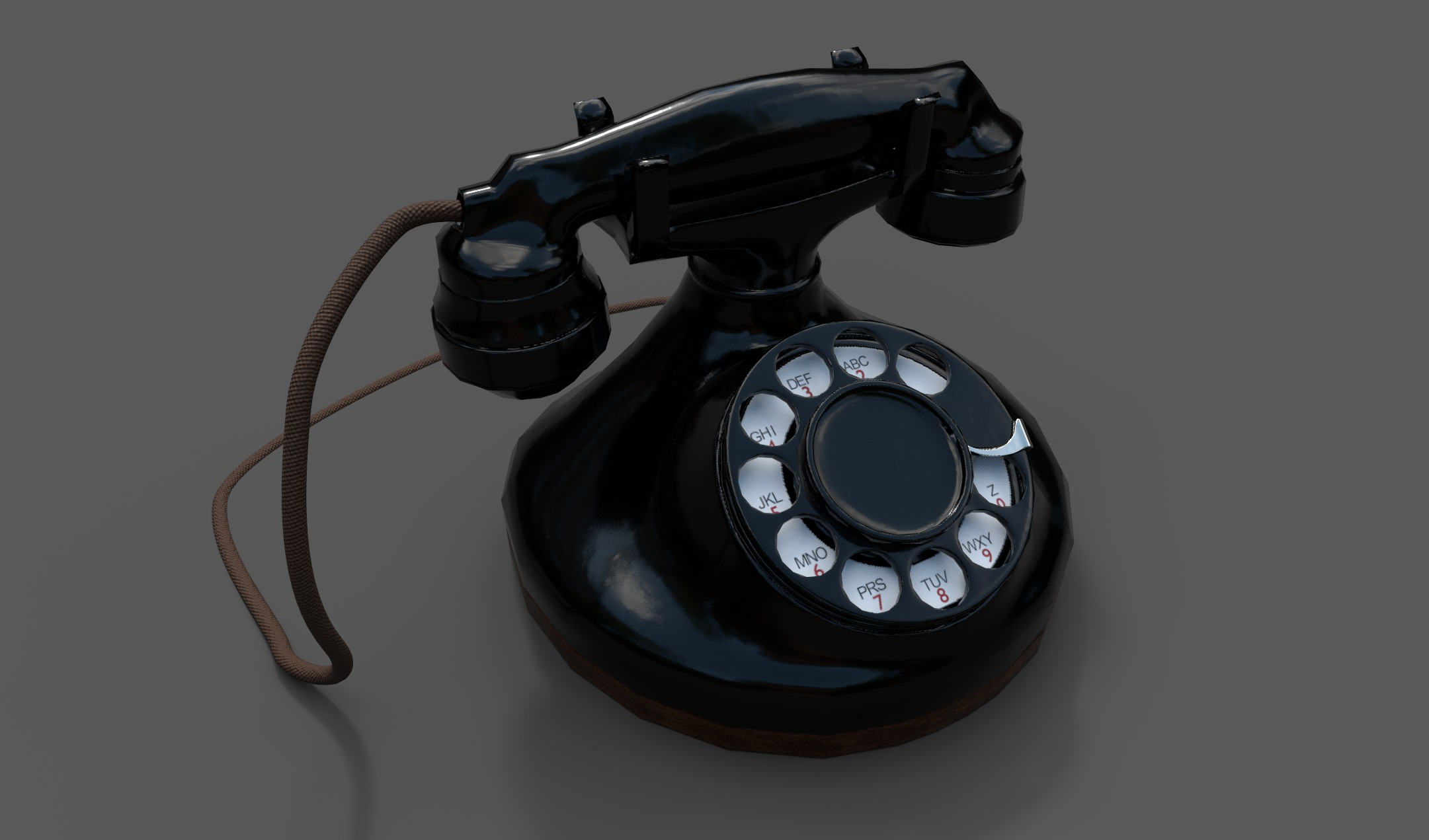
The issue I have is that it seems with this and other models I bring into substance, when I bake the normals from the high poly, there are many artifacts imprinted onto the low poly model.

I'm a returning (after many years) 3d artist so I might not have even said that correctly but it always seems my high poly bake doesn't end out like I think its supposed to. Any help would be much appreciated.
Also, unfortunately substance just crashed (before I saved ) after I painted on the numbers and letters to the front of the phone so my project is now slightly behind what you see here.
The issue I have is that it seems with this and other models I bring into substance, when I bake the normals from the high poly, there are many artifacts imprinted onto the low poly model.
I'm a returning (after many years) 3d artist so I might not have even said that correctly but it always seems my high poly bake doesn't end out like I think its supposed to. Any help would be much appreciated.
Also, unfortunately substance just crashed (before I saved
Replies
Ya, thats the issue I don't know how to solve and need help with. I have been fiddling with the bake settings in painter without success.
I wouldn't be surprised if it was my UV's cause they seem pretty ugly. Or, I dunno, are they?
I don't necessarily want to go this close in for shots of the phone, it'll be part of a bigger scene, I just wanted to show these artifacts/jaggies. The low poly is quite low in places for sure, which I need to work on in general though.
Here are the wire and UV shots
1. If this is your low poly, you need to optimize it more. Of course it depends on what it is for, but generally there are too many unnecessary edges.
2. You need to take a step back and maybe watch a few tutorials on how to unwrap and pack your uvs. The islands are definitely too small. That causes the jagged edges issue.
Increase sampling and texture size depending on what you're intending to make this model for.
Regardless of the UV work I did, I was still having the same jaggy issue with my normal map, no matter what I seemed to do. So, I became convinced it was something to do with the high poly or the bake process itself.
I ended up doing the bake in xNormal for my normal map and AO. After a few tries, the results were wayyyyy better than just using Substance's baking tools.
In reality, the scene I'm making isn't going to be that close to the phone (probably as close as the last image), but I am glad I learned more and did everything as properly as I know how to do.
Going to get back to texturing those numbers into the ring now. Let me know what you think.
If we are not going to get any closer, then you dont need that many edge loops on quite a few things (cable for example).
You should also look more into texel density.
The way your UVs are right now, it is no wonder that you have baking problems .
Quite a lot of space is wasted, some parts are too small. You would need a 4k texture just to see something. A lot of pieces could be mirrored.
Here's where I'm at with the phone. I reduced the model further and feel like it looks pretty good now.
I tried to manually pack in my UV's, which took a long time and ultimately didn't feel any better than the automatic pack in 3ds max. I ended up settling for 0.001 distance between islands, which seemed to do a good job and increase the texel density by a bit.
Have been working on the textures now and feel like they are looking pretty good now.
The one thing I can't seem to figure out in Substance Painter is how to do simple transforms on alphas I draw onto my model. Like a simple transform you can do in Photoshop seems to be non existent in Substance. I just want to manipulate the shape of the alpha in a non uniform way but it seems impossible. I found a transform filter but it just scales it uniformly. Does a transform like you can do in PS not exist in Substance?
I need to put the word Operator in between the Z and the 0 but I can't seem to shape the alpha I made to fit there.
I think for now, I'm going to call this done. Might revisit it a bit when I'm putting the scene together.
I may also use this thread to post the progress of the scene overall. The idea is a 1930's cops apartment but just a side table area of the apartment that will have this phone, his badge, some other belongings and whatnot strewn about on it maybe next to a couch or chair.
Well, technically its not going in a game but I was trying to make a lower poly prop.
It does seem a bit blocky though. I think I fundamentally blew it a bit at the very start of this project by not having enough sides on the base of the phone. That's where it stands out I think.
I made a higher poly version just now to see how it would look and not surprisingly it looks way better. That said it went from 3.5k to 11k poly's. Is that high for a game prop? Maybe the other one was way too low?
Here it is
I would love to see more attention to lighting, you could study film noir to get ideas.
In particular it would help to add kicker and rim lights to make the shapes "pop" more. You;re losing a lot of shape detail with your minimal lighting setup.
Totally agree. Definitely going to be going for a film noir type look with the final scene. Those renders are just from Substance Painter. I still have far to go.
Right now I'm just blocking out some rough table ideas to use. I think I'm leaning towards idea 4, maybe 3. The first one looks kind of goofy to me now, like a mimic from the game Prey sort of. I think I just made the legs too thin. There were lots of tables with similar legs around that time.
I picked this different table to be the one the phone and other props will sit on.
Its based off of this pic I found online
I'm a little stuck at the moment though. I picked up zbrush a couple weeks ago. Been messing around in there with some organic sculpts just to get a feel for it.
The issue is that I want to be able to import this low poly, turn it into a high poly and add details like the grooves in the feet, scratches, etc... but once I have it in there and divided up (was able to figure that out) I'm just sort of unsure what to do...
I've been having trouble finding vids on how to work on a high poly in zbrush thats based on a low poly you import in. Most are about starting from scratch in zbrush. If anyone has any links to something that might be helpful, I would be really appreciative.
I guess one specific question I have is, in zbrush, is there a way to interact with just one of the legs and have the results reproduced on the other two? Like some sort of 3 way symmetry. Or am I approaching this all wrong and should import one leg, work on that, then export it back to 3ds max and make 3 copies in there?
Thanks.
Yep, have been texturing in Substance painter so far, some stuff in Photoshop.
Did the high poly in zbrush, low poly in max. Baked with handplane baker.
Really enjoying learning more about zbrush, UV's and texturing in substance. I think I'm going to have to go back through my props before I finish to give them a once over. The scene is supposed to be like a 1930's style cops apartment so some rougher textures might be in order for the rest of the props. Hopefully I didn't take it too far.
I've actually started to block it out in UE4 as well but that part is a bit too rugged to show so far.
I'm curious what the typical workflow for stuff like this is? Do you usually literally block out a scene in UE4 with blocks and get all the lighting right, then model high/low, texture, replace blocks in UE4 gradually as you finish them?
Or is it more of a model/texture a bunch of stuff and then move it into Unreal and set the scene up that way? Or some other way I didn't mention.?
I guess I'm wondering how liberal you can be with floaters without running into issues later or if it is generally a good idea to stay away from floaters and connect everything?
Any help would be great.
Any crits on lighting, texturing, modeling, framing, etc... (so all of it I guess
(If you diddn't know, indirect lighting intensity controls how bright bounced light is.)
And Ashervisalis is right, a warm light comming in from the side would look awesome.
There are only 2 walls right now, so I'll have to seal it up and try the sky light. I'm also thinking of redoing the walls so that there are old style wall mouldings throughout the place. I was playing the Division 2 yesterday and was in an old building which had wall mouldings and felt it was the exact look I wanted. Those guys did a great job with the environments in that game.
Thanks again.
- I sealed up the room and put in a skylight outside. Still tweaking that a bit.
- I didn't want to get rid of the directional light because I like the effect it has with the shadows on the table and chair (Is that ok to do?)
- Added a warm light inside where I will make a lamp of some sort
- Brightened the scene up from what it was (is it still too dark?)
- Changed the wall so it has wood moulding on it. This is just a first pass on texturing it so far, plan to work on it much more.
Still lots to do, let me know what you think
I don't know if it matters too much what is 'ok' to do, as long as it works and looks great. Especially for a small personal scene
Here's where I'm at so far with it. Had to run to work right after I extruded in the speaker grill on the left so havent had a chance to bevel those edges yet.
I'm actually really happy with how its coming along so far.
Its interesting, I was looking for reference for the radio and came upon some guys video of him making this same model in Maya. At first I couldn't resist watching how he had done it and was following along. The video was like 5 times speed so it wasn't like a tutorial.
Anyways, I got it to a similar state as I have above but the way the guy had done it was much dirtier than I felt it could be and had less detail than I felt the model deserved.
The interesting part was that I started mentally going over what I might do differently if I were to start again (since I was at work). I imagined a good workflow for the beginning of the model and I imagined it would work much better.
So, when I got home from work I went to it with this idea I had and very quickly things started to work out just like I thought they would. Which was great, cause I usually just work at something all willy-nilly without much of a plan. I feel like I had to try it this other guys way first though to see that it was a bad way to do it before I came up with a better way. Hopefully in the future, I'll skip that part and just come up with a good way before I start.
Thanks! Ya, I sometimes get hung up on wondering if things are "allowed" when I should probably just go for it. I guess I just don't want to learn bad habits and want to do things the right way.
Still notoriously bad at UV's and getting a good normal bake. I ended up just baking the low poly normals cause they looked better than the high poly bake. I will probably go back though cause I know thats a dumb way to do it.
I've gotten this far by manipulating the default materials in Painter. Do most people make their own materials or get them off substance share or something when making stuff like this?
I am curious about the question I posed about Painter materials, creating your own and whatnot if anyone has any insight there. I've always just used the materials in Painter, painted by hand in the program or used fill layers and masks. I'm curious how other people "do it"
This is the colour scheme I'll be going for or something similar
I think the Zenith background image will be a bit challenging to get right.
Still lots to do.
For the material questions you had... everyone does it in a different way, haha. It really depends on your focus and what you want to learn/what you already know. If you are focused on becoming a material artist, then definitely make your own smart materials and textures. If you're looking to do more prop/enviro work, then its not so important to have your own custom material every single time. But, it is good to know how to do it, so you can make custom stuff when you need to.
When I want to go quick, I just use smart materials from Substance Source (or defaults, or sometimes free content from textures.com, cubebrush, unreal marketplace, etc.) and hand paint masks a bit to make it more unique for the asset I'm working on. I think hand painting in the masks is one of the keys to making generic stock smart materials look unique.
As for the latest shot of the radio, the yellow wood looks a little too scaled up. The dark lines appear more often in the reference. You can also try swapping that out for another material if you can't get it looking right... possibly the darker wood, or a metal strip could look good. Also, the metal skid plate on the bottom of the radio is missing currently. But seriously, its looking like a real good start. Keep it up!
(Sorry, if this is all too much, but you've got some good work going here and you seem like the kind of guy that wants to know these things... if I'm reading wrong, I apologize.)
Dude, this is exactly the type of insight I've been looking for. Massive thanks for taking the time to write it!
Ya, the yellow stripe wood isn't where I want it to be at all. I'm having trouble finding a material that lets you change the colour of the grain as well as the main colour of the wood. The ones I found had lighter grain for some reason. This one is actually scaled up quite a bit and any more you can see the duplicating lines. I'll keep looking or may even just have a go at making some wood grain in Designer. Probably some tut out there for that.
Thanks again for your thoughts!
You might try layering a solid color over the smart material, only affecting the color channel. And for the scale, you should be able to scale only one axis rather than do a uniform scale. That might do something... Not sure, its all trial and error
And, yeah. There's definitely tutorials out there
For ages I was more obsessed with "the right way of doing it" than I was just JUST doing it so more time was going into asking questions and browsing the internet than was going into the artwork. I had to teach myself to work in the way I'm comfortable with and be open to multiple ways of doing one thing (if that makes sense)
So I guess the TL;DR is, as long as it works, go for it, and if it doesn't, try another way.
The scene is looking really promising so far, and I reckon if you let yourself just get involved in it and enjoy the process, you're going to end up with a really strong portfolio piece!
That definitely helped with the stripe. I'm pretty happy with it now.
Thanks so much for your words as well. I'm starting to agree. Just go for it and figure it out as I go seems like a good idea.
Man, I've been learning a lot from this site and am very grateful it exists.
I even learned a lot from a post where some guy flipped out at a bunch of guys trying to teach him how to put scratches on his models in Painter. Seriously, that post helped me take this thing to the next level the last few times I've worked on it.
Heres where I'm at with the radio. I'm like 95% done. Still need to figure out what the words are on the bottom right hand knob there and put them on as well as some more believable scratches in certain places. Feeling pretty good about where its at though.
The funniest part is that now that its done, I went to put it in my scene in Unreal and its just like some background prop that you'll barely even see. And of course it looks way worse than in Painter. Oh well, I'm sure I can figure something out for it.
The radio does look sweet though!
Has anyone had any luck making liquid or drinks in UE4 actually look like drinks in glasses? Any tips would be much appreciated. Thanks!
Another thing to consider is your PBR values, especially the albedo blacks. Try to avoid anything below 15% intensity.
1) that the aging on the chair looks random as the paint is not chipped where the chair would have been rubbed the most.
2) the veins on the wood part of the walls look too big
Any tips for the liquid in the glass part? I think I'll make some ice cubes and put them in the drink too which will hopefully help sell the shot a bit. Right now the glass and the liquid are separate meshes, I have the liquid a tiny bit bigger than the internal mesh of the glass so the meshes aren't on top of each other. Really stuggling to make it look good from the top. If I go right down next to it and look through the glass it looks good but from 3/4 view its not looking great.