improving readability in composition #01

polycounter lvl 13
hi,
I just want to share some basic composition tips. I'm trying to explain how we can deliver better readability by adjusting proportions, leading line and detail distribution.
more tips on my facebook
https://www.facebook.com/groups/116341985204628/
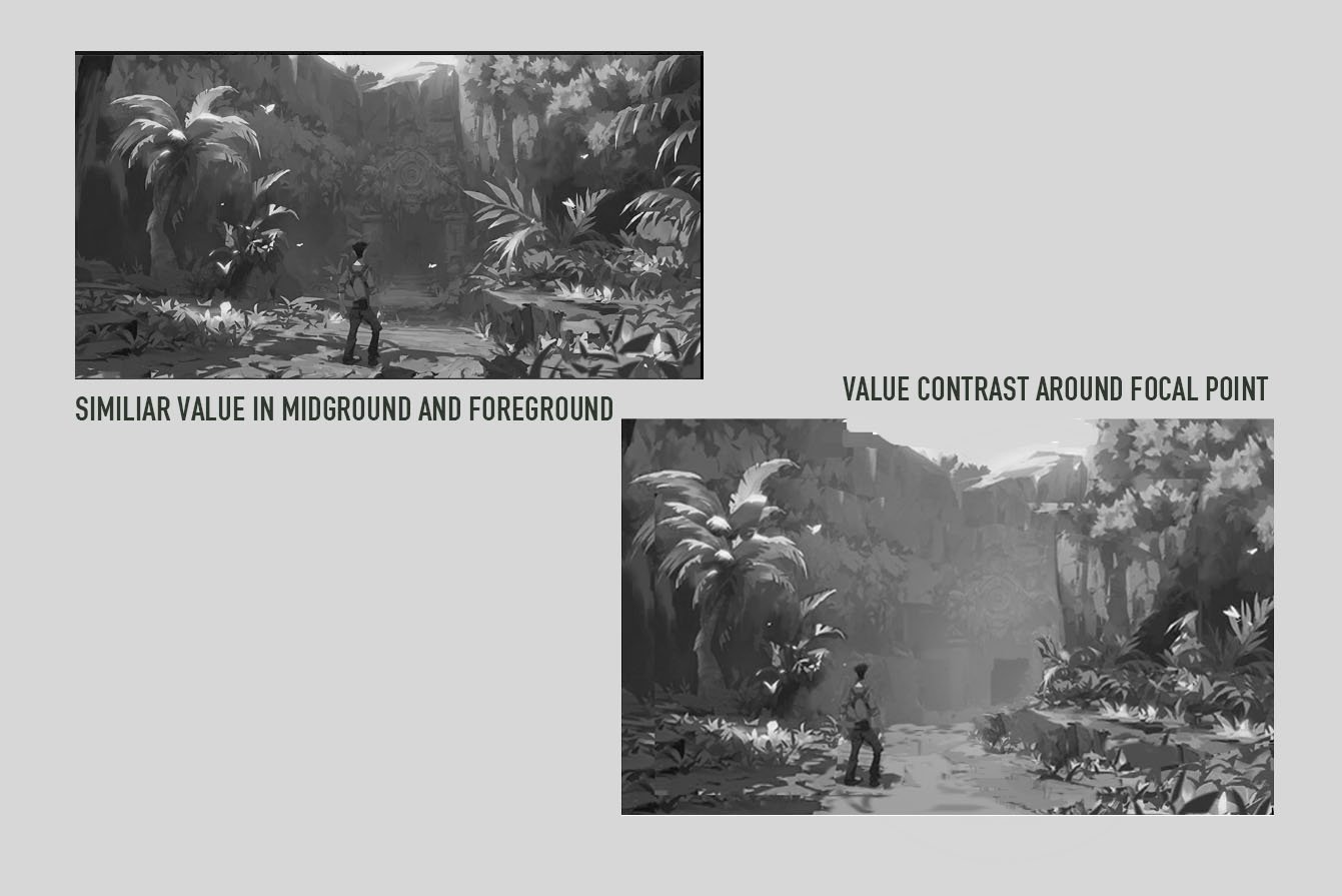
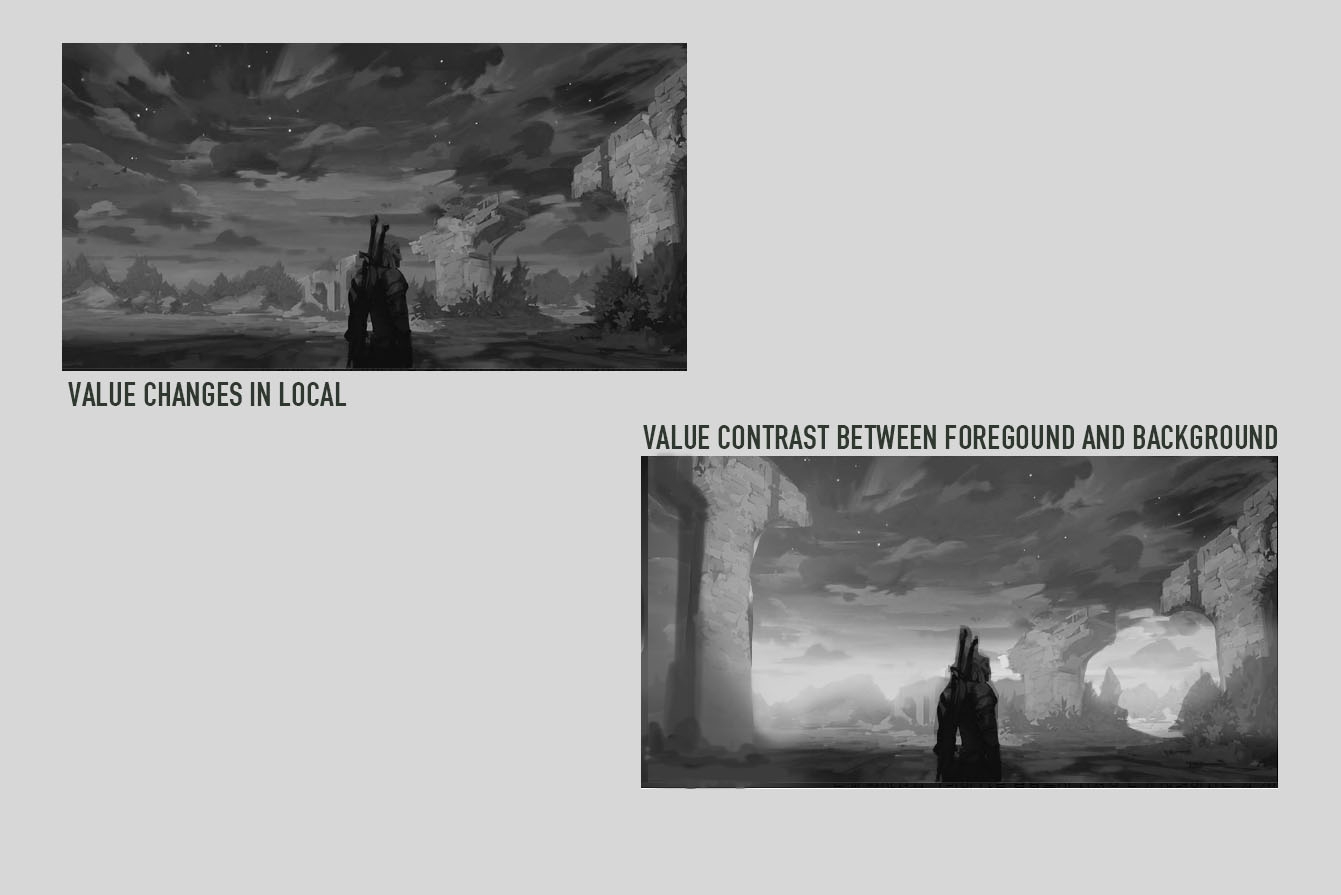
Apply a bright value on the background to create a sense of depth between the foreground and the background
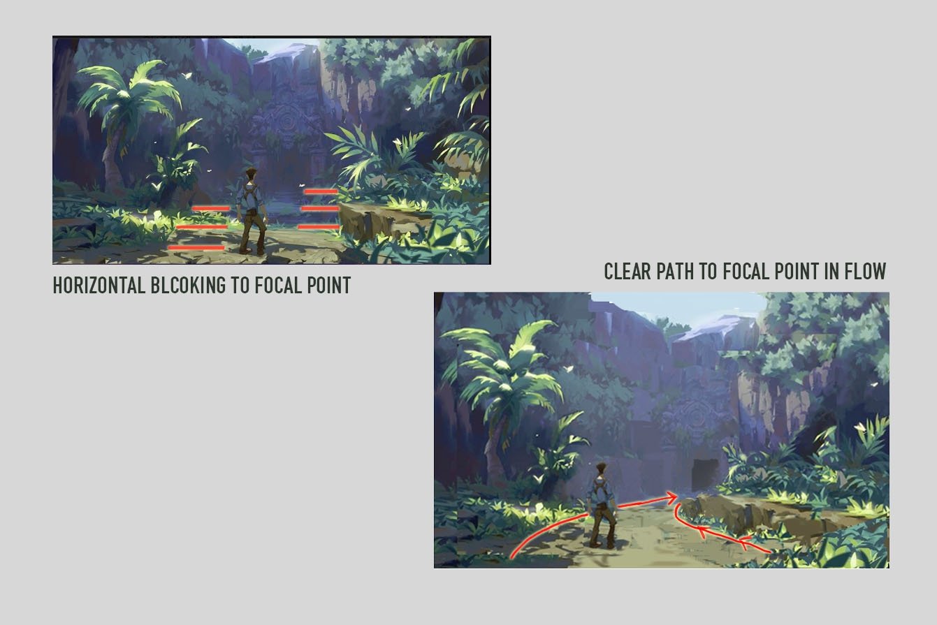
Avoid horizontal blocking structure such as cascade or stairs along the leading line. Try to make a clear leading line to emphasize the traveling path.

leading line is emphasized as if the position of the character and destination is far a parted.

Make some areas broad and empty to create a contrast with intense detail in small area

Longer leading line between character and destination helps the viewer's eye stay in the picture. Tone down the strong cast shadow on the ground support lead the clear traveling path.

Place the character in 70 to 30 helps make longer traveling path
Having horizontal bright value in background makes a simple visual order in chaos and value contrast.

Apply a bright value on the background to create a sense of depth between the foreground and the background
Avoid horizontal blocking structure such as cascade or stairs along the leading line. Try to make a clear leading line to emphasize the traveling path.
leading line is emphasized as if the position of the character and destination is far a parted.
Make some areas broad and empty to create a contrast with intense detail in small area
Longer leading line between character and destination helps the viewer's eye stay in the picture. Tone down the strong cast shadow on the ground support lead the clear traveling path.
Place the character in 70 to 30 helps make longer traveling path
Having horizontal bright value in background makes a simple visual order in chaos and value contrast.
Add a big object on the left side to make a balanced visual
Replies
This article explains about leading line. It is quite same as traveling path though.
Please I want to make my future In 3D modelling.
I am looking forward the next thread ! (I really need to improve my composition skills)
The values were already very good for different reasons. It feels like most pictures are more "bleached" than enhanced. The travel distances were reasonable and a lot of contrast was in the colors itself.
Overall I think there are very good points to keep in mind when concepting, but overdoing it is also a thing to be aware of.