Oh man, my apologies, it must not have included the text I wrote along with the post!
Yeah, I'm always looking for C & C from the community. All assets are my originals, I used some texture reference here and there but most of this is Quixel work with some tweaking. Thank you!
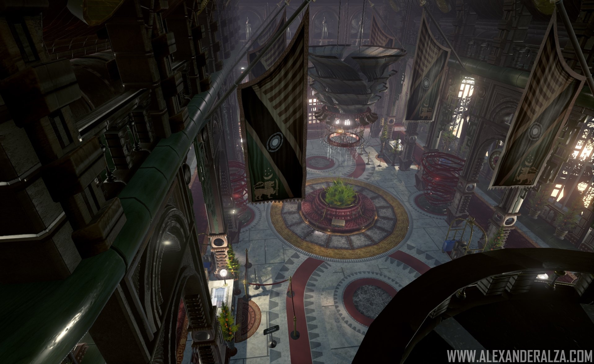
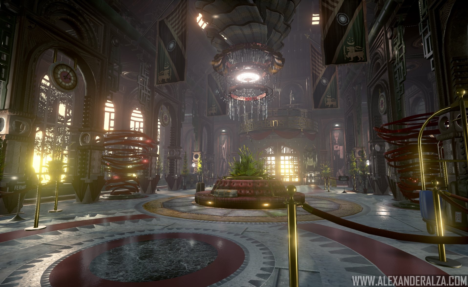
Not in love with the pallet on this yet. I'm struggling to identify with the architecture. It'a a bit noisy in terms of visual clutter, I think spaces like this are stronger when you have more bold shapes and features. Less is more.
Things I'd try:
Remove some the trees and shrub planters out of the middle of the space, make it more open. Shrink the planters on the outside by 0.8 Rework the large scale floor tiles. Those gaps on those slabs are huge. I'd make the circular detail around the center sitting area more subtle, less contrast for your flooring in general. Your walls and arches and window treatments are already so busy, I'd make the floor as cohesive as possible. I'd try a tweak to the floors or the pillars in terms of value/color. Either your floors are dark with light pillars, or lighten up the floor and have pillars push more dark in value. (make the base of the pillars a shade darker to ground them to the floor, almost like a trim). The reds on the stanchions, and rug in front of the desk area are a bit washed out in comparison to the rugs. Really struggling to figure out what the ribbon tornado sculptures are. I'd consider removing em, and replacing with one of your shrubs. Your pillars with the large circle cutouts are so ornate, consider using those in key areas (sides of room or around check-in desk) and making a 2nd "simple" version that is less busy for everything else. The sci-fi lights on the seating area throw off the feel of the room for me. I'd remove them. Finally I'd add a bit more color into your main lighting model, it's so washed out and gray. (I'd tweak your ambient/skylight color)
*you don't need the "www" on your images, and your website didn't load for me.
Some good stuff in here for sure, but needs a bit more polish to push it over the top.
Thanks for the great feedback PIXELPATRON, lots of good stuff that I'll take under consideration! *Addendum to original response* Now that I have a bit of time to properly respond... I'm not sure why my website wouldn't load up for you, with or without the www it should work just fine so yeah, file that under strange? Regarding the "Ribbon tornado" sculptures, they're meant to be abstract sculptures which I had loose reference for but I can see where one would find those more distracting than anything, I will likely pull those out and add some seating benches there perhaps. Regarding the lack of color, I AM using a LUT texture for color grading to desaturate/give things a cooler tone as this piece originally started with much warmer tones but I will most definitely revisit my lighting and lessening the visual clutter. Thanks again for the valuable tips!
I agree with PIXELPATRON - there seems to be a lot of trees, shrubs etc... it looks very busy unless that was the look you were going for. Also I think there seems to be a lot of glare from light sources. Maybe you can reduce it or minimise it? For example, these images all have subtle glows/glares and I think the more subtle the better - http://1dot61.co/portfolio/architectural-rendering/ I think you need more contact shadows with props in your scene with the ground plane. Without this, it looks like everything is floating.
Thanks for the feedback THERENDERER, those are things I can tweak for sure! The main white marble floor is actually a BSP brush and I was having a pretty hard time (even with tweaking Post Process AO settings) to get decent contact shadows to show up there so I think I may actually model out a couple of modular tiles and spread those around to see if I get better lighting results that way as BSP can misbehave at times. Thanks again for taking the time to give me feedback, much appreciated!
Finally got some time to address the feedback you guys gave me, I'm much happier with the changes so thank you guys for your critiques! I think I'm going to call this piece finished since I need to move on to other work but I'm always open to more feedback!
Looks better man! Good job on completing this project.
The only crit I have is that the scene doesn't tell much of a story. Everything looks perfectly clean and the multiple blooming light sources from all the windows and all the glares are making my eyes fly everywhere looking for where to rest.
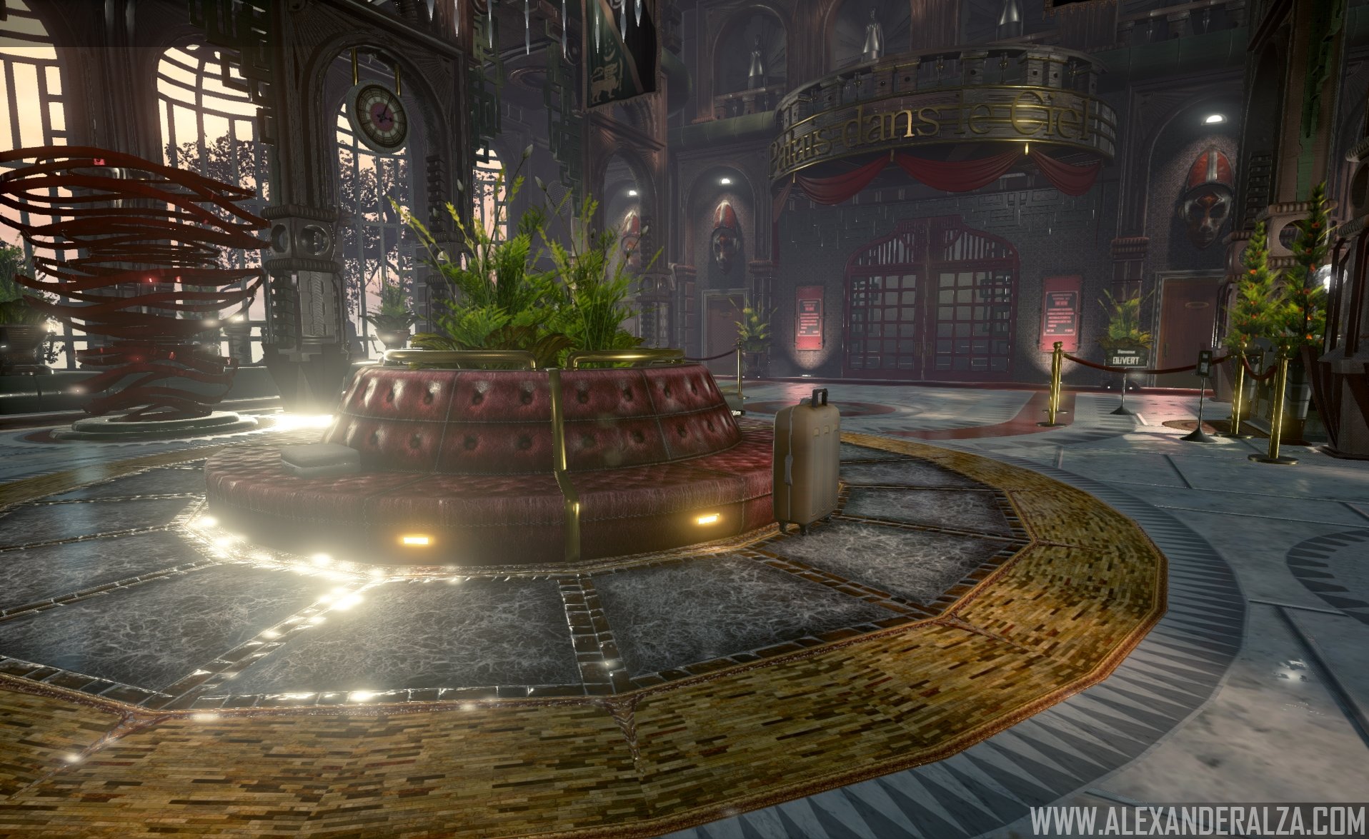
I personally would have closed some windows and made the chandelier to highlight a point of interest (I love that round bench at the center!).
Thank you MRGESY, I agree with the busy light/glare issue. I had to use a couple of point lights as fill lights and wasn't able to get their reflections not to show on the ground unfortunately. I'll see if there's a quick fix to it otherwise it's something I'll have to learn from.
....so I lied, my previous post wasn't the final version :-) I started to get annoyed at the visual distractions and decided to change the time of day to a more overcast evening to lessen the "exterior light noise", also moved around the reflection capture actors to prevent some unnecessary white hot ground reflections. I'm a bit more at peace with it now, thanks again to those of you that gave feedback, it's very much appreciated! Final results below.
I had to use a couple of point lights as fill lights and wasn't able to get their reflections not to show on the ground unfortunately. I'll see if there's a quick fix to it otherwise it's something I'll have to learn from.
There is a setting for lights in UE4 called minimum roughness. Sliding it up will change the way surfaces reflect the light (as though they have a higher roughness just for that light source), removing the specular glare of the light at higher values. If you hadn't noticed it, I think it should help.


Replies
Just posting some images is great I guess, but thats more suitable for ArtStation. Here, we're trying to foster some sort of feedback.
Yeah, I'm always looking for C & C from the community. All assets are my originals, I used some texture reference here and there but most of this is Quixel work with some tweaking. Thank you!
Things I'd try:
Remove some the trees and shrub planters out of the middle of the space, make it more open.
Shrink the planters on the outside by 0.8
Rework the large scale floor tiles. Those gaps on those slabs are huge.
I'd make the circular detail around the center sitting area more subtle, less contrast for your flooring in general. Your walls and arches and window treatments are already so busy, I'd make the floor as cohesive as possible.
I'd try a tweak to the floors or the pillars in terms of value/color. Either your floors are dark with light pillars, or lighten up the floor and have pillars push more dark in value. (make the base of the pillars a shade darker to ground them to the floor, almost like a trim).
The reds on the stanchions, and rug in front of the desk area are a bit washed out in comparison to the rugs.
Really struggling to figure out what the ribbon tornado sculptures are. I'd consider removing em, and replacing with one of your shrubs.
Your pillars with the large circle cutouts are so ornate, consider using those in key areas (sides of room or around check-in desk) and making a 2nd "simple" version that is less busy for everything else.
The sci-fi lights on the seating area throw off the feel of the room for me. I'd remove them.
Finally I'd add a bit more color into your main lighting model, it's so washed out and gray. (I'd tweak your ambient/skylight color)
*you don't need the "www" on your images, and your website didn't load for me.
Some good stuff in here for sure, but needs a bit more polish to push it over the top.
*Addendum to original response* Now that I have a bit of time to properly respond...
I'm not sure why my website wouldn't load up for you, with or without the www it should work just fine so yeah, file that under strange?
Regarding the "Ribbon tornado" sculptures, they're meant to be abstract sculptures which I had loose reference for but I can see where one would find those more distracting than anything, I will likely pull those out and add some seating benches there perhaps.
Regarding the lack of color, I AM using a LUT texture for color grading to desaturate/give things a cooler tone as this piece originally started with much warmer tones but I will most definitely revisit my lighting and lessening the visual clutter.
Thanks again for the valuable tips!
Also I think there seems to be a lot of glare from light sources. Maybe you can reduce it or minimise it? For example, these images all have subtle glows/glares and I think the more subtle the better - http://1dot61.co/portfolio/architectural-rendering/
I think you need more contact shadows with props in your scene with the ground plane. Without this, it looks like everything is floating.
Hope this helps -
The main white marble floor is actually a BSP brush and I was having a pretty hard time (even with tweaking Post Process AO settings) to get decent contact shadows to show up there so I think I may actually model out a couple of modular tiles and spread those around to see if I get better lighting results that way as BSP can misbehave at times. Thanks again for taking the time to give me feedback, much appreciated!
The only crit I have is that the scene doesn't tell much of a story. Everything looks perfectly clean and the multiple blooming light sources from all the windows and all the glares are making my eyes fly everywhere looking for where to rest.
I personally would have closed some windows and made the chandelier to highlight a point of interest (I love that round bench at the center!).
Otherwise good work!
I started to get annoyed at the visual distractions and decided to change the time of day to a more overcast evening to lessen the "exterior light noise", also moved around the reflection capture actors to prevent some unnecessary white hot ground reflections. I'm a bit more at peace with it now, thanks again to those of you that gave feedback, it's very much appreciated! Final results below.