Mega Man X Props, Tiles and Modules

polycounter lvl 16
Hello everyone ")
I am starting a thread of props, tiles and modules based on the Mega Man X franchise. Here are some of my primary goals:
1) A much higher level of detail and believability in my models. Here is what I'm shooting for:
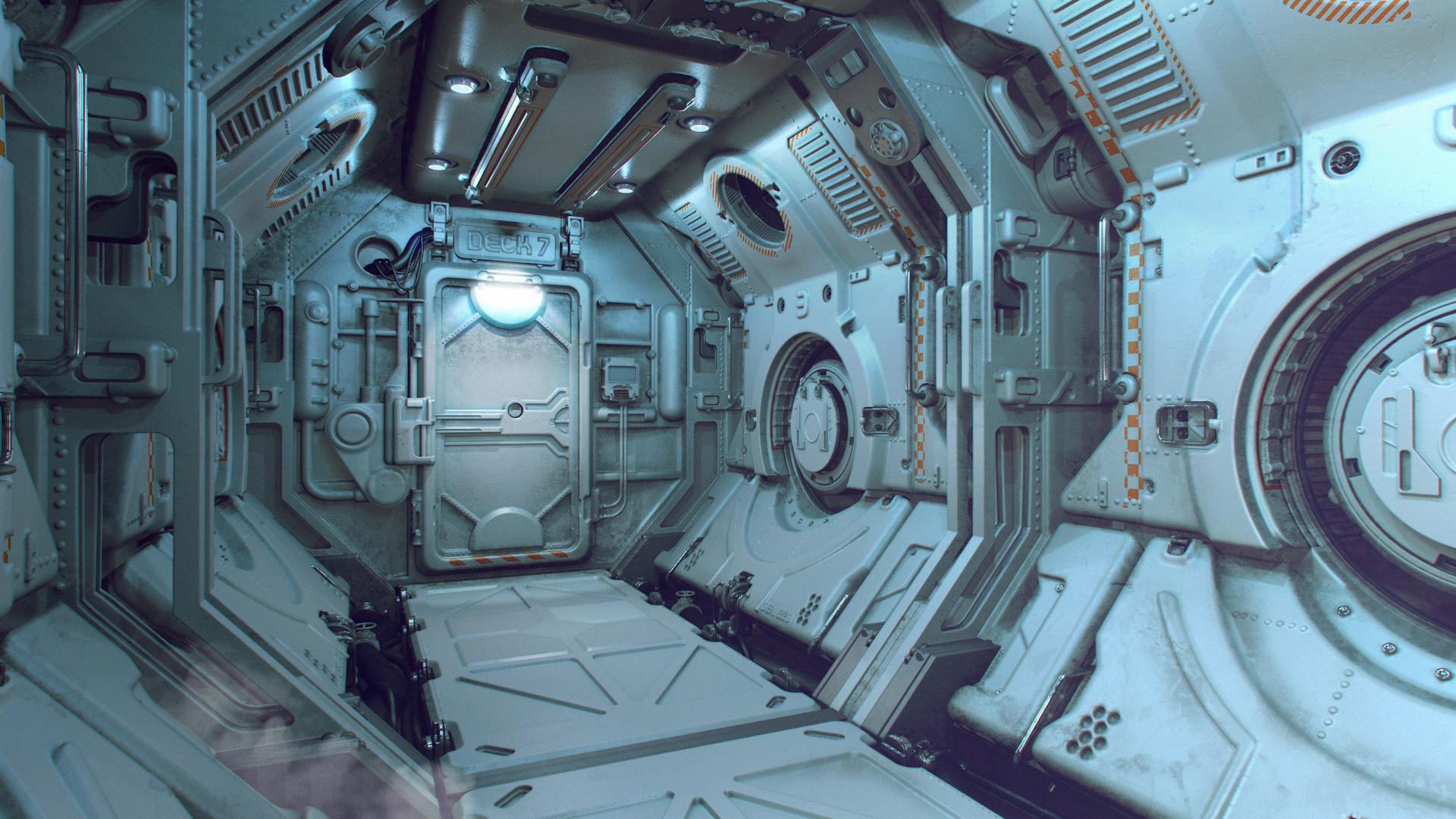
http://www.jacquechoi.com/MegaMan.html
http://torfrick.com/Art/WIP/corridor003.jpg
https://www.pinterest.com/pin/408842472395908376/
2) Better material definition (this is always in the list of goals for me). I'm using primarily Substance Painter.
3) To focus on quality over quantity. I want to nail down the best small pieces I can before moving on.
Here's the first post:

As you can see it's currently in a very simple state, looking mostly like the X4-X6 design. I want to take this as far as I can and anime style models don't typically impress with their believability without stylized textures. At any point in this thread I'm open to all crits about designing hard surface objects and what I can do to improve what I have. Thanks!
I am starting a thread of props, tiles and modules based on the Mega Man X franchise. Here are some of my primary goals:
1) A much higher level of detail and believability in my models. Here is what I'm shooting for:
http://www.jacquechoi.com/MegaMan.html
http://torfrick.com/Art/WIP/corridor003.jpg
https://www.pinterest.com/pin/408842472395908376/
2) Better material definition (this is always in the list of goals for me). I'm using primarily Substance Painter.
3) To focus on quality over quantity. I want to nail down the best small pieces I can before moving on.
Here's the first post:
As you can see it's currently in a very simple state, looking mostly like the X4-X6 design. I want to take this as far as I can and anime style models don't typically impress with their believability without stylized textures. At any point in this thread I'm open to all crits about designing hard surface objects and what I can do to improve what I have. Thanks!
Replies
Here are the high poly, low poly, and low + normal versions of the first prop. Material coming soon.
Feel free at any point to help me be a better artist
Here's the textured version of the prop. Any crits? I used Substance Painter with substance effects on masks.
Keep at it. MMX4 is my favorite platformer of all time and I am a beast at it with Zero. Now I have to go play it. You're always tickling my nostalgia.
I'm by no means a Substance Painter expert but I took a quick stab at making a clean but worn material inside substance. There's a dirt layer to fill in the cracks along with a slight dust layer - just a fairly rough light grey layer with a dust generator on it's mask. On the paint layer, I duplicated the base paint but increased it's roughness, lightened the color slightly, and put it's height to a small negative value. I used this rougher paint for edge scuffs, to show where the paint has been scuffed but not worn down to the metal.
I did this pretty fast so it could use some more lovin' with painting back some of the damage.
@Dethling: thanks. agree.
@ysalex: thanks again and agree. I need to define these materials better! Also I literally just played MMX4 with Zero just before starting this LOL! X4 and the original X are high up there for me too.
@Justin: huge help, thanks! The last shot here is me trying to do what you did with the Pokeballs with multiple levels of wear. Admittedly, I'm not sure how to get that fine a resolution, as mine seems in comparison like 256 pixel paints.
In the curvature slot I've tried using a 3ds Max normal map, a curvature map made from that normal map in Photoshop, and a curvature baked in Painter. The last one gave the best results. Also I'm very much prefering the dirt on the second version here, but I'm not sure about the metal wear through the purple paint. I feel like the simpler one may be better ... not sure. Maybe the grey primer was too much?
Thanks
Another quick update. I finessed the metal edge wear on the purple a bit so it wasn't as uniform. This one has no dark gray in the painted metal wear.
I added another roughness layer. The lower image has the roughness layer below the appropriate layers for (I believe) a better effect.
Feel free to crit as to how these updates are comparing.
Next module. ref: http://www.mobygames.com/images/shots/l/18887-mega-man-x4-windows-screenshot-zero-battles-a-boss-storm-owls.jpg
Out of nostalgia after seeing those doors I replayed MMX4 - 13 year old me would be super disappointed in 30/year old me's ability to play MMX4.
Thanks.
How's material definition on this one? Notice that I changed the low poly mesh a bit by adding the cylinders to the mesh.
Thanks for commenting. Just making these for practice/portfolio sake. I've been given the advice to work on my material definition and to make more props and fewer full environments, so that's what !'m doing
I took the front end of the last piece (which I was very unhappy with) and re-unwrapped it. This portion is covering the entire UV space by itself at 2048. I can see the resolution being better, but I still have a lot of questions about my workflow and the results I'm getting. How normal is this?
1) What should I be placing in the curvature slot? The normal map? I've tried Photoshopping a curvature map to bad results. I've tried baking a curvature map which worked once, but it seems to me at least that the baking options here in Painter are still in development without much to visualize to solve issues. Last time I tried it they all failed to bake and I realized I didn't have a clue how to figure out what went wrong, so I gave up.
2) How much control in Painter should I expect? It seems that with this mesh here, I can get a strong line of wear along the top edge of the middle purple box, but nothing is showing up along the curved rim below it unless I crank the wear. At that point there is so much wear that the placement is useless. Notice with the blue ends that the wear is so uniform that it seems useless. I can't control it.
3) This wear doesn't look like metal edge wear to me ... more like fuzz.
4) How much hand painting of wear should I be doing? When I paint, the edges of the brush strokes look bad ... very generic. You can tell that I painted it which kills the definition.
Keep the good work though, I'm looking forward to seeing some nice scene done with all this!
Here's a new attempt at the last module (likely the last). I used dirt brushes onto the group masks to reduce the wear and dirt, as well as painted a new roughness. I hope this doesn't look too uniform. Thoughts?
Thanks.
Next one is the sub tank. ref: http://cdn.wikimg.net/strategywiki/images/c/c3/Mega_Man_X_Arm_Arm_Sub-Tank.png
Here's the sub tank textured. Noticed that I played around with the Substance Painter post effects. Any thoughts at all are welcome. I hope this is an improvement over the previous materials. I think it is.
ref: https://lh3.googleusercontent.com/-XTkx43J1bOQ/VSXyWzS_SbI/AAAAAAAAFV8/nYV88jsNS5E/w438-h303/heart-tank.gif
Thanks for the comment
PSX ref: http://oyster.ignimgs.com/mediawiki/apis.ign.com/mega-man-x-collection/thumb/9/92/Mmxc_x4_02.jpg/225px-Mmxc_x4_02.jpg
Here's the textured heart tank. Thoughts? Help me to better understand what it is that I'm shooting for? I was getting critiques that I was overdoing dirt and grunge and changed things up a bit. Is it better? Worse?
My take on the X capsule. I'm not sure how many more (if any) I will do after this one.
ref: http://cdn5.howtogeek.com/wp-content/uploads/gg/up/sshot4e52c2505fba6.png
The baking took me way longer than the initial modeling. Note that I dropped the small wires on the bottom part and that I will likely either 1) lose the big cylinder in the center or 2) place it further outside to surround more.
Does this make sense? I feel like I'm randomly trying to change it over and over having little idea what to do because no matter what ... its not good enough. Is this better? Worse?
I'm going to return to the others as well.
I think this is better. Is it? Is the material definition better? I'm trying to get better edge definition with harder edge wear marks. I was looking at Frank Robbins work for ideas (among others).
Before in the first attempts I was playing around with the Substance Generators and painting into masks (on group folders) to reduce the generated details. Now with these new attempts at the door I'm painting in the details in Substance Painter without generators. For the purple areas I have a layer for purple, then light purple, then grey primer (which I gave up on completely eventually), then metal. There is a separate roughness layer as well.
New attempt at the ground prop.
Here is the final prop in the series. I always knew I would do the X capsule and wanted to build up to it after doing a few simpler ones first. I'm still open for crits if you have them. Either way ...thanks! Here is the final portfolio page:
https://www.artstation.com/artwork/megaman-x-capsule