Home 3D Art Showcase & Critiques

[PBR] Environment Challenge

1
polycounter lvl 12
Offline / Send Message
Bartalon polycounter lvl 12
Hey everyone, I'm trying to get another environment into my portfolio. I already have a hand-painted one so I'm aiming for a PBR one for more variety.

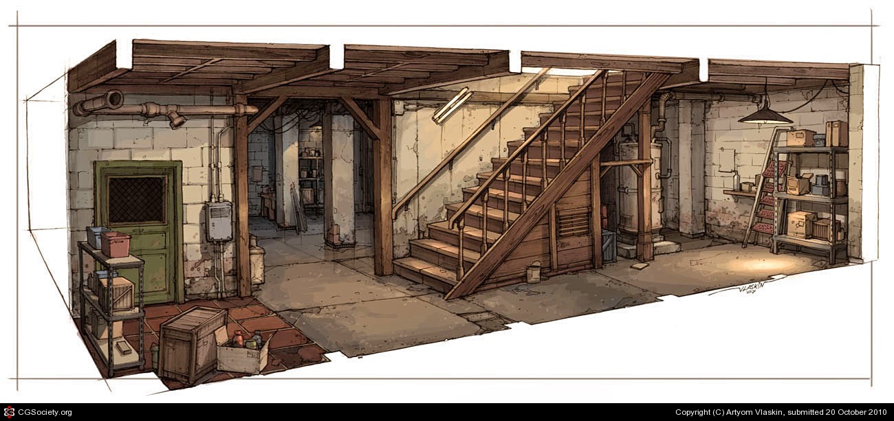
Some of you probably remember this one from one of the older Noob Challenges (#3)

5Y4BX.jpg

My blockout:

Blockout.PNG

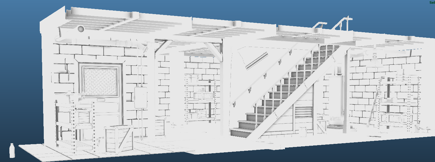
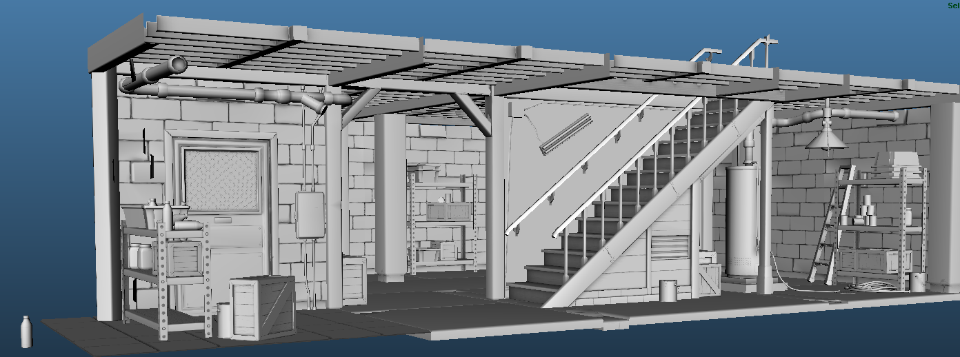
[edit] Here is a shot in Maya of all the assets with their AO maps applied. Time to move on to the texturing phase!

Basement.png

Basement_Shaded.png

More shots later!

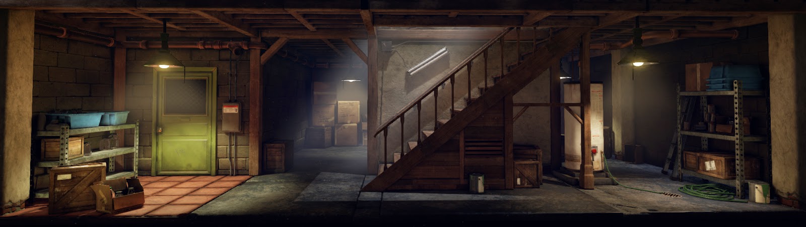
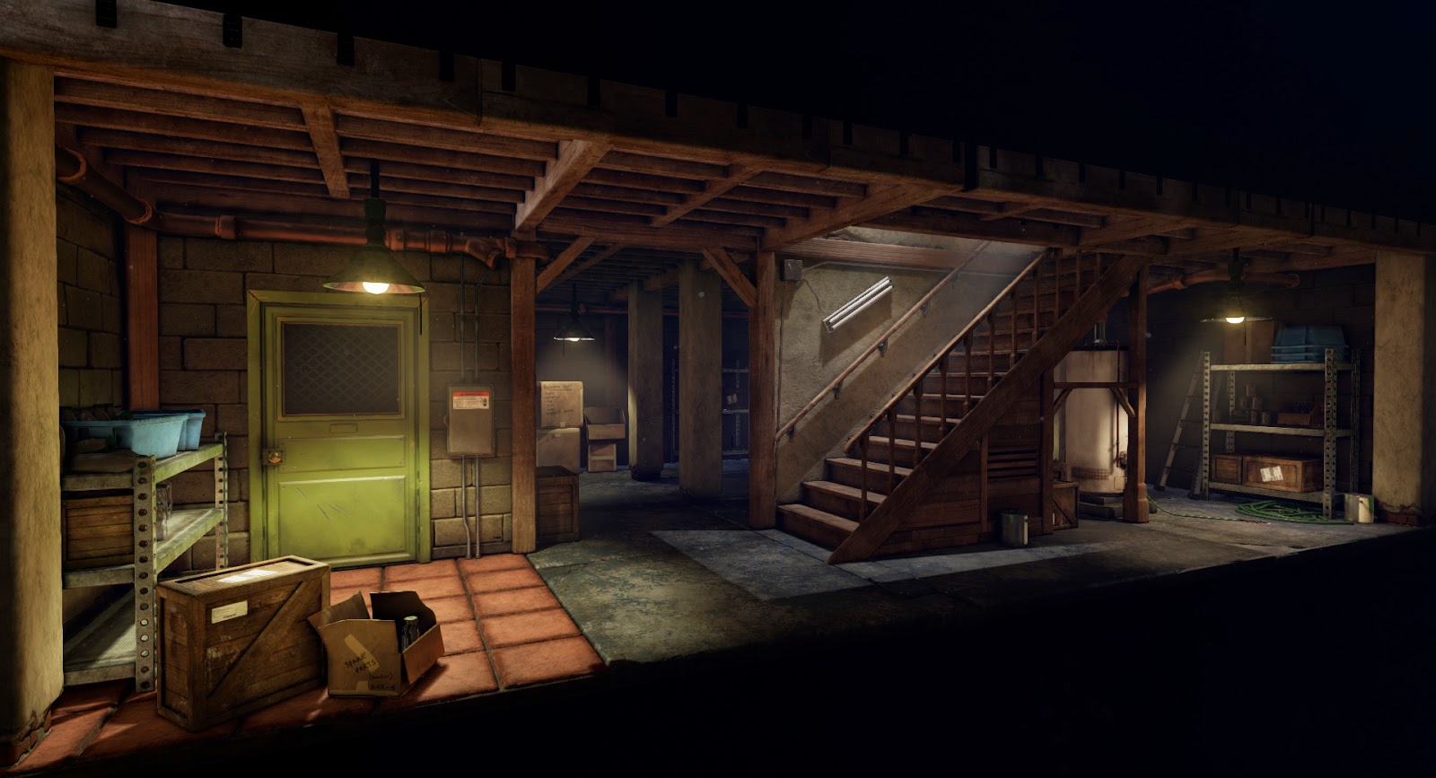
[edit] I'm done! Thanks everyone for all your feedback! Here are the final beauty renders. As I stated in post #49, please do critique these final shots so I can take any advice you may have with me to my future projects.

beauty1_full.jpg

beauty7_full.jpg

beauty2_full.jpg

beauty3_full.jpg

beauty4_full.jpg

beauty5_full.jpg


[/edit]

Some first-pass materials made in Substance Painter:

Red cement tiles
RedTiles.PNG

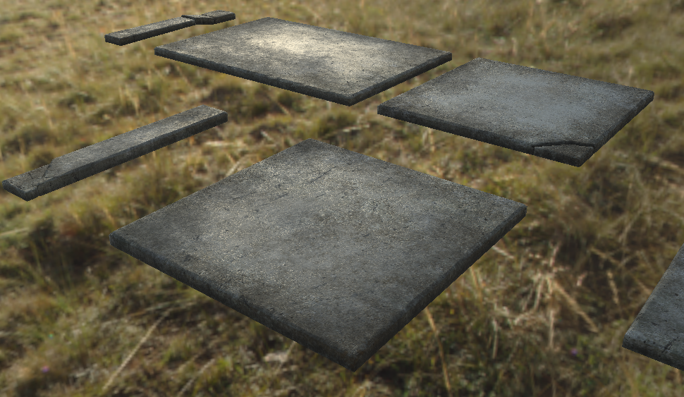
Grungy polished cement slabs
Slabs.PNG

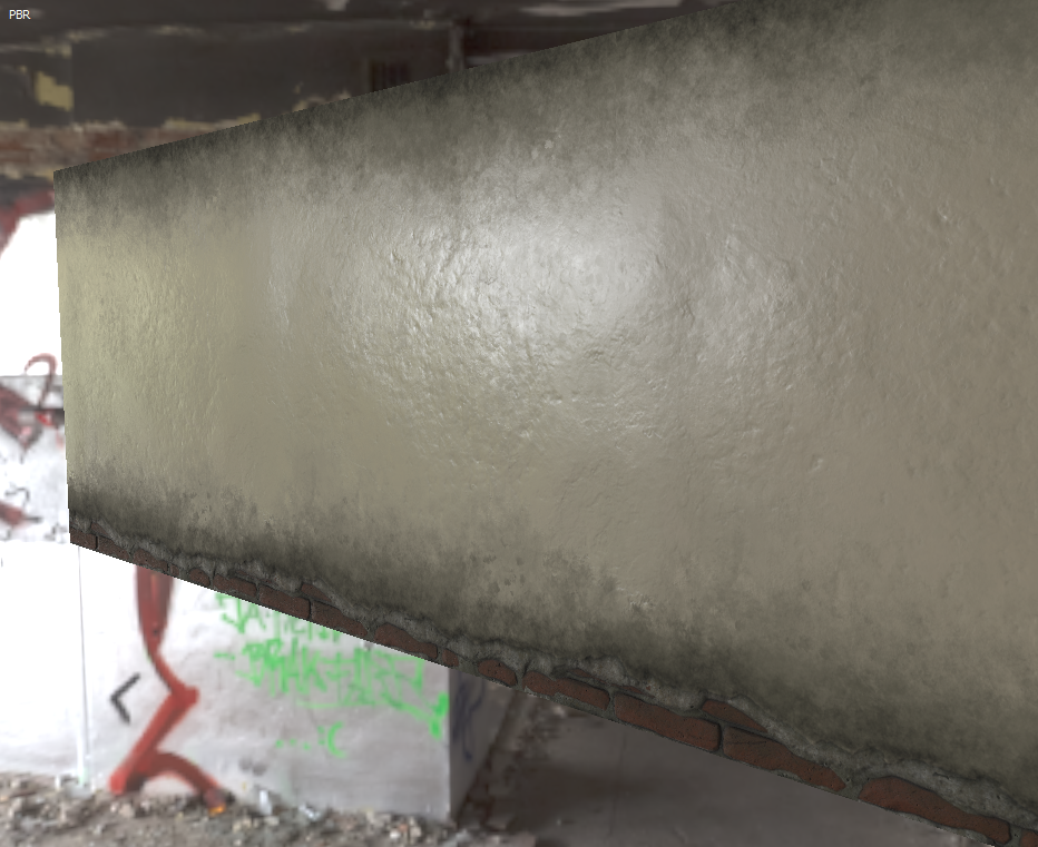
Painted cement wall with brick underlay
Wall.PNG

Comments & critiques encouraged

Replies

  • oxblood
    Offline / Send Message
    oxblood polycounter lvl 9
    looking good. material definition is great :)
  • Dragonar
    Offline / Send Message
    Dragonar polycounter lvl 10
    it's looking good ! :) maybe more bump on the brick for the "painted cement"
  • razz
    Offline / Send Message
    razz polycounter lvl 9
    This one's going to be fun to follow! Looks like nice work on the materials already. Looking forward to seeing this shape up ;]
  • last
  • Spoon
    Offline / Send Message
    Spoon polycounter lvl 11
    Great start :) Looking forward to this :) Is it just me, or is everyone doing this piece?
  • AneeshaRode
    Great start with the material play, substance painter is fun to work with. :)
  • lamar McHaney
    Offline / Send Message
    lamar McHaney polycounter lvl 9
    This Looks great so far, my only suggestion would be to have the brick normal map show on the cemented wall. I think it would look really similar to the concept.
  • Bartalon
    Offline / Send Message
    Bartalon polycounter lvl 12
    Dang thanks for the positive feedback everyone, it's really getting me pumped to continue working on this!

    last, holy buckets that guy's scene is ridiculous! Not sure I can match that :)

    lamar McHaney, yeah that plaster wall texture is actually different from the main brick wall throughout the perimeter. It's going to be for the cement pillars and the dividing wall between the stairwell and that whole back room area.

    Here's a first pass on the main brick wall. Needs some color variation and such. I'm not too satisfied with this one right now. It's supposed to be painted, like the one with the brick underlay; I think I need to meld the bricks together so the crevices aren't so pronounced.

    CinderWall.PNG
  • lamar McHaney
    Offline / Send Message
    lamar McHaney polycounter lvl 9
    Looking good, your bricks are a bit soft. You may need to crisp your edges.
  • ScottHoneycutt
    Offline / Send Message
    ScottHoneycutt polycounter lvl 13
    I'm interested in your material creation process in Substance as the definition is quite good. Any tips or care to share more of your workflow? Thanks
  • Bartalon
    Offline / Send Message
    Bartalon polycounter lvl 12
    lamar McHaney Yeah I agree. I went back and crispified them edges.

    ScottMichaelH Hey thanks, I'd be happy to share my general work flow. I don't think I've even scratched the surface yet though; I haven't even integrated Substance Designer so I'm still working with what comes inside Painter.

    Layers.PNG

    I've been trying to stick to my work flow from Photoshop where most of my layers are Fill Layers with masks instead of raster layers. Specifically for Painter, when I create a new fill layer I immediately toggle off all the channels that aren't important to avoid confusion. Since each layer holds 4 texture channels it can get hairy remembering if something is important or not.

    I start with defining the base material on a fill layer (Fill layer 1) and adjust the color/roughness to what I'm aiming for. For this particular model I just used a basic concrete material (Fill layer 2) then masked out areas in the center to return some of the shine from the base material. There's a copy of Fill layer 2 just because it made everything look better. lol

    On top of that I added a grunge layer (Fill layer 3) and went around the edges. This layer has a subtle height and, combined with varying greyscale values in the mask, blends really well on top of the concrete material. When I'm satisfied with the first grunge layer, I will duplicate it to copy all the settings and then adjust the color slightly. The second grunge layer (Fill layer 3 copy 1) has its height channel disabled because it would look strange having the same material visibly stacked on top of itself. I may increase this layer's roughness if it looks better that way.

    I try to keep the first layer of grunge between 0 and 70% visible, and the second layer is around 50-100%. I use the default Dirt 1 and Dirt 2 brushes to add these in and lightly/randomly stroke in areas to build up the color and density, occasionally adjusting the greyscale value of the brush.

    Because everything is a fill layer, if I need to adjust something I can simply move some sliders back and forth, or move the color fill until everything looks perfect. For instance if I thought the cement was too shiny, I could just go back to Fill layer 1 and increase the roughness slider a bit. Adjustments take seconds this way. I basically just try to keep each material its own layer and not mix things together.

    Layer 1 is a raster layer which I used to paint in subtle color variation to the color channel only. I usually don't paint in random materials with all the channels active because it's too hard to control after it's been laid down (for me anyway).

    Order.gif

    That's the general formula I've been sticking with for most of my models, seems to work pretty well and it's easy to manage.
  • Bartalon
    Offline / Send Message
    Bartalon polycounter lvl 12
    Here's a buncha junk I've been knocking out. If you see anything that reads poorly please do point it out!

    Bin.PNG

    Bottles.PNG

    Cans.PNG

    Crate.PNG

    Door.PNG
  • lamar McHaney
    Offline / Send Message
    lamar McHaney polycounter lvl 9
  • Micaki
    Offline / Send Message
    Micaki polycounter lvl 3
    reflections are a little bit wierd imho, especially doors and bolts are too glossy for me. everything else is looking nice ;)
  • Bartalon
    Offline / Send Message
    Bartalon polycounter lvl 12
    Hey sorry for the huge gap between updates, I wanted to wait until the next huge phase was completed. Nearly all of the assets are modeled with base maps baked out. I have to re-bake a few to get better lighting but it's more or less done. Now I can move on to texturing everything!

    Here's the scene with flat shading and AO maps only:

    Basement.png

    Here it is with just default lighting + AO in Maya:

    Basement_Shaded.png

    My next step is to start throwing everything into Unreal Editor and get some real lighting going.

    lamar McHaney: Thanks!

    Micaki: Yeah I agree. All the textures you've seen so far are first pass, I'm going to be returning to everything and fixing them up. More textured assets to come soon.
  • Bartalon
    Offline / Send Message
    Bartalon polycounter lvl 12
    Knocking out the smaller pieces as I go. Shoot down anything that looks wrong! Like those pipes maybe :)

    01_Wire%2BBox.PNG

    02_Door.PNG

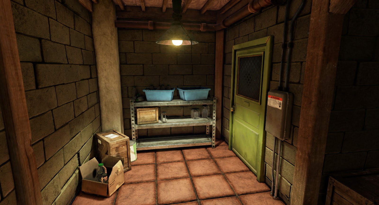
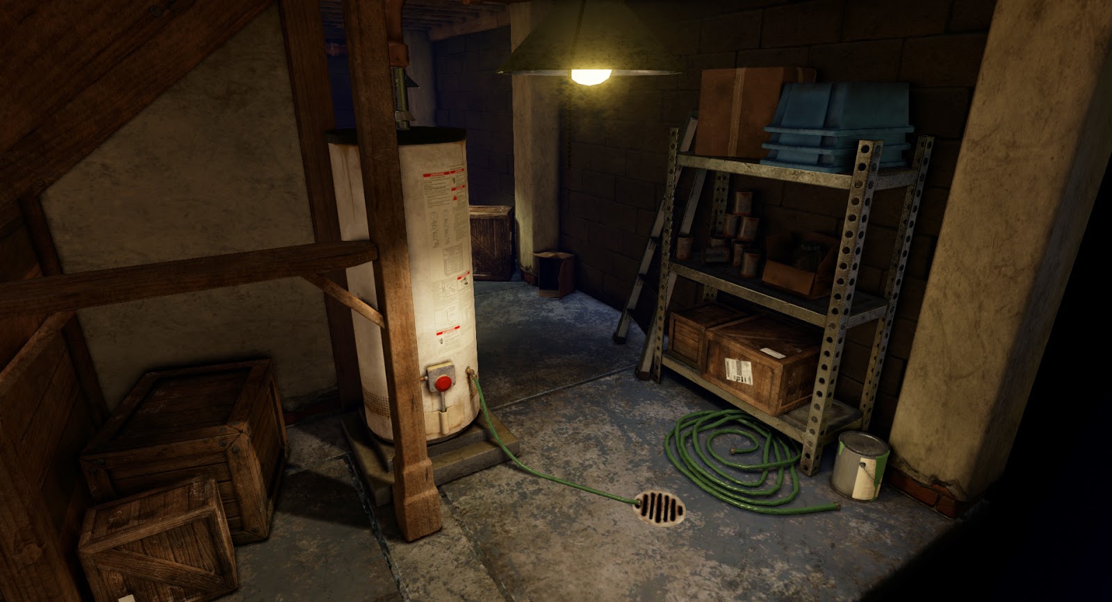
    The plastic label on the circuit breaker panel will be filled in later with warnings and whatnot.

    03_CB%2BPanel.PNG

    After coming back to this screenshot, I think there's probably too much red for what is supposed to be copper.

    04_Pipes.PNG

    05_Drain.PNG

    06_Hose.PNG
  • Bartalon
    Offline / Send Message
    Bartalon polycounter lvl 12
    Asset dump #2

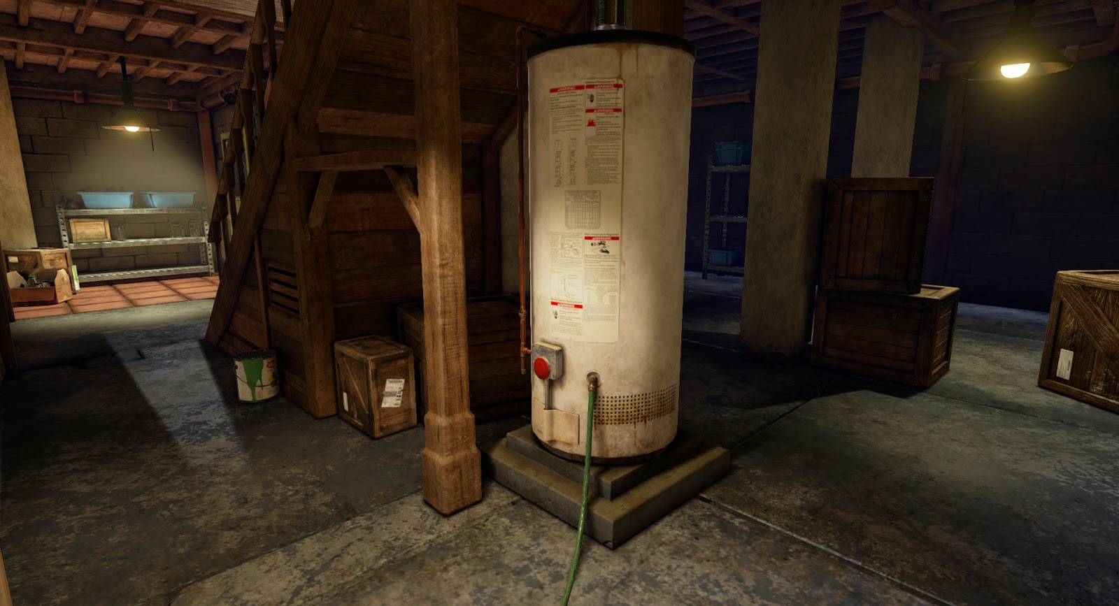
    I still need to add water stains to the water heater

    Old_New.png

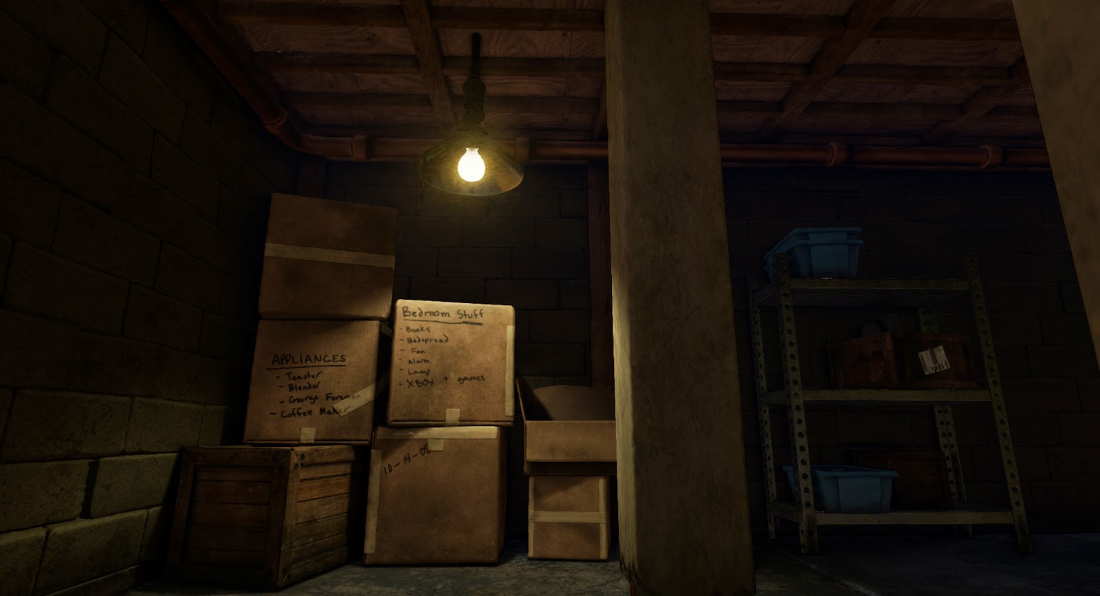
    Revisited the plastic bin textures

    01_Bin.PNG

    And the red bricks

    02_RedBricks.PNG

    And the brick wall (now with crisper edges!)

    04_CinderWall.PNG
  • NurmanZh
    Offline / Send Message
    NurmanZh polycounter lvl 10
    Quixel used???
  • anura
    Offline / Send Message
    anura polycounter lvl 3
    Wow, this looks really awesome, the amount of detail is great. =)
    To be honest I'm kinda curious about the wireframe of some of the assets and what software you are using to build your shader.
  • MephistonX
    Offline / Send Message
    MephistonX polycounter lvl 9
    Just one comment on the size of the door, it looks a little wide (and or short). Check that against standard door sizes. Other than that its looking great, keep up the progress.
  • nathdevlin
    Offline / Send Message
    nathdevlin polycounter lvl 12
    Hi,

    So far you are doing a really good job of sticking to the original concept. I did want to highlight an issue with it as there are some elements in the concept which are off in relation to scale.

    The green door to me looks too wide and I'd expect it to have proportions more like this:

    http://www.freeindex.co.uk/media/listingpics/301/687/SteelPersonnelDoor(1).jpeg

    With that said I did notice a wider door with a different design that has similar proportions to the door in the concept but the door works on a roller system so is a sliding door not a hinged one as in the concept.

    http://media-cache-ak0.pinimg.com/236x/58/e7/20/58e720385ea8ca403f7af283a42aa1a7.jpg

    It is common for games to increase doors for design decisions but it does always look odd.

    The concept seems to have overdone the width and height of the steps also, this may or may not be something you want to stick with as relative to everything else in the scene they make some assets appear to be off in scale.

    *edit* Just saw the previous post ...... took too long writing mine :P
  • Bartalon
    Offline / Send Message
    Bartalon polycounter lvl 12
    NurmanZh: I'm using Substance Painter.

    anura: Thank you! No fancy shader work yet. I'm still taking shots of everything from inside Substance Painter. I've tested the materials in UE4 just to make sure they look the same and they do, so I'm putting off importing all my textures until they're all done. I'll post some wires once the project is completed!

    MephistonX: Yeah I see it now, it's probably too wide. It's already coming a bit too close to the ceiling compared to the concept so I'll narrow it down a bit.

    nathdevlin: Thanks for the reference pictures. I did have to improvise a bit since the door is blocked in the concept. I'll probably just scale the door frame inward a bit. We'll see how it looks when I get back around to it.

    On a related note of proportions, I ended up tweaking that right wall and moving it in. There was way too much space back there in my blockout compared to the concept (seen in my first post). Seems to look better now.

    Thanks guys, more to come soon!
  • Bartalon
    Offline / Send Message
    Bartalon polycounter lvl 12
    Asset dump #3

    An assortment of old and new. Went back and touched up some of the first textures I did.

    Added some water stains to the water heater. Looks way better now I think!

    01_Waterheater.PNG

    Touched up the polished cement wall with brick underlay

    02_PlasterWall.PNG

    I discovered that, in some cases, by plugging my cavity map into the height channel, it really makes the normals pop. Worked out really nicely for this particular asset, especially around the bricks at the bottom.

    Cavity.gif

    Substance Painter was causing some odd lighting at the front of the crate here, not sure why. I think I'm going to also go back and add some scrapes and wear to expose some of the raw wood underneath.

    04_CrateSmall.PNG

    03_Slabs.PNG

    First time playing around with the emissive feature. Not bad

    05_LampRound.PNG
  • Bartalon
    Offline / Send Message
    Bartalon polycounter lvl 12
  • Bartalon
    Offline / Send Message
    Bartalon polycounter lvl 12
    A crate and the first glimpse of my project in UE4! Everything in engine is still super WIP. As you can see, I still need to rebuild lighting and implement tons of textures. None of the materials have AO/Cavity channels yet. No post effects yet either. SOON

    01_Crate.PNG

    02_Engine.png
  • Cheeky_Pickle
    Offline / Send Message
    Cheeky_Pickle polycounter lvl 9
    Wow looks great so far!
  • Bartalon
    Offline / Send Message
    Bartalon polycounter lvl 12
    Holly Mellor: thanks!

    I'm getting awful close to calling this one done! Here's what's left to go:
    • Texture the Ladder
    • Reduce door width
    • Add label to circuit breaker panel
    • Implement translucent shader for glass/plastic bottles
    • Model a box & put stuff in it
    • Move some assets around
    • General tweaking of texture values as needed
    • Ambient effects
    • Test & bake lighting
    • Beauty shots & portfolio

    Scene.PNG
  • KazeoHin
    Offline / Send Message
    KazeoHin polycounter lvl 8
    This is looking very good! can't wait to see the finished beauty shots.. however those red floor tiles read as 'leather' to me... it looks like floor padding...
  • Bartalon
    Offline / Send Message
    Bartalon polycounter lvl 12
    KazeoHin: yeah, I can see that. I've been tweaking a bunch of stuff all day, found out my lights were set to something like 17,000 lumens and were washing out the material pretty bad.

    More to come in the next day or two.
  • Bartalon
    Offline / Send Message
    Bartalon polycounter lvl 12
    Alright, here we go. I'm almost near the end! If you have any critiques, now would be the best time to offer them!

    Still working on fog/particles, lighting tweaks, subtle repositioning of assets.

    Box_closed.PNG

    Box_open.PNG

    Scene.png
  • pixelpatron
    Offline / Send Message
    pixelpatron polycounter
    overall your saturation seems high on your door, the floor red tiles, and the wood. Your also doing yourself a disservice, by having all four of your lights at the same color/value range. I'd pick one area to make bright, and let the rest of the lights in the scene be more dim....pushed back to the background. I'd also remove the light on the stairs (or turn it off)....you'd have better lighting/interest if the light was spilling from the top of the stairs (the room above has a light on).

    Looking good though.
  • Youngy798
    Offline / Send Message
    Youngy798 polycounter lvl 4
    I think some kind of trim between the tiles and the concrete slabs would be nice, like the little metal pieces at the bottom of a doorway
  • Bartalon
    Offline / Send Message
    Bartalon polycounter lvl 12
    pixelpatron: Thanks. There is a lot of over-saturation happening which I am fixing now. Basically all the wood, crates, red floor tiles, door, hose, and the copper pipes.

    I also agree with you on lighting. I'm going to bring the luminosity down for the lights in the back room, and maybe I'll make one of the foreground lights browning out. Also looking into adding a light from upstairs instead of the fluorescent light.

    Youngy798: Good idea, I'll see if I have time to squeeze something in. I'm trying to knock out the huge problems first!
  • elfronza
    Offline / Send Message
    elfronza polycounter lvl 7
    this is looking great, congrats
  • Bartalon
    Offline / Send Message
    Bartalon polycounter lvl 12
    elfronza: Thank you! Hopefully this update looks even better :)

    Alrighty, I considered a handful of feedback and have made some major lighting and color tweaks.

    Scene_Tweaked.png

    Let me know if there's anything that stands out still. I'm feeling pretty good about this one, hopefully I can start wrapping this project up and getting to the beauty shots.
  • Bartalon
    Offline / Send Message
    Bartalon polycounter lvl 12
    I've been told my new image is too dark now. Does anyone else think so? Looks fine on my monitor.
  • GrungyStudios
    Offline / Send Message
    GrungyStudios polycounter lvl 8
    Really like your texturing style ;) a nice consistency between them
  • AdvisableRobin
    Offline / Send Message
    AdvisableRobin polycounter lvl 10
    The contrast does look really nice, with the lights and the darks...but I feel like a lot of your hard work isn't visible when you have such dark areas in the scene. I would try to find some believable way to light up the scene more.

    Maybe add in a window, some basements have those ground level windows to allow more natural light in.
  • Bartalon
    Offline / Send Message
    Bartalon polycounter lvl 12
    GrungyStudios: Thanks, I had to do a lot of fine tuning to get everything to work together :)

    AdvisableRobin: Hmm, perhaps I will add a window in the back room area to give it more light, but that would sort of go against the gloomy presentation.

    Maybe I will do a second shot with more uniform lighting like how the concept has it, just so everything in the scene can be seen clearly.

    blazed: Yeah I agree it's not lit the same as the concept but it doesn't make sense to have a fully lit basement scene like that with just the few lights that are in the concept. I had to add a light just so the door area wasn't totally dark. It's probably bright in the concept to show off the general floor plan rather than lighting. Like I said, I'll probably just do both for the wide shot: fully-lit and dark and gloomy.
  • pixelpatron
    Offline / Send Message
    pixelpatron polycounter
    I think your on the right path with the lighitng, but I agree it's too dark in spots. I'd turn up your lights a hair as well as your ambient light. I wouldn't worry about a window or any other light source, you got it right, any more light sources are going to be too much, you just need to spend more time tuning what you have.....and bring up the overall values a bit so there are not areas that are too dark. I think it has the right mood now compared to where you were at. Keep going.

    (you nailed the stairwell btw....all the subtle stuff happening there is working, get the rest of the scene to that quality in terms of lighting and your there.)
  • Bartalon
    Offline / Send Message
    Bartalon polycounter lvl 12
    Thanks pixelpatron, yeah it's definitely getting closer to where I want it.

    I bumped the luminosity a bit on the rear light and the water heater light, and increased the bounce light intensity which really helped lighten up the rafters a bit and lit up that shelf on the right nicely.

    I added a light shaft coming down from upstairs, and a really subtle bluish fog that fills out the back room.

    Scene_Lighting3.png
  • minorthreat
    Offline / Send Message
    minorthreat polycounter lvl 7
    wow, i'm really inspired by the quality & effort put into every single one of these assets. Thanks so much for sharing!!! :D I can learn alot from this water heater. I like the lamp too, & the conduit boxes & pipes, although i really like everything here.
  • pixelpatron
    Offline / Send Message
    pixelpatron polycounter
    I like the direction you've gone, only thing standing out for me now is the trim on the outside of the scene (at the top), The wood picks up some light here and there, but it's not as even as it probably could be (really dark in the middle). If your planning on showing these outside elements in your shots, I'd also suggest you do a similar treatment on the concrete floor, like it's a cutaway of exposed brick and concrete...not a deal breaker, but I've seen similar treatments done that way and it's always a nice touch.

    You could bump up the light right at the top of the stairs, the railings would be lighter coming from where the light source is. Maybe a small low opacity point light?

    Looking good.
  • Jerc
    Offline / Send Message
    Jerc interpolator
    Looking awesome, one thing that bothers me is the part with the orange tiling. They look giant to me, maybe because most of the times this kind of orange tiles on floors are much smaller than that.
  • NajimCG
    Offline / Send Message
    NajimCG polycounter lvl 10
    Realy love your textures , keep doing !
  • Robbie222
    Offline / Send Message
    Robbie222 polycounter lvl 3
    I love everything except the bluish fog ...there is something about it that it's not right.
  • Bartalon
    Offline / Send Message
    Bartalon polycounter lvl 12
    minorthreat: Thanks! Check my site for a complete showcase of assets (below).

    pixelpatron: Yeah I saw that lighting, I think it was due to a low light map resolution or something. I think I got it fixed up a bit better now. I wish I had more time to implement your suggestion of the cross-section of concrete but I'm out of time! I added some light shafts on all the hanging lamps. Not too overwhelming I hope, and I think it adds to how dingy the room is.

    Jerc: Yeah, I can see what you mean. In this case, I tried following the concept image and it's exactly 5 tiles across.

    NajimCG: Thank you!

    Robbie222: I added a subtle bluish fog to offset all the reds and oranges that are happening in 90% of the scene. I hope I didn't overdo it :O


    Alright, I'm done! As with any work of art, there is still so much more I could have added, tweaked, and refined. But I need to continue pushing forward, taking what I've learned in this project and incorporating it into my next one.

    You can view the complete showcase of this project (including individual assets) here!

    Here's what I got out of this project:
    • I got my feet wet with Unreal Editor 4. It's leagues more intuitive than UDK. I still prefer Unity I think, but I can use UE4 to toy around with custom materials.
    • I got a ton of experience with Substance Painter. I'm pretty sure this software is going to completely replace Photoshop in my pipeline. I need to try out hand painting with it. Seems like it would be super easy, but we'll see.
    • Speaking of pipelines, I developed a new one that seems rather quick and streamlined. I recently learned a new trick in Maya that lets me retopologize super fast (not talking about Quad Draw).
    • Solid understanding of PBR textures.

    Here are some issues I encountered:
    • The metallic surfaces in Substance Painter did not visually match when imported to UE4. It was probably a mistake on my end somewhere, but it caused a bit of a slowdown in the polish phase when I had to tweak color values to get them to display satisfactorily in UE4.
    • GUV tiling in ZBrush is really iffy (I used this method for baking some of my color ID maps). It took such a long time to do in many cases that I ended up just painting my own material masks in Substance Painter. I tried doing GUV tiles on decimated meshes but it seemed to crash ZBrush every time. Perhaps with the 64 bit version soon to release that problem will disappear.
    • I was a bit too timid when it came to jumping into Unreal Editor. In an attempt to not derail my project by spending too much time learning the software, I modeled the majority of my assets in place inside Maya which led to some more slow-downs later in the project during the polish phase.
    • I was not able to implement some suggestions due to time constraints. If those slow-downs I mentioned hadn't happened, I could have added a few more things to make it look better. Hindsight is 20/20!


    beauty1_full.jpg


    beauty7_full.jpg


    beauty2_full.jpg


    beauty3_full.jpg


    beauty4_full.jpg


    beauty5_full.jpg


    Please do feel free to critique these final shots. I may not have time to go back and fix them right now, but I will definitely take any further feedback to heart and incorporate it into my next project, if applicable!
  • LaurentiuN
    Offline / Send Message
    LaurentiuN interpolator
    This is looking awesome man, great job on finishing this nice environment, for your metallness and roughness when importing in UE4 from SP you should disable sRGB when you double click on the texture and if u`r using 4.5.1 when you select the node texture in the material you must set the sampler to linear color just do this only for rough and metallic, hope this helps.
  • Bartalon
    Offline / Send Message
    Bartalon polycounter lvl 12
    s1dK: Thanks! Yeah, I tried fiddling with the sRGB settings. While they were incorrectly set when I started investigating the problem, it still looked wrong even after using the correct settings. I think it may have had something to do with the ambient cubemap settings (in UE) and the dark nature of the scene.
  • Markthenerd
    Offline / Send Message
    Markthenerd polycounter lvl 4
    Very awesome work. I really dig the water heater area.
1
Sign In or Register to comment.