[CE3] Star Wars - Sci Fi Slum Environment
Latest Progress (01/08/13):
Video (Please Watch HD if you can):
[ame="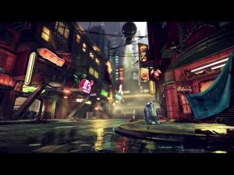 https://http://www.youtube.com/watch?v=X5uX5EiArVM&feature=c4-overview&list=UU1DADH8l7uI6upRxK7G_nXA"]http://http://www.youtube.com/watch?v=X5uX5EiArVM&feature=c4-overview&list=UU1DADH8l7uI6upRxK7G_nXA[/ame]
Final Image:

Hello Guys and Girls, So this in my new environment I have been working on for last few weeks and I'm at the stage now where I'd like to show it off to you guys for some feedback. Now this is still WIP and I will list what needs doing.
I only have a few more weeks left on this and would really appreciate your feedback and comments to make this a kick ass piece for my portfolio.
So First off id like to say that I've been using the star wars 1313 concept art they done(http://www.giantbomb.com/star-wars-1313/3030-38490/images/). Now I have seen this environment done many times since I began this piece and hope that mine stands out above the rest and I would like your help to do that!
So without further ado here is what I have so far:


So this Is what needs to be done:
With that said Please leave comments and feedback and I high appreciate you coming to check out my thread thank you.
Video (Please Watch HD if you can):
[ame="
https://http://www.youtube.com/watch?v=X5uX5EiArVM&feature=c4-overview&list=UU1DADH8l7uI6upRxK7G_nXA"]http://http://www.youtube.com/watch?v=X5uX5EiArVM&feature=c4-overview&list=UU1DADH8l7uI6upRxK7G_nXA[/ame]Final Image:
Hello Guys and Girls, So this in my new environment I have been working on for last few weeks and I'm at the stage now where I'd like to show it off to you guys for some feedback. Now this is still WIP and I will list what needs doing.
I only have a few more weeks left on this and would really appreciate your feedback and comments to make this a kick ass piece for my portfolio.
So First off id like to say that I've been using the star wars 1313 concept art they done(http://www.giantbomb.com/star-wars-1313/3030-38490/images/). Now I have seen this environment done many times since I began this piece and hope that mine stands out above the rest and I would like your help to do that!
So without further ado here is what I have so far:
So this Is what needs to be done:
- Finsih off the ground texture and models
- Finish off the signs texture
- Make the background buildings Add more dirt / Vertex painting / Decals
- Add dynamics to the scene e.g. moving drone, flying vehicles (distance) Effects and more small details like dirt on the floor and smoke flowing across the scene.
With that said Please leave comments and feedback and I high appreciate you coming to check out my thread thank you.
Replies
I'd echo the comment on the DOF, feels way too strong. I'd tone that down quite a bit.
Great use of lighting.
I second what's been said so far.
Once you get to polish phase, I would think that a lot of the buildings would dump/vent into the street so that you have a lot of particles in the air.
Can't wait to see where this goes
XaKu - yeah what you said will be done later
lukepham101 - Thanks alot! I've changed my DOF settings now and upped the gloss on my R2 he sits better in the environment now
MartinH - Thanks for the comment, the fire trash can idea is in the concepts and thought I had to get it in there
NomadSoul2501 - Thanks, ive tried pushing the light even more today ( maybe to much?) and yesah im going to be adding in vets on the floor which will be a starting point for my particles
Here is new update, going to try and update this thread more regular compared to my old thread as I hope fore more awesome feedback
I've added in the ground today to fill up that dead space in the image, I'm going for this damp grunge feel as its meant to be set underground so there would be allot of smoke and condensation on the floors etc.
I've also tried the vertex painting today, using the blend layer, for the building on the right. this helps break up the cleanness of that building.I kinda miss UDK's vertex painting in real time but it gets job done.
Still lots to do which I mentioned in my last post
Crits and Comments please. Thanks for looking!
Mostly all buildings are made up of 2 textures and the whole scene contains around 6 textures so far not including my R2 unit. I've took this approach so that I could create assets faster and get a largely familiar feel to each building. It also helps with memory so I can push higher poly counts.
Here is the scene updated:
Here is a close up of my R" unit, he has a POM on his body in engine to make him look higher poly.
Please comment and give feedback, Highly appreciated.
Thanks for viewing.
Looking forward to seeing more
You might want to play around with making the purple a different specularity intensity. As if the paint reflected differently than the rest of the metal.
Overall, your spec/gloss might be a bit too uniform, try to grunge it up a bit without altering the diffuse too much.
Keep rockin'!
Two comments after seeing the concept :
- Composition could be a bit better in your picture I think. Of course it's hard to say with the end still wip but you got very bright emissive lights everywhere, they tend to really attract the eye. You could guide the eye in a straight line towards the end of the road by playing with their intensity. You could maybe do some sort of gradient : the nearest light would be the lowest in brightness, the farthest would be the brightest. That would ease the navigation in your picture. In the concept, most emissive are not really strong, leaving the eye to wander to the bright white space.
- Second comment is actually related to the first. You don't really have any "verticality". It could be a simple town with a very big thing far away. In the concept, there's no denying that the building we see are very small in a huge space and are located at the very bottom. It also helps the composition. It's not only at the end but also on top of each building. You listed the end building in your to-do list though so that may very well be a useless comment.:)
Looking forward to seeing it finished!
Could you outline your process a bit?
I'm currently on a similar model (NY themed sidewalk) and would love to see your approach
I'm still not digging the R2D2 unit, I think it's just your specular map that needs work to define what is reflective and what is not. For example, that top part needs to be more reflective, something like an environment map would help that getting that look down. If you contrast the colours between the top and bottom to grey on top and white on the bottom too I think it'd look better. Also, my mind is just rejecting purple R2D2, I think it'd be better if you changed that to a more blue tone. It's just a step away from being pretty good to freaking epicccc.
leleuxart - Thanks for the crit I really do need to go back into it all and dirty everything up!, however I'm just focusing on getting the main elements done, I got a bit burned out today so focused on other crits for now
OnionCake - I've pushed it more to look like the original R2D2 now with the colours and I have played with the spec to try and break things up more, but may have to grunge him up some more (image below).
serinayd - I've tried to push the atmosphere today and have a play around in the particle editor in cry engine, hoping to get this really misty steamy street, may have to push it further, you can see this below.
Madwish - Thanks allot for the comment, I've tried to alter the composition of the shot some today, more in-line with the concept composition. Not sure if this works so please feel free to say
I really liked your idea with the light gradiants guiding the player and have tried to adjust them today to help with that, may have to tweak them even further though.
As for the verticality comment, I'm abit unsure what you mean. are you talking about the buildings in the distance? and the roofs of the close up buildings? Thanks again for commenting.
NomadSoul2501 - Ive added in an image below for you, but basically I created simple tiling pattern in Maya using simple cubes, I then went on and created the high poly in Zbrush (shown below) and once baked and textures I created a height map for POM in cry engine to create more depth. I hope that helps you? if you need more info please say
lukepham101 - Cheers for comment, I have changed him to his original colours now and improved the spec on him, I've also took a screen grab out of cry engine as its got a much better cube map on him.
So onto the updates for today
Please keep the feedback coming on anything your unsure of in my work
Here's an update been working more on atmosphere and finishing up on the signs, I've also starred blocking in back building now and adding in a flying droid
Wippy:
Please leave comments and feedback please highly appreciated
I only see a problem with the concept, they used many characters and spaceships and stuff to get the image dynamic, and the imperfectness of the 2D medium is certainly not achievable with a 3d environment, so id highly suggest adding a lot more random props and junk and whatnot than on the concept is given to make the scene vivid and believeable.
Just maybe try out a light blue instead of the green light to have better contrast and add some poison green on smaller things as highlight to not miss out that variation the starwars scene wants
Looks good, I do agree with Shrike the scene is a bit empty and it's quite clean for slums add some trash and debris a long and it will bring some believability to the slum concept. Other than that great work!
Borgleader - Thanks alot mate, glad you like it
lukepham101 - thanks mate, I've still got more work to do on the R2 unit but im leaving it now until rest of the scene is more finished.
levigilbert - Thanks alot I've been working on atmosphere quite abit lately for a break from the art side, bgeen nice and relaxing and learned moire about particle editor in cryengine
serriffe - thanks mate, still ways to go yet but coming to all the small detials now
Shrike - Thanks for the feedback, I've still yet to do all the small props of rubbish and boxes but yeah im glad you pointed it out. When you mention blue light you mean the dominant green light on the floor?
Twotents - Thanks for the comment, much of what I said above, its all coming
Not really much of an update to show you guys yet but thought I had to reply to your great comments
Not sure if what I've done makes it any better, anything new at the moment makes it look better to me...im too close to the project! More comments would be great
Also finished more of the back building. busy day today so not much progress.
Keep the great feedback coming!
A little "tip" to judge your work is to keep lots of printscreen from roughly the same place in photoshop and add them on top of each other. Then when you want to see the effect of your new work, toggle on/off the last layer. The eye is very good to quickly tell you which one works better and how much exactly.
And some comments :
- I'm not a fan of the green light on the ground. It kinda kills the reflection effect of the yellow sign next to it because it's so big and I can't see where it comes from at first glance. Plus it's quite bright and saturated so it attracts the eye quite a lot. I think it would look better without it.
- I like the idea of green for the end of the alley, but it seems a bit too much right now. Maybe something a tad more subtle. Same for the fog effect, maybe using it closer to the ground would help. Might just be me though.
- Like the flying robot, but I didn't see it at first. In the concept, it's one of the brightest spot and it guides the eye well. Maybe you could put him higher and make its light brighter. Blue and orange leds like in the concept would be cool too.
- You got a lot of glow effect on the very far end, it doesn't really look natural. There's a lot of informations using very few details in the concept, with a nice gradient dark to light. Only the very top part is as bright as yours and it has a nice futuristic shape. Flying cars are cool too, but I don't know if it would work in your scene.
Keep up the good work! Like it a lot. :thumbup:
I love the little mech and I absolutely love that stone sculpt and texture, perfect balance of normal and diffuse detail noise.
keep it up dude.
Borgleader - I'm uploaded .PNG but imgur seams to compress them quite abit, any tips?
Madwish - Thanks for the great feedback, I have removed the green light on the floor which has helped remove that glare you was talking about and I feel your eye is being guided more now. I've tried moving the droid higher in the air and the glow effect is abit stronger, the droid is moving in the scene so its glow changes from time to time as its passing through particle effects. As for the glow effects I've tried to tone all of them way back.
[HP] - Thanks for the comment I've really tried to push the lighting away from being so flat, I've drifted away from the concept abit in terms of lighting but I'm liking my direction, what do you think? I've reduced how bright the background is when creating the buildings. This has added depth to the scene and now hopefully looks less flat.
Thanks for the comment on the sculpt, not done much work in zbrush so your comments really help. also I've tried to make the diffuse really flat looking as cryengine really doesn't need alot
So here is where my scene is so far hope you guys like it.
Please keep the crits and comments coming highly appreciated!
Blaisoid - I have tried to warm it back up again in this update.
Chillydog12345 - Not sure what that is but hope its good! lol
So what I've done today, is try and warm it up some more and toned down the blue, so its abit more in-line with the concept, it needs to be more brown but doing this adds alot more contrast in the scene that I'd like and not getting the right balance yet.
I've also started adding in posters and dirt layers to the floors and walls. I've also created some crates to help populate the scene more and give more depth, along with changing a few lights to increase the depth on the left hand side.
Adding in some more effects such as rain and sparks, this goes well with the puddles on the ground. seeing as this is meant to be underground I see the rain as more as a moister from every building falling down so I've tried to make it quite subtle.
So here the up date:
Please leave comments and feedback, highly appreciated
based off this http://static.giantbomb.com/uploads/original/4/48227/2293590-gallery_3.jpeg the contrast of warm tones in the light and the cool blue tones in the shadow and background work really well together.
YOUTUBE LINK TO STAR WARS EP II - ATTACK OF THE CLONES UNDERWORLD SECTION
http://www.youtube.com/watch?feature=player_detailpage&v=hElmALWGFJ8#t=376s
Or maybe I didn't follow the conversation properly?
Oniram - The haze is hard to judge on the static photos in the scene when its all moving it does feel alot more polluted, I've also changed the colours to be alot more warmer and brightened up the scene as it was to contrasting.
chrisradsby - thanks for the image and video! I've gone abit more warmer in tone to match the concept abit more now, I prefer nice blues etc but seeing as I'm following these concepts I may as well try and get the general feel of the lighting more. Struggling to match it completely but think im going in the right direction now.
Borgleader - not sure I understood your comment but my lighting change is more in line with concept now I believe.
I have changed the lighting again today by making it alot more warmer in tone and brightened it up,I probably can push it even more but I'm going to finish up making it dirty now as its far far to clean.
Please leave feedback really appreciate it!
Props/otherwise looking cool! But I agree with others, Atmosphere needs work (including the background
Some Nar Shaddaa footage from TOR
[ame="
Looks great so far though.
pixelpatron - your right I've added in more details to the hanging wires now and adding it some more details such as table and chairs in far building etc.
s620ex1 - you was completely right with the background, I still have more ideas to add to bring it more in line with the foreground but I've added in alot more pipes which I think is a step in the right direction.
The Mad Artist - I thank you for the link and comment and have tried to bring it abit more in-line colour wise but alot of conflicting ideas and feedback I' trying to find a middle ground and find a direction I'm happy with.
Chillydog12345 - Ahh I didn't realise! that's good then
So this update I have tried to balance colours and lighting, add more details which I've detailed above, hope this is an improvement and I'm happier now with where its at.
Thanks for all the feedback, keep it coming!
Are you planning on adding anything more to the ground?
The place looks lived in now, the torn cloth, the broken sign and the dirty windows are telling a great tale of this place. But wouldn't there be stuff on the road too?
I think some debris would look cool.
Cheers
So today's update was adding in more grime to the scene as a whole and feel like its going in the right direction now, with the added props on the floor I feel its starting to feel more slum like.
Please leave comments and feedback, I feel like I'm getting close to the end now.
I'm calling this done now and only have a few more days left on it anyway its been a real learning experience. Ill talk about about what I wanted to achieve during this project and how I went about creating this piece, also giving self crit to help improve my work in the future.
To start I broke down my concept (star wars 1313 concept) to see what could be reused. I then blocked out 2 textures to be used as my main modular texture and main tiling texture in my scene, these was used to create a variety of assets in my scene, you can see these textures and assets below:
I believe this approach has its pros and cons which I discovered throughout the project. Its very good at making quick assets and getting your scene filled out quickly, efficiently and consistently. it also helps that you can vertex colour your assets to get different colours to stop the repetitiveness of the scene. But I have found that it becomes very tedious as an artist and quickly felt myself longing to create unique props as the process started to take its toll on me and I started to lose motivation. More unique assets could fix this but I hadn't planned to do enough of these and started running out of time, this is something I will take on into future projects.
I started by creating the main buildings on the left hand side of the concept and began with a simple block out of the street, My initial plans was to just create that one side to keep this small but as mentioned above, using this modular texture approach I began quickly blocking in the other side to get a much more interesting composition for my final shot.
Now that I've told you a tiny bit about what's going on in my head, I found this to be useful for myself as typing it up helped me realise mistakes I've made and also helps other artists out there that want a deeper look into the process of creating the environment. If anyone wants to ask me any more questions on anything as a whole or show examples more please comment and ill do my best to explain.
So here are my final images and also a fly through of my environment I hope you guys have enjoyed seeing it progress and hope you leave comments and feedback so that when I have spare time ill be able to go back and correct certain issues.
Video (Please Watch HD if you can):
[ame="
Final Images: