Home 3D Art Showcase & Critiques

Future SMG - trying to improve

polycounter lvl 8
Offline / Send Message
Luke003 polycounter lvl 8
Latest Update:

9480149808_3986a5f73d_o.jpg

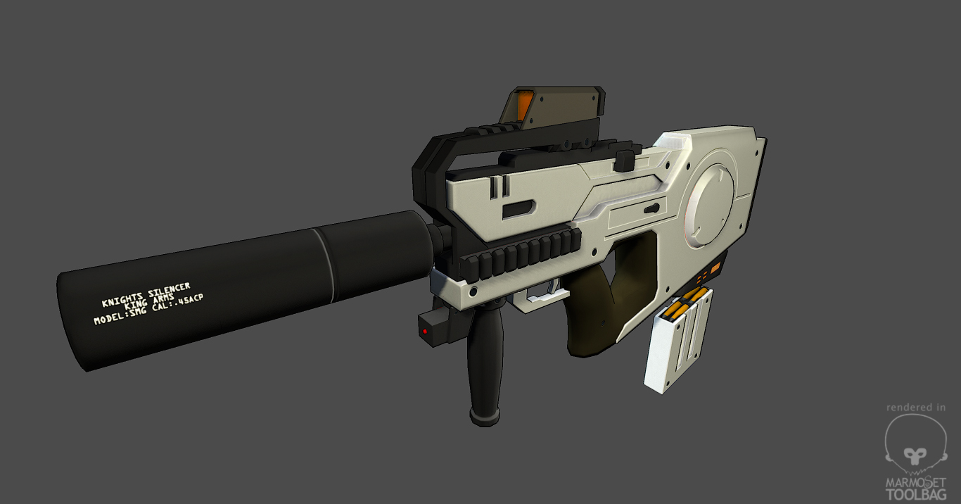
I have been working on this model for a while now, showcased primarily in my sketchbook. Now I think it's time to introduce it to P&P and get some proper feedback. I'm still trying to get better at this, and this is definitely helping. I really think my texturing skills need some serious work. Anyway, pardon the massive pic dump, but here it is.

The model is based on this concept by Adam Baines:

F48.jpg

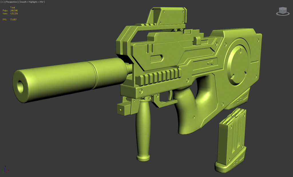
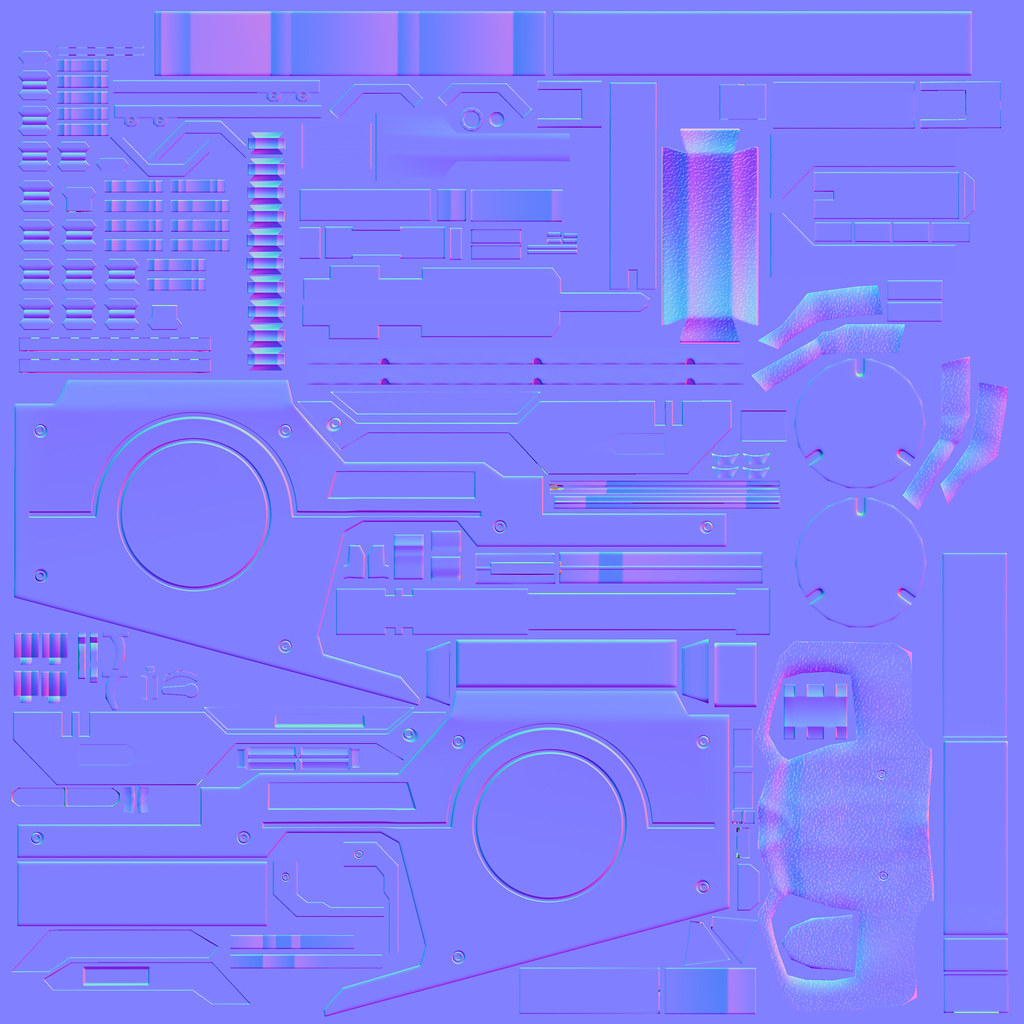
Here is my high-poly:

8549279854_4d3955397e_b.jpg

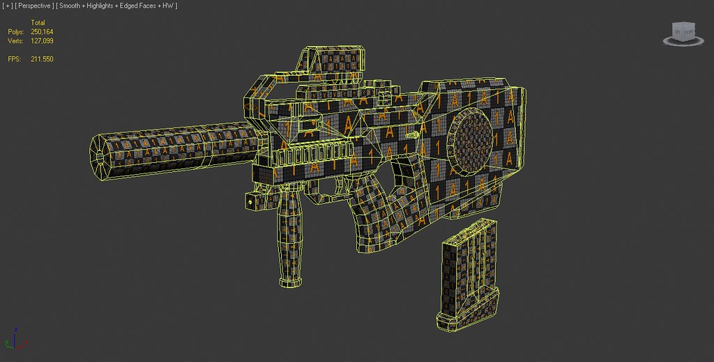
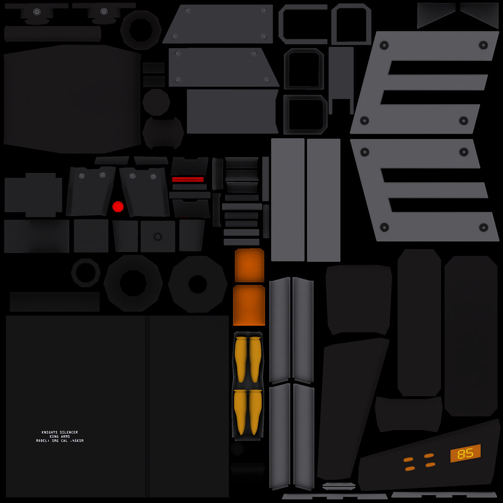
Here is my low-poly (during the unwrapping process):

8569320338_761555bfaa_b.jpg

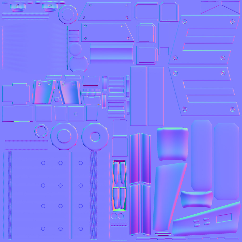
Here are the maps I am working on:


4k for the body
8618635567_4507b0052b_b.jpg

8618635385_a50fdb36b6_b.jpg

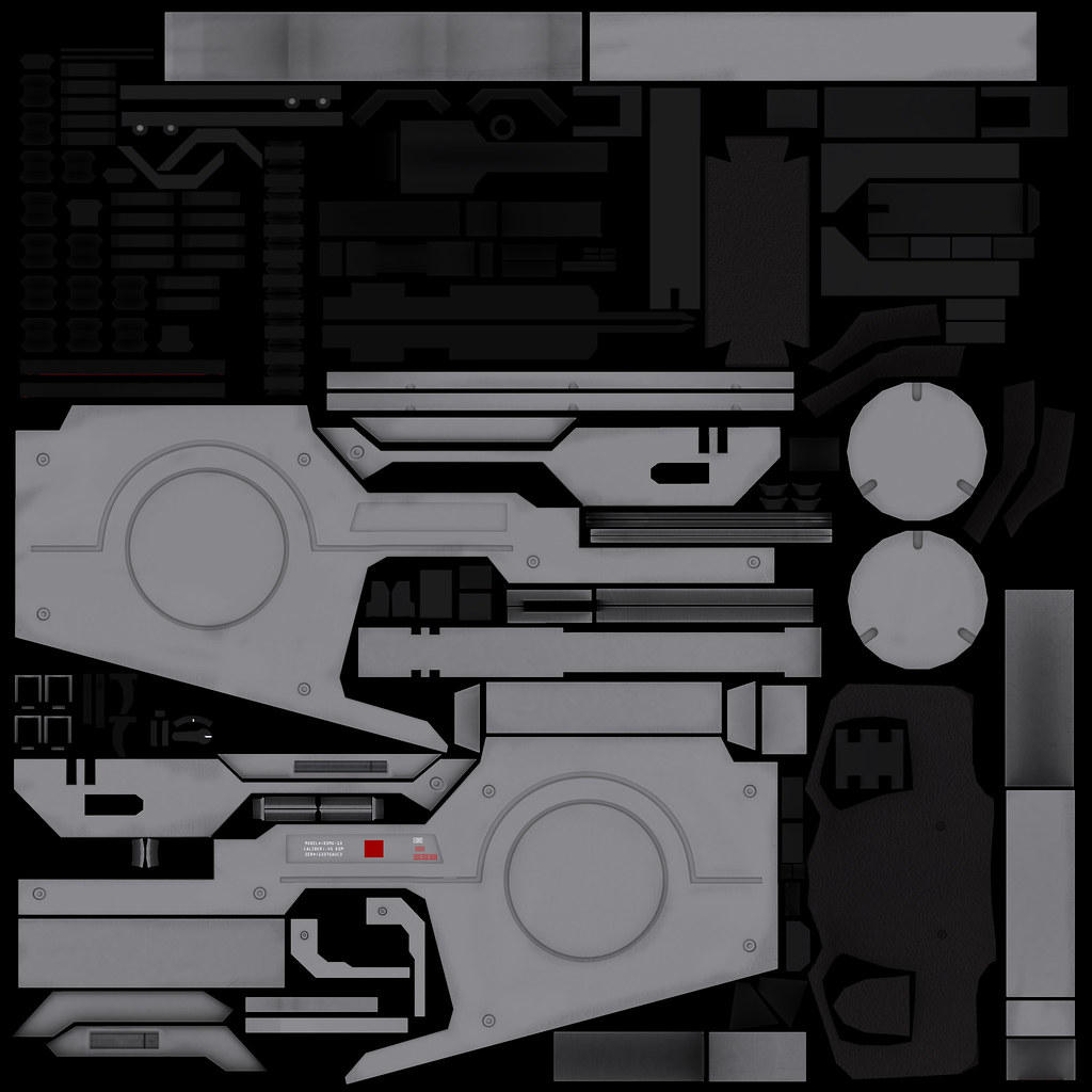
2k for the accessories
8619740240_ee1e9a0c6a_b.jpg

8619740166_a6ecd3b5aa_b.jpg

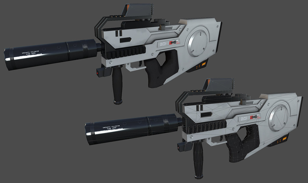
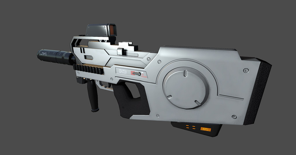
And this is what it looks like so far:

8613247131_b0f25e6fb4_b.jpg

8618663937_1fabc778e6_b.jpg

8619769192_664dcf7ebd_b.jpg

I am in the process of refining the spec/gloss maps, and finishing up the other maps.

This is only like my second "legit" model, and I can see I'm improving. But I have a looong way to go. I really need some feedback though, because I really want to get better at this. Thanks for checking it out. :)

Replies

  • r3spawn
    It looks great, but maybe a bit too shiny, makes it look less real
  • CougarJo
    Offline / Send Message
    CougarJo polycounter lvl 6
    The only thing that bother me is that you've made the upper rail horizontal. On the concept it is slightly inclined, giving a more aggressive feeling to the weapon.
  • RobbZ3D
    I agree with CougarJo, it's looks decent so far. It is ok to wander off from the concept just a bit to make the model look more interesting, however you should def always try to keep the actual silhouette as close the concept as possible.
  • Vertrucio
    Offline / Send Message
    Vertrucio greentooth
    Also, every single corner on the model has the exact same hard edge. Go beyond the concept and vary up the edges where appropriate.

    You're also missing some stepped beveled areas near the middle top of the gun.
  • snoops3d
    Offline / Send Message
    snoops3d polycounter lvl 12
    yeah I totally agree with vertrucio: your edges are actually harder/sharper than what is represented in the concept look a the top of the stock, if you give them slight more rounded bevel the lighting will pick up on those edges a bit better as well helping with high lights and adding more interest to the look of your model.
  • Luke003
    Offline / Send Message
    Luke003 polycounter lvl 8
    @r3spawn - Thanks! I definitely think it's too shiny right now. I have the specular sharpness turned up 100%in marmoset so that I can tweak the gloss map correctly. As a result, most of it looks way too shiny because I haven't gotten to it yet on the specular side of things.

    @CougarJo - Thanks for the feedback. That was one of the first hurdles I tackled. I consciously made the decision to straighten that part of it because I felt like it made more sense functionally. Maybe that was a mistake?

    I felt similarly about the feeding part of the magazine, but I left that unchanged in my hastiness to finish. I figured maybe since it is the future, maybe the risers used some future non-ferromagnetic system which allows you to feed four different ammo types and select them individually via the control buttons on the butt of the magazine (read: lazy) But I just figured that was one of the pitfalls of following concept art. What do I know anyway? I'm very new to this whole thing.

    Should I change the rail to match the concept, or stick to my guns?
    <--pun

    @RobbZ3D - You kind of answered my last question. It does change the silhouette a bit.

    Would it be difficult to go back and change that at this point? (Like, what would happen to my maps and bakes etc?)


    @RobbZ3D - I see what you mean about the beveled part I missed. I think I got a little confused when I was looking at the drawing trying to plan that part out.

    @snoops3d - That sounds like good advice. If I can change it without significantly setting myself back, I will make sure to do that.
  • CordellC
    Offline / Send Message
    CordellC polycounter lvl 11
    Definitely need some chunkier edges -- they are much too tight right now. You'll get a much better bake and a vastly improved model.

    Here's an image from racer445 that gets posted around here a lot when it comes to tight edges: hcL91Aw.jpg
  • Luke003
    Offline / Send Message
    Luke003 polycounter lvl 8
    @CordellC - I've seen a lot of really good weapon posts on here with really good looking rounded high-polys, and their bakes are beautiful. I definitely screwed up on that front.

    Is it worth it at this point to go back and redo the high-poly and then re-bake everything?

    Originally my edges were SUPER tight, and I loosened them up a tad, but obviously not enough. I think I was worried about the fact that a lot of the edges were close together and the edges wouldn't be defined.

    8622115428_893f5c38d9_b.jpg
  • Xoliul
    Offline / Send Message
    Xoliul polycounter lvl 14
    Hah sweet, I used to work with Adam.
    Gotta echo the rest, WAY too sharp on most edges.
  • Benton
    Other then the edges, it needs some more bad-ass-afacation. Could probably do that with the texture.
  • RMeeks
    The way the bullets are in that magazine seems really odd to me. Do things like that exist in the real world?
  • Amsterdam Hilton Hotel
    Offline / Send Message
    Amsterdam Hilton Hotel insane polycounter
    Luke003 wrote: »
    Originally my edges were SUPER tight, and I loosened them up a tad, but obviously not enough. I think I was worried about the fact that a lot of the edges were close together and the edges wouldn't be defined.
    it is important not to swing too far the other way and get the blobby- or soft-edge look, like you drew in that img. the ways around it are to use more support loops for each edge (it generally takes two, not one) and sometimes to actually chamfer the edge and add supports for the chamfer. sometimes when things are very close together you can get away with fewer supports, and sometimes things are so close on a concept or a real object that you just have to space them out more, but that should be considered a backup option. i'd say looking at this that you should be able to expand most of those edges without conflicts.
  • Luke003
    Offline / Send Message
    Luke003 polycounter lvl 8
    I'm working on a better version of the high-poly, taking all the feedback into consideration. I really want to avoid making it blobby, so I'm spending some extra time tweaking it. I'll upload some new screenies asap.
  • Luke003
    Offline / Send Message
    Luke003 polycounter lvl 8
    It's been a rough couple of weeks, and I haven't been able to work on this as much as I would have liked to. But I'm back on it and I have been grinding my gears on the sharp edges topic. These are some screenshots of my current progress at loosening some of the edges, but I'm not sure if it's too much or not. I'm starting to think it looks too blobby, but lessening it kind of makes it look like the previous version. Am I on the right track?? (Ignore the holes, notches, and rear. I haven't gotten to that yet.)

    8662594931_47cc13f2f6_b.jpg
    8662594981_b9d596fbed_b.jpg
  • Luke003
    Offline / Send Message
    Luke003 polycounter lvl 8
    Back at it, after a bit of a hiatus. Loosened up some of the edges, and adjusted some things to help the silhouette. This is the version I am going to move forward with and bake. Should be good texturing practice. I've already learned a couple of tricks that should help make this much better than my first attempt.

    8933258206_8976617ddd_o.jpg
  • Luke003
    Offline / Send Message
    Luke003 polycounter lvl 8
    Finally getting back to this. Tweaked the hi-poly a bit and messed with the cages to get some really decent bakes. I've noticed that my bakes are cleaner through Max RTT over xNormal, but I think that has a lot to do with my inexperience with the latter. These are Max grabs with Xoliul's Shader.

    9254024675_722f40b507_o.jpg

    9253982499_68aa37739f_o.jpg

    There are a few bake issues I'd like to fix, then I'm going to start texturing tonight hopefully.
  • VeeJayZee
    Pretty rad design there, dude. As to what I'm seeing, you can beef it up some and I think what can help you to do that is to add some geometry of the lowpoly on the cheek-rest of the butt stock. Although the normal bakes is good, it fall apart when a hard light hits your the lowpoly. Its a showpiece so don't be afraid to kick ass :D

    I'm looking at the lineart design and I think you can stubby-up the vertical grip; And don't forget those dent holes on it :)
  • Luke003
    Offline / Send Message
    Luke003 polycounter lvl 8
    VeeJayZee wrote: »
    Pretty rad design there, dude. As to what I'm seeing, you can beef it up some and I think what can help you to do that is to add some geometry of the lowpoly on the cheek-rest of the butt stock. Although the normal bakes is good, it fall apart when a hard light hits your the lowpoly. Its a showpiece so don't be afraid to kick ass :D

    I'm looking at the lineart design and I think you can stubby-up the vertical grip; And don't forget those dent holes on it :)

    Thanks, those are good suggestions. Most of my other proportions are based on the side view, so it would make sense to make the vertical grip shorter. Also, I wasn't aiming for a specific polycount and agree I can increase the amount of geo in several areas.
  • Shrike
    Offline / Send Message
    Shrike interpolator
    CougarJo wrote: »
    The only thing that bother me is that you've made the upper rail horizontal. On the concept it is slightly inclined, giving a more aggressive feeling to the weapon.

    Yea but actually thats stupid from the concept artist no ? If you would put on a normal sight, it would have a really disorted aim.

    Looking at the concept again, its a double fail because theres actually no
    way putting the sight on the rail. You didnt quite nail the exact proportions of the gun, but the concept itself dosnt have the greatest imo atleast, and its hard from side view and proportions are damn hard.

    I would suggest you try adding wear and tear which is vital to any texture, larger than life. Wear sells it, the base texture is pretty fine.

    Presentation is fancy, digging that, the background is not as modern and could be better, but the direction is cool , dont let them tell you to leave it out, if you never try you will never be great at it.

    But nice one, keep on modeling
  • Iciban
    Offline / Send Message
    Iciban polycounter lvl 10
    i have to ask, how do you get such beautiful bakes? mine has all these artifacts. Do you just keep messing with the cage until its good enough? So nothing is crashing through?
  • nak1411
    Offline / Send Message
    nak1411 polycounter lvl 8
    RMeeks wrote: »
    The way the bullets are in that magazine seems really odd to me. Do things like that exist in the real world?

    Hah, I was about to say the same thing. I would love to know how the bolt would be capable of loading that. I suppose this isn't "real world" though so either way, it looks great!:thumbup:
  • Luke003
    Offline / Send Message
    Luke003 polycounter lvl 8
    Shrike wrote: »
    Yea but actually thats stupid from the concept artist no ? If you would put on a normal sight, it would have a really disorted aim.

    Looking at the concept again, its a double fail because theres actually no
    way putting the sight on the rail. You didnt quite nail the exact proportions of the gun, but the concept itself dosnt have the greatest imo atleast, and its hard from side view and proportions are damn hard.

    I would suggest you try adding wear and tear which is vital to any texture, larger than life. Wear sells it, the base texture is pretty fine.

    Presentation is fancy, digging that, the background is not as modern and could be better, but the direction is cool , dont let them tell you to leave it out, if you never try you will never be great at it.

    But nice one, keep on modeling

    Thanks. I also agree that some of the proportions and things are a little off, but I'm not knocking it. It's a cool concept and I'm learning and having a lot of fun. Not to mention, this is the first time I've ever modeled something off of a concept like this and I'm actually a little proud of myself. Not content obviously, it still looks amateurish, but I am definitely seeing some progress with my overall skills.

    Wear and tear will definitely follow. Once I get a good base down, I plan to focus hard and learn as much as I can in regards to getting the maps to look really good.
    Iciban wrote: »
    i have to ask, how do you get such beautiful bakes? mine has all these artifacts. Do you just keep messing with the cage until its good enough? So nothing is crashing through?

    I'm flattered you think my bakes are beautiful. I still have a lot to learn about the baking and texturing process, so I don't think too qualified to give any actual instruction on the matter. That being said though, it is my understanding that the overall goal is to encompass the mesh with the cage and avoid any collision with it. So yeah, basically tweak it until it's good.

    Big ups to joeriv for helping me realize some things I just didn't know about tweaking the cages in max with this extremely helpful post.
  • jonincgi
    Very Nice Gun! I'm gonna read through this thread to get some tips. I'm also doing gun modeling.

    p.s. Any constructive criticism is much appreciated. :)
    http://www.polycount.com/forum/showthread.php?t=123104
  • Luke003
    Offline / Send Message
    Luke003 polycounter lvl 8
    I found a few minutes to work on this, but I wanted to get some feedback on taking the texture in a different direction. I turned on the outline in Marmoset and didn't hate how it looked. The sharp angles on my low-poly seem to accentuate that rendering style. What do you guys think about going with that sort of texture for it?

    9480149808_3986a5f73d_o.jpg

    9480149496_43a8f46605_o.jpg

    9477361179_35ff06d082_o.jpg


    Also what do you think of this kind of presentation style?

    9480148838_e139fc290b_o.jpg
  • s6
    Offline / Send Message
    s6 polycounter lvl 10
    That's a neat background. Ming sharing how you got that effect?

    And presentation looks good. Only crit might to be go more orange with the strip, or more yellow. Right now its kinda in between and feels kinda off. maybe more saturation? Otherwise, looking cool. HP this time around is much improved as well, So good job there.
  • Luke003
    Offline / Send Message
    Luke003 polycounter lvl 8
    s620ex1 wrote: »
    That's a neat background. Ming sharing how you got that effect?

    And presentation looks good. Only crit might to be go more orange with the strip, or more yellow. Right now its kinda in between and feels kinda off. maybe more saturation? Otherwise, looking cool. HP this time around is much improved as well, So good job there.

    Hey thanks, if I remember correctly, I created some difference clouds and then used a combo of paint daub, pallet knife, and poster edge filters until I got something that looked nice. I agree about the yellow, I am going to see how it looks with more orange.
  • s6
    Offline / Send Message
    s6 polycounter lvl 10
    Cool. I'll have to try that out :) Thanks
  • Iciban
    Offline / Send Message
    Iciban polycounter lvl 10
    the white base looks pretty clean right now. Maybe throw on some decals to add some love. a few scratches here and there. some battle dmg would be nice.
  • Luke003
    Offline / Send Message
    Luke003 polycounter lvl 8
    Iciban wrote: »
    the white base looks pretty clean right now. Maybe throw on some decals to add some love. a few scratches here and there. some battle dmg would be nice.

    Thanks, I haven't added any real details just yet because I'm trying to decide if the texture should have a kind of cartoony feel or if I should focus on realism. That and I'm trying to learn more about the texturing process. This is what the map looks like so far (ignore the red):

    9509146407_35987dd413_o.jpg

    9511937830_c7ed26a2be_o.jpg
  • Iciban
    Offline / Send Message
    Iciban polycounter lvl 10
    Bake looks so clean. You can go with boardlands style? First thing that popped into my head when i saw ur render.
    something like this?
    borderlands-2-physx-image8.png
  • Luke003
    Offline / Send Message
    Luke003 polycounter lvl 8
    Iciban wrote: »
    Bake looks so clean. You can go with boardlands style? First thing that popped into my head when i saw ur render.

    I think I am going to go with a similar style with this texture. Probably not as exaggerated, but definitely somewhat animated. I want it to go with the drawing as much as possible.
Sign In or Register to comment.