Cool Man
polycounter lvl 9
I had started a thread called Cool Man but I can't find it anywhere...
Here it goes again.
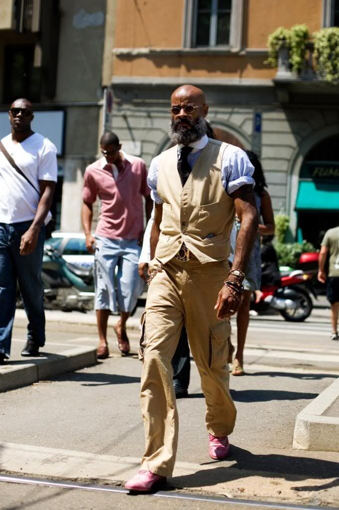
This is a new project I started after seeing this image. That guy is the definition of "cool"! I'm still not sure if I want to reproduce the same thing or add my own touch to it.
Here it goes again.
This is a new project I started after seeing this image. That guy is the definition of "cool"! I'm still not sure if I want to reproduce the same thing or add my own touch to it.
Replies
Just go into you profile and look at the threads you have made.
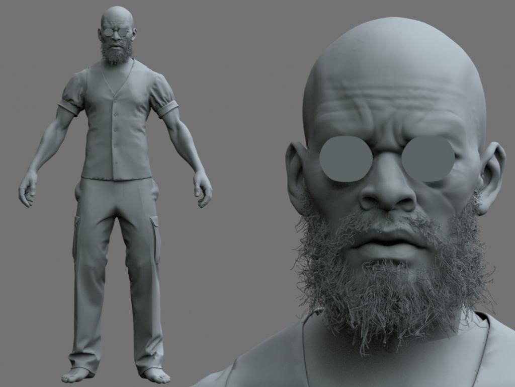
Nice start you have on this, I think the cloth around the shoulder needs to be puffed up more to match the reference.
Would be nice to see the face without the blockout classes, since you will be able to slightly see through them.
Hope that is of some use.
1. In the photo, the dude has a bit of an angry grimace going on that pulls his upper lip up and out, resulting in an inflation of the form above the nasolabial fold that really catches a highlight.
2. This character is bald, and hes got a pretty distinctive cranium. It wouldn't hurt to exaggerate the angles up there so you can really read more of the planes that make up the top of the head.
The others touched on the cloth, and I tend to agree.
1. The sleeves have an awesome silhouette in your reference. Its almost as if his coolness is exploding out of his shoulders. I'm not reading any of that in your sculpt.
2. In addition, the amount of cool that this man possesses is much to high to be contained by that tight vest that you've sculpted, loosen it up a bit to fill out the negative space around his torso.
Despite those critiques, you're really on the right track with this one. Awesome subject and awesome execution. I can't wait to see the finished product.
may be Marvelous Designer ?
the thing about cloth sim is that it creates this shrink wrapped feeling which yours has and lot of the folds are static and lacks memory folds.
so you have to manually sculpt in those folds and create that loose dynamic drapery with lot of memory folds.
anyways, really nice start on the character. the face is looking good.
Stromberg90 - Thanks, I was used to just search for my thread since it was quicker but when I search for "Cool Man" I can't find a thing weirdly... Oh well! You can see the head without glasses. The eyes are too symmetrical right now.
Giacomo X - I'm working on the clothing to have it less shrinked onto the model. For thing like the rolling of the sleaves, I'll do that in zbrush later.
Brandon.LaFrance - Thank you! I've worked on the head's silhouette. I'm not trying to get the same exact character down to the smallest detail. I'm working on the cloth right now. Anything I can't do in Marvelous designer I'll do in Zbrush and photoshop (bump map).
amile duan - Thanks! He just looks super manly and has pink shoes. Fun contrast.
MM - Thank you. Yes, it's done in Marvelous designer. I'll get as far as possible before getting into Zbrush.
Here's the head so far. This is just the high res model that I'll bake on the low res. The beard will be changed so don't mind it. I wonder how I'll get a good beard in low res...
drawingyourdreams.com
It seems like your upper arm is too short, and overall too skinny. Generally the joint is just somewhat above the navel, and you can see much more of the triceps from the front view.
I think your torso is too short and rib-cage too narrow, causing some problems in the armpit region.
And finally, your upper legs are too short in relation to the lower legs.
From the great Glen Vilppu, here's another reference I like to use for general anatomical proportions:
Edit: I'm sorry, that was confusing as hell, each cyan line corresponds to a magenta line on the OPPOSITE side of the center line. Just look at this reference from Scott Eaton:
Thank you Brandon.LaFrance, I guess looking at the character for too long made me forget the important things like proportions! I did some corrections and used my Anatomy figure from the Grnomon workshop as a guide so it should be OK now.
Ouf! I was trying to do the most today so I could add to my job application. Time for bed.
The guy is a fashion designer if I'm not mistaken, so I wouldn't stray too far from the design of his clothing. It's missing a few fine details, after which, I think it will look very impressive. great work so far.
"The guy is a fashion designer" I don't understand who you're talking about. The character I'm making?
I started making a gun with dynamesh for my character. Almost done.
The reference image you're using is a pretty recognizable image of fashion designer Kevin Stewart. I can tell you're trying to change him up a bit (this is especially evidenced by the gun you're gonna give him...) but when it's an image so many people will recognize I don't know if it's that good of an idea. Or maybe not as many people will recognize this as I think.
they look too bulky for his body type and very inconsistent in general anatomy.
the feet/shoes could also look better if they were slightly smaller
only way to show is a paintover:
also, the cloth sculpting needs to be brought up to par with the cloth simulation.
for example, the rolled up sleeves don't really look like rolled up cloth at the moment. also some memory folds behind the knee would make more sense than the long vertical simulated folds being created there right now. unless the character is suppose to always stand upright, those simulated folds wont work.
take a look here to understand what i am talking about in regards to memory folds behind the knees.
http://www.mightyartdemos.com/mightyartdemos-bradley.html
scroll down and look at "memory zigzag folds"
http://www.thegnomonworkshop.com/img/products/figure_03_main.jpg
I worked some more on the KSG shotgun. It's the first time I've used Dynamesh and I'm sure it's not the last!
I still need to add a few elements on it.
note the volume of knees and feet. even in main photo reference you can see that the knees are not that bulky.
the knees on your model are just too bulky for a man of that height/build.
here is a photo reference from different angles that would help:
(nudity warning) http://www.posespace.com/posetool/showcontact.aspx?sku=edison023
Evil raz - The beard was done in 3dsmax with Hair&Fur. The render was done in Vray with the VrayHairMtl. I used low res version of the head to grow the hair on and used a density map to set where the beard grows. I used a lot of kink and hair segment.
You can see more high res images at my website: www.oliviercg.com
in ZBRUSH?! My jaw just punched a hole through the floor.
Procedural Materials on High Poly or a real uv + texture ? Did you use SSS for the plastic ? Which DOF are you using there ? It is really strange
Thanks Shrike! Once I was done with the dynamesh in zbrush at a high polycount (I ofter used 2048 to generate the dynamesh per subtool) I made a copy of each subtools and redynamesh with a much lower resolution (around 256). That gave me meshes I could UV and project onto the highres dynameshed versions. There's no SSS. The plastic parts have a IOR of 1.6 and the metals 4.0 (I think). And I just plugged in the dDo maps. I used a Vray physical camera with the settings below.
Thank you Arod529! I'll be making a low res for it soon.
Here are the settings for the camera. Also, an image of what I created in 3dsmax to create the iron sight attachement at the top. It was the most complicated object to create. The process made it simple. I would make 2 or 3 objects in 3dsmax at a time with simple primitive or splines/extrude/shell to create more complex one and export to zbrush.
I took the same approach in the "Radio" tutorial
http://pixologic.com/zclassroom/homeroom/lesson/military-assets-with-joseph-drust/
The difference was in the dynamesh settings. I used "Project" and a "Smooth" of 0. After I was done with the subtool, I did a small Polish.
Given MM's history of work vs yours, you could stand to learn a lot from him (we all could), particularly in the area of character design, which given your female knight seems to be an area of struggle for you, vs. an area of strength for him. It's also clear looking through your portfolio that your anatomy is okay, but not particularly strong, and it might be frustrating for you that MM's keen eye brings some of these issues to light, but that's not his fault, he's just being a good critiquer.
Don't mean this to be offensive, just an observation. Good luck.
That gun is looking awesome, and I'm impressed you built it in zbrush.
I don't like comparisons between artists. Frankly, I don't think it has it's place in a CGforum. This being said, I more than based my character's body type on an anatomy figure that I meticulously photographed so I could almost trace it. An anatomy figure done by Andrew freakin' Cawrse, master of anatomy modeling, let alone proportions. If he did make a mistake in the proportions of the model I bought, so can I make mistakes, and you, and MM, and just about anybody else. I'm sincerely not trying to offend anybody, just to make a point.
Choosing one body type or another, both done by Andrew Cawrse, is only a matter of personal preferences. I'm not gonna change body type because some prefer it over some other types. Just thing about If I would change to the body type proposed by MM, and later, some other artist tells me I should use another body type also done by Andrew Cawrse backed by the exact same arguments you guys previously used. What makes him right to say the body type you and MM chose for me was wrong?
MM wasn't proposing a different body type, he was suggesting that you should make yours consistent and proportionally coherent throughout, since it would be extremely strange to see a person that thin with legs like that, and arms, and other parts.
And as pointed out now several time, your anatomy is wrong in place. It's not that you chose a bad reference, like you keep going on about, that's a great reference you chose, it's that your eye for anatomy is not the best, so you interpret the anatomy wrong, and it ends up wrong on your model. Just because Andrew is a master and you based your work on his, does not make you a master.
It's plain to see that you have some strange anatomy there, particularly like Gir said in the arms, the torso, and the legs.
This is not just a problem with this model, but ALL of the models in your portfolio, and generally in the same places with each. Arms, legs, torso, and for some reason your butts are very very strange.
_______________
It's not bad to make mistakes, its bad to be blind to them, and to argue about it to protect your ego. That's what I think is strange about the way you dismissed MM and others.
That's enough. If you wanted to deeply hurt me, you did a great job. And I'm not in a sarcastic mood so believe me when I say that I was sincere when I said that.
As an artist, I wouldn't recommend saying things like that or even thinking them. Be able to and humble enough to recognize when critique is coming from a credible source. If you're going to dismiss such critique, make sure you do due diligence before doing so.
Not a character artist but I like MM's paintover better. Perhaps because he slightly enlarged the penis bulge.
Your guy doesn't look like he squats or deadlift or legpress or any exercise that would make his legs look like that, because I'm looking at the rest of the body and it just doens't make sense, especially with heavy teardrops, which should slope inward more. If he has bulky legs, the rest of his body would also transform. Quite frankly you have way too much tapering at the joints in the arms (brachii radialis and the flexors look way too curved inward) and his ankles too.
MM's critique is spot on. Now you can choose to ignore it, which is cool too, artistic license right? But it would actually make your model's mass look better and the how the cloth drapes over much better if your anatomy is solid. Just something to think about. Peace!