[WIP] Sci-Fi Hallway
LATEST UPDATE:
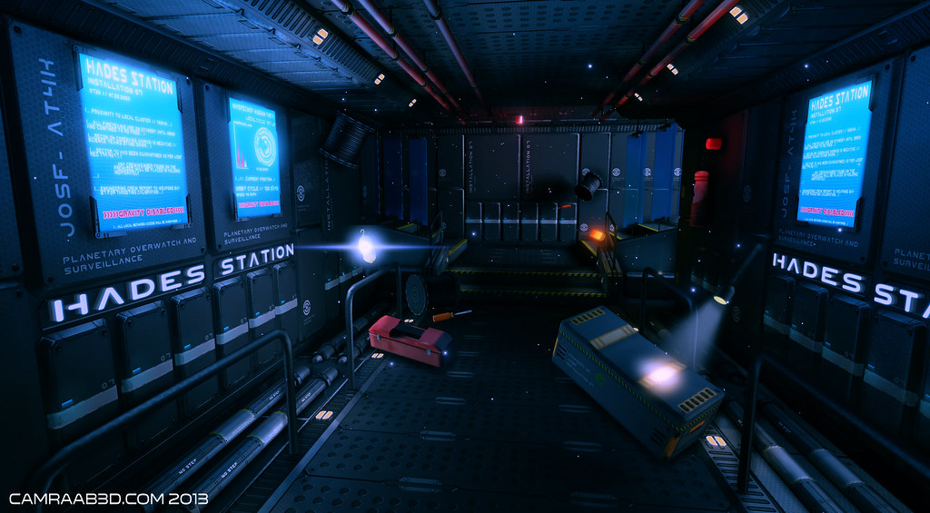
Sci-Fi Hallway2 by camraab, on Flickr
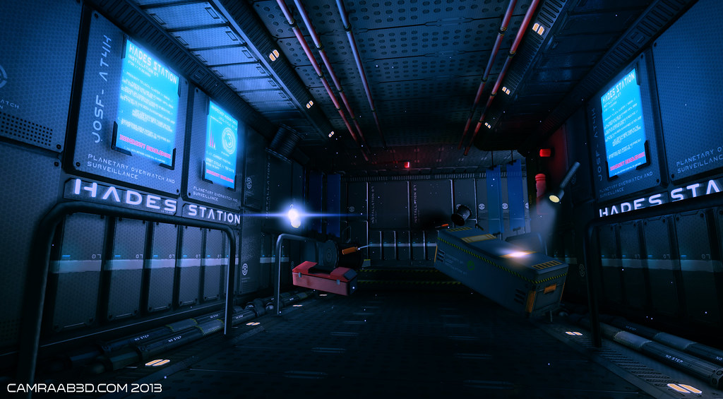
Sci-Fi Hallway by camraab, on Flickr
Hey guys, just getting this thread going for when I really start pumping stuff out, but for now here's what I've got.
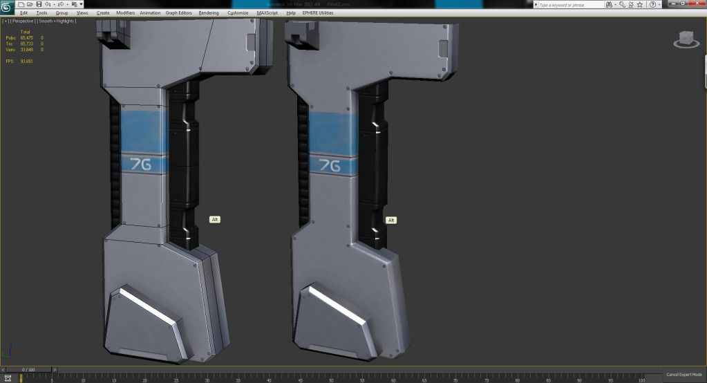
It's pretty basic, and that's by design. This is basically me committing myself to bettering my skills one project at a time. This environment was started with the goal of learning better workflow techniques, specifically normal and spec mapping, as I am seriously lacking in those areas.
That being said, there is no specular, and only the most basic diffuse on it so far. I hope to have the pillar completely done by Sunday evening, and get moving onto the floor/walls.
Forgot to add, sitting at about 550 tris, if anyone cares to discuss that as well.

Sci-Fi Hallway2 by camraab, on Flickr

Sci-Fi Hallway by camraab, on Flickr
Hey guys, just getting this thread going for when I really start pumping stuff out, but for now here's what I've got.

It's pretty basic, and that's by design. This is basically me committing myself to bettering my skills one project at a time. This environment was started with the goal of learning better workflow techniques, specifically normal and spec mapping, as I am seriously lacking in those areas.
That being said, there is no specular, and only the most basic diffuse on it so far. I hope to have the pillar completely done by Sunday evening, and get moving onto the floor/walls.
Forgot to add, sitting at about 550 tris, if anyone cares to discuss that as well.
Replies
I'm envisioning this pillar as being an air purifier in the hallway of some sort of spaceship/tech facility. Dirty air gets sucked in the vent at the bottom, then expelled via the diffusers? that I added. Maybe reverse that? Dirty air in via new piece and out the base of the pillar? Either way, that's all for tonight. More tomorrow.
If that pillar is supposed to suck in air at the bottom you could put some horizontal slats or some sort of vent on the bottom flat part.
Make sure you get a blockout of your environment pretty early on.
Keep at it dude!
As you can see, I'm getting a weird shading line down the center. Methinks it's because of something I did wrong in my process when I baked it out. So I just made the one half of the pillar, and mirrored it, but not for the AO bake, could this cause the problem? Even if I move the symmetry modifier over so it's overlapping by a large margin, I still get the error. Should I have added the symmetry modifier, then baked it out, does max see that symmetry upon the baking? Sorry if that doesn't make perfect sense, I'm tired and I had some beers while I worked on it......
EDIT: I think I've cornered it. I've since abandoned this pillar to the realm of bad ideas, but I wanted to figure out what I did wrong. After some looking around, I found this little nugget in the Normal Map wiki:
Sometimes an artist will decide to delete half of a symmetrical model before baking.
This is a mistake however because often the vertex normals along the hole will bend towards the hole a bit; there are no faces on the other side to average the normals with. This will create a strong lighting seam in the normal map.
This is exactly what I did, and this is exactly the problem I had. Hope this helps anyone that may have this problem in the future.
- Respect the rule of thirds and watch your proportions - try to add details and breaks around the 1/3 junction, not the 1/2 or 1/4. Try to find a harmony between large bold shapes and detailed elements.
- Always, always have real world reference up on your monitor, even if what you are modeling is strictly fictional. Don't simply go off what is in your head. Using real world reference will ground your designs and make them more pleasing and believable.
@Paul Pepera very, very helpful advice, will look to make the changes sometime soon. Much appreciated.
I feel like I'm starting to form what might turn out to be a direction to go in for the overall design of this environment. Let me know what you think, I need to start thinking of ways to draw in more than just a straight on perspective, as I have some ideas for the whole environment but, as I said, my traditional drawing skills just aren't where I'd like them to be. Anyways, thanks for the advice so far guys, I really appreciate it, keep it coming.
TBH i have zero clue if this is your problem but its 4am and the video i just watched the guy kept reseting the xform and flipping it everytime he mirrored anything lol.
On another note the concepts look promising
Still trying to figure out what workflows work best for me, hopefully things start to move along quicker now that I have some sort of direction.
The pieces look decent, and your really reminding me how bad I need to try out NDO2.
You should post up a blockout as early on as you can though.
Keep it up man!
Anyways, when I brought it into UDK and built the level for the first time I got all sorts of strange lighting errors:
As you can see, it's all blotchy, the shading is different from one piece to the next. Here's my setup:
Default light in the scene, dead center of hallway. Lighting quality is preview, but no change was evident on the higher settings. Checked my lightmaps and they seem to be getting called up correctly. No overlapping pieces in the UV space, and no overlapping pieces inside of UDK.
I noticed if I moved the light away from one wall, the problem seems to go away, but only exacerbates the problem on the other wall.
This is by no means the lighting setup I will have as I progress, but I'd like to figure out what I'm doing wrong now before I really get into UDK. I haven't worked in it in a while, so much of this may be the rust coming off.
Diffuse is very basic, preview only, and there is no spec. Critiques on layout welcome at this point, but keep in mind, it's still missing a lot, my main concern for now is why the lights are doing this.
Post your lightmap UV.
So I'm building the Texture sheet as I go, adding pieces as I go along, and there is no overlapping of any UV's, as it was designed to be modular (not that that would affect overlapping, but...). That being said, I didn't change the unwrap for the lightmap, as nothing was overlapping. I simply saved the UVW from map channel 1 in max, went to Channel 2, reset UVW's, loaded channel 1, then collapsed. Then in UDK It's showing the lighting map as channel 1, and the main uv's as channel 0.
That's the process I remember from school, which was a while ago, so any/all of that could be wrong, of that I'm more than aware
@nick2730 are you referring to in UDK when you say set the lightmap UV coordinates to 0? I think I know what you're asking, I'm just not sure.
Process is right tho
Re the light errors, have you got enough padding around the UV shells on the lightmap?
Could also be an AO problem in UDK, try turning the AO on and off to see if this makes a difference.
To stop bleeding on the lightmap (especially where a flat modular piece butts up against another flat piece) you need to snap the 2nd UV shells to a grid that matches your light map resolution output. In Max this can be done by setting the UV grid to 1 divided by your light map resolution (i.e. for a lightmap of 64, grid setting would be 0.015625), then use the snap setting which looks like a magnet with a p by it.
Hope this helps, keep up the good work
EDIT: This seems like a really stupid question, but how in the hell do I delete a static mesh from the content browser in UDK? It keeps saying it's in use, but it's not, I've deleted every instance of it from the level.
Anyways, here's my light setup now, and the light settings I have:
Everything looks much better, the blotchiness is mostly gone, and I think the only problems now may be from the way I originally unwrapped everything, I'll give those another look tonight after work. Here's the only problem I'm having anymore:
Not quite sure what's going on here...it's like that in random spots on the other panels of this style as well. Any help is appreciated guys, and all your suggestions have been spot on thus far. Thanks!
Upped the lightmap resolution of the meshes from 32 to 256. Turned off Ambient Occlusion, and followed the instructions I found in this article:
http://www.worldofleveldesign.com/categories/udk/udk-lightmaps-03-how-to-fix-light-shadow-lightmap-bleeds-and-seams.php
Specifically the part where it talks about Seams caused by in-between pixel UV edges. It seems to describe a lot of the problems I was having. I couldn't get the grid and snapping to function in Max quite how they have it set up in Maya, but I must have gotten it close enough to work. Anyways, thanks a ton for all the suggestions guys, I really do appreciate it.
I've spent some time figuring out cubemap reflections (still not perfect), and trying to figure out how I'm going to light this. I've looked into and tested out using holograms, or holographic signage as the primary light source.
I'll be adding in some plants off to the sides of the stairs, possibly some benches/chairs, stray cables, and other misc things to populate the scene. I'm looking forward to getting back into this, thanks for any critique.
Also, the cubemap reflection you are seeing right now is more of a test than anything close to final. Correct me if I'm wrong, but I want to have all my lighting set up in the level, and THEN I'll make the final cubemap? Again, any help is greatly appreciated.
Yes, the normals are mostly done in NDO2, therefore they're all flipped in-engine, That's next on my list.
"
Well, you want the cubemap to have the same overall color and feel of the room to kinda match...so if you change your lighting drastically, it might be good to make a new cubemap, yeah.
"Yes, the normals are mostly done in NDO2, therefore they're all flipped in-engine, That's next on my list."
Heres a little trick I do with nDo2 so I don't have to worry about flipped normals:
Also, when you have modify the adjustment layer, and your using the brush tool for normal map layers, instead of being white it will be pink :P
If you already have a bake with the green channel flipped, just copy the adjustment layer and place it right above your baked maps...this will flip anything below the nDo2 stuff back.
Because that would be too easy :P
(and I didnt know that you could do that lol)
Suppose I should describe what this is a hallway to.....In my head I wanted this to be an orbital defense outpost. Possibly doing surveillance, but with offensive capabilities as well. Trying to thing up military-ish lingo to put on the holograms, looking a lot at the control rooms from Halo 4 and Halo Wars ships for inspiration, as I really like the mood that was set.
Once I've got the lighting nailed down, and the material for the glass panes, I'm going to go through and clean everything up, and nail down my normals, spec, and diffuse textures, as well as add some assets in to fill up the scene.
As always, comments/critique welcome.
I'm going to fix the mini bonsai-ish trees, as I feel they're too small, and add in another tree to break up the repitition.
Another issue I'm having is with my cubemap. This is the first time I've dealt with one, but it seems to be projecting some details incorrectly. Things aren't on the correct axis, and some things are reflected very large. Any help with this is appreciated, and all comments/crits are welcome.
Let me know what you think, I'm not going to have much time to devote to this anymore, but I will make changes where appropriate when I can. Thanks for all the critique guys, it definitely helped.
Are those all modular meshes ? and did you all do it in nDo2 ?
You didnt use pillars from the first posts ?
@RaPtoR I'm unfamiliar with how to do that, but I'll figure it out and if I've got time I'll give it a shot. Yes, the walls/floors/trims are modular. I've had to rearrange some texture sheets to accomodate me continually adding more and more pieces
Crits not only welcome but definitely needed. Messed around with the floating dust particle effect, moderate success, needs to be tweaked a lot but I'm liking what I've got so far. Does anyone know if there's a way to make the light in the scene determine the color of the dust particles, as in I just make them white, and then whatever light they pass by the color changes? Or am I locked into the color in the material for the particle itself, and just change the color depending on where it is in the scene. Any help is appreciated, thanks.
Here is good tut on particles UDK http://eat3d.com/free/dust_particles
And last shoot is way better i like it very much... good job bud
I will be replacing the hologram at the end of the hall, and the dust particles were removed (for now). Been working on the spec maps for everything, as before I only had base spec on everything for preview purposes. Any other ideas for things I could add? Also, I messed with the scene color. Too blue for your tastes? Not blue enough! C&C, as always, more than welcome.
I really like your progression, each post is getting better and better! I think you're a little over lit - the materials are sophisticated, shiny, and reflective, and that's helping you some, but I think the scene can use a little more asymmetry in the lighting design. Your palette is predominately blue, with little hints of yellows (in the runners) and possibly some greens toward the end of the hall. I think you should, just as you would do with a model, break up some of the symmetry to get a more complex look.
What is making the player move through this space? Right now, it's pretty even, so I'm not drawn particularly anywhere. The assets are great, so I think introducing more drama would give you a completely fresh and more interesting look.
I propose removing the mirrored lighting scheme and make your right wall dark. We naturally scour an image left to right, and your text reads better on the left wall anyways. Kill the emissive monitor and station writing and let your left wall bring light very softly to the right. I'd aim to have it barely kiss the right wall (so it's not black), but have the right side pretty dark. Have its influence really start to dampen around the footlocker thing you've added in the floor. Then, I'd take the runner lights on the floor and have them softly splash some of the warmth and light onto the floor pipes and the railings. Really sell the rim lighting on the railings - let the light punch up the specularity on those guys. Again, keep the light soft with them, I wouldn't let too much up onto the right wall. Keep the right wall dark enough to where there's great contrast, but not to where it's black - hint at the details that are there.
So, now your right wall is dark - I'd introduce some lighting coming from the top of the stairs on the right. Don't use the monitors, pretend there's a spotlight above a door at the top of the stairs. Now, my eye is moving down the scene, and as a player, I want to find out more about this mysterious light. To make this work, you'll probably need to rework the emissive monitors at the end of the hall - either take them out, or let them barely add light to the scene. Now, the predominant light at the end of the hallway is on the right side creating great contrast from the dark wall to the lit stairwell. To sell this even more, I'd move the extinguisher thing to the right wall and let it's dark silhouette pop off the lit backdrop (light from the stairs).
I'd love to do a paint-over but I don't have anything to do it with at the moment. I hope this gives you some ideas. If anything else is unclear, just ask, I'll be watching the thread. Good luck!
-Jon
@ Jon That is some really good crit. I really love your portfolio environments and lighting. Sad to hear about 38 studios. I hope you have found new work. I am a Baltimore local and I was really wanting to apply to Big Huge, but its not around. Impossible studios is close by in Hunt Valley. I might try there sometime. Need to work on my own work till then.
-Ryan
@Zero Thank you, it's been rewarding feeling myself gain more confidence as I go along. I would like to incorporate some wires and more miscellaneous stuff in the scene, I've got plenty of room on my texture sheet so there's really no limit.
camraabSciFiHallLights2 by camraab, on Flickr
Still to do: Figure out what I'm going to do with the end of the hallway, and whether or not I want a hologram down there. Obviously I've got to add a cable for the work light, and I'm not sure if I'm sold on the plants. Thanks for checking it out!
Also btw, I'm sure sure if you have seen these guy's threads. They are kind of similar to yours. http://www.polycount.com/forum/showthread.php?t=102301&highlight=server+room
http://www.polycount.com/forum/showthread.php?t=85296&highlight=%5BUDK%5D+CORRIDOR_01
Also messed around with the dust particles, I just don't want to overdo it. Same goes for a lens flare. Would like to add one to the work light, but again, I don't want to overload the scene. Here's a quick shot, again, didn't change much other than dust particles and pinker flowers.
Sci-Fi Hall by camraab, on Flickr
HallFuzziness by camraab, on Flickr
It's like this all over the map. I'm not sure what's causing it, and it shows up strange in Max as well. Never run into this before so maybe some more experienced eyes might know what this is. Next, I'm having an issue with the cubemap:
HallFlippedCubeMap by camraab, on Flickr
As you can see, the cubemap is reflecting on the wall incorrectly indicated by the red arrow. I don't know if I'm understanding it correctly, but I believe it should be going in the direction of the green arrow. Nearing the finish line with this one, here it is with an added lens flare to the work light:
Sci-Fi Hall Update by camraab, on Flickr
SciFi Hall Update by camraab, on Flickr
As you can see, I'm playing around with an anti-gravity type of thing. The question is, what do you think? Good addition? If I stick with it I plan on doing some destruction in the back right corner where the light would be coming from out to space, and I'd change the holograms to display a warning of some sort. I just don't want it to get too busy. As always, critique welcome.
Sci-Fi Hall Update 2/7/2013 by camraab, on Flick
Pretty obvious tweaks in the colors of a few things, not sure if I'm keeping them, but I like some of the additions. Let me know what you guys think, is it too much, not enough? Love it or hate it, let me know.
also you might want to turn it a bit, so you can see the on/off switch. would make it more readable.
for my taste, you are getting too colorfull overall, but dont take me on that, i'm nobody
as far as too colorful, I was worried about that too. While I do like some of the additions, I was sort of fond of the bluish tint overall. At some point I'll have to stop tinkering
Pros:
You can do EVERYTHING in 3D!
Cons:
You can do EVERYTHING in 3D!
:P
Sci-Fi Hallway by camraab, on Flickr
Sci-Fi Hallway2 by camraab, on Flickr
Moving on to other projects now, but if there is enough consensus on something that needs to be changed, I can always find time to revisit this. Again, thank you for all your input, I truly, truly appreciate it.
Also I see Greentooth.