Medieval Dungeon [UDK]
Hello!
I'm trying to learn Zbrush, and I got really inspired when I saw Romys awesome thread Pirate Castle. I learned a lot reading his workflow, and wanting to try making something myself. So I'll try to learn Zbrush and build something in the process.
I'm trying to make a simple one-shot view of a dungeon throne room. Then I will be able to learn creating stone/rock/decay/cloth/wood/leather/rust surfaces.
Thumbnail sketch:
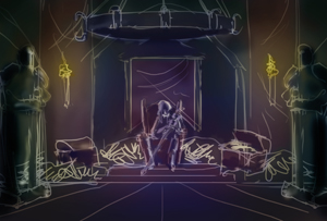
Something like this:
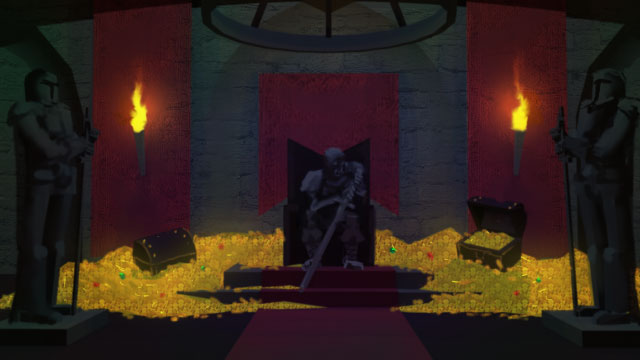
So I was trying to learn Zbrush and I started creating a brick wall. But I was too soft on the edges, it looks like a weathered brick floor:
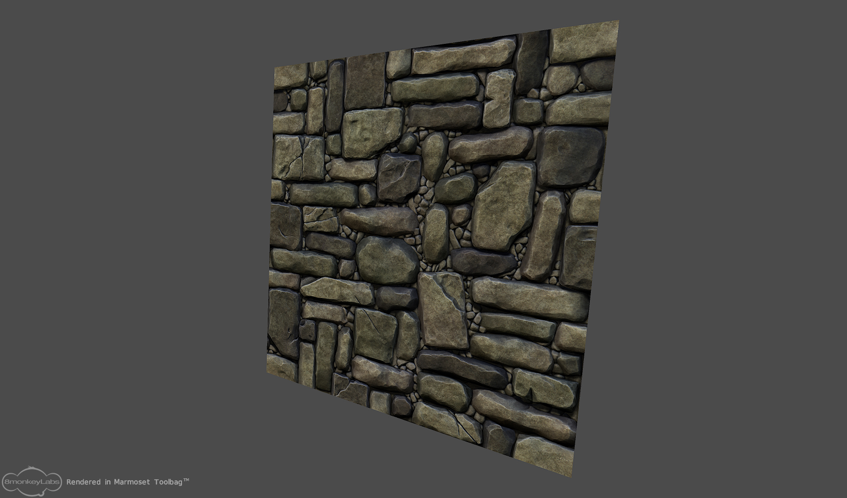
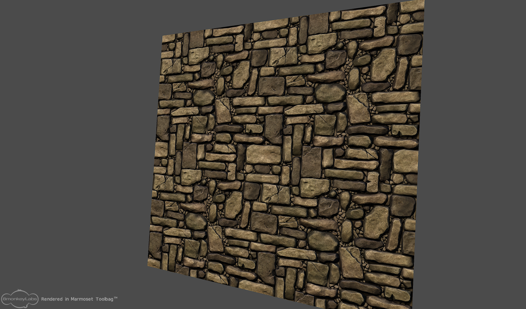
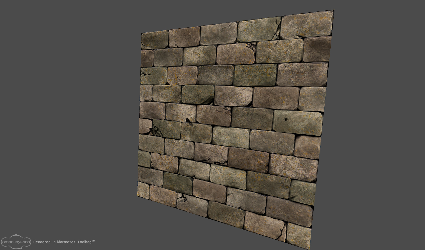
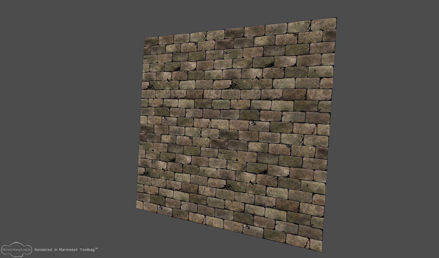
And then I tried to make a castle brick wall. But it was a bit flat.
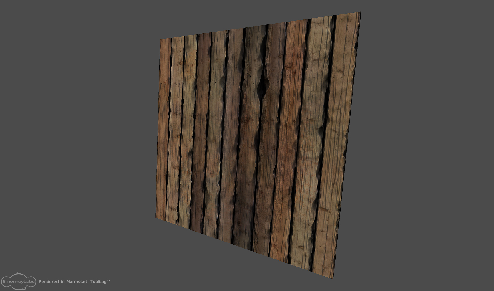
And then I tried to make a wood wall, but it didn't feel right.
Then I made a new brick wall, this time trying to get the edges sharp. It felt more like stone than the first one.
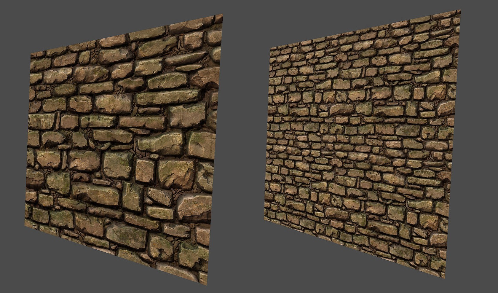
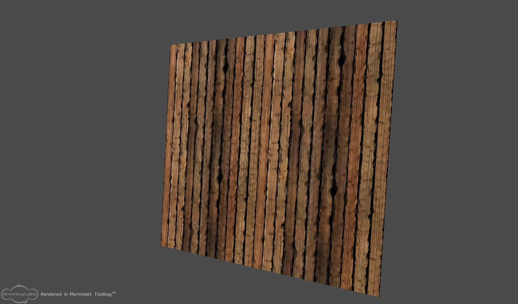
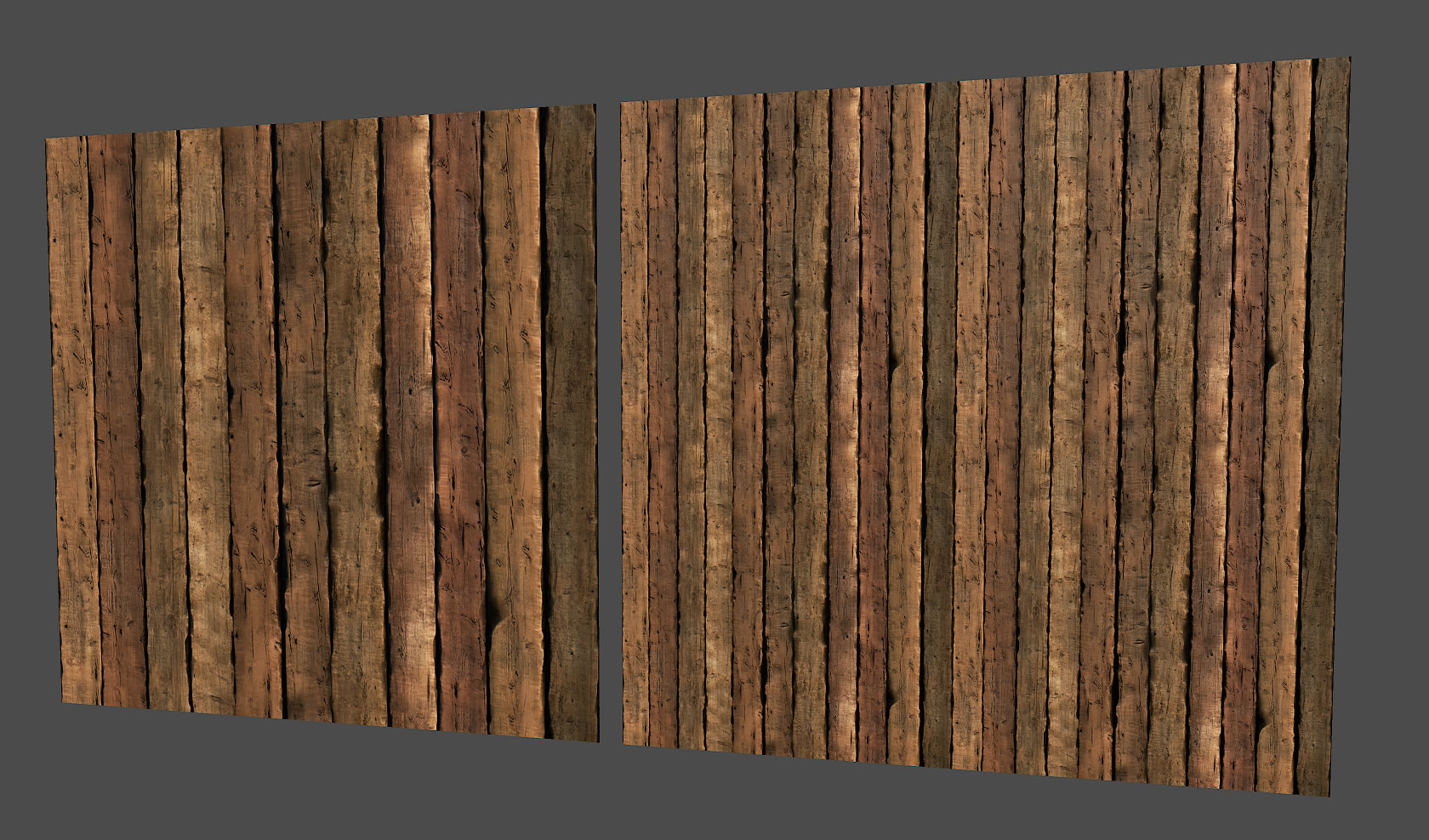
And then I made another wooden wall. It felt more like wood in weight, but the cracked "lifelines" doesn't feel right. Currently, it feels too spotty.
Next, I wanted to create a texture of the treasure coins.
Here's my single golden coin:
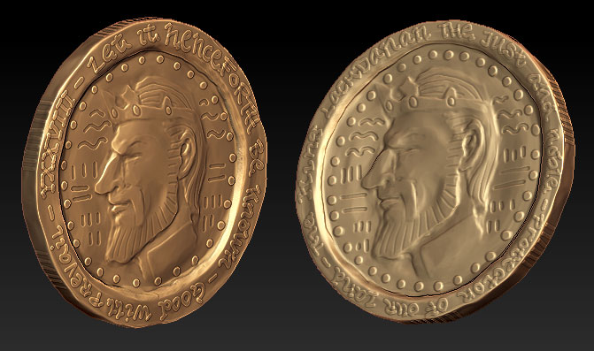
Next, I tried to use Zbrush 2.5D functions to draw a tileable texture on the canvas with the golden coin. I use ~ to offset the texture and make it tileable. But when I draw the coins, they don't orient right to the surface they are being drawed upon.
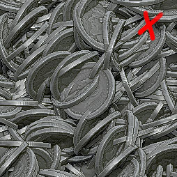
It seems to be cutting every surface. I would like to rotate it's origin so It draws flat on the surface instead of cutting it.
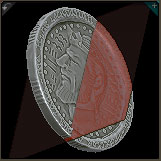
But I don't know how to change it's initial rotation! If someone knows how, I would really appreciate the help!
I'm going to continue posting my progress in this thread. Hope you like it!
I'm trying to learn Zbrush, and I got really inspired when I saw Romys awesome thread Pirate Castle. I learned a lot reading his workflow, and wanting to try making something myself. So I'll try to learn Zbrush and build something in the process.
I'm trying to make a simple one-shot view of a dungeon throne room. Then I will be able to learn creating stone/rock/decay/cloth/wood/leather/rust surfaces.
Thumbnail sketch:

Something like this:

So I was trying to learn Zbrush and I started creating a brick wall. But I was too soft on the edges, it looks like a weathered brick floor:


And then I tried to make a castle brick wall. But it was a bit flat.


And then I tried to make a wood wall, but it didn't feel right.


Then I made a new brick wall, this time trying to get the edges sharp. It felt more like stone than the first one.

And then I made another wooden wall. It felt more like wood in weight, but the cracked "lifelines" doesn't feel right. Currently, it feels too spotty.

Next, I wanted to create a texture of the treasure coins.
Here's my single golden coin:

Next, I tried to use Zbrush 2.5D functions to draw a tileable texture on the canvas with the golden coin. I use ~ to offset the texture and make it tileable. But when I draw the coins, they don't orient right to the surface they are being drawed upon.

It seems to be cutting every surface. I would like to rotate it's origin so It draws flat on the surface instead of cutting it.

But I don't know how to change it's initial rotation! If someone knows how, I would really appreciate the help!
I'm going to continue posting my progress in this thread. Hope you like it!
Replies
Your tilable stone stuff looks really good, I dig it quite a bit.
Der Hollander, thanks! It worked when I used the GoZ functionality. I began drawing coins, but I encountered a problem when I tried to render the coins. I got a seam which I had some trouble removing, but then I found a nice script at ZbrushCentral.
Here's what it looks like now. Perhaps a little too saturated.
S_ource, I also thought about using physics, but ended up placing every coin instead. It didn't take that much time in the end, and I got it tileable at the same time.
or if you want to keep it as it is, but lower the saturation a little and punch the specular map more for highlights
but from distance it's not really that noticable.
Blasoid, good point! I'll remember that.
Quickel, thanks!
tristamus, I created the wave pattern by using a simple maya polyplane in the background. I placed it in the document and then painted waves using the 2.5d simple brush. I used ~ to offset the image. Then I placed each coin individually on the sculpted plane, a litte imbed and facedown.
Here's a little update. It felt like I put a lot of effort in making only textures, so started out on the skeleton instead. Here's the complete sculpt of the face. Still very plain, I'm thinking of adding a beard later.
I've been trying to bake matcaps to texture for regular game models, using this tutorial.
[ame="
But I'm getting funky displacement maps when trying to bake it on the projected highpoly models onto pre-uv-mapped game models. It get's better if I use "SmoothUV" in the baking settings, but then my uv-borders shrink and leaves a gap along the border. I really wish I could get it to work. Uhm, I'll get back with some pictures to show you what I mean...
Skull is also pretty good. The base shape and scale is right. Agree that you should put a faint beard on it and you should destroy it a bit more.
Example, hole in the head, a big sword cut over an eye an small scratches everywhere.
Keep it up!
Here is the finished textured throne model, 616 triangles.
The basemeshes.
Here's the highpoly model.
I'm soon ready to begin creating the lowpoly-model, and I'm looking forward giving it some color!
Can't wait to see in-engine screenshots with some good lighting.
I was hoping for the exact same thing.
Otherwise really cool work!
stickadtroja, you have a point. I have to think about that sword decoration...
alexCatMasterSupreme, Rikimaru03, If you want to know how I sculpted the rock textures, you can read about it more here. I made the wood in the same manner, but with less damage and with more focus on texture overlay in photoshop.
The tilable textures you made have color variation but i think its a bit off color wise with the pinks and so forth. The one i think you should revisit the most is the chair.
The high poly sculpt came out awesome but the diffuse almost looks placeholder, like you just slapped on a generic wood texture and overlayed it.
I think you should seperate the patterns for the different sculpted elements in the chair as right now the grunge and grain overlay all flow over it making it appear flat. Those details need to pop more! Possibly throw in some edge highlights on the details to achieve this, or use different `materials` to add color variety to this thing.
The organic character stuff is great, but atm it is looking better than the rest of your environment. Keep it up!
keep up the good work
ScottPetty, thanks for the feedback! Yes, you are correct about the wood overlay on the throne. I thought I could achieve the same effect when overlaying the wooden texture in Photoshop, but it didn't... My older brother told me to try to apply the texture directly in Zbrush with a displacement map instead and continue sculpting it there. For this to work I have to uv the highpoly throne first, and I haven't tried that yet. I will give the throne texture another try when I'm finishing some tweaks on the Skeleton highpoly.
Aga22, Whoa, I didn't think about Skeletor up until now. Hehe, he sure looks like him a bit!
frell, I made a chainmail alpha by creating chainmail ring meshes in a tileable pattern in Maya and then rendered the luminance depth. I just made a large image with chainmail rings and applied them as a displacement map on the chainmail-armour-mesh in zbrush. For this to work properly I created an uv for it beforehand.
Feel free to use the alpha when creating your own chainmail! You can download it from my website here.
I believe if you separated the carvings in your diffuse texture you would see better results, and it wouldn't look like you just slapped a wood base texture on top.
But wow, the work is fantastic.
I agree with the above posters about your wood textures. They are, mostly just okay. I think they really need to benefit from some more of your focus. They're looking noisy and a bit nondescript.
Your first rock texture looks really good, I'm not a huge fan of the tiny stones in between your main bricks, as they look more like pebbles on a floor than rocks that are there to support the brick in a wall. You could fix this by pushing them back a bit with your diffuse with some darker coloration and avoid making them stand out so much with highlights and such.
Looking forward to seeing where this goes!
I've got a question about your brick tutorial. How did you manage to tile your irregular textures? Or is it tileable?
Evolvyn, I didn't tile properly in the rock-sculpt-tutorial above. But what you can do, is group all objects intersecting with the left end of the texture, duplicate them, and then move them one texture distance away to the right end of the texture. So, basically the stuff intersecting out of the left side should be the same intersecting into the right side. You do this top to bottom as well. The inbetween stuff can be placed however you wish, because now the sides will loop correctly.
There's not much to show for today, just tweaks.
- Thone model, texture update.
- Throne highpoly polypainted sculpt render, the left girder was missing in the last render.
- Tileable wood texture, I switched the type of wood to a less spotty one.
- Tileable brick wall, I darkened the gutters between the bricks as to hide the pebbles. A cheap but effective trick, I know... : p
- Skeleton, the pants are more detailed, the armour less doughy, the chainmail turned 90 degrees correctly... tweaks.
I can't wait to create the treasure pile... rubies, sapphires, emeralds, pearls, chests, golden statues and trinkets...I have also created the lowpoly model for the skeleton. He is built with 6646 triangles, and I just finished baking out ambient occlusion and normal maps. I will be cleaning up the bakes before starting to texture him. I'm planning on using alphas to make holes and tears in the clothing.
on your tiling wood texture i would reduce the color variation, or try to find a way to justify it, you have a plank green next to another red etc... try to justify those color, with some moss for example.
for the stone wall, great sculpt as well, but i would reduce the AO on your diffuse to reduce the contrast a bit, and to avoid getting very dark spaces between your rocks, which always seems strange... it seems like your stone float in the void ^^
nothing to crit on the character, really cool work, continue !