Home 3D Art Showcase & Critiques

Sci-fi Hallway Finished

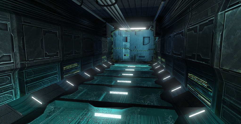
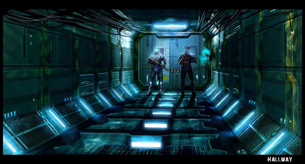
So I finished up the Sci-fi hallway I started a few days ago. Didnt have much time to work on it over the weekend like I wanted but regardless here it is next to the concept I worked from. Any critiques would be great! This was my first project in Max as normally I tend to stick with Maya but I am really starting to enjoy Max. Normal programs to create: 3DS Max, Photoshop, CrazyBump, and UDK. Screenshot is from in-game.


Render
FinalRender.jpg


Concept *NOT BY ME*
189_realsize.jpg

Replies

  • megalmn2000
    Offline / Send Message
    megalmn2000 polycounter lvl 13
    You should put a "Constant3" shader node on the emmisive in order to boost the blue channel to give the blueish glow.
    There's also too much bump on the metal texture, while it's suppose to be flat and glossy. http://cg.tutsplus.com/tutorials/photoshop/how-to-hand-paint-convincing-metal-textures/
    I also saw the difference of texture resolution, the gray grid at the bottom is more crisp and sharp than the metal wall, when it's suppose to be the opposite (wall more rez)
  • chrisradsby
    Offline / Send Message
    chrisradsby polycounter lvl 14
    The texture resolution isn't necessarily different, however the texel density is. It's a big problem when it's super obvious like that. Something placed on the side of the hallways.
  • chazzur
    First of I have to say I agree with you guys 100%. After a good nights rest, looking at the render with a fresh pair of eyes its extremely obvious. I think this was the case of just working with something for a long time and over looking the really obvious stuff. I get back into it and work on the aspects listed and re-post. Thanks for the comments!
  • Cordell Felix
    Offline / Send Message
    Cordell Felix polycounter lvl 9
    pay attention to scale when following a concept, sure you can stray away from a concept and make ur own kinda thing. But right now following the concept is best because it already looks badass.

    What im talking about is most of your stuff is too elongated compared to the concept. Each panel is too wide which makes the whole scene longer. squeeze some of that stuff up, and yes...pay attention to texture resolution. Right now the walls are blurry 256's and the floor is like 4096's >_<

    I'm sure with more work, this scene can improve alot! good start mate
  • ErichWK
    Offline / Send Message
    ErichWK polycounter lvl 12
    No material definition or contrast. Everything is flat and looks a bit lo rez, Also your metal is reading like concrete at times. If you post individual texture sheets we can give more in depth critiques.
  • chazzur
    Since the wall panels seem to be the bulk of the problem I only included the 3 texture sheets I used for panels. I will note that these are the textures as seen on the render above as I have not edited them yet. All textures are 1024 with Diffuse, Normal, Specular, with the third have an emissive channel.I also much agree the scene seems much elongated from the concept but that is pretty easy to adjust.

    WallpaneltextureSheet1.png

    WallpaneltextureSheet2.png

    WallpaneltextureSheet3.png
  • Paul Pepera
    Offline / Send Message
    Paul Pepera polycounter lvl 9
    Unless you really take some large liberties interpreting the concept your work will only look as good as the illustration, and what you got there is a square room, with some random sci-fi looking wall panels loaded with diagonal shapes and pointless emissive glows, cables dangling from the ceiling leading to a generic looking sci-fi door complete with warning strips.. *yawn*

    However, despite the faults with the original concept you still missed its most appealing part - the lighting. Great lighting can make even the most generic and boring of sci-fi hallways look interesting. Kill all the light sources except for the main light above the door and use that as the focal point. Use lighting to bring out shapes (though there really are none in this square room) and material definition.

    Also, please do not use procedural programs like Crazybump to do all the texture work for you. Programs like that are a helpful tool, not a replacement for actual art.
  • konstruct
    Offline / Send Message
    konstruct polycounter lvl 18
    lol @ "lazy bump". Still the best cavity map generation I`ve seen.
  • Alex3d
    Offline / Send Message
    Alex3d polycounter lvl 9
    Don't hate on LazyBump, its a useful tool if you know how to use it... But its true, it should not be used to generate final textures.
    As for the hallway, you have too many texture samples. You should have paid close attention to the concept and how the wall segments were built. It has 3 parts to it(excluding the vents); top and bottom are the same thing, just flipped. The middle segment does not align with top and bottom and is simply repeated a number of times. All you should have is 1 diffuse, 1 spec and 1 normal. Create 1 material set up in UDK and create a material instance with emmissive mat. use standard mat on regular panels, mat inst on emmissive pannels...
  • chazzur
    Wow so that was some great feedback. I am going to go back and try my best to fix all the issues brought up. Ill be posting as I go...
  • chazzur
    So Iv taken some steps back on the level in order to encompass all the errors you guys enlightened me with. First problem I'm addressing is the elongation problem. Iv shrunk the level down some so hopefully the proportions look closer to the concept. I tried to get it as close as possible and actually found it pretty difficult to get it exact. I also remade the wall panels thanks to Alex3d's response. Next I will be moving on to remaking the wall textures. More critiques along the way will be very helpful.

    aotest.jpg
  • Tobbo
    Offline / Send Message
    Tobbo polycounter lvl 11
    I am liking the new version so far. =)
Sign In or Register to comment.