So i am in the final two quarters for school, and i am now in the process of working on my portfolio. since this is a very crucial period for me, i would LOOOOOVE and really appreciate some feedback on the work that i post. i want to make this the best work that i possibly can and i am open to any criticism that will help make my work great. so, here are the pieces i am going to be working on
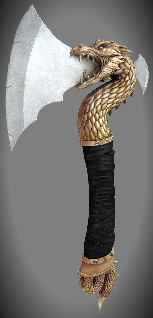
ive started on the axe.. and here is my progress... please.. if necessarry.. rip my work apart until i begin to furiously cry and hate myself. it will help.
man i wish i would have started on my portfolio when i was still in school, thats the best time to get it pumped out while your already working on little things here and there for classes.
i would suggest you stick with one focus in 3d art while getting your portfolio together (in your case, either weapons OR vehicles). from what ive read on here, pretty much if your a weapons modeler, your ONLY doing weapons, and i can only assume the same for vehicles.
as far as your dragon axe, i would have to say that some of your shapes, mainly on the face, seem a bit blobby compared to the sharpness of those scales. it looks pretty rough as of now though, so i suggest that you just keep workin on that bad boy
@Mike: well doing my portfolio in school has its good and bad points. on one hand, yeah i can get some work done for classes and use that as a port piece.. however in my case, i chose not to use any pre-existing pieces for my portfolio (now when im talking about portfolio in regards to school i mean the graduating demo reel). what i have on my port website, some was done for classes, others just for me. but im basically having a little competition with myself, if that makes sense.. trying to beat the most recent item on my portfolio (as of now, being the scifi pistol). and ill keep doing that as i go.. so i keep trying to improve.
as to the focus.. I WISH! if it were up to me i would do all weapons, but due to b/s at school i have to be diverse. maybe i can convince them to let me do weapons if i can show enough people on PC saying what you said, but as of now im fine with doing both.
thx for mentioning the blobbyness of the dragon.. i had been a bit concerned as to whether or not the head still needed tweaking.. my main concern is the grip right now, as i spent a few hours on it today.. unsatisfied with the result, dealing with about 2 max crashes and 3 zbrush crashes.. having to start over.. o well. it happens. ill get on to fixing the stuff you mentioned tomorrow.
@gibson. ill try those out, thanks. and the cannon may just end up going because its older. i did that about a year ago. generally, ill probably have an "older work" section in my portfolio to put all of the "knock outs"
spent some time today and fixed the grip on the axe.
ALSO! i was approved at school to do a portfolio of all weapons. they said it isnt really the subject matter that they want to see diversity in, its the technique and all that. so as long as i dont hand in 5 or 6 modern guns or scifi blaster rifles, its ok.
thx diego.here's an update. got the blade in place and fixed up the scales and wrapping. also went over the dragon with the trim brushes after picking up some techniques from the eat3d hardsurface dvd.
i made 1 scale in max to start with, then working off the grid i arrayed them to the right so that the edges would touch, then did another array halfway down and halfway to the right to get the different rows. put a bend modifier on the entire thing. then i made a spline that sort of encompasses the shape of the dragons body, and exported to zbrush. then i used the MoveElastic brush to put it into place.
Thats a pretty cool way of going about it. good job dood.
This is looking great! Only thing that pops into my mind atm is that the thickness of the axe atm currently looks very uncormfortable to hold in your hand. I would squeeze it to make the shape more oval then the current cylinder shape it seems to have
Serp: thanks, ill be starting the texture this week.
Workin on the low poly for the head of the dragon. its surprisingly at 3.5k triangles. a bit too high but i feel if i bring it lower ill lose some information in the mesh.. and im generally trying to aim for a max of 6k for this so i think ill be good. here is where im at.. and a VERY TEST BAKE! just trying to see if id have any projection issues, and it appears i do, only underneath the neck and tounge. surprisingly.
some updates. more tests bakes. the lp is gettin there. may be a bit high for some folk but i think im ok with it for now. (feel free to paint over anything you feel is unnecessary geometry-wise). total triangle count is about 4800 right now.
In regards about geo to cut... get rid of anything not contributing to the silhouette, also think about the way your weapon will be used in the game...
Is it First Person? or Third Person? It's it's first person higher poly count is acceptable so that it looks it's best. If it's third person try to only use as many as you need to convey the necessary detail for the size that it'll be on screen.
Why not do both versions? I'd start with the high poly first person one, UV it, and then create a more optimized version for the 3rd person mesh.
You're off to a great start. Got some really nice, readable shapes in there. Agreed on the poly reduction for the strapped area - it's really dense considering the silhouette. It's a bit hard to tell from the angles posted, but the axe head looks as though it could be a bit chunkier. It's quite flimsy looking in comparison to the handle.
@LMP: thx for that. i am not sure about the use of it, as im just making it cuz i liked it. lol. but ill keep it as if it were a first person, and maybe do a LOD which could act as the 3rd person model.
@willy: done. saved about 200 i think. total now for the handle is about 680.
@cheeseontoast: well im going to be making the handle skinnier, i just need to keep it thick as of now to project onto the hp but i will make the adjustment once its projected. since its just a scale on the Y axis it shouldnt mess up the uvs at all.
Highpoly looks great man! Though I think you are wasting TONS of tris. I think you could get the same silhouette with 4500 less. So in otherwords I think you could get this in 3000 tris. And you might be able to argue that it is next gen... but man lol I am doing a full blown motorcycle in around that much.
In any case... Keep that stuff coming man. I slowed down these last couple of quarters... Next quarter was supposed to be my last. But... I am going to stay one more.
You know... Have you been informed about that... onlinestudentportfoliothingy? Where we have our portfolio up for the 6 months after we graduate? Was wondering what you think about that. They told us down here that your school is the one that seems to be using it the most. And how is your competition up there? Students producing quality work? And you can PM me if you want. lol
gibson: thx for the input. i agree with you about the blandness.. but honestly didnt know what other direction i couldve gone with the texture. i wanted to find SOME balance between nice n shiny n gold, and sort of damaged. i was given some advice today to vary my reflection map with the scratches, and i also want to go back and add a gloss map, clean up the mess on the blade, and maybe get rid of some of the surface damage of the blade, and focus it more on the sharp area.
synergy: may your troubles be gone! enjoy.. a quick 5 minute thingie i put together.
Axe looks great man, and thanks for sharing your scale making technique, pretty interesting way to get it done.
The only crit I could give u is that in my opinion the cloth on the handle could do with some stains and wear to give it some age. Or if its leather some cracks and wear and specular detail like you could see here: http://www.flickr.com/photos/myeye/4562531493/
You could probably find better ref, thats just to make a point.
Also add some detail in the spec that does not appear in the diffuse, and crank up the contrast quite a bit (on the spec) to give it a more metallic feeling.
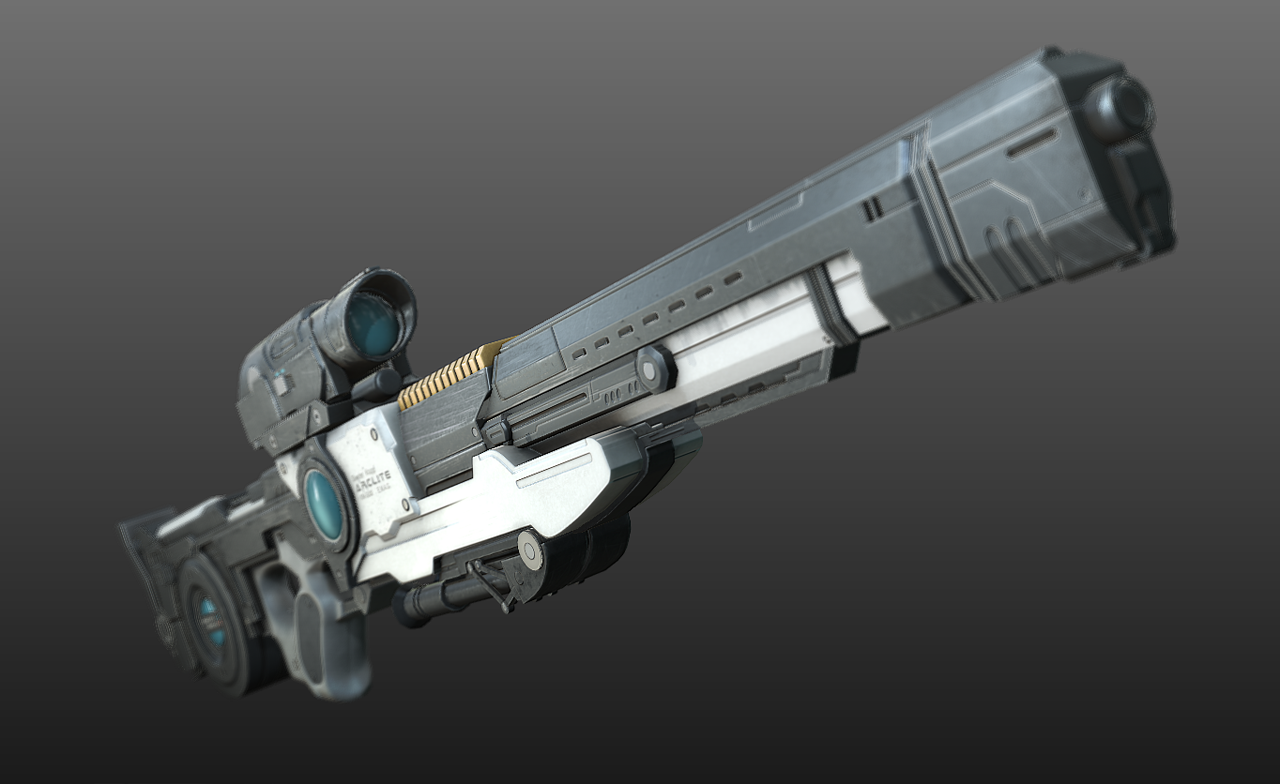
that's a dope rifle. Your own concept? My oly crit for the HP would be that the front end of the rifle looks like it's still just blocked out, where the butt of the gun seems more developed. I understand that this could be intentional, but the barrel - i think - could use the same smooth and stylish treatment as the stock.
thx adam. no the concept is not mine. credit goes to biometal79 (from deviantart). followed the concept as close as possible, with a few tweaks just because certain things needed a bit more pizazz and functionality. but yeah, ive heard the same crits of the barrel. ill see if i can do anything else to change it, as in the fps view it does look a bit "meh".
You've got really nice hi's but your low topo for the axe is awful, it will seriously damage your folio if you leave it. The texture looks fairly flat aswell.
I'd recommend getting some reference, not just for the texture but for the topology aswell.
@mask_salesman: i agree with you and ive had some crits on how to break it down some. ill definitely do it, and i plan to rework the texture a bit later. thanks.
here's what ive got so far. workin on the low poly for my rifle, its roughly under 10k tris. gonna break it down some more once i collapse the stack to get rid of some of the symmetry lines.
i had considered it. i actually even thought of putting the blade on the back of the head to make it look like a wing. the closest i got to flames was putting little etching/engravings in the blade that were flame-like.. only near the mouth area, but i didnt like how it came out. ill be reworking this texture slightly later on so maybe i can revisit that idea.
Replies
i would suggest you stick with one focus in 3d art while getting your portfolio together (in your case, either weapons OR vehicles). from what ive read on here, pretty much if your a weapons modeler, your ONLY doing weapons, and i can only assume the same for vehicles.
as far as your dragon axe, i would have to say that some of your shapes, mainly on the face, seem a bit blobby compared to the sharpness of those scales. it looks pretty rough as of now though, so i suggest that you just keep workin on that bad boy
as to the focus.. I WISH! if it were up to me i would do all weapons, but due to b/s at school i have to be diverse. maybe i can convince them to let me do weapons if i can show enough people on PC saying what you said, but as of now im fine with doing both.
thx for mentioning the blobbyness of the dragon.. i had been a bit concerned as to whether or not the head still needed tweaking.. my main concern is the grip right now, as i spent a few hours on it today.. unsatisfied with the result, dealing with about 2 max crashes and 3 zbrush crashes.. having to start over.. o well. it happens. ill get on to fixing the stuff you mentioned tomorrow.
@gibson. ill try those out, thanks. and the cannon may just end up going because its older. i did that about a year ago. generally, ill probably have an "older work" section in my portfolio to put all of the "knock outs"
ALSO! i was approved at school to do a portfolio of all weapons. they said it isnt really the subject matter that they want to see diversity in, its the technique and all that. so as long as i dont hand in 5 or 6 modern guns or scifi blaster rifles, its ok.
Thats a pretty cool way of going about it. good job dood.
Serp: thanks, ill be starting the texture this week.
Workin on the low poly for the head of the dragon. its surprisingly at 3.5k triangles. a bit too high but i feel if i bring it lower ill lose some information in the mesh.. and im generally trying to aim for a max of 6k for this so i think ill be good. here is where im at.. and a VERY TEST BAKE! just trying to see if id have any projection issues, and it appears i do, only underneath the neck and tounge. surprisingly.
Is it First Person? or Third Person? It's it's first person higher poly count is acceptable so that it looks it's best. If it's third person try to only use as many as you need to convey the necessary detail for the size that it'll be on screen.
Why not do both versions? I'd start with the high poly first person one, UV it, and then create a more optimized version for the 3rd person mesh.
@willy: done. saved about 200 i think. total now for the handle is about 680.
@cheeseontoast: well im going to be making the handle skinnier, i just need to keep it thick as of now to project onto the hp but i will make the adjustment once its projected. since its just a scale on the Y axis it shouldnt mess up the uvs at all.
here is the finished low poly. 7.5k
In any case... Keep that stuff coming man. I slowed down these last couple of quarters... Next quarter was supposed to be my last. But... I am going to stay one more.
You know... Have you been informed about that... onlinestudentportfoliothingy? Where we have our portfolio up for the 6 months after we graduate? Was wondering what you think about that. They told us down here that your school is the one that seems to be using it the most. And how is your competition up there? Students producing quality work? And you can PM me if you want. lol
Could you go into more detail about how you did the scales?
I read your explanation but I am having trouble understanding.
Thanks!
synergy: may your troubles be gone! enjoy.. a quick 5 minute thingie i put together.
Ima so Freakin use this for some badass scalemail one day
The only crit I could give u is that in my opinion the cloth on the handle could do with some stains and wear to give it some age. Or if its leather some cracks and wear and specular detail like you could see here: http://www.flickr.com/photos/myeye/4562531493/
You could probably find better ref, thats just to make a point.
Also add some detail in the spec that does not appear in the diffuse, and crank up the contrast quite a bit (on the spec) to give it a more metallic feeling.
hope that helps
Thanks for taking the time to post that tutorial!
here's my next piece. high poly done. gonna start on lp tomorrow.
must.... not.... fap...
here's the concept.. link also on the first post.
http://biometal79.deviantart.com/gallery/24226447?offset=24#/drrojq
and also an fps view.
here's an update on the high poly of the gun. hopefully i can call it done here. i like this version of the barrel much more.
I'd recommend getting some reference, not just for the texture but for the topology aswell.
Good luck with it
@mask_salesman: i agree with you and ive had some crits on how to break it down some. ill definitely do it, and i plan to rework the texture a bit later. thanks.
here's what ive got so far. workin on the low poly for my rifle, its roughly under 10k tris. gonna break it down some more once i collapse the stack to get rid of some of the symmetry lines.
Nice work, but I think you missed a golden opportunity to shape the blade like stylized flames.
FUCKING DO IT!!!! love the riffle BTW!