WIP: Rage Environment
polycounter lvl 14
Hey, Im currently working on an environment influenced by the upcoming game "Rage." Im lookin for crit, advice, pointers... anything.
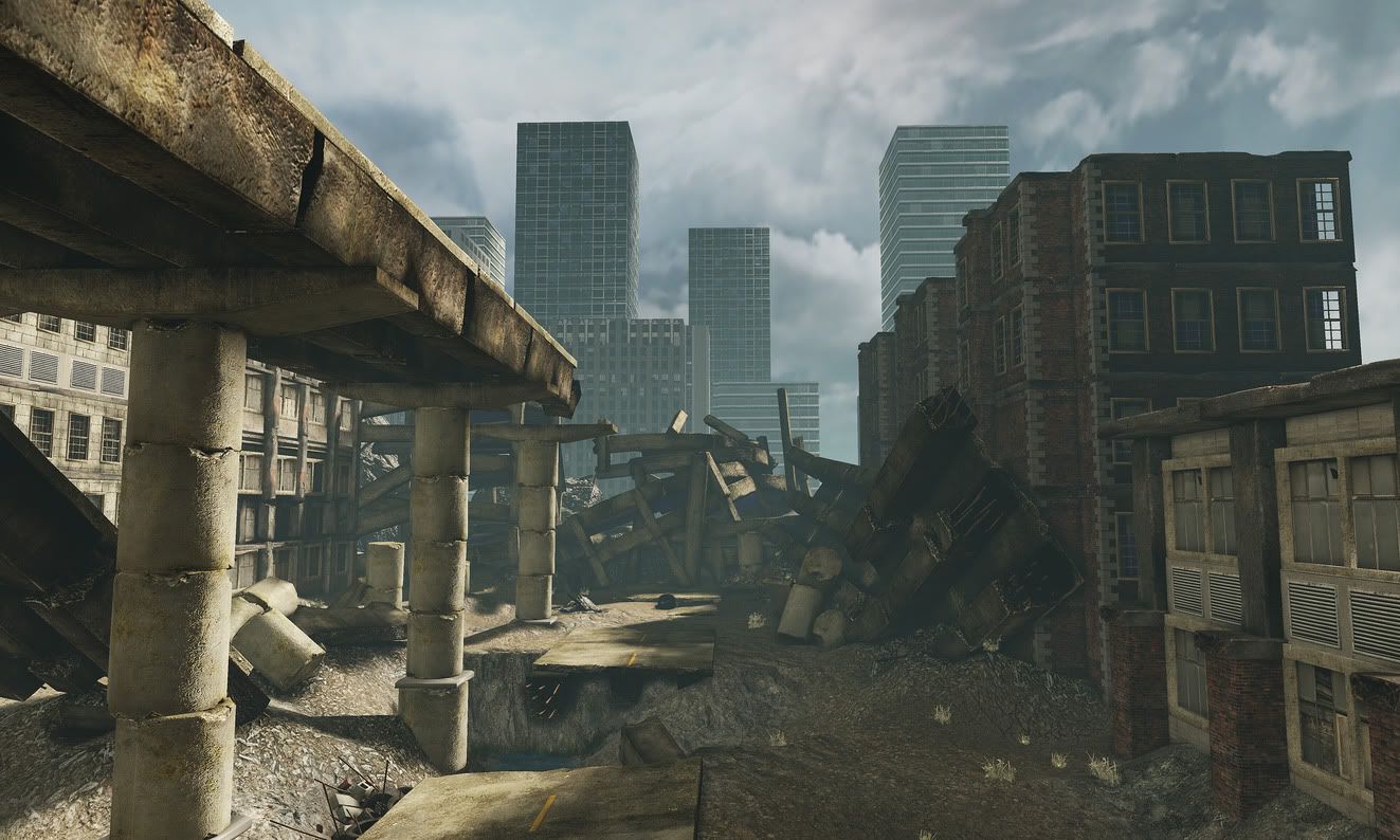
Also, the buildings in the background are not mine. They will be replaced soon enough.
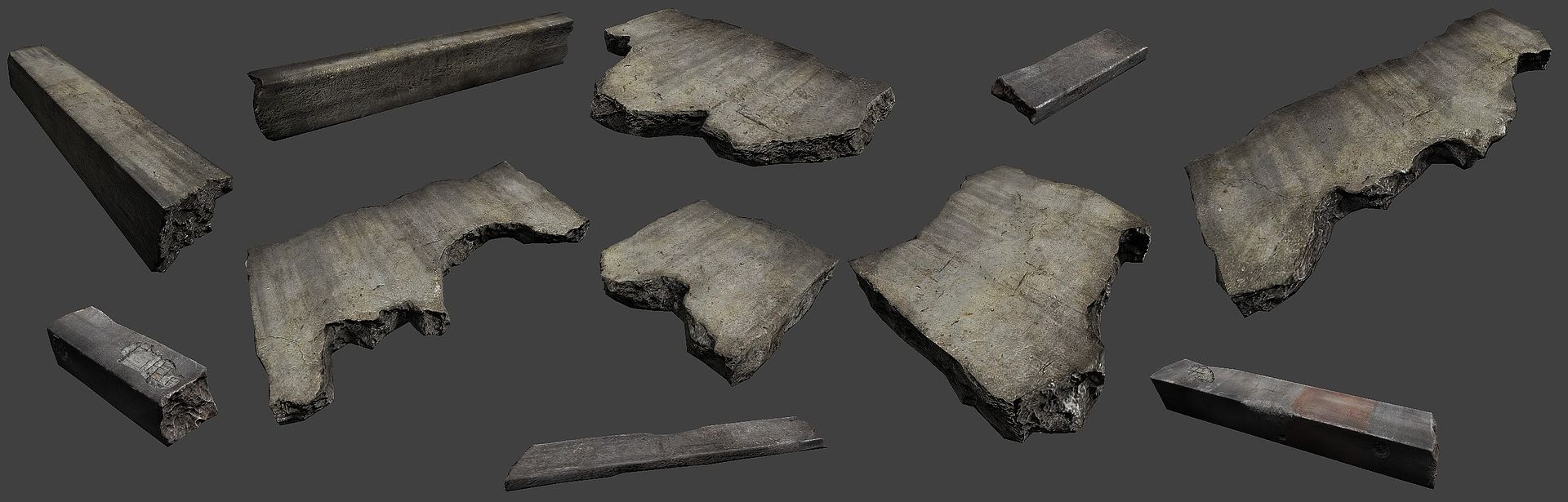
You may recognize some of these assets from my rubble thread:
http://i232.photobucket.com/albums/ee214/wareznoob/rubble_pack.jpg
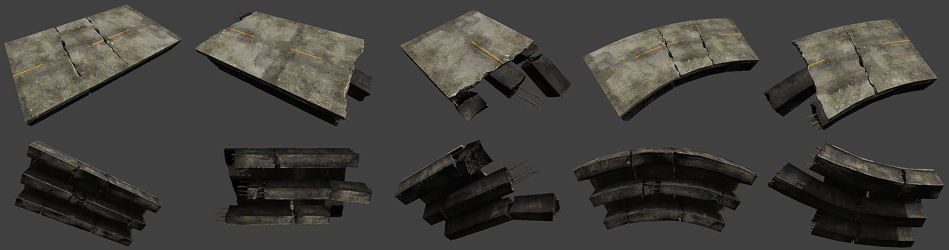
http://i232.photobucket.com/albums/ee214/wareznoob/roads.jpg
Its not finished yet, I still wanna add signs, traffic lights, cables, pipes, sidewalks...
But I think im on the right track.
Also, the buildings in the background are not mine. They will be replaced soon enough.
You may recognize some of these assets from my rubble thread:
http://i232.photobucket.com/albums/ee214/wareznoob/rubble_pack.jpg
http://i232.photobucket.com/albums/ee214/wareznoob/roads.jpg
Its not finished yet, I still wanna add signs, traffic lights, cables, pipes, sidewalks...
But I think im on the right track.
Replies
This is looking pretty good so far. Can never beat post-apoc environments. Don't have time to look at it in-depth but down below I have a picture of 5 things I initially thought.
1. Could be a place holder texture or not finished with it but I would say this is pretty low quality texture compared to the rest of the scene.
2. Maybe still have some of the supports fully intact. Doesn't feel integrated at the moment. Variation seems to be key.
3. I read that you were going to add street signs and stuff. Maybe add trash too. Liter (paper, cans, dirty boxes, maybe throw in a child's toy for effect, etc) is efficient for filling up spots that feel empty.
4. This kind of goes in hand with suggestion #2. Need more variation between those modular pieces. Perhaps different damaged sections on each?
5. Again, just more variation. More broken glass on one than another, maybe make the vent covers seem bent on a few.
This is just my quick analysis. You're doing great and keep up the good work. Looking forward to seeing your progress.
Zack Dembinski
Alright, i just updated the screenshot. I get rid of the important mipmaps.
but I disabled the mipmaps for the highway models.
Also, im touching up an old model for a trash can:
I may make some small tweaks in the lighting, but for now, im gonna call it done.
Now, Im gonna keep making assets, and maybe even have time to replace some ugly ones.
In addition to feedback, I would also like an answer to the following question:
In the "World Properties" window under the "Lightmass" tabs, there are these 3 options that are unchecked. Enable Image Reflection Shadowing, Visualize Material Diffuse, and Visualize Ambient Occlusion. When I select them and build them, it takes VERY long, so I never followed through. Could someone tell me what these check boxes do?
This is something new from the March build. There doesn't seem to be a whole lot of documentation on it yet, but this is the sort of effect is supposedly gives - http://udn.epicgames.com/Three/rsrc/Three/DevelopmentKitBuildUpgradeNotes/Shadows_Reflective.png Though I'm not entirely sure which part -_-
- Visualize Material Diffuse:
Override normal direct and indirect lighting with just the material diffuse term exported to Lightmass. This is useful when verifying that the exported material diffuse matches up with the actual diffuse.
- Visualize AO:
Override normal direct and indirect lighting with just the AO term. This is useful when tweaking ambient occlusion settings, as it isolates the occlusion term.
Step 2: Place it EVERYWHERE. there you go!
Looking good btw, keep it up.
(also, was serious about rubblemesh. :])
Im really happy with how the sun and water turned out. Also, im glad how subtle the chromatic aberration is. I think it really adds the the scene.
At one point, I did play around with lens flair, but decided it wasn'[t a good idea.
Also, I think im about finished with the lighting and post processing. So now I can get back to adding assets.
Other than that, it looks great (maybe even because of that).
my only crit is that it's clear you're using the same photosource overlay for all of your concrete... some color variation in your pieces would be great... some more contrast in your spec maps might be cool too... i'd also suggest lowering the gloss on them too and letting the spec map do a lot more of the work.
Cheers
It might look nice if you use decals or mesh paint to blend the bottom pillar pieces with the ground. It's such a harsh transition right now so my eyes goes straight to it. Also I would suggest adding some rubble or more foliage to that big empty space in front of the vehicle.
To the only doubt that I have is the structure of concrete pieces.
For example the pillars of viaduc normally are monolite concrete shapes. Its not like middle ages castles which were built by basically piling up sections of stones on top of each other.
The whole highway overpass structure just don't feel stable even in it's "undamaged" state. The fact thet it is 1 row of pillars which consist of "lego blocks" piled up would make the whole highway collapse even without any war or cataclysm event:P
Now, the collapsed concrete buildings seem to be fine in terms of their "blocks" but they seem to be in dynamic state right now.
That is to say they seem to be in collapsing motion and not in a static state. The way the blocks are turned and position in relation to each other just makes it look like it is a "freeze frame" from collapse aniamtion. The fact that individual pillar pieces stay "glued" to some parts donesn't help either.
There's also a place where a pillar that is holding up an overpass is partially floating over a ravine, I would pull out the bank underneath it, or make some sort of concrete base that goes underneath the pillars. I'm not sure how these pillars are constructed in real life, but they might have a concrete base that anchors them into the ground. You might be able to make a piece (or reuse one you have with a different coloring and/or normal) that you could place at the base of these pillars, so you could have a better transition from the uneven ground surfaces to your pillars.
Logic of tipes props usage is not very convincing.
Why there would be a pile of tires in the middle of the street?
I think if u would skatter them more around it would look more subtle.
Im probably gonna edit the materials a bit, but here's the basic idea? U guys think its better? Im gonna wanna increase the AO tho.
I also edited the specular maps to most concrete models so that they reflect a little more white light rather than a yellow glow. I also added a spec to the background buildings in order to bring out the shine from the windows.
Also I feel as if the brownstone type buildings don't work well with the architecture of the other buildings. I would also take a look at your overall composition and lighting as it feels a bit lacking at the moment. Maye get more sky in your shot for color. More props like street signs and light poles for color too. Don't just go with ref for that stuff like the brownstone buildings... try to tech it up or change the design to get more character to the shot and hint at the rest of the world that we will never see. Tell a story with those bits.
Cool stuff so far just keep pushing it and check your scale.
Keep it up!
On a side note, after looking at some screens from Rage, I can see where you got the almost 'house of cards' style of building collapse from.
Great work so far, keep pushing it.
that said I dig the way your materials are reading so far
http://plaza.ufl.edu/rooster/ID_software.html
I also added a collapsed skyscraper. Still working the kinks out on that one. Its tricky to make it look good with modular pieces.
- a bus stop
- road signs
- commercial/advertisement boards
- Road/street nameplates
- Streetlights
- Classic dark-green City Direction Signs (Since the big road looks a bit like a highway, or access to one)
I think adding a couple of those can bring more color to ur scene. Myself I'm all for the big Gears of War I dark color settings but I think with games like Bioshock3 gamers want to see a bit more variation
btw thanks for posting that Tut you made a few weeks back !