Home 3D Art Showcase & Critiques

First UDK environment (help me improve this)

Ok, I've worked in UDK before, but I've always just done props and the like, and have only done environments in other engines, so I decided it was time to buckle down and learn more features in UDK and do an environment.

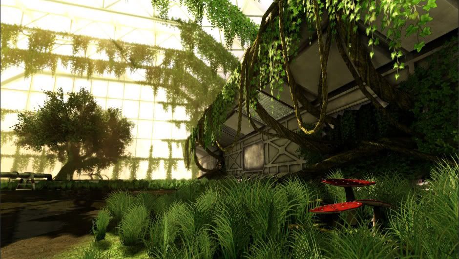
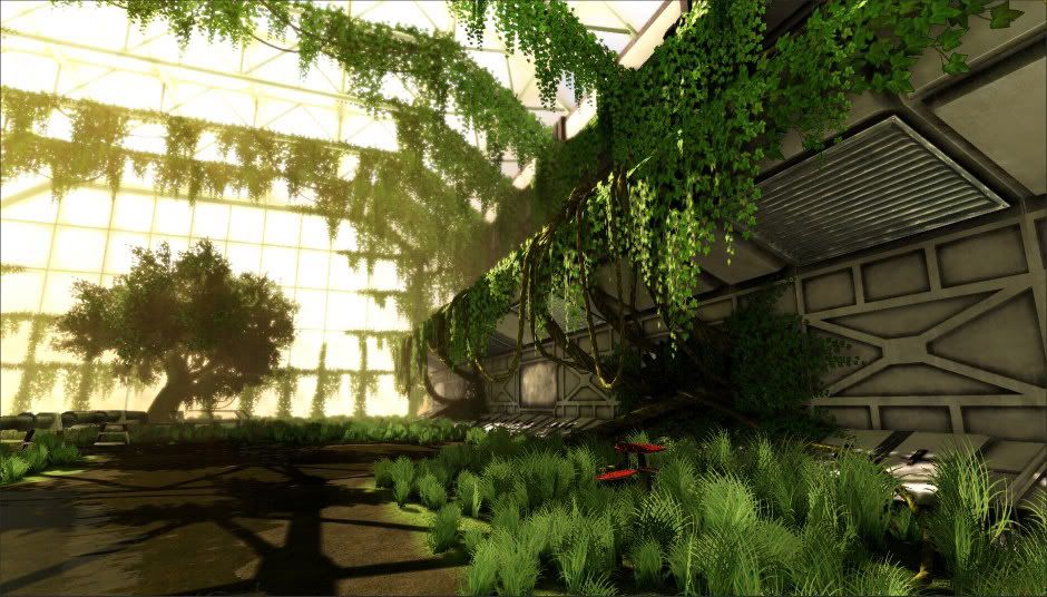
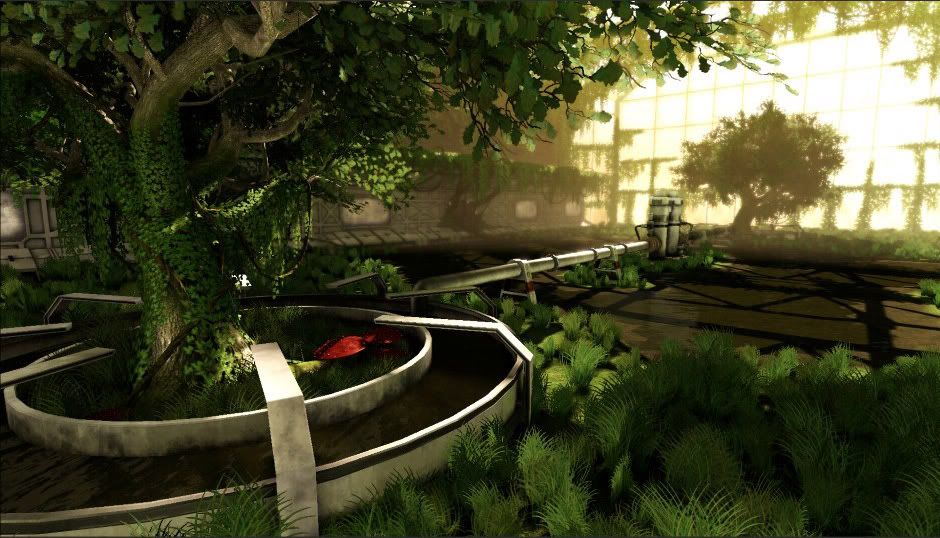
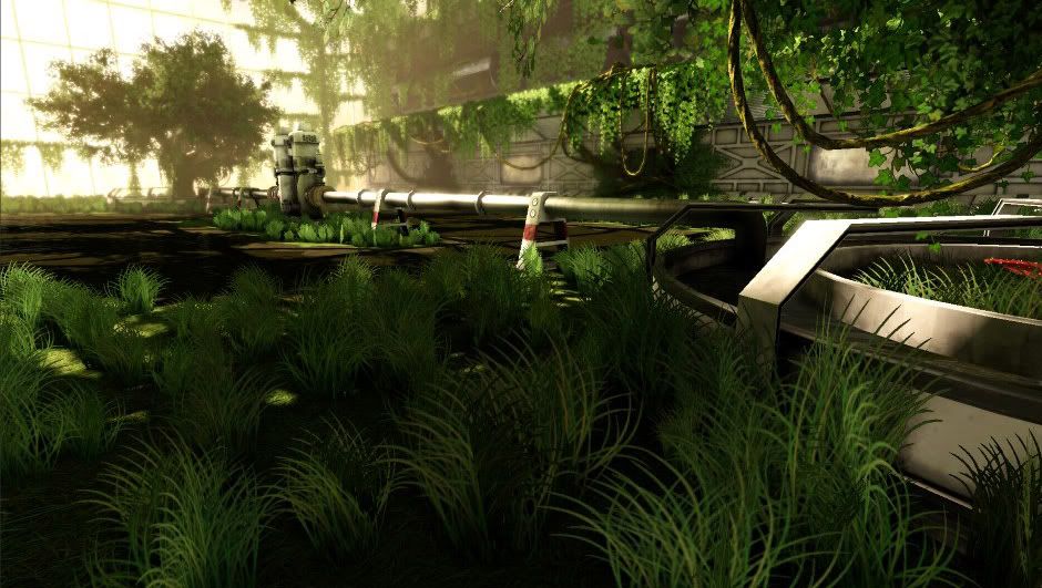
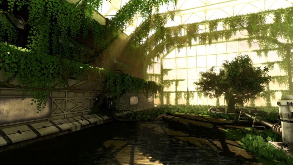
This is "finished" but I know there is a lot of room for improvement so I would like to hear any suggestions people have on how I can take this to the next level. Any C&C welcome. I know the images are on the small side, I can upload higher res images once I get home from work if people want.

EDIT: Well, now that i've successfully outed myself as a complete moron, you can all finally take a look at the images :P Anyway thanks for the help getting these visible guys. 940x663g.jpg

940x663f.jpg

940x663d.jpg

940x663.jpg

940x663gs.jpg

Replies

  • BlvdNights
    Offline / Send Message
    BlvdNights polycounter lvl 8
    1. Click on the little yellow box on the post toolbar with the mountains and sky

    2. Insert jpg link

    3. ???

    4. Profit
  • CrackRockSteady
    I'm uploading the images from my computer, not from a URL. I followed the instructions laid out in the FAQ...upload the images, click the arrow next to the "attach" icon, select "insert all". Instead of embedded images, i get whacky links...?
  • oobersli
    Offline / Send Message
    oobersli polycounter lvl 17
    upload to photobucket, then link it in your post. easy peasy.
  • CrackRockSteady
    hm, i guess I'll just do that. Seems like it would be pretty convenient if it just worked to upload them from my computer though.... Oh well.
  • Shiniku
    Offline / Send Message
    Shiniku polycounter lvl 9
    I definitely prefer when someone hosts the image offsite anyway, so I can see the images even when I'm not logged in.

    Anyway.. your links work pretty much, and that looks pretty swell, nice foliage.
  • Charlie
    From the pictures I think its great for a first environment! The only thing that stuck out was the lack of variation in the plants. The ones on the floor all look the same, maybe subtle colour changes would work to change it up a bit?
  • CrackRockSteady
    @Charlie -- I totally agree, I had originally wanted to add some more plant variations, but kind of ran out of time (i gave myself a deadline for finishing this). I think that's one of the biggest things I want to change. I'm also not satisfied with how the grass looks and I want to go back and revisit that and see if I can get it looking better.
  • Sharvo
    Offline / Send Message
    Sharvo keyframe
    Lovely seen for your first real time in udk, i too am doing my first seen looks like you have got to grips quicker than me.

    I was wondering how you did your water? Looks very nice!

    Well done.
  • CrackRockSteady
    @Sharvo -- Thanks :) The water was sort of a combination of techniques from Ryan Smith's advanced mesh paint tutorial from 3dmotive.com and the water material tutorial from hourences.com. Neither one had exactly what I wanted, so I took bits from both and got pretty much what I was looking for. There's definitely room for improvement in that material as well, but for right now I think it accomplishes what I need.
  • Rurouni Strife
    Offline / Send Message
    Rurouni Strife polycounter lvl 10
    From the "first full UDK enviro" side I like it quite a bit. It looks like you know exactly what your doing! I more have a comment on the artistic side. I feel like the walls need to be dirtied up some. Throw some mud or dirt on the areas closest to the plants, and rust where the water is. They read as metal walls to me, hence some light rust. I would also like to see another grass type or and variation in heights a little more.

    Really great job. Push it a little further!
  • CrackRockSteady
    @Rurouni -- Thanks, good suggestions, I'll dirty up the walls some more. Also, the walls are actually supposed to be smooth plastic (if you've seen the movie Moon, or I guess 2001 A Space Odyssey would also be similar), so I guess perhaps the walls aren't reading quite as intended. I'll have to work on the spec/gloss a bit and see if I can get it to read better. Good point on the vegetation as well, after I get some more plants in there I'll try to make sure to vary the height and break it up some more.

    Thx for the suggestions guys, I'll try to update the thread as I make changes.
  • Seaseme
    Offline / Send Message
    Seaseme polycounter lvl 8
    you would benefit from duplicating that grass clump, making it slightly larger and making it a different hue of green with more yellow or red. That would really help pop your foliage out. I feel like the amount of green is overwhelming. Add some colorful flowers or props or something to make the scene a bit more interesting.


    quick paintover to illustrate point:

    W9SPn.jpg
  • CrackRockSteady
    @seaseme -- I actually have a dupe grass clump in there with a slightly yellower color, but clearly it is too subtle right now.

    as for your paintover - YES. I like it, great idea. I had been thinking of adding more different types of green plants, but you're absolutely right, it needs more color. I think that's really going to help this scene. Thanks dude.
  • glottis8
    Offline / Send Message
    glottis8 polycounter lvl 9
    Different heights, shapes of grass would help a lot to break up your env. Different plants, or more colorful hanging ones. Think of where the light hits would make the grass grow faster. Things like that. I attached a pic that your scene reminded me of. I thought you could benefit from looking at it. I like where your scene is going. Good job!


    conservatory_concept.jpg
  • Justin Meisse
    Offline / Send Message
    Justin Meisse polycounter lvl 18
    The overall look is great, you really did a good job on the tree canopies. The grass is a bit disappointing, it's too clumpy right now and obviously the photoshop grass brush.

    Setting a deadline for yourself was a great idea, I suggest you take a break for a few days so you can come back with fresh eyes and do a polish pass.
  • CrackRockSteady
    @justin -- I actually made the grass blades in photoshop using the eliptical marquee tool and cloning them around, and it never even crossed my mind how incredibly similar my result looks to the grass brush :( Probably a good idea to just start from square 1 on the grass I guess, "grass brush" is the last thing I want people to see when they look at this. Thx for pointing that out.

    @glottis -- cool concept. Which Gears is that from? I've only played Gears 1 and its been a few years, I don't recall anything like that in the game. Was there a level like that in Gears 2?
  • glottis8
    Offline / Send Message
    glottis8 polycounter lvl 9
    @CrackRockSteady: I think thats from the first one. This is the botanical garden i think.... the level was there... it was just not as colorful. The first one was way grey and monotone. Hope that helps to give you some ideas on how to break your composition a little bit. :)
  • Striff
    Offline / Send Message
    Striff polycounter lvl 18
    You need more spec in your objects. Everything right now just feels flat. What is the lighting setup? I'm guessing you just have 1 dominant directional light right now. It looks like you might have a height fog in there, but it really isn't helping add anything to your scene.
  • CrackRockSteady
    @Striff -- Can you be more specific? What do you think needs more spec? With the exception of the pipe running through the scene, and a few other metal bits here and there, the rest of the stuff was intentionally given low specularity. Most of it is supposed to look pretty dirty and flat (adding some more obvious dirt to the textures is something I'll be updating soon).

    You're correct, there currently is just a single dominant directional. I got the look I was trying to achieve with the single light so I didn't feel the need to add additional lights.

    As far as the fog, my intention was simply to give the scene a slight warm haze in the distance. Granted, it is a fairly minor addition to the scene, but I wanted the effect to be subtle.
  • CrackRockSteady
    Quick update, I redid the grass and added a few flowers. Grass can probably still use some work, but at least it looks a lot better than my previous "looks like he used the Photoshop Grass Brush" attempt.

    I'm still planning to dirty up the walls some more when I get time.

    WIPNew01.jpg

    WIPNew02.jpg
Sign In or Register to comment.