The BRAWL² Tournament Challenge has been announced!
It starts May 12, and ends Oct 17. Let's see what you got!
https://polycount.com/discussion/237047/the-brawl²-tournament
It starts May 12, and ends Oct 17. Let's see what you got!
https://polycount.com/discussion/237047/the-brawl²-tournament
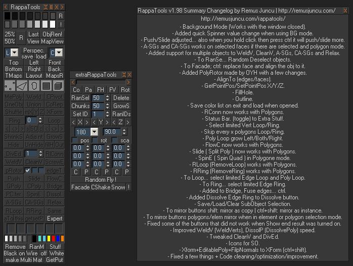
RappaTools v1.98
polycounter lvl 17
RappaTools is an modeling toolset for 3ds Max (9 Sp1 +), that offers a
wide range of tools for creating various types of subobject selections as
well as a set of modeling tools which will make any tasks in everyday
modeling a lot easier. It also has a lot of other options like 50%/25% Render,
Quick Light/Cam select, Toggle maps display in viewport,
Random Material/Wirecolor, Make multi material from textures
in a folder, and many more...

Download and Experience the power of this free MaxScript yourself.

If you enjoy this free MaxScript consider donating especially if you use it for
commercial work, since I'm developing this script on my free time when i'm not
working on my college assignments.
So what do you think !?
http://remusjuncu.com/rappatools/
or scriptspot.com/.../rappatools
Replies
I will have a look at the videos to get an overview, for your site or project I'd like to see some kind of overview table or list with thumbnails mini ani's showing what each tool / script does. That way one could start play with it around and once a bit familiar read up specific features in a list like that.
as for the help/overview_table/thumbnails i will do that after i finish 2.0
Many people already tried tackling UI concepts for max as most people are not happy the way Autodesk is going (including me).
screenshot reference for polyboost:
music app GUI screenshots references:
http://www.creativeobserver.com/img/3189_future_audio_workshop_circle_1.0_ui_lg.jpg
http://www.creativeobserver.com/img/9851_propellerhead_software_record_gui_lg.jpg
http://deckadance.image-line.com/extimages/p_DeckadanceScreenshot.jpg
http://www.soundonsound.com/sos/sep09/images/ReasonTech_01.jpg
http://www.soundonsound.com/sos/sep09/images/VSTDIY_02.jpg
http://www.cokemachineglow.com/images/8138.png
http://www.lennykiser.com/wp-content/uploads/2010/11/ableton.jpg
http://www.wiretotheear.com/wp-content/uploads/2007/12/ableton_auto_filter_sidechain.jpg
http://www.msbkonline.com/wp-content/uploads/2008/12/darkgrapescreenshot.png
as for the tabbed mode, that might be one of the few solutions that i have... i hate rollouts too, plus when using rollout it gets to high and you have to scroll... especially for a low rez display...
yeah i saw mzp rucksack, you had a great start there but hopefully ie9 will bring flash to x64 :>
Will make a few mockings and take it from there
what do you think !?
version 2 and 3 under development
Good ui imo. have a way to teach the user on their own pace which tools belong together and which tool can be used when or for what. But if you have everything shown at once you have 100+ buttons facing you and it confuses a user even more which one to click at first. And learning them like that one by one is even more frustrating - because its tedious and hard to track. So honest I think quite a few people might try it but then again many of them might just uninstall it after a few tries again because of this UI complexity.
I'll be honest here, to this day I haven't even tried this script because simply the amount of buttons scared me away + I found many rather useless buttons in it giving me the impression that only 20-30% of the buttons are actually interesting to me.
I'll propably repeat myself but try considering:
- stripping non unimportant things (focus on a productive direction and keep the tools to that)
- using tabs, rollout or other expand/ collapse or reveal switch elements
- combine symmetrical tools in 1 button or tool, similar to games that have a 2ndardy function on weapons - use the same method to trigger the opposite or symetrical result with a 2ndary mouse button. For example: Black/ White, Rings/ Loops, Shrink / Grow, +/-, push/ pull, save/ load, similar/ random, ...
- sometimes images can tell more than 1000 words, even icons. Maybe consider using icons instead of text for some items or a mix of the 2 for a faster eye reading and better cognitive recognition and memory of the user.
the way it looks like now is more like a competition of who has the most buttons or tools in his interface. The worst 3dsmax script interface I have ever seen was this one: http://www.lotsofrobots.com/automatron/Images/Automatron_Interface.jpg (a pure mess on so many levels)but if i were, the tool would be frightening to me
so much stuff, all at once. the tool scares the user away
a good way to work around this would be an option where you can enable or disable functions from showing in the menu(with one short phrase explaining what it does), with the default set to disable everything but the 4-5 core functions
so users could easily enable more and more functions as they need/learn them and the ui would feel more natural to them
i dont know how hard it would be to set this up, but this would be my approach to this
And that hotbox thing is quite intriguing, I'm hoping this is customisable, that may save me from going back to maya as soon as possible when touching max.
i really don't know what to remove
there are 3 tabs now, I don't like to keep changing tabs, that why in previous versions there was only 1 tab...
tried to combine more buttons now...
+1 for icons but i suck at doing them
and i have to agree with BeatKitano...
SnowinChina idea seams cool but that will take a lot of time to implement... even now i spend a loft of night just to finish it as it is...
Don't know if you've mentioned this, but in ZBrush, you can hold down ctrl while hovering over buttons to view brief breakdowns on the button's function. Could be an interesting idea to help everyone learn to use all these tools you love so much
Best of luck! I have some buddies who use Max, so I'll shoot them a link and ask them to test.
If you mouse over the buttons you get a small popup with an explanation what the button do.
Thank you for the quick response, which leads me to a concern
The beautiful thing about ZBrush's method is holding a button down when hovering keeps you from having to wait a second for the info to pop up (don't know if that's how RappaTools works or not). Those seconds add to the frustration of the new-user.
Mostly, I just hope that the popup isn't always there when hovering, though... it hides other buttons and makes picking the right one difficult which makes me a very sad panda (in other tools I've used).
If none of this applies, just forget I said anything :P
added the box menu...
remusjuncu.com/rappatools/RappaTools2.mzp
what do you guys think !?
Seing it in action in the video makes me very interested in it (I can see many, many applications for it) but I do not have interest in the full modeling toolbar (since I have my own toolset already)
I am sure you have many other interesting tools like that. Would you mind posting screenshots of the other things you can do ?
As for the UI - I think all you need is rollovers, with clear categories.
Thanks!
Short answer, no... at least not now... the easiest/fastest way is to get rappatools3...
Can do with "spline brdige" or rappatools3 !?
The new rappatools3 has been mostly re-written or improved... and now it's not based on the interface anymore... the interface it's a faster way to access stuff from it... or the box menu that can be easily assigned to the space-bar or something else...
Loop, Ring, "Sub Object Level 1, 2, 3..." are smarter then before... almost every selection tool support's edit_poly modifier...
Improved Similar, DotLoop, FlowConnect, Mirror, GeoPoly, RemLoop, SpinEdge, Union undo, Copy/PasteTrans...
also check the other videos... http://vimeo.com/21060880
Cause I WOULD BE TERRIBLY INTERESTED since max 2012 looks more reactive (no more delays when switching between component mode)
Also new video: [ame="
any thoughs !?
should work on new features though, but i can't seem to find time from college
Now I've two things:
1: why no trial/demo ? I'm seriously considering purchase, but since I can't see what's the additions of 3x in a production usage I probably won't take the step.
2: I SOOOO would love to be able to create my own buttons in rappatools to tie all my scripts together, I don't like max toolbar, rappatools have been my weapon of choice because it's the inverse of max: everything in one place ftw , so been able to put the things not included in it in the same rolllout would be ace!
[edit] and now I realize I probably should go see my old pal rucksack for the second part...
1. Because RappaTools2 it's free... And i don't want to work on script protection
Well imagine rappatools2 but better... new features and improved old features...
also now functions are available for costume use... and the interface it's just a quick way to access them, where in v2 the interface had the scripts...
adv.fn: RappaTools3.Loopfunc ctrl:true/false shift:true/false alt:true/false selLevel:1..5
2. I had one idea to make the ExtraStuff dropdown to load things that you want so you can access them from there... but i could make another tab for custom stuff...
[edit] - later on the interface will be open so everybody can change it
Everything works with all max versions starting with max 9 sp1
P.S. you can navigate the site using keyboard: 1.rappatools2 2.rappatools2 3.images/videos 4.features - something that i wanted to do :P ...
You can use shortcuts just like any regular custom maxscript, custom trl/alt/shift modifiers switches are practical and very appreciated.
Really for 15$ it's worth it. I know I sound like an adbot but this complete and improve the missing parts of vanilla max.
I'm looking forward to the minor suggestion rappyBMX (btw deleting modifiers could be just a ctrl+ mod dropdown menu of "add mod"), rt3 is an invaluable companion to modeling in max
No problem at all, just popping in to let you know that you can completely collapse the interface of IC.Shape to its header only (a bunch of pixels) by double clicking on it.
The idea behind having the interface open when tools are needed is to avoid having callbacks constantly working in the background when the tools are not. Also IC.Shape status and position is saved in an ini file and restored when 3ds Max starts.
IC.Shape provides actions to associate shortcuts to every tool in the set by default, and also extended actions to single modes for multi-mode tools. You can install them by right clicking on the header and select "Add Actions".
This is also something i really hated about Polyboost.
Btw the toolbox may help you get into it, try 2.x it's in there.
@synchviews: I know about the roll thing, but I hate to be dependant of an open interface. I dunno, I don't feel safe, besides (I don't want to diss your work as it has helped me quite a bit in the past) but i experienced bugs sometimes when it wouldn't work anymore and had to restart max, probably because some scripts where not finishing and blocked the thing.
There's probably some bugs in rt3 too (but it's a beta it's expected) but I've not yet encountered a show stopper (in 2.x that is it's too soon to say for 3x ^^)
Such plugins are meant to make life easier, even vanilla max´s "scattered item interface" is more then just ab bunch of buttons randomly packed together at least there is some kind of structure.
I agree rappatools is crowded wit buttons, I can be wrong, but the only way I see to make it more structured and easier to grasp would be to add breaks and separators (things like that), but that will only make the pannel bigger for the same amount of functions.
I personally don't want that, I like my screen estate even if I've plenty and concentrate on the work more than the fancy ui (I hate polytools for that even though they are seriously feature packed). I want contextual actions and rappatools (and IC.shape too !) offer just that.
I'm using 40 custom mcr/ms files just to have contextual interactivity between all subojectlevel modes using perna smartcreate pattern scripting. And that's why I'm really enjoying max now.
A good UI concept comes first, having the possibility of customisation is a plus so that you can make it fit to your own needs.
Leaving everything to the user from the start is either beeing lazy or not beeing user-friendly in my honest opinion.Even more if he wants to sell it.
A good UI doesn´t force you to take half a week(exaggerating here, you get the point)doing customisation to make it fit your needs(shortcuts aside).
At best the user doesn´t feel the need to change anything(or just a little bit).
Don´t get me wrong i love most of the features, but for me the ui is plain shit(you can call me an asshole for that, but that´s my honest opinion)
even though sometimes i like the rt2 ui more because i don't have to switch tabs to get to things i have everything right there
but i could include diferent UI's
I know this was a suggestion, but I actually undocked the various and modeling tab to fit them on the same panel... Tabs are not a good idea here imho :>
@specter: I think rappatools 3 is not meant to be a replacement for max interface (Am I wrong rappy ?) and is more like a power user thing. So yeah I think vanilla max still suck big time about intuitivity and streamlining but at least we got the mean to make it our own and I don't think that's the point of rappatools, just a power user tool panel not very friendly looking but very powerful...
Let's say for now I'm not counting on rt3 to be the max I dream of "ui-wise", I'm looking to 3point studio for that :>
I think for RappaTools the major thing that scares people away is the wall of buttons. Work out some new concepts or ideas on the UI.
I always felt that the design followed your evolution of developing the tool, whereas it doesn't always necessarily follow function or ease of use and other usability goals. But I wrote this stuff several times before in this thread- I just think just like Specter that the UI is bad- and it needs a proper concept or idea.
Certainly, but what ? I'm seriously asking because I honestly think it's only going into one direction: slowdown the use of the tools. I would be happy to see something simpler to use while functional, but I don't really know if that can be achieved, look at the ribbon: panels and subpanels=SLOOOOOW.
Max wasn´t made to contain a ribbon , but they "hacked" it in by force.
It´s like loading a small car with tons of nice stuff, eventhough it´s not meant to carry that many.
Making things cleaner and appealing is nice, we all agree, but most of the time this leads to slowing down the workflow. I know there's a balance but honestly except for gesture or quick menu access, i can't see something quicker than a button (with the exception of hotkeys ofc). That's why when I see people saying "rt looks like shit" I understand the crit, but I'm curious to see what they would suggest to change that.
Don't get me wrong I'm not doing the old "do better if you can" speech here, just trying to be pragmatic.
You keep open the tabs you need most often -> no slowdown
Need another functions in another tab? -> 1 click more at most compared to wall of buttons.
This kind of approach has many pros:
- Looks and feels more intuitive
- On average case you need less space
- not that many additional clicks
- easier to add features, if he adds a new feature the user knows where it is
I know that most of that is possibe with the mzp rucksack for example, but that should be the first option for the ui and not a possible solution to the wall of buttons.
And i´m not talking about nesting tabs into nested tabs to organise stuff.That´s what autodesk did with the ribbon, where you have to click 4-5 times in the worst case.
I would bet that i´m faster with what i said above then you are with the wall of buttons if he rearranges it completely(to simulate you being completely new to it).
Not because i think that i´m "king of the hill", but because it´s organised in logical groups.If i needed to search for something i could exclude some groups completely and just look into the one(s) which could have the function i need.
That´s why data-structures like binary-trees are so damn fast.
If you know the ui completely you could be faster, but only by a small amount, which can be further reduced, because i have the groups open i use the most, which makes me use just one click like you do.
Because yes you would be faster if I didn't know the layout, but I prefer to be able to click the buttons I need directly when I know where they are.
Having to click on a tab I need when another is taking it's place before clicking the button is a loss of time.
Organization helps, but if you still need two clicks when one suffice when you know where's what you're looking for it's pointless.
Your point is valid at the beginning, when you're completely new to the thing, and less and less after you know the buttons locations: at that point you need to be able to access them directly (hence custom placement in tabs with your most used buttons) or it's becoming an obstacle to workflow efficiency.
@RappyBMX: I discovered a bug today, nothing too serious but annoying nonetheless:
if you push MePoly while using isoline display on turbosmooth you get a broken mesh (vertices inserted without edge connections)
For example:
- ! (i mean what the hell?)
- Me Poly
- BC
- CL
- This
- getSetPpos
I know i can read the manual, but come on be serious, give them proper names!
I mean what will happen if you add lets say 10 new selection things. will the part where all the selection related stuff is be squashed together and we get names like R,L or something for Ring/Loop ?Or will the new button be placed where it doesn´t make sense?
Make them collapsable and give each group a proper name. And make little gaps, the eyes need some rest, this makes searching certain buttons easier for the brain.
Sometimes even the manual doesn´t give much information see:
"One Node"
Description:One Node Tool
How the heck is someone not familiar with it supposed to know what it does?
Instead of helping being productive you need to find out or test the weirdest stuff.
Look at it from the beginners perspective or someone who looks at it for the first time.In most cases you are forced to spend time learning it you often don´t have.
Or look at it from the perspective of a possible buyer.Would you buy something which has more tools then the free one which already is crowded with buttons and stuff you don´t get?
I´m not saying that to make you feel down or something i just want to help improving it.
I think you got me wrong there with the tabs(tabs is the wrong word i guess)
You should be able to have more then one tab active at time. So not like opening one and the other gets closed.
Nothing to argue about, but getting used to it is easier the way i say it(and the possibility that the plugin is used is higher to)
You get the infos you need that way, that may not be optimal but it works.
I understand the idea, but it also creates a problem: what do you do if you have multiple buttons in multiple tabs (or logical groups if you prefer) that you want to use often?
You need to keep those tabs open "all the time" and there's not only one button in those. So this bring the question: how much buttons in multiple opened tabs are visible at all time ? This is starting to resemble the "all button all time" situation. This is why I ask for a custom placement of buttons in tabs (maybe a custom tab with YOUR most used tools ?). That way you can collapse the tabs you use less often and have a reasonable amount of buttons in a few (one ?) tab(s).
I like this discussion even though you are a lil' bit aggressive I think (but I'm not the one taking the heat so I don't mind haha and still it could be because english is not my native language) because this helps narrow the ui that may work.
In 4 posts we are starting to get to an agreement, not bad.
P.S: I've to admit I'm participating in this discussion only to make thing emerge for rappy. (I don't use the interface much as I'm using hotkeys for almost everything, in expert mode 90% of the time when modelling and ultimately if I could I would only have the viewport on my screen
well no, not really... same here, but for the moment i don't see other option
I usually don't like tabs because my pc is slow
i have: AMD 64 x2 4000+ (2.1GHz), 3GB Ram DDR2, GeForce 9800GTX+ 512mb - a decent video card though... but the processor and the motherboard suck big time
And i´m doing it for rappy too, i could do most of it myself or use it like you do.
But getting it bought by people is easier if it looks good
It reminds me of the discussions I sometimes have with TAs at work. They always want to name their tools with the shorter name possible, because they think it saves space and artists like that. In return, I always ask them to give the most descriptive name possible, even if it ends up being super long. That way, anyone using the script a month or two later can still understand how to use it.
I seriously want to use your tool, but in its current UI state, no way. Simply break it down into collapsable categories, and maybe limit yourself to 2 full text buttons per line. Also, use colors!
I would happy to provide interface mockups, but for that I would need to know exactly what each tool does...
[ame]
if you have something selected it works only with the selected objects... if not it works with all the objects in the scene
( also note that the name of the turbosmooth modifier doesn't matter )
pior - waiting the email...
BeatKitano - check you're email... the new rappatools3 should be in there
another video... also working on the new interface...
still have two more weeks of college but after that i'll work mostly on finishing it
any thoughts !?
( the new build should be available in a few days )