Hi-tech research facility (UDK environment)

polycounter lvl 18
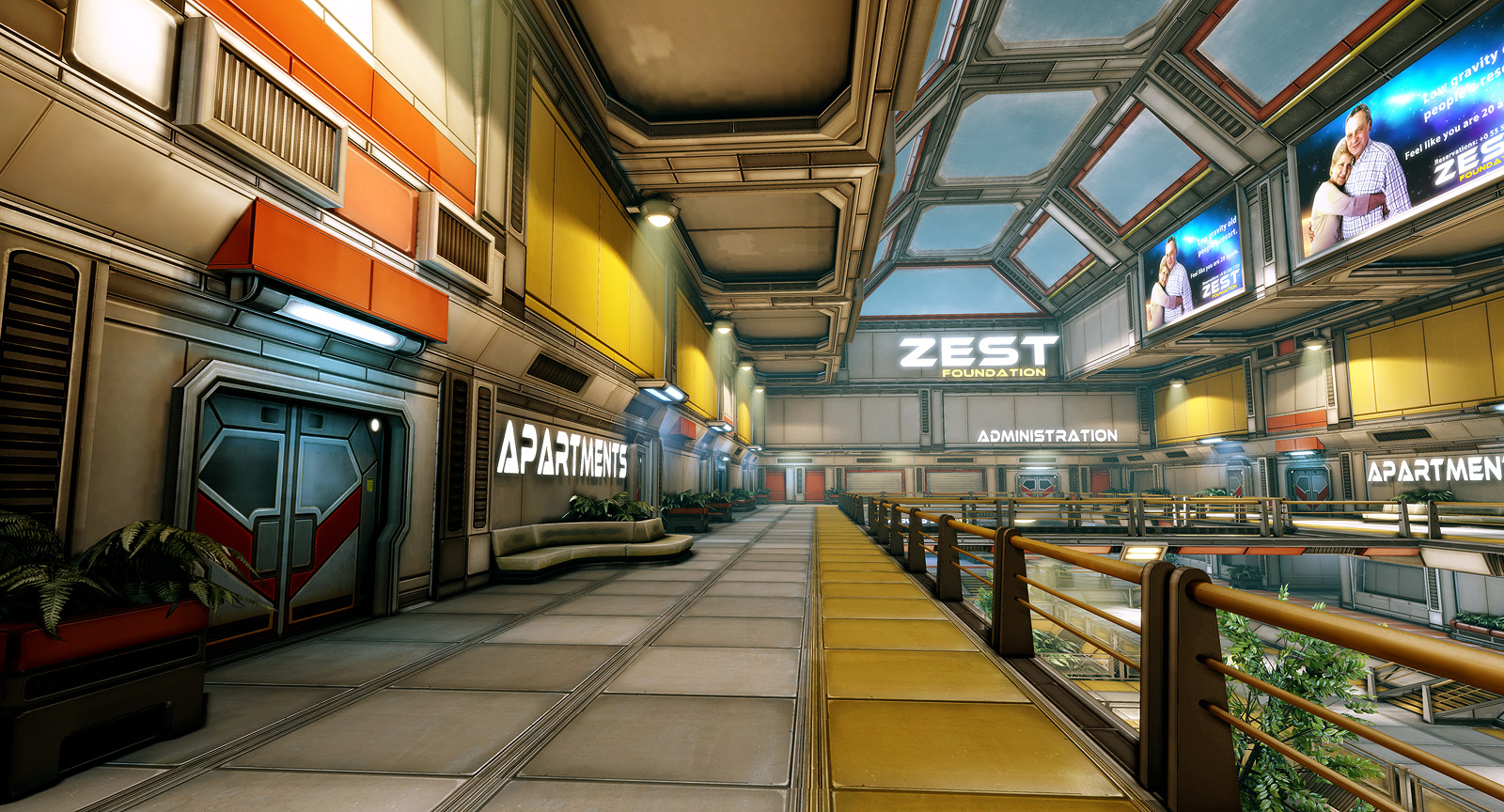
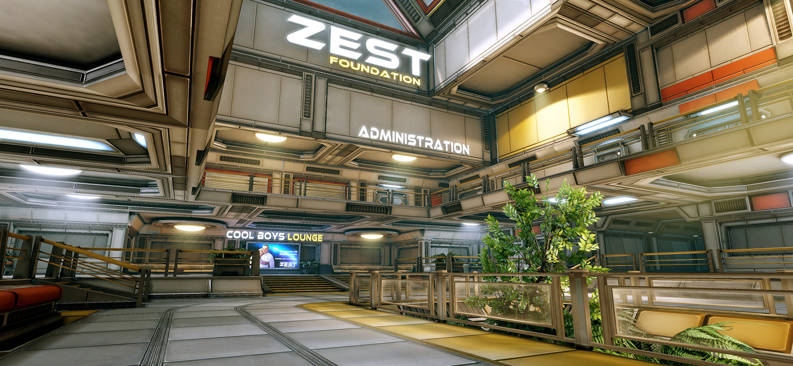
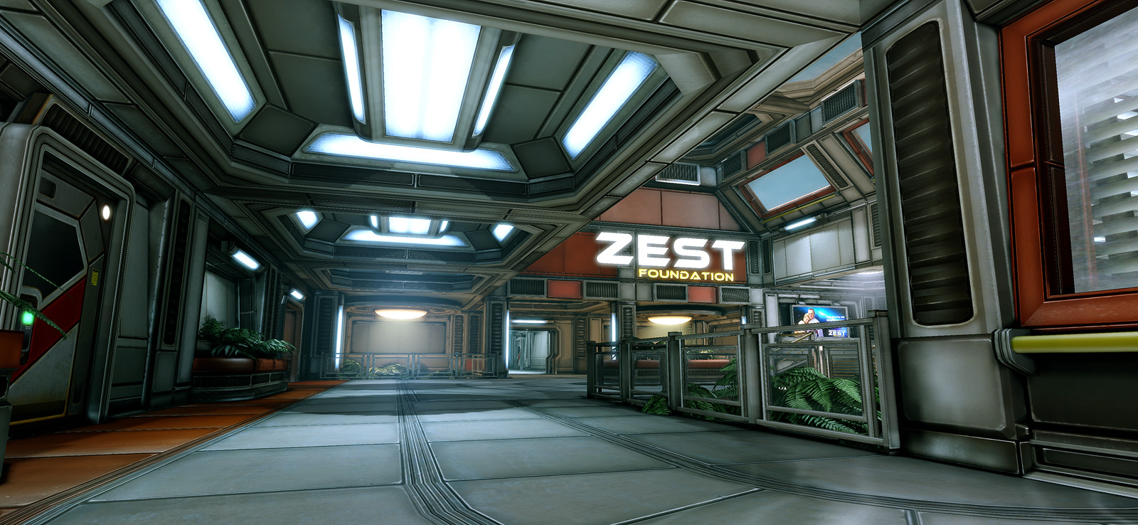
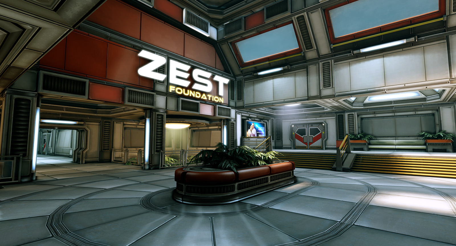
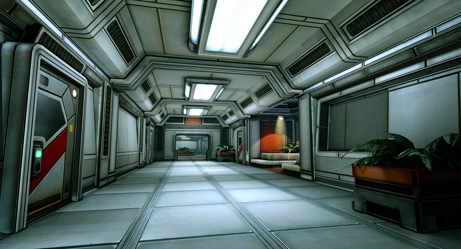
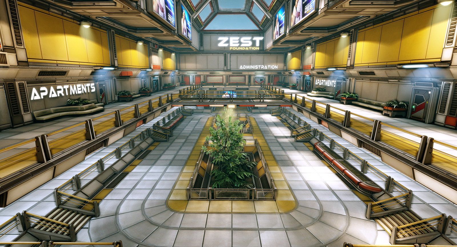
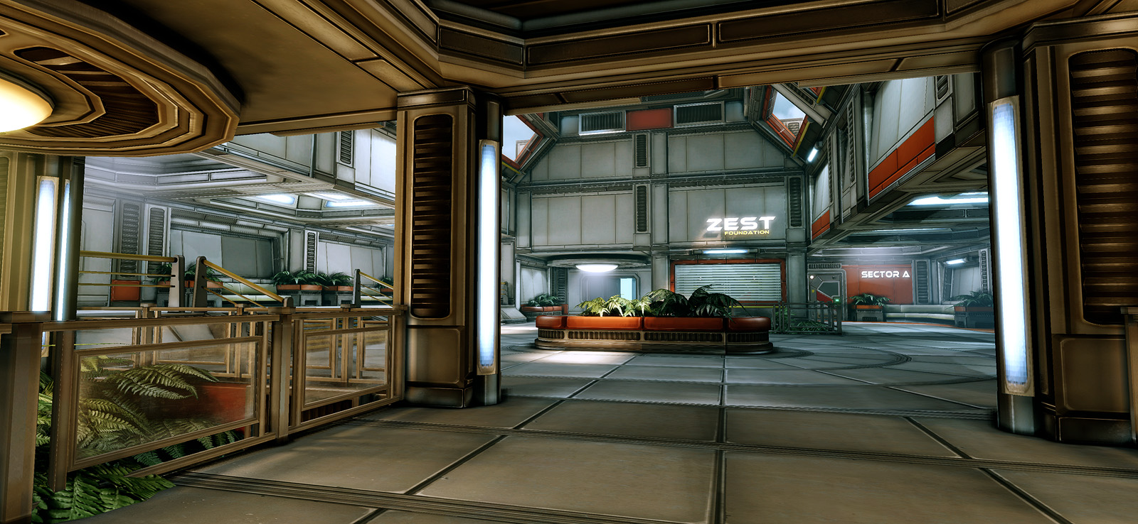
Final screenshots:
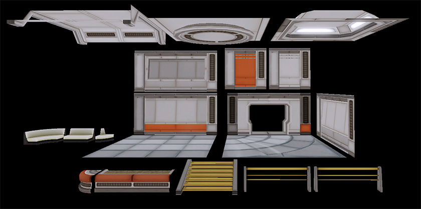
Some of the modular pieces:
Thiago Klafke - Environment Artist
www.thiagoklafke.com
Some of the modular pieces:
Thiago Klafke - Environment Artist
www.thiagoklafke.com
Replies
looking forward to updates on this.
@divi: Yeah I exaggerated the bevels so I could have more depth in my normal maps. My previous tests with this kind of sci-fi stuff on UDK turned up kinda bad because lightmass tends to make normal maps look flat... it's either that or you crank up indirect lighting influence and get huge blobs on your lightmaps...
@kaburan: You are right, I plan to improve the sense of scale by adding props and doors
@fearian: I think it looks like doom because of the viewport shader I'm using for visualizing the mockup. I'm pretty sure it will look a lot different when I put this on Unreal. I'm planning on having some direct lighting and windows where the light comes through, and that alone will give this a whole different look I think!
I understand that yo may be going for a clean, new look. In which case this would look fine, but not that interesting.
The green should add a nice touch as well.
Can't wait for more
@brandoon - I'm using lower res lightmaps at the moment to keep iterations fast. The final version will use higher res maps!
@ScoobyDoofus | @Xendance - Cool! I'm planning on adding detail specular maps, just need to figure out how to make good tiling detail textures that don't look tooo repetitive from the distance. Far Cry 2 did that and it looks really good.
I also plan on using spherical maps for "reflections", but I can't seem to find any good tutorials on this. The one on UDN is obsolete
@SasoChicken - The ceiling holes are not visible in the screens because they are just placeholder bsp atm ^_^
Tonights update:
- New wall set
- Using placeholder plant meshes by Epic at the moment
- tweaked the floors diffuse map, which was way too dirty
i think the darks in the corners are a bit too dark. i dont know if thats the realtime AO or what.
needs:
some signage, leaks n drip decals, moar plants (maybe a new section with a planter that stickout into the pathway some, with a nice trailing plant that could creep into the rest of the scene
and the retaining glass for the plants makes the Env less interesting...when IMO it needs more breaking up with organic elements....SOrry dont like it
I might even change the theme to something else to justify all the foliage I want. Maybe some sort of futuristic residence or a human colony in a lush distant planet? hmm that would make a bit more sense considering everything I have planned for this
Perhaps the AO is a tad too intense for how much light looks to be coming in.
Regardless, awesome looking scene! Can't wait for more updates
@Brandoom: Agreed. I haven't looked into a way to tweak the SSAO effect yet. I don't even think it's possible though
@Divine Rage: Can't avoid being influenced by ME, it is my favorite game this generation
@Saso: Yep I've never really decided what kind of research I wanted this base to perform... i'm seriously considering making this a settlement instead, with rooms like kitchens, lounges, balconies and gardens. The actual research base or factory (where the dwellers work at) would be visible in the backdrop instead. Would fit the assets I have in mind for this better I think
So far the panels look well designed and have a unique style to them really something I've not seen before, maybe its a tad too clean (even modern/newly built stuff has some dirt in places) but it doesn't distract me too much.
Always love scifi stuff, looking forward to seeing more.:)
Yep, my portfolio is soo outdated right now. I'll definitely update it with this scene and some other stuff I've been working on at Ubisoft (nothing fancy tho, just DS games and stuff. in fact I'm not even sure if I should add them to my folio at all lol). I also have to remove some of the older stuff like HL1 props and that crappy girly scene.
This scene still has a long way to go though. Progress has been slow this week but I hope to get up to speed again soon!
I keep pushing people to record timelapses of their work aswell.
Anyway, you've certainly pushed me over the edge to finally do some game modelling myself. Tried out the UDK these past few days and I really like it so far.
Keep up the great work!
Did you make those texture sheets first, and then build your geometry around them? Or did you make your geometry first and slice it up onto those individual UVs?
Since I answered this in PM on another forum I thought it might be useful if I posted the answer here too:
I created the texture sheets first trying to be as generic as possible, and then reused these textures in different manners to create modular pieces. For the red panel wall I created this texture:
and then created wall units out of it:
I started this scene with unique textures for walls and stuff but that wasn't very flexible and fast so I'm sticking with tiling textures for now on, using unique textures when needed. Ex: doors, seats, signs and so on. This way I can iterate between versions much faster.
Progress on this has been slow due to Red Dead, but I hope to post updates soon, so stay tuned!
Nothing to say, it's an error, sorry.
This scene is not dead, I've just been working quietly on it
I've also been away from my PC the last few weeks (crunching @ work and then I took a week off to pull myself together). But I'm back now. I've tweaked the modular parts and materials a lot since the last update. I just need to put it all into UDK which I hope to do soon!
Please excuse me for the horrible screenshot quality. I just can't get tiledshot to work inside UED (I can't run my map on play mode for some reason). Tiledshot looks like this for me:http://www.thiagoklafke.com/misc/temp/scifi_udkwip_tiledshot_Error.jpg Has anyone any idea on how to fix that?
New media:
I'm struggling a bit to find a good color palette for my lighting, any tips on that will be highly appreciated!
And as far as the tiledshot, use tab to pull up the command prompt and not the "~" key if you want to avoid the big black menu in the screens.
Is the "Zest" thing meant to be a hologram? If so I would suggest removing the 2 wall lights above it and let the hologram itself emit the light, but only slightly. There is functionality in UDK for emissive materials to light the scene, so that would be perfect for this application. Then maybe add tiny point light type meshes on the wall behind each letter to act as the projector of the holographic letter. Something like that would help it feel attached to the scene as opposed to just floating in it. But those are just some suggestions, the scene looks great regardless : ).
Great stuff Mino!