Abducted XNA game WIP
I am working on a game and was hoping to see what people think about it so far...
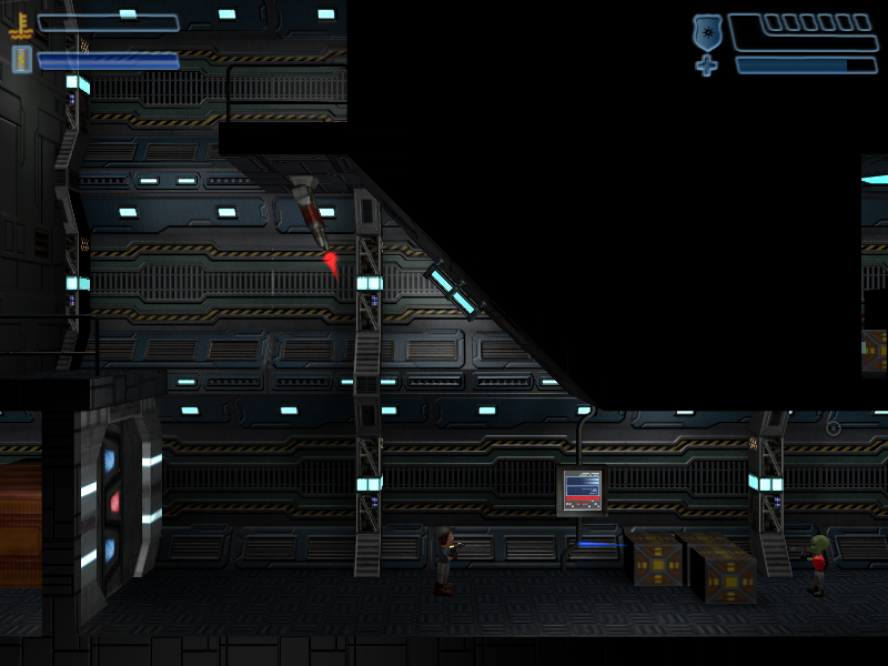
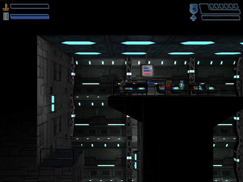
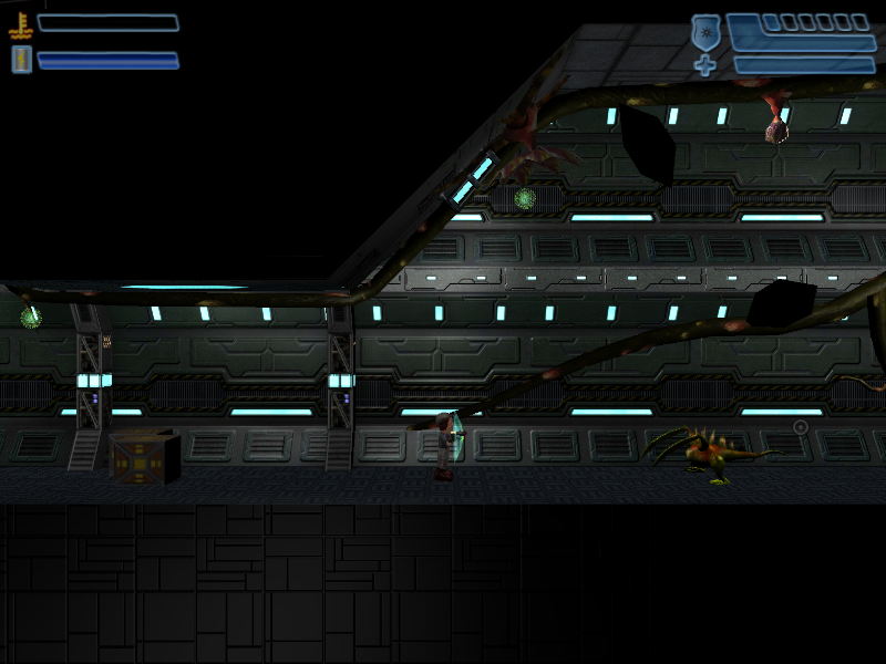
The game is called Abducted!. You have been taken by aliens and are on your way to an intergalactic zoo. A close encounter with a wayward black hole has released you and various other creatures. You must journey through the ship to find out how to return to Earth. The gameplay is going to be like the metroid games where you have exploration and backtracking as you gain new abilities. The escaped creatures provide some of the boss fights. It is a 2.5D action/adventure game
It is an indie XNA game for the XBOX-360. Everything you see has been done by me - the game engine, models, textures, particle effects, etc.
I use radiosity normal mapping and ambient cube maps for lighting in the engine - kind of a HL2-lite engine.
Please tell me what you think.
Here are some screenshots
Here is a gameplay video. If you last to the end there is preview of the final boss monster of the first level.
http://www.youtube.com/watch?v=syq9-lWQcZA&fmt=22
Thanks
Replies
It's hard to tell without playing it, but some of the gameplay looks a little stiff, but it's really hard to tell.
Anyone else have comments ? I know at least a few have viewed the video and I am interested in what people like or don't like about the game.
I did get a comment on youtube that it was too much like Halo, although that is obviously intentional. I didn't see a problem trying to duplicate the pacing of Halo in a 2D game and throwing in a few obvious references because of that. I also thought it would be fun to have the player use a shield like the Jackals used. It was something that is a little different from the standard shield which surrounds the player.
What do people think ? It would be easy to change.
One thing that really jumped out at me, though, was the contrast between the characters and background, or lack thereof. Right now the characters and pickups are really hard to pick out against the background.
Lighting can be a great tool, to direct your viewers' attention.
Most of my attention is on the background because of the contrast with lighting and attention to detail.. but is that really where you want the players focus to be?
and move out of the way. It made the game REALLY hard, so I dumbed back down the AI. In most 2D games I looked at the AI was even more basic than I have. Do you have any examples of what you might be looking for ? I guess I could throw more enemies in and make then much easier to kill. I was afraid it just becomes a button masher and that is not what I was going for.
StephenVyas - I have been struggling with the same point on how to put more attention on the characters and enemies. I tried brightening them up so that they stand out better but it just made them look like they glowed. I tried rim lighting, which is what I think is done with Shadow Complex, but I didn't like the look. I really softens everything and that is not the look I wanted. I am certainly open to any ideas. I know this is an imported part to get right.
Can you explain what you meant by putting the lighting to better use ?
Getting right down to it, when dealing with viewers attention, it's a good idea to understand the "Why". Why do my eyes go there.
Value is one key to making something stand out.
Popping the image!
Probably the easiest tool out there for making an image pop. Would be the contrast between
1- light and dark,
2-large vs small,
3-saturation vs de-saturation(very subtle but pro-like) ,
4- primary colors contrast each other too- But becareful of too much primary color valuing in an image. It can hurt the eyes because it stands out so much.
So if you wanted something to pop, you'll be looking to use one or all of these 4 value attributes in your design.
When there is a difference between the two, your eyes will go to the point of greatest contrast.
(i.e. The blue lights against the desaturated green/grey background really grab your eye)
Currently, your main character is a muted desaturated grey color which blends into the background quite well at times. You may be interested in picking a color that pops against the background.
Hope that helps to answer your question.
If your interested in learning more, youtube 'Color Theory' 'lighting theory' and/or 'value theory' to enhance your production design.
Basically what I did there was to light up only the platform bits, so the player knows where to go. If there's a switch in the area, you can use lighting such that the player will immediately be able to focus on the switch and have an idea of what to do. You can also play around with warm/cool colors for the lights and shadows.
edit:
also dimmed the wall lights so you don't have a million points of focus at any one time. The remaining wall lights in the paintover could serve to guide the player somewhat (the lights running down the right side of the screen, for example, let the player know there's a drop/shaft)
you might also consider making those railings shorter. Right now, besides not making much sense, they're obscuring the hell out of the characters.
I appreciate the effort to do the paintover.
I like that look too. If I understand correctly, you have dimmed the lighting and then added light cones over the platforms. I guess I'll have to figure out how to make light cones in my engine since I can't do that yet.
cannonfodder:
The volumetric light isn't really a must, but it can help. Mainly you just want to make sure that you're giving the player a sense of what to focus on, and lighting is just one way of doing that. The paintover simply darkened the areas that weren't that important overall, and the lighting is used to guide the player's eye so they know what to focus on, and where to go.
Same deal with the recolor of the main character. With the cool colors of the background, a stark red really pops the character so you never really worry too much about losing sight of him.
Here is my quick attempt at what you have above. I changed the lights to spotlights, regenerated the lightmaps, and added a light cone texture. I still need to play with the lightcone to get it to look right, but this should be close. Please tell me what you think and I greatly appreciate the help.
I haven't changed the characters colors yet - I need to play around and see what I like, but I get that using camouflage is not the best choice to make the character stand out. Since the player gets kidnapped after a late night playing xbox360, maybe I should just cover him with pizza stains
right now if I sqint, I can make out some small points of light, and 3 groups of 3 crates because of their bright yellow markings. No character though.. you might want to consider making him brighter to pass this test
I would suggest you focus on composition. Fullscreen the game and close your eyes for five seconds. When you open your eyes they will automatically fixate on the immediate subject of interest, and then move to sub-interests. This scan takes a fraction of a second and is entirely subconscious, but it's important to note what is happening. The characters are the last thing I'm focusing on. They should be the first.
Check out Three Point Lighting and maybe go back to rim lighting the characters. It may be wise to dedicate a unique color to the player so they are effortless to track.
Edit: Sorry Tracy, edited your post removing the quote. Keeping these boards clean.
I appreciate all the feedback. I will definitely use the ideas when I reskin the character - which won't be till after thanksgiving unfortunately.
I actually understand three-point lighting and this works for static objects. For moving objects you need to fade out one light and fade in another light so that there is never an abrupt transition on the lighting as the character moves. I only have three lights in the shader for my character since I don't want to do multiple passes. The character usually ends up with one strong light and two weak lights, or two medium lights and one light off.
Rhinokey - I recreated the sounds and the shield. Not even sure how to rip stuff from an xbox360 game anyway. I just used audacity till I got something close. I think I will change it so it isn't as close. That way there is no confusion where I got the sounds from. I thought people would appreciate throwing in a few things like that from Halo. I didn't even think about someone deciding I ripped them off.
Here is another attempt at the volumetric lights. What do people think ?
Here is what I mean if I make the lighting on the character brighter. See how he appears to glow...
Hard to believe you did this all yourself, so congrats!
Obviously the characters are a weak point of your game at this point, and I think you should put some more love into the characters tbh.
I really like the detail and backgrounds but like everyone said, and as you know, it's sort of distracting.
I think if nothing else you should use a higher texture resolution on the characters and give them an equal amount of detail to the background.
Oh, and the video is loading really slow, not sure why.
Still really impressive work so far, keep going!
Either way, cool game you have going there.
I reskined the character with brighter textures, added a very subtle rim light and darkened the textures on the walls (maybe too dark).
Please tell me what you think of the changes ...
Thanks