Brink Dev Diary - Art direction & concept art - Now with added HD Video!
So Bethesda just posted a blog written by SD's Art Director, Olivier Leonardi - quite an interesting read, plus there's concept art there from our very own Tully.
Spacemonkey and I get a mention too!
Enjoy: http://bethblog.com/index.php/2009/10/08/brink-developer-diary-2-olivier-leonardi/
New dev diary from Lead Writer Ed Stern: http://bethblog.com/index.php/2010/03/04/brink-developer-diary-3-ed-stern/
Some posters from a recent press pack!

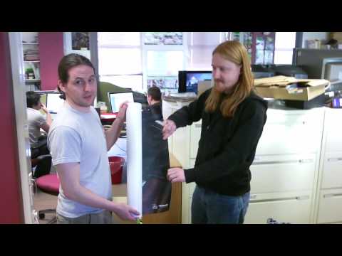
Video of crazy huge poster being unrolled at PC Gamer!
[ame] http://www.youtube.com/watch?v=7-Y840jPIAI&fmt=22[/ame]
HD Character customisation video!
http://ve3d.ign.com/videos/play/65171/PC/Brink/Trailer/Character-Customisation-Trailer/Flash-Video
Full HD downloadable videos from VoodooExtreme:
http://ve3d.ign.com/articles/news/51825/Seventeen-Minutes-Of-HD-Gameplay-From-Splash-Damages-Brink
Spacemonkey and I get a mention too!
Enjoy: http://bethblog.com/index.php/2009/10/08/brink-developer-diary-2-olivier-leonardi/
New dev diary from Lead Writer Ed Stern: http://bethblog.com/index.php/2010/03/04/brink-developer-diary-3-ed-stern/
Some posters from a recent press pack!

Video of crazy huge poster being unrolled at PC Gamer!
[ame]
 http://www.youtube.com/watch?v=7-Y840jPIAI&fmt=22[/ame]
HD Character customisation video!
http://ve3d.ign.com/videos/play/65171/PC/Brink/Trailer/Character-Customisation-Trailer/Flash-Video
Full HD downloadable videos from VoodooExtreme:
http://ve3d.ign.com/articles/news/51825/Seventeen-Minutes-Of-HD-Gameplay-From-Splash-Damages-Brink

Replies
i absolutely love what you guys are doing there. wish i could work on something that cool.
Looking great guys!
just love the stuff.
http://g4tv.com/videos/43012/Exclusive-Brink-Playing-Smart-Freedom-of-Movement-Preview/?quality=hd
(I get a "SEXPO" ad before that... thanks G4)
Though northern hemisphere fall release? aw i was hoping for sooner.
Really cool guys one of my majorly anticipated games.
Love the art style, btw!
Didn't want to see this though: http://www.shacknews.com/featuredarticle.x?id=1226
But, no girls in brink?
Marketing master plan.. or something
PS I typed this reply with my boner.
however....please fix the old doom walk anim. the gun bounces like mad when dude is creepin.
i've been waiting for someone else to hit up mirrors edge style navigation. do we have any news on how the navigation may be different from mirrors edge?
I wanna play!!!!!!!t! !!
Great stuff MoP!
Ambitious though, I like it.
It is. Basically you have the traditional jump/crouch buttons that you still use manually, and holding down the SMART button is analogous to using "sprint" in most current FPS games.
We just took the concept to it's logical next step by saying "well, surely if you want to sprint then you want to be going as fast as possible all the time", leading to automatic low vaults, mantles, and other more advanced techniques in conjunction with jumping/crouching at the right time.
Thanks for the feedback guys, it's worth noting that this footage is old (if anyone saw our original E3 presentation then they will recognise it) so we've come a long way since then, and everything looks and works even better now
Edit: Weird, missed this video before:
http://g4tv.com/videos/43021/Exclusive-Brink-Preview/
It's not HD but it does show some gameplay.
I really love the direction of the art and the SMART button seems to be really intuitive.
Tully has done a great job with the concepts...I really love the Resistance-Character-014 piece...its very dynamic and has a real feeling of life.
The environment is looking groovy too...You must have made some massive changes to the engine...its another world, even when compared to ET:QW
This is idTech4 right?
As Keizza said, the walk animation seems a little jarring but im sure it will be improved before the release
Im definitely going to grab this one.
Not such a huge fan of the Assassins Creed-esque "hold for magic freerun" button (although it makes sense in a fast paced MP game like this) but it's great to see it nonetheless.
And the art style is, as already heavily stated, fantastic
thisll be on PC right??
you guys have seriously kicked it up a notch since quake wars.. qw looked great, but this is another level
HD Container City walkthrough!
kinda reminds of APB a wee bit.