The BRAWL² Tournament Challenge has been announced!
It starts May 12, and ends Oct 17. Let's see what you got!
https://polycount.com/discussion/237047/the-brawl²-tournament
It starts May 12, and ends Oct 17. Let's see what you got!
https://polycount.com/discussion/237047/the-brawl²-tournament
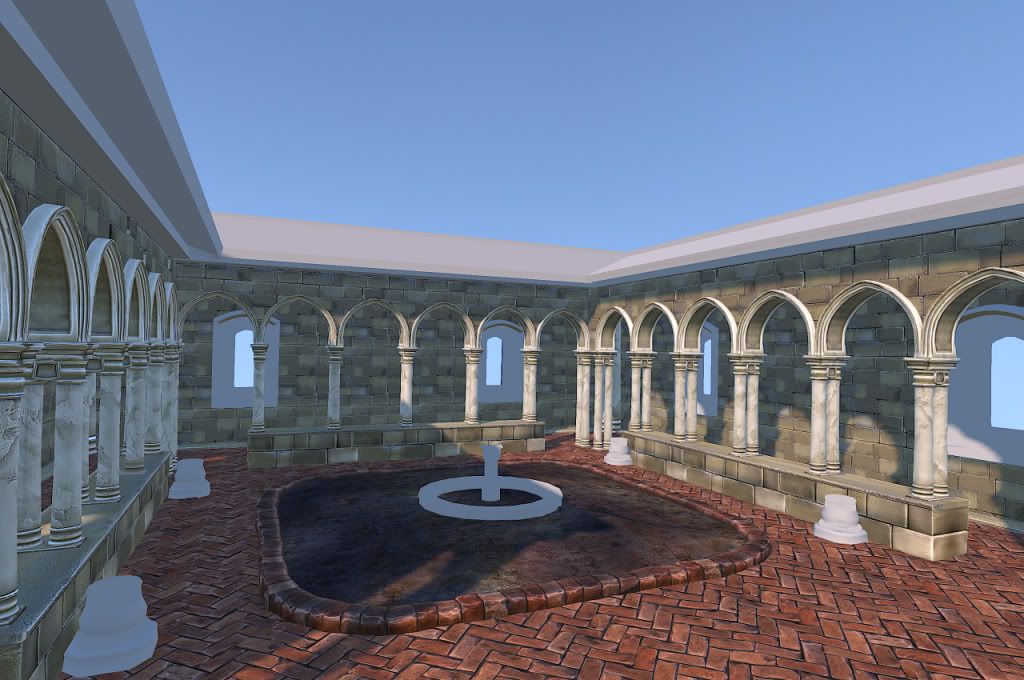
Courtyard [WIP]
So I'm sorta a lurker round here, who's avoided posting for a good while, figure its time to start. This is my current project rendered in marmoset. Any crits or comments are welcomed. There is still a ways to go yet though. Currently working on the window frames and roof. The middle will be a fountain surrounded by plants.

Replies
Try to get more detail into the bricks (especially the bigger ones supporting the columns. I like the colors thusfar in your scene, would look great with some green I think
Thanks mate. I've pumped up the detail in the larger bricks and it looks much better already.
The green from plants should really compliment the scene perfectly.
Coming along nicely, your textures are nice and it shows that you've put a lot of effort into them.
I'm not getting any real sense of scale/space. Check the size of your floor pavers, they seem quite large. If your floor texture is over-scaled it makes everything else seem miniature.
Also on the floor pavers, have you considered knocking a bit of saturation/vibrance out of them? I might be wrong, but they just seem a little too vibrant, try it and see, perhaps it might look better how it is.
Finally, and I'm sure you'll get to this later on. Don't forget to add some props & dirt decals between the walls and the paver. Or, for extra believability and if you have the budget, add some 'Edge Paving' between the walls and the floor. If you look at any herringbone paver in reality (the type you've got). It is almost always bordered with Edge Paving. (otherwise it'd just fall apart). This edge paving will also add a nice detail buffer between the two faces.
Looks awesome, keep going!
Ivanzu: I think this update will answer your question.
Guy123: Thank you for the kind words and advice! I will have to readjust the scale of the bricks before I show my next over all shot. I will play with the saturation maybe once I've finished the garden so I can see how it all fits together. (i must admit I'm a sucker for colour) I will also have to consider putting in edging for the pavings like you pointed out, I hadn't looked into those type of pavings so this was a very helpful hint. Thanks again.
Also if anyone has advice on dirt maps or a good tutorial please link it to me as i have no idea about them yet.
A few clouds wouldn't go a miss?
I would lower the camera angle, don't forget - we look down on things we don't like, and up to things we do!
at the moment, by looking down on the scene you are making it seem quite small. By lowering the camera you can induce a feeling of awe and scale.
Great work!
Glad to help!
I think you need to break it up and add some depth to the scene. Break up the doorway you have there, create a bigger archway or something. You're getting stuck in this little scene with little to no depth to it at all, make it a little bit more interesting, the mirroring of everything is a little bit too obvious.
Either way, really nice props and plants
Good work so far!
Aimbiz: your not the first person to tell me about the lighting not being strong enough, so hopefully this is a little better.
Chrisradsby: Yeah might be a tad late to the scene, I had always intended on this being a small piece to begin with, I promise something bigger next project! But I must admit I'm a sucker when it comes to symmetry, I just think it looks pleasing.
I forgot to mention before too: I'm a big fan of your foliage, care to share your process? The normal maps are quite well defined so am I right in thinking it is all baked?
The point about the lighting that people are pointing out, I agree with. I wish I was at home so I could provide a really quick paint over (more of a Photoshop adjustment to levels really). This is all very minor stuff-it looks great!