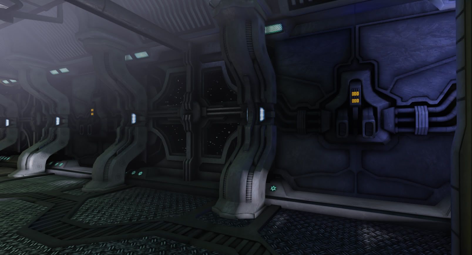
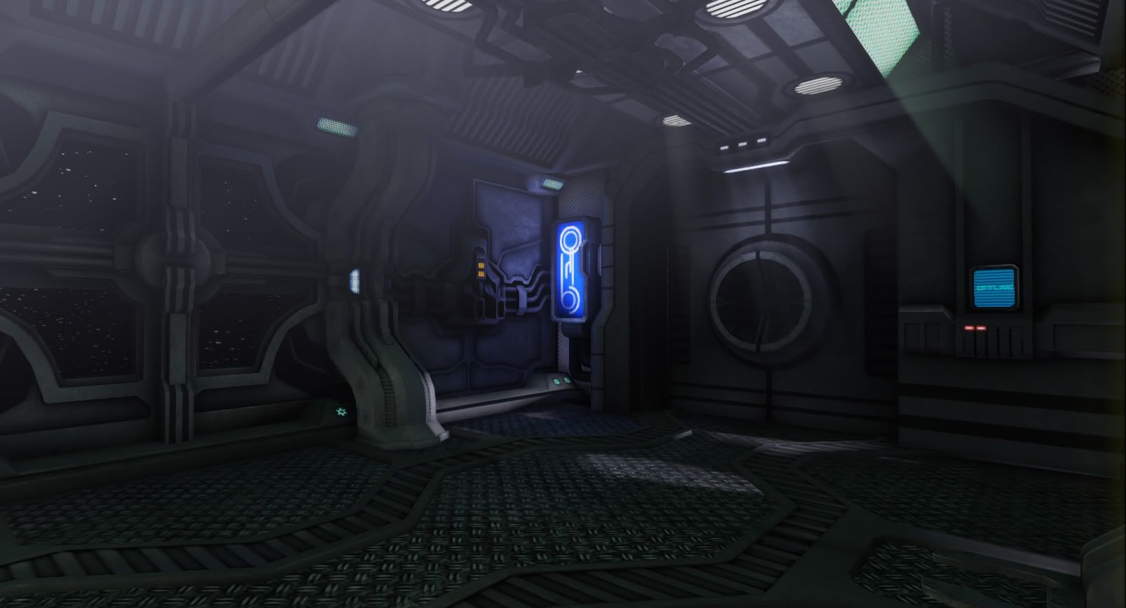
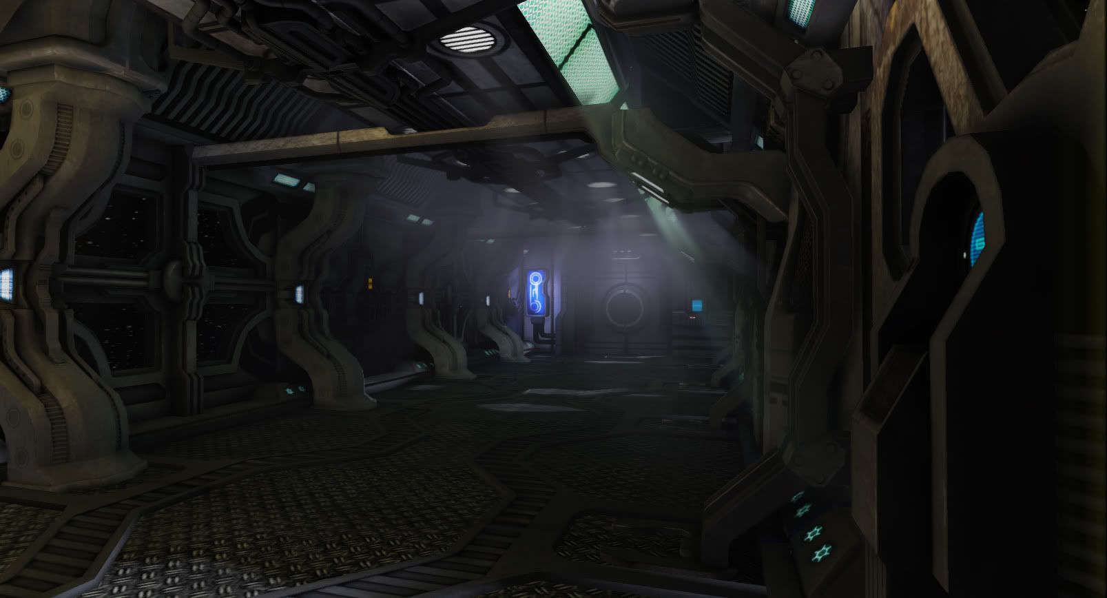
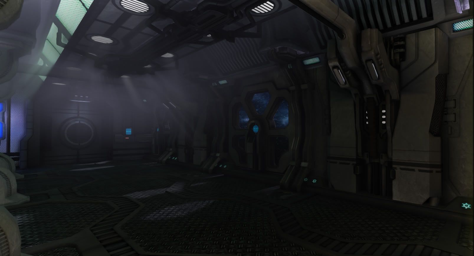
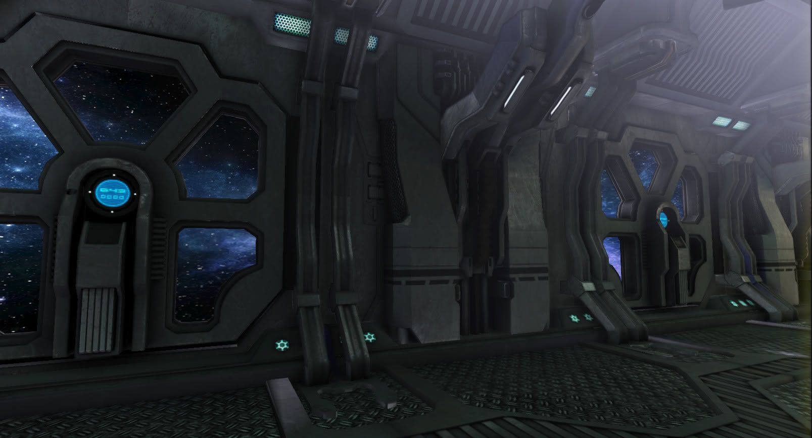
Just a little environment i've been working on. Any critiques would be appreciated. I've used the UE3 editor in the past, but this is the first time using UDK. It's basically the same I rekon. I think i might be going overboard with the foggy fx and light beams etc.
update:
I made some crates and a holo-control panel. Worked on the lighing quite a bit. Still working on just about everything including textures, lighting, smoothing groups, etc.
I think your pillars read a lot like concrete instead of metal. Maybe a higher/tighter spec and a little bit of reflection could help. (unless its supposed to be concrete.
Also, I think that the treadplate floor fits in well with the environment...it looks too modern day and less futuristic, if that makes sense.
GRR those fracking pillars!! I've been trying to beat the concrete look. I will try some reflection. ANd I will look into a more futuristic treaded floor:) Thanks for the opinion!
Overall I think it's a pretty cool idea, and you are doing a good job, this being the first time you've used UDK. There is a couple of things you might want to try out, and maybe posting a couple of your maps might help us to understand it better (i.e., a diffuse, normal and spec of a couple of items).
A couple of things I notice right off the bat:
The AO. It looks like you baked it, which is great, but the falloff and spread seem it bit too high. Especially on the door, it just seems like its moving pushing out to far, as opposed to just each item occluding one another.
Also, I think you are at a good start for your prop additions, but maybe add a few more tubes and pipes here and there. Give it the full 'Fifth-Element-too-much-to-process-in-a-single-viewing' look, without cluttering it. They don't have to just be free items like crates, but things that give it the ambience that this is a space station, and it takes a lot to make this thing stay in space.
From what I can tell, your specularity on the overall scene seems a bit low, which is probably a good telltale as to why your pillars are coming off as more of a flat concrete than a polished metal.
And last, everything is putting off a little too much of a new, perfect vibe. Maybe check out this tutorial to hard-surface texturing by Stefan Morrell. The guy is pro when it comes to adding the details you want in a sci-fi metallic scene
Thanks so much for the helpful reply. I finally figured out how to make a reflective bumpy surface and think it looks a little better. The AO's might have been washed out a bit due to actually trying to make the environment appear fairly clean. I guess i've grown tired of seeing overly detailed environments and probably from watching too much Enterprise while working on this project:P
I will add some more wear to the textures. I also changed the floor as gsokol suggested.
Thanks for the suggestions. They are helpful and appreciated:)
Yes! Those props are making this scene even more awesome! Good job. Loving those little computer console things. The way there being held is awesome. Now we just need to get that stuff lookin metally!
Thanks so much for the helpful reply. I finally figured out how to make a reflective bumpy surface and think it looks a little better. The AO's might have been washed out a bit due to actually trying to make the environment appear fairly clean. I guess i've grown tired of seeing overly detailed environments and probably from watching too much Enterprise while working on this project:P
I will add some more wear to the textures. I also changed the floor as gsokol suggested.
Thanks for the suggestions. They are helpful and appreciated:)
update:
That's what these threads are here for . You can tell especially on the bottom of the pillars that you've started adding some specularity to the textures, and it's already starting to have a positive effect on the overall coolness of the scene. And don't ever think that any suggestion made is gospel, if you want to stick to a style, go for it, it's your scene, and it should turn out the way you want it. The community is just here to make sure it turns out the best it possibly can, you learn from it, and stay encouraged throughout the project.
Replies
Also add some props, crates, computer consoles, etc, so make the room more dynamic.
Loving it
textures lack details and proper material definition, they feel kinda like concrete.
lighting could definitely use more work as well.
I made some crates and a holo-control panel. Worked on the lighing quite a bit. Still working on just about everything including textures, lighting, smoothing groups, etc.
I think your pillars read a lot like concrete instead of metal. Maybe a higher/tighter spec and a little bit of reflection could help. (unless its supposed to be concrete.
Also, I think that the treadplate floor fits in well with the environment...it looks too modern day and less futuristic, if that makes sense.
A couple of things I notice right off the bat:
The AO. It looks like you baked it, which is great, but the falloff and spread seem it bit too high. Especially on the door, it just seems like its moving pushing out to far, as opposed to just each item occluding one another.
Also, I think you are at a good start for your prop additions, but maybe add a few more tubes and pipes here and there. Give it the full 'Fifth-Element-too-much-to-process-in-a-single-viewing' look, without cluttering it. They don't have to just be free items like crates, but things that give it the ambience that this is a space station, and it takes a lot to make this thing stay in space.
From what I can tell, your specularity on the overall scene seems a bit low, which is probably a good telltale as to why your pillars are coming off as more of a flat concrete than a polished metal.
And last, everything is putting off a little too much of a new, perfect vibe. Maybe check out this tutorial to hard-surface texturing by Stefan Morrell. The guy is pro when it comes to adding the details you want in a sci-fi metallic scene
Hope some of this helps!
Thanks so much for the helpful reply. I finally figured out how to make a reflective bumpy surface and think it looks a little better. The AO's might have been washed out a bit due to actually trying to make the environment appear fairly clean. I guess i've grown tired of seeing overly detailed environments and probably from watching too much Enterprise while working on this project:P
I will add some more wear to the textures. I also changed the floor as gsokol suggested.
Thanks for the suggestions. They are helpful and appreciated:)
update:
Great progress
That's what these threads are here for . You can tell especially on the bottom of the pillars that you've started adding some specularity to the textures, and it's already starting to have a positive effect on the overall coolness of the scene. And don't ever think that any suggestion made is gospel, if you want to stick to a style, go for it, it's your scene, and it should turn out the way you want it. The community is just here to make sure it turns out the best it possibly can, you learn from it, and stay encouraged throughout the project.