[DS2] Mace, Relaxesonsand
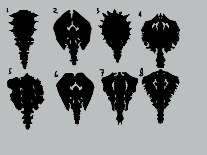
Bit of a late start I know, but this is a pretty cool contest so I thought I should have a go. I've started doing some sillhouettes for a mace design looking at some of the different themes:

I thought numbers 2 and 4 look a bit too much like axes, though that could depend on how bulky the striking part is, I was thinking that one could be made up of 3 angels with their wings facing outwards.
I think at the moment no. 6 and no. 8 look the best (I'm pleased with no. 7 but it's more of an idea of what a basic sillhouette of a mace could look like rather than somethign that fits into any theme)
Any comments would be welcome.
Replies
I'm hoping once I'm happy with a sillhouette, the rest of the design will flow much quicker so I can get to modelling and texturing soon as.
I think I might go with the Crow Temple theme despite favouring Angelic before. I'm liking the look of 3, 5 and 6 here mostly.
Any opinions on whether the crow skull shapes on number 3 could be actual skulls or another material in that general shape? (Thinking they could be too big to be actual skulls but I don't know if that really matters)
Any other criticism or opinions on which is better please comment. *tumble weed*
These 3 designs show different variations of the different parts of the mace. (Which has 3 heads, the one on the left would probably be at an angle more like the one on the right)
The veiny shapes are supposed to be a solid material rather than actual veins. I think perhaps the whole thing could be a bit more angular as well.
Any comments welcome on which parts of the different maces are better.
Also, does anyone think the skulls are possibly too big? Is the size even an issue?
This image shows what I think could be an issue, just that the skulls would have to be absolutely massive.
I'm thinking if it's an issue then the shape of the skulls could be carved out of some other material
But in a sort of veiny shape with a heart in the middle, so pretty much the same but a bit more angular and shaded a bit differently. Hopefully it'll look like I meant it to when it comes to modelling