This is my latest university project. At the end of it I should have a playable and pretty-looking level in UDK.
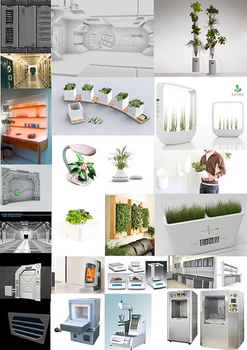
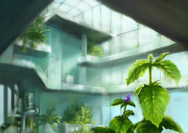
My plan is to create a futuristic greenhouse in the Arctic. Lots of windows, clean white surfaces, bright lights and laboratory equipment.
This will be my first proper environment, so I have loads to learn and I'm quite excited!
I would love to hear any tips and feedback you have to offer.
Concept:
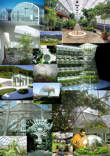
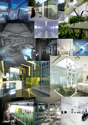
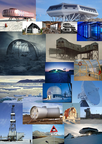
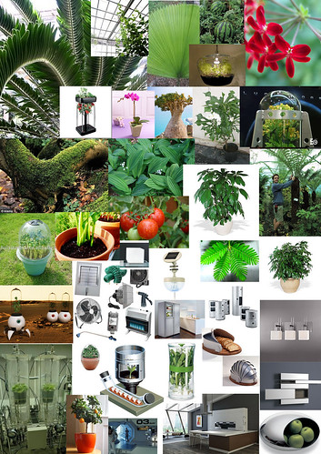
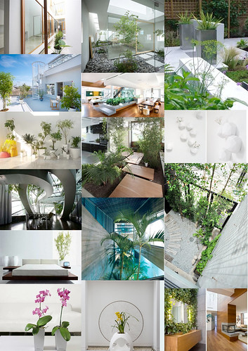
References and moodboards:
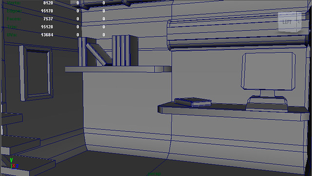
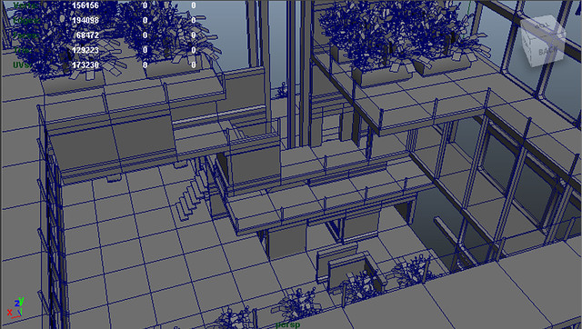
3D so far:
This is the latest design for the level.
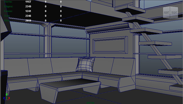
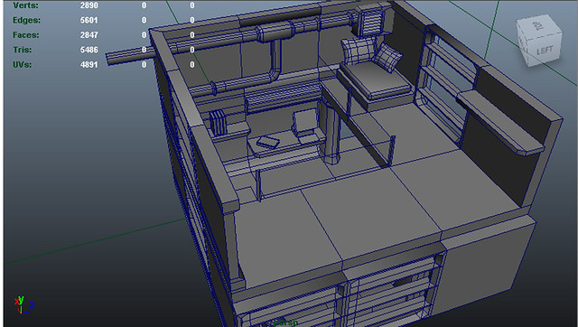
These are designs for the living quarters. I wanted to go for something a little bit more cosy.
Props:
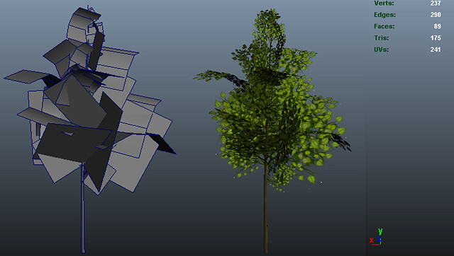
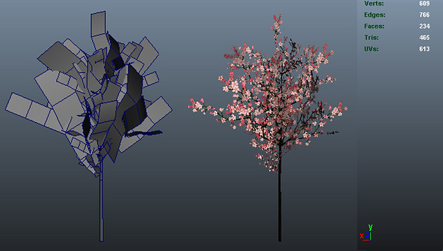
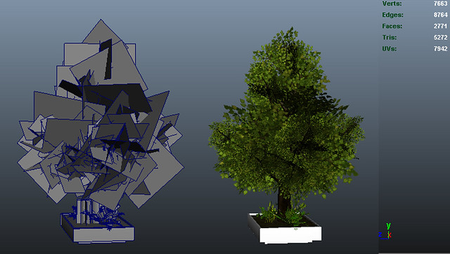
These two are my second, low-poly versions of little trees.
This is still very high poly, but I will redo it soon soon.
One this i will say is that you might wanna learn collision because that is gonna hard to look around in udk without. but so far it is really nice. I would like to see maybe a little bit of overgrown like vines climbing walls. I have a feeling that will help out the feel of it. watching this now!
Very true, if it starts to look too repetitive in the final scene I will definitely do that! I think i was just super excited when I realised I can just use the same model with different leaf textures (which I meant for bushes, for example) and it still looks like a tree. Happy accident!
I also started working on pots to put the greenery in. This is a two-storey version of a simpler pot I made earlier. I thought it might be more interesting to look at if it had multiple levels.
I also thought of putting an ultraviolet light on the lower level to try to get some interesting lighting effects going.
The model is not yet finished at all, and even though it's probably impossible to see at the moment, the lower level has glass walls.
coming along nicely Sai, really like the new containers for the plants feels much more like a greenhouse with these installations keep up the great work!
Hey saija i think you should post process some Depth of field for the outside and get some snow effects in there, give it the feeling of the arctic. awesome work so far!
I have been working on my textures now, but in the meanwhile I really thought I should see how the plants are working in the environment. I have also been feeling a little down about the scene (because there is soooo much still to do) and this cheered me up a bit.
Do not feel down Sai the process is long but always worth it! i like where its going it feels allot more i guess green and warmth then i thought it would do, the practical elements really help!
I have been working on the seed bank room and adding little details. Textures are still not quite ready and the computers are floating, and lights are just all wrong. But slowly getting there!
I have been having loads of problems with lighting, but most of the props are complete, and the gameplay is pretty much done.
Plants are still going through items and things need to be rearranged, and the start room is still empty.
Lovin this!! your lighting is going in the right direction, how did you do the lighting in the room with the glass bottles and in the image before that (the hallway)?
can`t wait to see this finished, it`s gonna be awsome
In the corridor I just put dim spot lights in every doorway and on the tall ceiling between them. They aren't really in the right places considering that the light should come from the emissive lamps. But that was the best way I could think of doing it at the moment, and it gave the exact atmosphere I was going for.
The seedling room also has just one blue-green spot light in the ceiling, and lots of emissive lamps.
I have a huge lighting problem still with the interactable tubes, they shine terribly and really stand out, so there really is no challenge in finding them.
Lately I have been getting a little worried again, because I always kept on telling myself that nothing is final, it will look great by the time it's done.
And now I have a feeling that very soon I'm going to run out of ideas of how to make it look better. I still have good time to change and add things, and a lot of my problems are techincal, but still it feels like it's missing something. I don't want to clutter up the space either, so I shouldn't keep adding things just for the sake of it.
saija, you're scene is looking fantastic right now. One thing I think can really make it pop concept wise is to add spots of color such as colored lights or directional/descriptive signs along the walls. Some red and blue strip signs would look great. Also add some more variation in your contrast, not everything has to be so brightly lit. Some areas or rooms can be darker. Another thing that will make this pop is getting some reflections on these plastic and metal props/
As for your lighting issues, how are your lightmaps? Having good lightmap uv's can be a huuge plus. What type of light are you using as well? A dominant directional?
This is really fresh looking, i love it!Introducing some color to this could really help separate some of the shapes but i still love what you're doing. Great to see more people going away from gritty environments and tackle cleaner, more unforgiving surfaces where you cant hide inconsistencies and artifacts by cluttering up your scene.
Thank you so much for the ideas!
I'll definitely try to add more colours then.
I made all the light maps in Maya, and yesh, I have one dominant directional light and then a bunch of spot lights. I do agree, the huge contrast gets really boring after a while, I'll try to make the rooms a little dimmer
For your dominant directional light, in the cascade shadow maps part of the properties menu you can set the whole scene dynamic shadow radius to 2048 and the num whole scene dynamic shadow cascades to 3. Those settings give you a fairly soft shadow while still having defined edges. Play with those settings and you can control how sharp or soft you want your shadows.
You might also find it worthwhile to disable SSAO/Screen Space Ambient Occlusion. It's good in most engines but Unreal's SSAO is a total joke. The smudging behind the railing in that screenshot will be gone if you do. It's only useful in scenes with a lot of noise to cover up the smudging. In such a clean modern environment it only serves to ruin the image.
The SSAO is a post process; it's done in realtime. Rebuilding the map should have nothing to do with it. If I remember correctly the SSAO control in View->World Properties has two checkboxes, one of them enables/disables overriding post process volumes, the other tells it what to override to.
Looking good so far. I don't know if you are planing anything like this for later on but I'm thinking maybe you can add in some subtle grid textures or pattern embosses to the floor to make it a little more interesting. You could also create a sprinkler system for watering the plants and a drain hole on the floor.
I totally agree with the looking good so far and you have done great work with the plants... the environment, for me at least, misses some believability... right now it is a bit too clean and organized with some big spaces where nothing seems to be going on... try to look at you environment again from the perspective of the people working there, define some paths where people would walk, put some benches and screens away from the wall, cause most people don't like sitting with their backs to the big busy room behind them, etc...
For instance in that last shot... I would imagine that screen being in a rather cramped corner... unless forces by cords and whatnot people would have moved it to the right after the first day.
Great work though and really love the concept and it's execution!!
I do see what you mean, matsman, the lab is looking a little boring at the moment with everything against the walls. My original idea was that the player is here all alone, so everything is designed for one person only, and the books that are lying around (titled "How to cope with loneliness" etc.) are really the only things that show signs of use and that someone is living there.
But I will definitely try to add a little bit more life and disarray to the environment in other rooms too.
Thank you so much for the ideas and feedback, it's greatly appreciated!
Really like this, it's got a lot of nice forms and lighting opportunities. Something's been bothering me the whole time though; it kinda feels like a miniature in some shots. I'm curious, are you building your assets to the UT3 scale, where a person is 96 units tall?
Looking much better, I'm glad that helped. I'm looking forward to seeing more of this. Your plants do look dark though. You can edit the vertex normals in maya by transfering the attributes from a sphere (that is placed in the middle of your foliage) onto your plants. This way each of the normals will radiate from the center. This should stop them being so dark.
S2Engine: yes the player is 96 units and everything is designed for that.
Hmm, I do agree that I have some spaces that are quite cramped, but I also kind of liked the contrast between small spaces and big open areas. I'm still working on lowering the camera a little bit as well to make things more epic.
marq4porche: Very true, they are way too dark. I'll give that a try right away!
Contrast between small and large spaces is absolutely a good thing, so keep that. I do think it might help in some of the images if you dropped in the Iron Guard skeletal mesh for reference though.
marq4porche: I have been working on the foliage, but I think I'm doing something wrong, because nothing seems to change, things are still really dark. I was doing pretty much this [ame="http://www.youtube.com/watch?v=APV11HL6_es"]Vertex Normal Editting in Maya - YouTube[/ame]
This is the first time I'm trying these kinds of things, so I'm quite lost with it. (Still trying go understand what exactly is going on)
I do have quite a bunch of plants, so I don't want to do that to all of them before I know I'm doing it right.
Saija, I'm loving your Arctic greenhouse and I'm really so proud of you to see the progress you've made with technical skills over such a short space of time. Your perseverance is showing in the results you're achieving. The level is believable and sets a convincing scene. I particularly like the crisper images with a variation in colour in the plants as this helps to give identity to areas of the map. I think the shadows work beautifully with the design of the building but some of the blurring and spreading of light around bright parts is a little too much in some areas such as the last image here. It can obscure the definition of focal points and the overall composition of the scene. It may be best to save the really bright lighting for your glass bottle room which is designed to be that way. I like the way you've shown the development work here so we can see the work grow in stages. I agree that some additional spots of a complimentary colour could help to give a sense of direction in the scene. Perhaps some colourful berries could also be used on the plants to introduce pathways of particular colour? I like the simplicity of your corridor and the fact that all your level assets are fully designed to work together as a whole. There's a cinematic feel to the level which gives it a WOW factor that's reminiscent of Kubrick's 2001: A SPACE ODYSSEY.When this is teamed up with sound effects and music it will really bring it to life.
I'm still trying to lighten up the plants, but so far it hasn't worked.
I have been trying out a few different colours, I think I prefer orange most.
I also have this really annoying lighting problem, where all movers look really bright. I've been trying to google this quite a few times but so far no luck. It's especially annoying here, where the point of the puzzle is to locate the correct tubes with their numbers alone.
Looking good! I was gonna say some color variation would really help, but it looks like you were feeling the same. The orange additions look really good. I love the plant holders and the seed room.
Have you thought about some particle effects? Like mist or steam? Maybe sitting up mist to sprinkle over the plants at certain intervals? Or mist in the seed room, like they're being cooled? Either way, it's looking good!
that's a really cool environment. i think pipes steal too much attention at the moment though. orange looks like a fitting color for the scene but you probably should allow player to focus more on devices and plants.
Glad you like the orange, leleuxart, I was thinking of some irrigation mist, but for some reason I can't get particle effects to work at the moment. I would definitely like to add it later though, it's a great idea!
I see what you mean, Blaisold, in the first picture the orange is a little bit too bright. Maybe I should remove the horizontal beam so it wouldn't be so overpowering. Or put it a little higher, perhaps.
And I'm really glad if people like it! I just hope I can finish it nicely on time.
sure you will sai i like the seed room the most! but the environment is really coming together love the signs and the little touches that make it feel lived in for your first scene this is really really great! good job looking forward to your next project
Replies
I'm trying to make a very clinical and modern laboratory-like space, so unfortunately the plants are not allowed to climb the walls.
Here are some more images about the living quarters:
These guys are 429 tris each:
465 tris each:
175 tris each:
I also started working on pots to put the greenery in. This is a two-storey version of a simpler pot I made earlier. I thought it might be more interesting to look at if it had multiple levels.
I also thought of putting an ultraviolet light on the lower level to try to get some interesting lighting effects going.
The model is not yet finished at all, and even though it's probably impossible to see at the moment, the lower level has glass walls.
I have been having loads of problems with lighting, but most of the props are complete, and the gameplay is pretty much done.
Plants are still going through items and things need to be rearranged, and the start room is still empty.
can`t wait to see this finished, it`s gonna be awsome
In the corridor I just put dim spot lights in every doorway and on the tall ceiling between them. They aren't really in the right places considering that the light should come from the emissive lamps. But that was the best way I could think of doing it at the moment, and it gave the exact atmosphere I was going for.
The seedling room also has just one blue-green spot light in the ceiling, and lots of emissive lamps.
I have a huge lighting problem still with the interactable tubes, they shine terribly and really stand out, so there really is no challenge in finding them.
Lately I have been getting a little worried again, because I always kept on telling myself that nothing is final, it will look great by the time it's done.
And now I have a feeling that very soon I'm going to run out of ideas of how to make it look better. I still have good time to change and add things, and a lot of my problems are techincal, but still it feels like it's missing something. I don't want to clutter up the space either, so I shouldn't keep adding things just for the sake of it.
As for your lighting issues, how are your lightmaps? Having good lightmap uv's can be a huuge plus. What type of light are you using as well? A dominant directional?
I'll definitely try to add more colours then.
I made all the light maps in Maya, and yesh, I have one dominant directional light and then a bunch of spot lights. I do agree, the huge contrast gets really boring after a while, I'll try to make the rooms a little dimmer
Before:
After:
I never even noticed it before! Thanks for pointing that out.
Should I build the lighting before I see the difference? (It takes hours so I usually let it build over night.)
Thanks again!
I'm afraid it might be a little too advanced for me at the moment, but I would love to learn some day.
For instance in that last shot... I would imagine that screen being in a rather cramped corner... unless forces by cords and whatnot people would have moved it to the right after the first day.
Great work though and really love the concept and it's execution!!
I do see what you mean, matsman, the lab is looking a little boring at the moment with everything against the walls. My original idea was that the player is here all alone, so everything is designed for one person only, and the books that are lying around (titled "How to cope with loneliness" etc.) are really the only things that show signs of use and that someone is living there.
But I will definitely try to add a little bit more life and disarray to the environment in other rooms too.
Thank you so much for the ideas and feedback, it's greatly appreciated!
Hmm, I do agree that I have some spaces that are quite cramped, but I also kind of liked the contrast between small spaces and big open areas. I'm still working on lowering the camera a little bit as well to make things more epic.
marq4porche: Very true, they are way too dark. I'll give that a try right away!
marq4porche: I have been working on the foliage, but I think I'm doing something wrong, because nothing seems to change, things are still really dark. I was doing pretty much this [ame="http://www.youtube.com/watch?v=APV11HL6_es"]Vertex Normal Editting in Maya - YouTube[/ame]
This is the first time I'm trying these kinds of things, so I'm quite lost with it. (Still trying go understand what exactly is going on)
I do have quite a bunch of plants, so I don't want to do that to all of them before I know I'm doing it right.
I'm still trying to lighten up the plants, but so far it hasn't worked.
I have been trying out a few different colours, I think I prefer orange most.
I also have this really annoying lighting problem, where all movers look really bright. I've been trying to google this quite a few times but so far no luck. It's especially annoying here, where the point of the puzzle is to locate the correct tubes with their numbers alone.
Have you thought about some particle effects? Like mist or steam? Maybe sitting up mist to sprinkle over the plants at certain intervals? Or mist in the seed room, like they're being cooled? Either way, it's looking good!
I see what you mean, Blaisold, in the first picture the orange is a little bit too bright. Maybe I should remove the horizontal beam so it wouldn't be so overpowering. Or put it a little higher, perhaps.
And I'm really glad if people like it! I just hope I can finish it nicely on time.