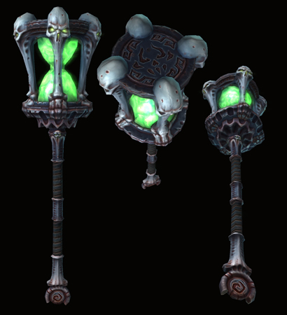
[DS2] Multi, AimBiZ
--- LATEST UPDATE ---


---
This is a too good of an opportunity to pass up!
So better get some stuff rolling on my part. Been doodling a bunch which atm boils down to two ideas. Posting this first sketch up while trying to tie that other design together.
So yeah this is supposed to be demonic.
My second idea was to incorporate the hourglass somehow. What do you think?


Replies
- BoBo
The fragility has been a concern of mine from the start but I went with this in lack of better ideas. However since I can't have transparency anyway I'll go for either metal or some kind of marble so the whole head is more of a whole consistent piece.
New version of the concept. Made them skulls bigger and provided some stronger expression. Trying to convey the feel of metal (as kingdom of the dead use metal mostly it seems) but still keeping colours varied.
I'll move on to 3D asap just to have that ball rolling. Still open for changes etc.
- BoBo
cool style, there has to be a spirit of some sort locked in there!
The biggest challange (except making the deadline) I would think will be to have this idea making sense in the end.
LuCh: Having a spirit could be a cool thing. Just wondering how to convey that with no transparency.
Main focus will definitely to make this look like it could beat the shit out of something and not looking fragile. So propably in the end I might make the glass metal and make it look like it's mergin with the rest of the head, like it's simply a sculpted motive made into a weapon.
Anyway, got around doing some blockout. As you may notice I've already dumped some forms I found obsolete.
Skyerzz: No worries. I was thinking of naming it Time of Death...
So, got the hipoly somewhat done. Just wear and tear missing.
Anyway
Waiting for more
Konras: Greentooth would be nice to incorporate in some way but it'll be hard making it not feel out of place. Would have to make it very subtle I guess, like an easter egg or something.
I haven't done any "sulpting" btw. This is all sub-d.
3DHamster: Indeed it's too clean. Wear and tear plus additional details will come. First I want to get the lopoly step over with so I know everything bakes well and such.
ScoobyDoofus, afisher: Agreed there. Not entirely sure which shapes that'll be in partiular but I have done some adjustmenst, mostly on making the skulls a bit more dominant. The lopoly will make the sihlouette quite sharper though, so maybe it'll be easier to make tweaks on that one.
And glad people like it!
Lopoly still Wip. The poly budget is giving me some challenges right now. Made a lot of simplifications but it'll still up 500 over the limit. Wonder if this would be acceptable or if there's some spots that got more than they need. Will look with fresh eyes next time.
Got started on the diffuse as well which will be the hardest part I think, to get it in style.
Not sure yet what I'll do exactly with the glass shape itself.
Progress on the diffuse. Quite hard to make it go well with the normal map as it wash it out a bit.
Tried some other colours. Think I want it to be colder and monochrome with contrasting rust.
I'm afraid I'll need to modify the uvs and rebake everything. I was a bit naive to think the uv seam that goes over the crevices on the base of the hourglass wouldn't be too noticeable.
http://meshbin.com/m.php?id=4f64d2768e0b8
It's a cool design by the way. I just can't help but feel it needs something on top.
You're right Bobo. Didn't read your comment until now but I got it saturated up a bit. Not entirely sure what I want to do with the colours. Maybe I should make the whole thing except the "glass" more towards blue but still keep the red rust.
Alright, made a new uv-map and rebaked everything. Also put in some extra splits to hide some seams better.
Not really that far until deadline. Not sure how much time I'll have during the weekend so I will push it to finish over the week.
Next is adding highlights and whatnot to the diffuse and playing around with colours.
Oh and should probably put something on the top as well. Have been trying out some runes but not sure if it'll be overkill. A big one on the top wouldn't hurt probably.
Keep going!