Home 3D Art Showcase & Critiques

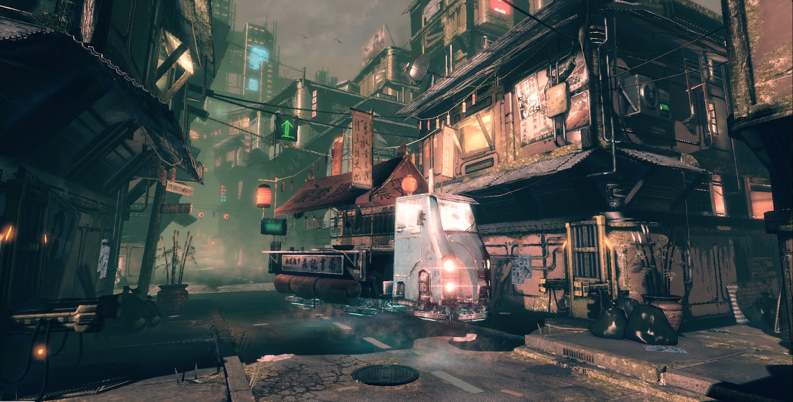
Chinatown UDK environment WIP

1
Hey Guys This a new scene I have started I already have a few props down and I am currently working on the composition and lighting any critiques are great. Let me know what you think! thanks everyone.

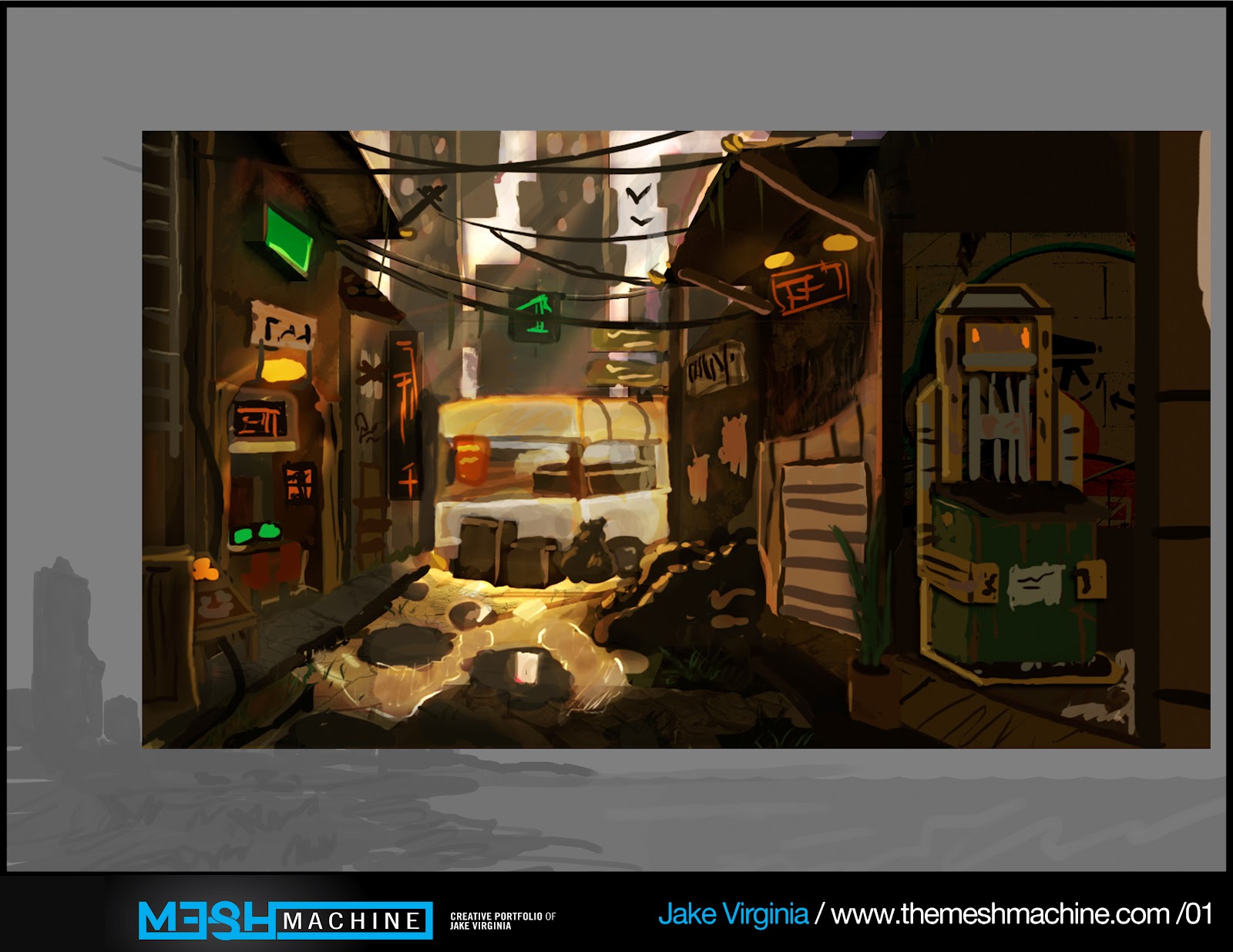
This is the concept that I started with the colors and Lighting I am planning to keep its the composition that needs change the hero prop is too far away.


Progress so far:
final_Chinatown.jpg


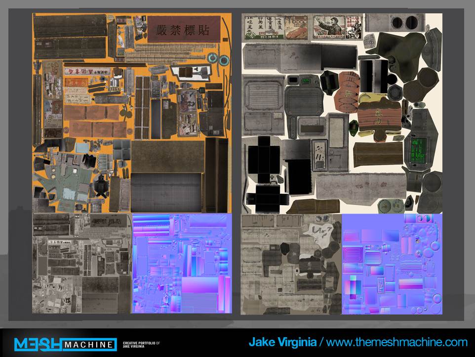
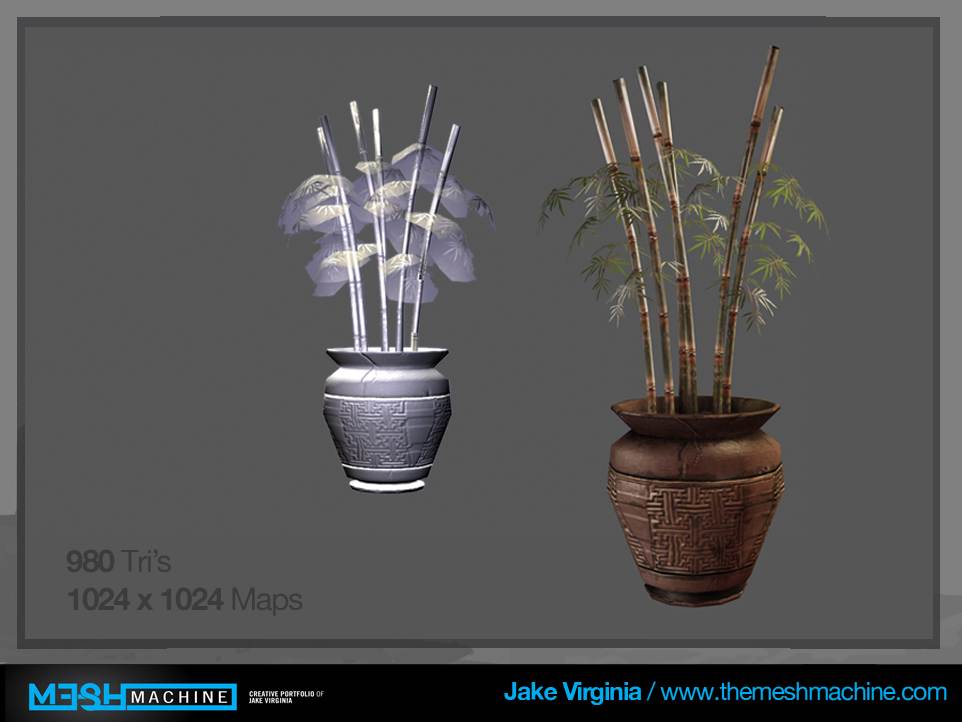
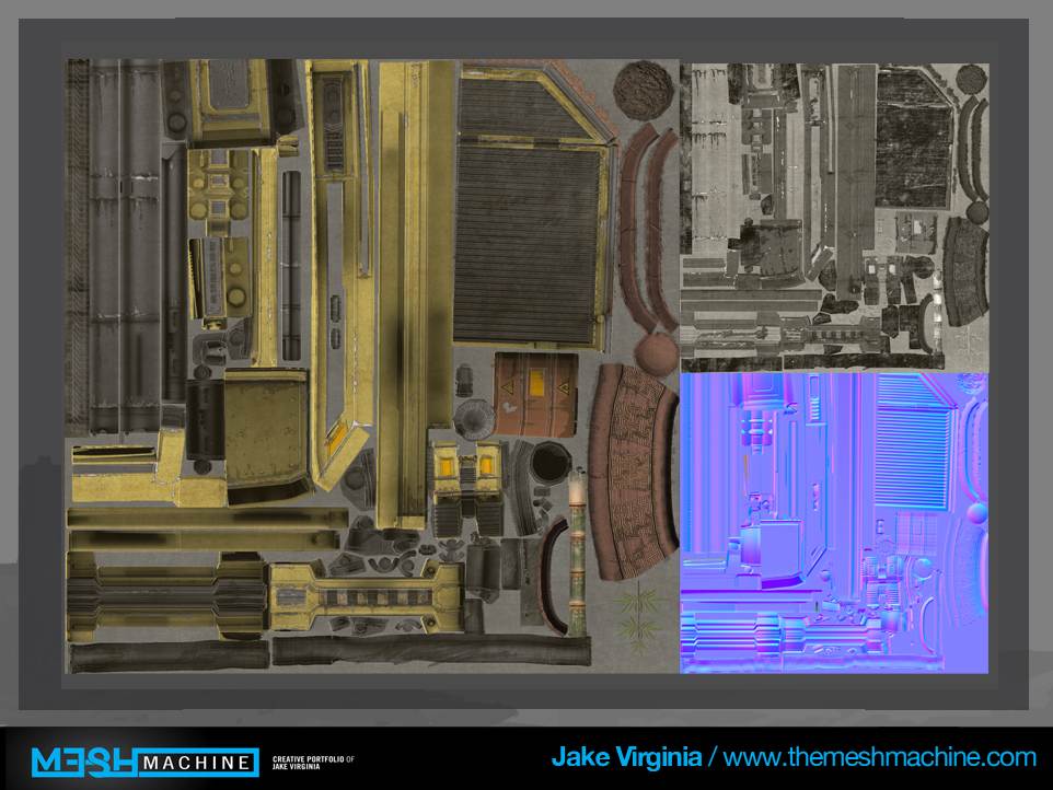
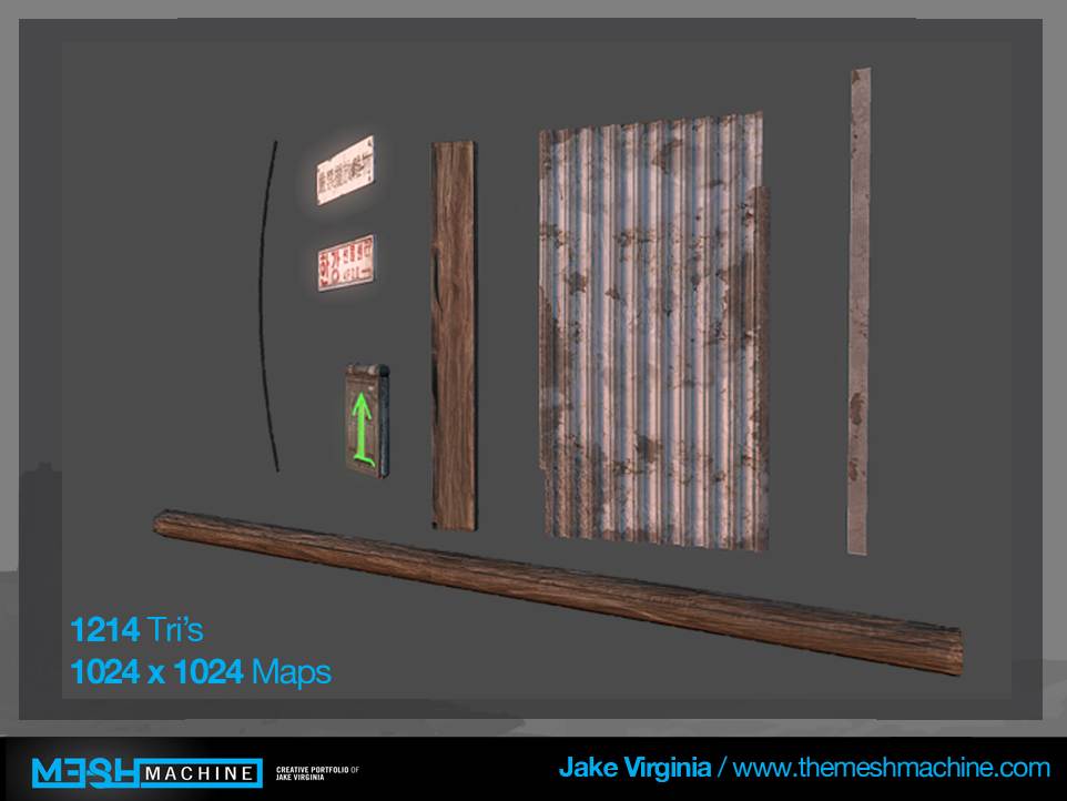
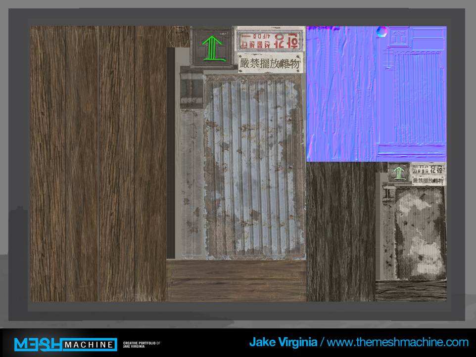
Here are my old prop sheets
colorcomp2_stylesheet.jpg


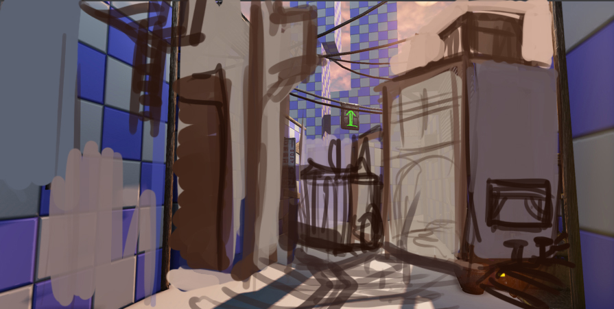
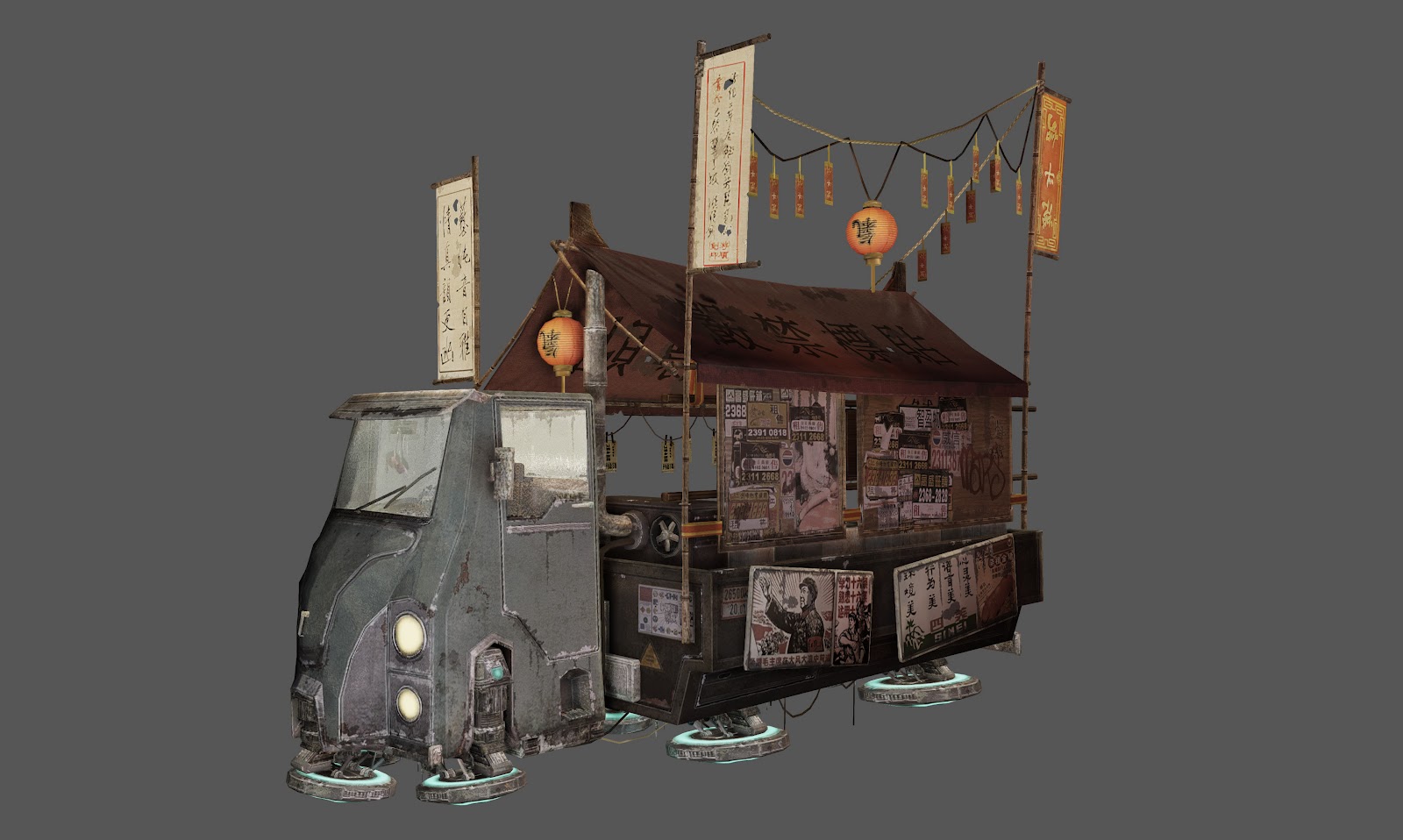
This was my next composition which looks better visually but the truck the hero prop is still too far away and so is my unique building.
final+shot.jpg

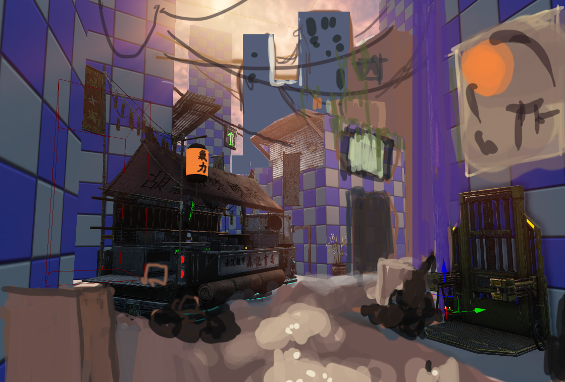
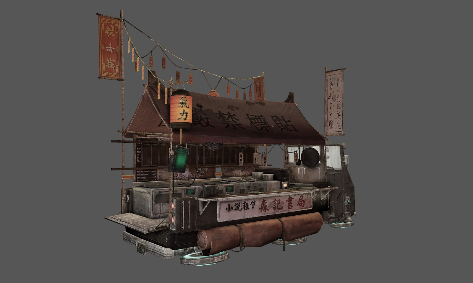
This is the newest paintover I have done The hero props are in a better position but the composition still seems off.
scenecomp.jpg

Highres_Screenshot_00016.jpg

Highres_Screenshot_00018.jpg

Highres_Screenshot_00017.jpg

truck1.jpg


truck+texture.jpg

airconditioner.jpg

conditoner+texture.jpg

machine.jpg

Plant.jpg

plantmachinetexture.jpg

modular+props.jpg

modular+prop+texture.jpg


Well there it is guys let me know what you think and more props coming soon as well as a more detailed blockout and paintover.

Replies

  • Jhill8
    Options
    Offline / Send Message
    This is amazing but i am guessing you aren't planning on going into this as the tri count is really high already ?
  • jk_virginia
    Options
    Offline / Send Message
    No This is purely A portfolio piece. For presentation purposes you may be able to walk around because my computer doesnt chug at all when using UDK but It is also not finished so for now just images. The only Tri intensive prop I have is the heroprop in my opinion. which models would you change the tri-count for maybe point out some areas on my wireframe I could fix?
  • Dolmen
    Options
    Offline / Send Message
    Dolmen polycounter lvl 6
    Really great stuff man.
    And your Asian shop remind me the Asian flying shop in "The 7th Element" by Luc Besson. (On the beginning of the film.)
    Good evening
  • jk_virginia
    Options
    Offline / Send Message
    thanks man I'm glad you like it, the concept of this scene was actually based off of the fifth element and bladerunner so i'm hoping to achieve that feel with the scene eventually.
  • reverendK
    Options
    Offline / Send Message
    reverendK polycounter lvl 7
    looking promising. in your paintover with the skyscrapers there's one you painted in that is the exact same height as the one next to it. i'd vary those up a little, their width too, i think. and are you gonna stick to the sillhouette you originally had for those background buildings? cause i like it a good deal more than the standard tall building fare you have in the newer one.

    diggin the noodle truck. do my work proud, son!
  • jk_virginia
    Options
    Offline / Send Message
    Yes I definitely will keep the skyscrapers the same I will post another paintover tonight of all the fixes I get today so keep the critiques coming!
  • Jhill8
    Options
    Offline / Send Message
    The only Tri intensive prop I have is the heroprop in my opinion. which models would you change the tri-count for maybe point out some areas on my wireframe I could fix?

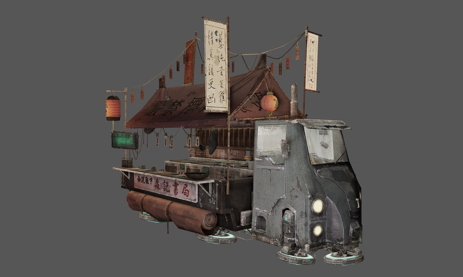
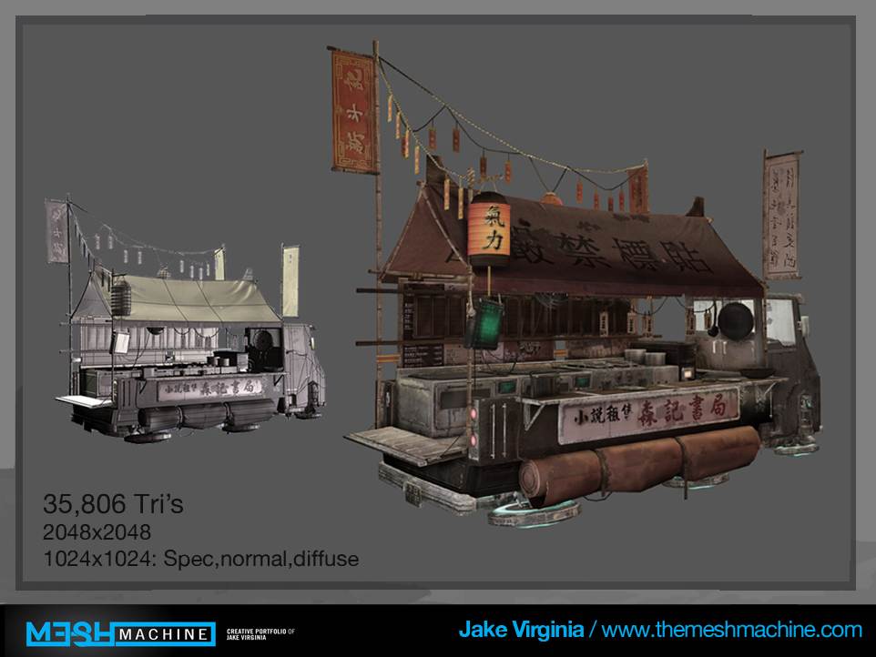
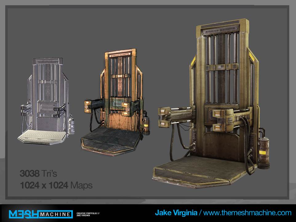
    I would maybe drop the tri count on the wall pieces i understand that high poly looks nice but you really wanna keep a level at 25 K but for portfolio piece you should keep it at 65 K that would be my recommendation the kiosk you have though is really nice :). well done :).
  • nathanbarrett
    Options
    Offline / Send Message
    nathanbarrett polycounter lvl 6
    your props are rad as hell!
  • jk_virginia
    Options
    Offline / Send Message
    jhill: what wall pieces the lift and airconditioner?

    Nathanbarrett: thanks
  • Jhill8
    Options
    Offline / Send Message
    jhill: what wall pieces the lift and airconditioner?/QUOTE]

    No no the corrugated metal and wood pieces, as they are not like the main view pieces you can lower the poly count a bit. Not hugely but every little helps.
  • RogelioD
    Options
    Offline / Send Message
    RogelioD polycounter lvl 12
    I absolutely love everything you're doing here. Keep it up; my eye is firmly on this one!
  • jk_virginia
    Options
    Offline / Send Message
    Cool thanks for the support a new paintover will be posted tonight just started on the scene and the truck is next
  • Cibo
    Options
    Offline / Send Message
    Cibo polycounter lvl 10
    Your Air Conditioner has 152 tris why not add a few more to smooth the edges a little they look really sharp.
  • jk_virginia
    Options
    Offline / Send Message
    Yeah it couldn't hurt but it is pretty far away in the scene but it is also a portfolio piece so I will smooth those out as .
  • jk_virginia
    Options
    Offline / Send Message
    Here are some of the fixes I am going to be working on for the truck some more dramatic lighting fixing up the spec and reflection maps and setting up the dioramma underneath it with some foliage and broken asphalt and such.

    Any Ideas for the dioramma? I Want to do like broken asphalt a sidewalk and some grass sticking out with maybe a puddle in the street. what do you guys think?

    Highres_Screenshot_00014.jpg
  • Jhill8
    Options
    Offline / Send Message
    looking forward to your next post i think the diorama idea is great !
  • Cibo
    Options
    Offline / Send Message
    Cibo polycounter lvl 10
    Maybe a puzzle like beton street like in Hongkong with tar seams. Or a asphalt street with new and old asphalt (sun bleach) for a good feeling of change and time.
  • jk_virginia
    Options
    Offline / Send Message
    So I was thinking broken asphalt like this except bigger crack with puddles of water in between the pieces and then the sidewalk would be a lot like the next picture with some grass sticking out of the cracks.

    buche_stradali.jpg
    buenos_aires_city_of_potholes_and_cracked_sidewalks.jpg

    My plan for the model and texture work would be a modular texture sheet that I could use to texture the sidewalk and its trim piece and the asphalt all with one sheet? what do you think?
  • konstruct
    Options
    Offline / Send Message
    konstruct polycounter lvl 18
    So cool- I think you should mirror the whole food truck model for the scene as the cab is an interesting design! It seems like your just hiding it- tucking it away in the current scene composition. Bring it up to the front! It seems like it would make a good focal point.
  • jk_virginia
    Options
    Offline / Send Message
    [IMG]file:///C:/Users/Gateway/Desktop/scenecomp.jpg[/IMG]ok I like the idea of the truck up front but the building that is circled still needs to be seen what I have in the current concept is that the truck is pointing your eye down that alley towards the market/resturant building?
    scenecomp.jpg
  • PhilipK
    Options
    Offline / Send Message
    PhilipK polycounter lvl 10
    That's a pretty cool idea and start. I hope you'll be able to separate areas well enough so it won't become too busy. Maybe with smoke effects etc. to add depth and have people focus mainly on the front left and right sides for details.

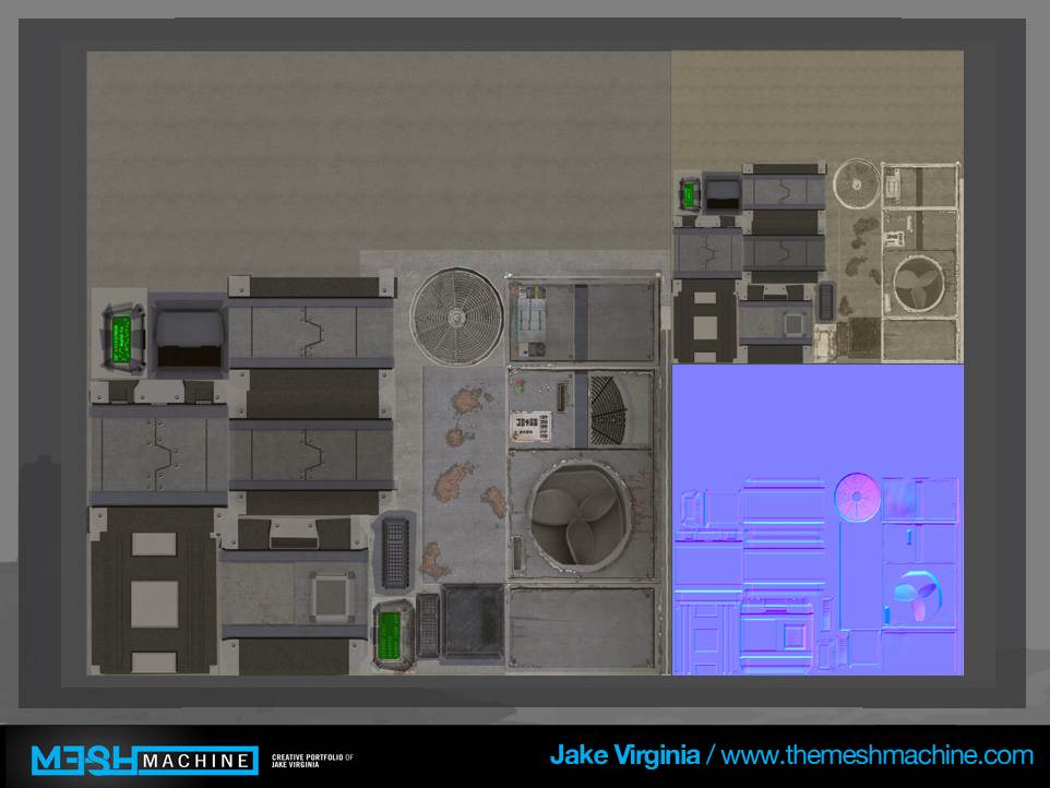
    One thing I find strange tho is the texture usage so far. I don't know if you plan to scale any of that down? I wouldn't be too worried about tri/vertex count but I would definitely be worried about the texture memory usage more.
    So far if I counted right you are using one 2048x2048 texture and 5 1024x1024 textures.
    All including diffuse, spec and normal. So depending on your compression etc. you'd end up with something eating up almost 25MB of memory on those few props alone!

    Seeing this would be a portfolio piece I'd try to make it as optimized as possible, especially on that front.
  • jk_virginia
    Options
    Offline / Send Message
    towards the back of the scene it will be filled with a green smog to make the viewer focus towards the front hopefully that will help.

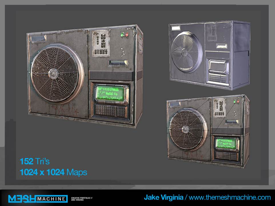
    Well right now I am using 4 1024x1024 maps and a 2048. one of the 1024 and the 2048 maps is on the truck I would like to keep those as detailed as possible since I plan on making that my hero prop. the other 3 1024 maps are on the other props. the machine and bamboo plant share a texture space, and the air conditioner and crates share the other one should I reduce those since they will be in the front of my scene? I plan on reducing the modular props to a 512 mostly because they will not be looked at as much.

    The 1024 map is applied to the props inside the truck They were put on a seperate map because the 10 props on that will be placed throughout my scene I will shrink those down to a 512 to see how they look.

    In total that would leave me with two 512 maps, two 1024 maps and a 2048?
    Thoughts?
  • PhilipK
    Options
    Offline / Send Message
    PhilipK polycounter lvl 10
    Ah ok, definitely sounds better! Seems like you've planned out for some more sharing there which is great :)
  • jk_virginia
    Options
    Offline / Send Message
    ok cool I will be adding some modular textures and tileable textures for the ground and buildings still but that is all thats left I will be posting more shots of that progress tomorrow.
  • jk_virginia
    Options
    Offline / Send Message
    Here is the lighting fixes I have applied to my truck and the zbrush progress I made today on the tiling street textures I plan to finish In zbrush for the diaramma under the truck and in my final scene.

    Highres_Screenshot_00000.jpgasphalt.jpgmanholezbrush.jpgmanholezbrush2.jpg
  • konstruct
    Options
    Offline / Send Message
    konstruct polycounter lvl 18
    I suppose I was talking about actually scaling the model along a single axis, flipping it- so you could position it like this

    I like where this is going!!!!
  • jk_virginia
    Options
    Offline / Send Message
    Oh sorry I hadn't worked on any of the composition yet that was just lighting fixes I did that is a good idea I will definitely try that I think i'm gonna bring the main building up closer too i'm probably gonna move it right to the right of the truck tomorrow I will have new shot!
  • jk_virginia
    Options
    Offline / Send Message
    Hey guys these are the lighting and composition fixes I have been working let me know what you think. zbrush updates coming up next.

    Untitled.jpg
  • aminos
    Options
    Offline / Send Message
    You've got some fabulous assets done there. Keep the good work. I think you might want to set up a more detailed test lighting rig to convey some kind of mood, before you jump in with some detailed texture work around your main assets. Just kind feel, you could have got more with your assets through better lighting.
  • jk_virginia
    Options
    Offline / Send Message
    definitely I will keep working on it especially the dark area in the front right now im just working on getting the street texture done.
  • jk_virginia
    Options
    Offline / Send Message
    Hey guys its been a bit since I could post something but here is a tileable broken asphalt texture I made in zbrush and rendered in marmoset it has a displacement map too but i dont have dx11 so I cant show you in marmoset.
    sidewalk is on the way let me know what you think!

    screenshot0.jpg
  • jk_virginia
    Options
    Offline / Send Message
    Here is a tileable mud that I will be using to vertex paint in udk on the street textures let me know what you think
    screenshot0.jpg
  • Fred2303
    Options
    Offline / Send Message
    Fred2303 polycounter lvl 7
    excellent work! cant wait to see it finished!
  • jk_virginia
    Options
    Offline / Send Message
    Here is a modular sidewalk texture that will be paired with the previous two textures to complete my ground textures.
    screenshot1.jpg
  • jk_virginia
    Options
    Offline / Send Message
    Here is a progress shot for all the stuff I've done so far!
    Highres_Screenshot_00000.jpg
  • mkandersson
    Options
    Offline / Send Message
    mkandersson polycounter lvl 7
    I love asian cyberpunk/sci-fi environments so I'm stoked about this one.
    Cool vehicle/shop, me like! Looking forward to see more
  • jk_virginia
    Options
    Offline / Send Message
    Hey guys so here are all the final models in the scene until I do the full scale version now I just have to meshpaint the building and fix lighting and composition critiques are welcome please let me know what you think.Highres_Screenshot_00023.jpg
  • chrisradsby
    Options
    Offline / Send Message
    chrisradsby polycounter lvl 14
    Too much red going in there right now and make sure you have a second unique UV-set for all the lightmaps or you'll end up with a weird result. Can't wait for the full-scale version! Good work so far!
  • jk_virginia
    Options
    Offline / Send Message
    Hey guys last progress shot of the night more tomorow!
    Keep the crits coming!

    Radsby: I put the red in there because it is supposed to be sunset what color would be better or should I just desaturate the light a bit?
    Highres_Screenshot_00000.jpg
  • chrisradsby
    Options
    Offline / Send Message
    chrisradsby polycounter lvl 14
    If you're going for sunset try the golden hours, you get a lot of depth and cool color variation.
    Like colder blues at the bottom and golden yellow/orange at the top of the buildings. (If you do a small city-scene)

    5125027842_94d861f5a0.jpg
    DSC_9585.jpg
    4.jpg

    reminiscing_changi_T1_winning_entry_2.jpg

    It's important to try and catch that initial feel, with the lighting it should be a great range and only top out (and get over-exposed) at certain points. Right now everything is red, try to get some more range in the colors in the scene so that your color information in your textures don't get lost. :)

    It's just my opinion though :) keep working hard , looking forward to more!
  • jk_virginia
    Options
    Offline / Send Message
    Ok yeah the second and third picture you posted is going to be a lot like my scene layout so I will go for that kind of lighting and see what I can get. I will post something up tomorow for sure.
  • Prtofdacrowd
    Options
    Offline / Send Message
    Prtofdacrowd polycounter lvl 8
    The great thing about UDK is its copy and paste functionality, if you really want to get a good feel of the lighting, copy all of the assets ( no lights or fog ) and open a default lighting template in UDK and paste, it will drop everything exactly as it was in a new map for you. If anything I can imagine maybe the opposite scene. A morning scene like your hero piece is a simple futuristic milk cart :P or a man on his way to work early to get the best caterers position outside a massive nuclear power plant :P
  • chakkrit
    Options
    Offline / Send Message
    Looks awesome so far, I really like the design of the vehicle.
  • jk_virginia
    Options
    Offline / Send Message
    Well yet another progress shot. Let me know what you think!

    fixed.jpg
  • wester
    Options
    Offline / Send Message
    wester polycounter lvl 13
    I immediately noticed the red crosshairs meaning you just took a screencap (with something selected) and not a tiled shot.
    Tileshot that shit!! ;)

    Also i would kill that dust effect under the hovering truck. I feel like you could sell the idea if you made a different effect. More of a magnetic effect from the hovercraft than dust from the ground.
  • jk_virginia
    Options
    Offline / Send Message
    ok will do I wanted like a distorted magnetic field under the truck but i wasnt sure how to make that any tutorials you know of? also I will tileshot it haha.
  • konstruct
    Options
    Offline / Send Message
    konstruct polycounter lvl 18
    distortion particles ftw !
  • Ferg
    Options
    Offline / Send Message
    Ferg polycounter lvl 17
    Hey man, really diggin the mood of the scene right now. Agree about the magnetic field effect.

    For crits... I noticed that all the garbage bags are sitting with the mouth of the bag tied and pointing straight up. Maybe make some variations using the same texture where they're slouching in different directions? The walls are also looking a little flat, you might want to play with popping the normals a bit more and adding some variation to the different panel elements in the diffuse and spec. They don't have to be huge variations, like a bunch of different bold colors, but some subtle material difference will give them a lot more passive interest.

    Hope that helps!
  • mbischof
    Options
    Offline / Send Message
    Props are looking cool, keep up the good work!
  • SirCalalot
    Options
    Offline / Send Message
    SirCalalot polycounter lvl 10
    This looks great so far @jk_virginia :)

    With regards to colouring and overall lighting, you could try adjusting the Colour Lookup Table to more accurately get what you want:

    Oniram wrote: »
    [vv]38542834[/vv]
1
Sign In or Register to comment.