UDK Underground Mine.
polycounter lvl 13
Hey All,
Here is the final Fly through. I know it is lacking in some areas but these are areas I will be addressing in the projects to come. Thanks to everyone for the great feedback!
[ame="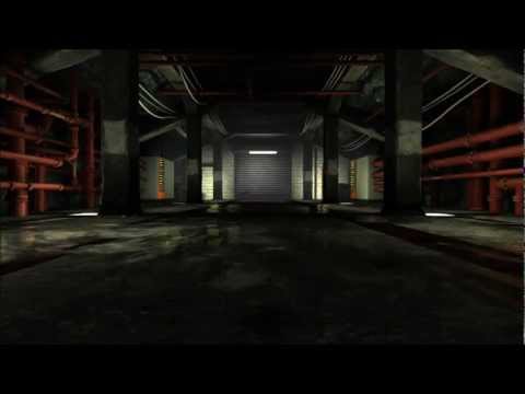 https://www.youtube.com/watch?v=76KUlPzBIMg"]Underground Flythrough. - YouTube[/ame]
On to the next project!
Carry on if you wish to read more about this thread
I'm currently on a break at college so though I'd use this time make something. I'm still relatively new to UDK so if there is something blatantly wrong please let me know.
Here is my concept I'm working from.

http://cghub.com/images/view/85537/
Modular Breakdown:
Red = Modular.
Blue = Unique assets.
Green = Decals.
I've have also attached some screen shots of my level too in UDK. I'm a bit bugged out why some of my corners on my pillars are showing black lines and can't work out wether it's due to light maps or the normals so if anyone can shed some light on this that'd be great too.
The Scorpion Vehicle is from the Unreal Engine and is there to represent the scale of the map.
I will try post some more updates later")
Here is the final Fly through. I know it is lacking in some areas but these are areas I will be addressing in the projects to come. Thanks to everyone for the great feedback!
[ame="
https://www.youtube.com/watch?v=76KUlPzBIMg"]Underground Flythrough. - YouTube[/ame]On to the next project!
Carry on if you wish to read more about this thread
I'm currently on a break at college so though I'd use this time make something. I'm still relatively new to UDK so if there is something blatantly wrong please let me know.
Here is my concept I'm working from.
http://cghub.com/images/view/85537/
Modular Breakdown:
Red = Modular.
Blue = Unique assets.
Green = Decals.
I've have also attached some screen shots of my level too in UDK. I'm a bit bugged out why some of my corners on my pillars are showing black lines and can't work out wether it's due to light maps or the normals so if anyone can shed some light on this that'd be great too.
The Scorpion Vehicle is from the Unreal Engine and is there to represent the scale of the map.
I will try post some more updates later
Replies
Try inverting the green channel before baking the Normals out again.
I'll hold off any critiques until you've come further with the scene.
I love the concept and can't wait to see where you take this
*Subscribed*
Here is what it should look like.
Thanks for holding back on the crit too :P I'm sure theres gonna be a bit but I welcome it, anything to make me a better artist.
If you excuse the quick and dirtiness of the paint-over, I've highlighted a much bigger modular piece that you could create.
It includes one pillar, the floor, ceiling and sloped wall. Then you could make the pipes and switchbox as seperate pieces for some variation amongst the walls.
Then other large modulars would be the central corridoor floor and ceiling pieces.
This'll help you to block out your scene in a moddelling program too, rather than having to place every pillar and line them up with every wall panel etc. separately both there and in UDK.
Hope that helps, and it's mainly just something to remember for the future as you have already got them blocked out here
Cheers for that simple breakdown SirCalalot, I should have probably looked at the bigger picture. I've had a few problems with snapping to the grid today but all is fixed and the results have been good. I've blocked out the rock face but not sure wether to build a high poly to bake down, what do you think?
I've generated a normal from NDO2 for the grill part of the floor, but it's just so I have something to look at whilst blocking out the scene.
here is a little update, let me know what you think.
If you guys have any ideas which could help this scene that'd be great
Again, it's hard to critique on much until you've come a bit further with the scene.
Don't forget about the rectangular lights in the floor behind the pillars though.
That's where the majority of scene lighting will be coming from later
Another update for you. It's not much as I've been trying to work out ways to break up the modularity down the line. Here are some Ideas I've come up with to break it up:
Wood Sheets.
Boiler Unit.
Doors.
Sound Alarm.
I'm quite stumped bar that. This type of facilities are generally quite empty but any suggestions would be great.
Been updating textures to achieve a realistic feel.
on the concept you can see that pillars have vertical stripes on them, making the texture more interesting. ceiling beams have horizontal stripe pattern as well.
i think edges of your pillars are too soft at the moment.
Thanks for that advice... Big fan of your texture work by the way so thanks for having a look at my stuff
Ignore the pipes as they have not been unwrapped yet
At the end of the tunnel I'm going to have debris and rubble blocking the exit, what do you guys think?
Here are some updated pics:
With regards to blocking off the tunnel with rubble, I think that would limit the lighting and make your final scene less interesting.
I'd love to see this match the concept a lot closer in the final iteration
The only problem I'm having is making the corner at the end. I think i'm gonna have to make some more assets in order to do that. I think I have a rough idea what to do but open to suggestion
My reference was this boiler I found on the internet. I just added a few touches here and there to make it more unique.
Been working on the door today, still need to add hinges and a handle.
Also went back and ammended the pipes and fittings.
[ame="
I'm a big fan of Sneffer (Tor). His work is truly inspirational, I have no idea how to set up those type of Dynamic Reflections. I can't work out wether he's used a cubemap or IRSC (ImageReflectionSceneCapture). I'd love to be able to achieve something along these lines but there doesn't seem to be any decent tutorials un less you no other wise?
Cheers for the feedback
Been working on the reflective material today. It's been quite taxing and there still quite a lot i need to learn but here is where I am so far. Let me know what you think
[ame="
Here are some more recent updates.
This also is a good time to look at lighting. The concept has the side areas more brightly lit than the central aisle, and there's a bit of a cool tint to it as well. The light is also very clearly coming from below and shooting up, whereas in your scene it looks like it's about at player height; try changing that up and see if it gets a more moody vibe.
Been playing around with the reflective surfaces this week and lighting, still need to work on some areas but toned down the pipe fitting in the scene to show their glossy effect on them too.
I've remodeled the the pillars and gave them a bit more character and detail.
2048x2048 maps , 408tris
I still need to do spec maps for the pillar then i'll move onto the other models.
I have also warmed the lighing and made the mist a cooler color for a nice contrast in the scene.
Any feedback would be great!
Here's a quick adjustment I did in PS:
All I did was bump up the brightness (of everything), and then made it slightly cooler. Can actually see what's in the scene now
I'm going to grunge the scene up a bit more and make it more worn and lived in. I'm still going to keep by the concept but make it my own. the floor has been bugging me a lot so I will break up it's clean finish and create decal puddles to reflect the scene. I have a more assets to model still Orchidface to make this look half interesting as the concept itself is very minimal and lacking interest like you said.
I'm pretty much revamping the whole scene as it is still very blocky so hopefully i'll have some more updates for you guys very soon
I agree with Orchidface, the scene is overall lacking. Its rather its boring and feels like there isn't a solid direction to it.
Why is it boring?
Well to start with hallways are Boring! Don't follow the concept 100%, its a good starting point but conceptualize a bit your self. Don't just throw some grunge on top and call it a day, think about the story behind this hallway.
Is this a scifi scene? real life? Fantasy? (get a genre down) Why was it built? whats it for? is it still being used or is it abandoned? what planet is it on? is it infested with nasty alien goo or did hobos take over start living in the hallway? etc. Asking yourself questions will add so much more depth and interest to it in the end and help you come up new ideas and keep you from having an underground Mine that looks like a maintenance access that only holds water pipes and boilers that look like servers.
Things to fix:
More variety and more consistency, Is this a mine or maintenance access? If you want those boxes to be boilers I would change them because they look out of place nor did I know they where boilers till you posted your reference. Add other assets that are not pipes, boxes and wires. Asking questions about this place will help you come up with things quickly also lots of reference. If its going to be scifi really make it scifi other wise it looks like it was tacked on.
Glowing lights alone wont make your scene look cool. Try to keep the 90 degree angles to a minimum, maybe instead of the boilers being square they are round with crazy extrusions coming out everywhere (extreme example to get point across). Instead of a flat ceiling maybe its arched? Silhouette is super important.
Think about changing the symmetrical feel too, maybe some of the pillars collapsed or the roof caved in since its underground. Splash some color in there, its very gray with gray fog (with can tend to flatten out a scene). All the pipes are white for the most part change some of there color. Get a sense of scale, at the moment I have no clue if this tunnel/hallway thing is 4 stories tall or 10 feet tall, put some objects that the viewer can relate to human scale.
Sorry for the wall of text, just trying to help a fellow artist out, please be aware that none of this is being said in a mean fashion. I struggle with all this shit too. Im sure you know most of this but its always good to remind our selves of it.
Keep punching donkeys!
At the moment It's serving as a maintenance area within a mine/underground area. Which has no depth or story I suppose but I guess it's something I really should have considered before starting. I have to agree with you about the boilers looking like servers because as a Plumber and Heating Engineer myself I haven't come across one that elaborate (but close in some ways )
I really like your idea about rounding the boiler's corners and maybe 'teching' it up in other areas as I also feel that it looks saturated. The pipes are now being revamped and scaled down as they through my scene's scale out but I can't settle on a colour right now so I may post some screen grabs when I'm happy with them.
'Keep punching donkeys!'<
only someone as immature as me would laugh at this
Been focusing on lighting and bring some of my models up to scratch as the scene was lacking a lot of character.
Be nice to know what you all think of the lighting as it has been a pain to set up. What do you think of the pipe color? Should I change it?
Remember that the Diffuse texture of a material is what colour it will be when fully lit, so a dark texture will only ever be dark, no matter how much light you shine on it. Add this to your naturally dark stone walls and you are going to struggle with lighting up your scene.
Now I know that you are not sticking religiously to the concept, but have another gander at its composition:
The artist has chosen the white pipes specifically for the purpose of creating contrast to the rest of the dark scene. With the lights shining on them, the pipes and light-grey walls create high-value areas of the image. Conversely, the unlit floor is a dark grey in opposition to this.
Maybe blue or yellow pipes would fare better - or creating brighter areas here in different ways.
Edit: I find a good technique is to blur your vision when looking at an image to see how much visual interest there is. If your image just turns into a dark blur, then more contrast is needed
I think you need to boost your lighting intensity from the floor spots too. As well as this, try upping their scene bounce-lighting contribution (View > World Properties Lightmass > Diffuse Boost) but try not to go much higher than 15.
This will intensify how far your lights contribute to the scene overall.
That last step will also no-doubt create a new problem - lack of contrast. This can be remedied in part by altering your shadow colour. As a general rule, shadows are never fully black, but are the colour of your environment.
For instance, an outdoor scene with a warm/yellow sun and blue sky - blue shadows. They work well as the opposite to your light's colour.
Looking at the concept, the lighting is a cold white and if you look carefully (on the floor's grating) the shadows are a dark terracotta.
To change the Environment Colour, just go (View > World Properties Lightmass > Environment Color) and the changes should update in real-time.
I hope all is well and that helps somewhat anyway
Sorry it's been a while I've been away and now back to kick some butt!
SirCalalot: Cheers for the feedback here mate it's great that people are willing to take their time to analyze my work and the tip on the texturing is a great tip and the UDK stuff in invaluable as I haven't really touched on that side of things yet.
I think I'm going to go off on a slight tangent in terms of the concept as it is lacking character so i will add my own touch/style in areas to make it my own.
Just finished a prop for the level this morning
here is the turntable link http://vimeo.com/40377046
Now about to start modeling the doors to close this level off.
As usual any feedback would be great!
Cheers mate! I didn't know that
^Explains it, make sure you read all 4 pages!
http://udn.epicgames.com/Three/ImageBasedReflections.html
Keep in mind you will need a video card that supports DX11 features to do it.
AmbiguousPackage - I have one set up at the moment but will use the reflections in puddle or oil on the floor as I'm going for a 'grungey' feel and yea I'm fortunate enough to support DX11
S2Engine - Your a gem mate! can't thank you enough for the help
Finally capped the end off with a door which has helped me visualise how the final oputcome may look now. I have a month roughly left to tie this up as it is due in middle of May.
I've scaled down the pipes an boilers to make the scene look taller and also helped with my scale. Only porblem is that it looks quite empty in some areas now. Any ideas on what I could add?
You could try adding a few of those plastic crates like the one in the concept.
Overall though, I think your scene is a bit too dark and lacks contrast. The lighting is really not showing off your work.
This could be remedied in part by brightening up your rock wall texture to include a bit more light greys and flecks of white to pick up more light.
Multiplying the Emmissive value of your light materials by a factor of five will bring in a lot more dramatic detail as well as making some nice bloom kick in. In conjunction, I'd recommend getting a nice complimentary colour scheme in there, as your environment is looking grey.
Maybe turning the floor lights ever so slightly blue with your light over the door as a red warning sign would work?
Then changing the fog colour to a light cyan would work well.
These are just suggestions, mind, it's up to you what you do
I've taken what you've said on board and tried to apply it to the scene so let me know what you think
Appologises if the picture quality isn't great. The puddle wouldn't show when using the 'tiledshot' function in UDK so I opted for the Windows snip tool
If I have time I will create some more decals such as:
Exit Signs.
Letters/Numbers for the columns.
Wall vents.
Grime on the bricks.