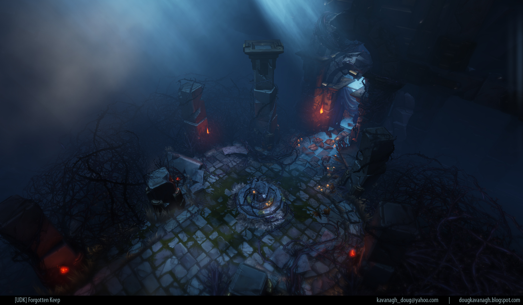
[UDK] Forgotten Keep - Hand painted Dungeon
Hey guys, just wanted to share my latest environment I've been working on
The back story is pretty basic. It's a keep/dungeon built into a mountain side in some remote corner of the world. Thanks to some travelers/monks/pilgrims etc, the place is lit almost as if it were in use by its former inhabitants. What all this really means is I was inspired by Diablo 3's sweet art style after loggin some hours in the beta. Gripping, I know
*Updated in the year 2013*
So...while I was reorganizing my dropbox to save space, I deleted everything (relocated from my dropbox folder) from this thread like a noob, so I'm fixing the glitch and adding some extra stuff!


Replies
@AckMaster: Can you be more descriptive regarding what you don't like about the lighting scheme?
Textures!
One crit I have however, apart from the first two shots, the other screenshots have less of a focal point. They seem very cluttered and there is no real space for your eyes to rest.
But again, great work and I'd love to see how you did your textures :poly121:
i think certain dimensional forms could use more emphasis, but i'm not sure how to achieve it.
sweet textures though.
Also the mood is great by me. I can easily see this piece in Diablo 3 for example.
We need more of such quality hand painted work. Keep it up, Doug!
I feel like your floor could be toned back a bit. It's so noisy and doesn't allow for areas to rest the eye in your shots.
Other than that I like it a lot!
...but holy cow are those handpainted textures fucking gorgeous! You're making my eyeballs pop dude!
as;dlfkjasl
Loved your textures
My one critique, as @Gannon mentioned, is that the flooring is really detracting from the solid composition of the scene. As there is a lot of noise and clutter, it is hard to distinguish where the player should be walking.
I can see that you were going for a destroyed, worn effect with the flooring, but the gaps in the brickwork just create dark black patches that make it hard to know what's what. As well as this, your brickwork is wonderfully worn and weathered enough as it is, without removing chunks of geometry.
I've done a quick and dirty paintover to better illustrate what I'm getting at - I hope you don't mind!
As you can see, I've tried to keep the overall shape of the floor more consistent and less sporadic
This (should) help to move the eye from the path and more towards the central doorway with its nice blue tones.
Just crazy!
Environment looks awesome too, but I agree with the people above about it being chaotic. If these were an actual game environment then I'd probably be really confused as to where to go and how to get there.
But really awesome work!
i think the reason its all a bit 'sameish' though is the lighting all looks pretty even.. it might help if there was something more like a subtle 'guide' telling the player which way to go, kinda like the way light filters through a dense forest.
or, something with a hotspot on a key asset or strong source coming from one direction and falling off nicely.
The enviros look awesome too.
oh - just out of curiosity - in UDK how did you get the kinda dark fog on the upper left and right parts of the 1st image -
Thank you all guys!..I really wish I had time to respond to everyone individually, but I'm in the middle of getting the breakdowns wrapped up! Should be done very soon
Also, how many of you want to see a tutorial on my texturing approach? I'd like to gauge the level of interest before I go through with it.
please