[Portfolio] - Johannes Waals, Environment Artist
Hello Everyone.
I am an Environment Artist/ World Builder currently studying Video game art at Full Sail University and in my final months of study. As my time here at school comes to a close I must begin to compile my Demo real and Portfolio and polish up some of my work in order to help me demonstrate my skills to a potential employer. I will hopefully be able use the Polycount community to help me gain useful feedback and critiques on my environments and continue to improve the overall quality of my work.
I thought I would post up my current environmental project and get some feedback. This is a scene of a Cliffside Palace Entrance and I am still blocking out assets and will be bringing them into UDK soon.
If you would like to look at my Main Reference.
http://i1243.photobucket.com/albums/gg557/jwaalsjr/enviroArt/skyrim-makarth-castle.jpg
My First Blockout pass
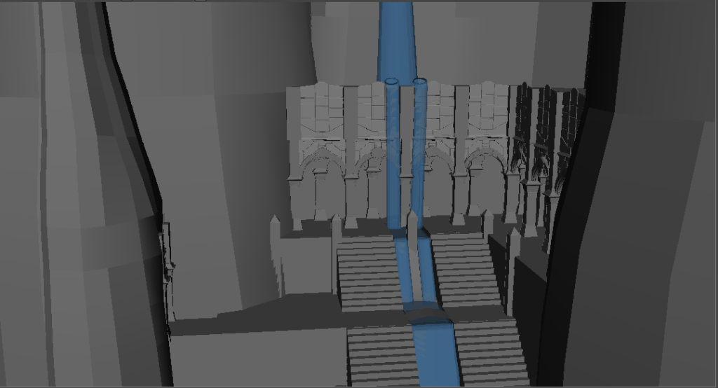
Any feedback would be greatly appreciated, Thanks.
I am an Environment Artist/ World Builder currently studying Video game art at Full Sail University and in my final months of study. As my time here at school comes to a close I must begin to compile my Demo real and Portfolio and polish up some of my work in order to help me demonstrate my skills to a potential employer. I will hopefully be able use the Polycount community to help me gain useful feedback and critiques on my environments and continue to improve the overall quality of my work.
I thought I would post up my current environmental project and get some feedback. This is a scene of a Cliffside Palace Entrance and I am still blocking out assets and will be bringing them into UDK soon.
If you would like to look at my Main Reference.
http://i1243.photobucket.com/albums/gg557/jwaalsjr/enviroArt/skyrim-makarth-castle.jpg
My First Blockout pass
Any feedback would be greatly appreciated, Thanks.
Replies
Wall, Door, Pillar, and Floor pieces
please have it in UDK,i like your details though, looks nice
to sclupt them ,?
Thanks Jungsik, and i plan to have them in UDK within the coming days.
Thanks ayoub... These meshes are more of a medium poly and will be giving me my base meshes to sculpt on, and so then to answer your second question, Yes i am also planning on sculpting most if not all of them.
i Brought it into UDK and reassembled the scene, plus begun the extension of other mountains in the distance and did some basic lighting setup.
-Main Shot
-Alternate Main shot
Some Other shots:
Looking out from the palace:
a side note, the sky itself is still udks basic night sky with some minor tweaks.
As always any comments are much appreciated.
I've got a new update of my project. I have mostly been texturing lately and have a decent base diffuse on most of the assets, some still have a basic grey as a place holder for the not so pleasing blue and whit checkers. I plan to have the last few done by tomorrow night.
So heres some shots of the environment currently, hope you like...
I also extended the area down to the end of the stairs and closed it off in different ways.
As always any feedback or critique on my models, textures, or design are more than welcome. Thanks
At the moment i do have actual geometry there and i defiantly see what you mean, I'll take a look at the smoothing on it and the lighting effecting it and see if i can find a nicer look, thanks for pointing it out though.
thanks Wonkey,
I have 33 assets that are geometry, that includes the water and rocks. 26 of them are Structural pieces.
Thanks for asking oobersli,
At the moment all the actual separate pieces are for the most part modeled but with what i think is fairly clean geometry. i could show you shots of specific pieces with wireframes and polycounts and such, but you are correct that none have normal maps at the moment. I've been focusing on diffuses at the moment.
If say you wanted to go for a peice that showed off modeling without textures, yes I could maybe see it being beneficial, but when our main goal today is to be optimized and efficient as possible, you can't always afford to model out every brick or tile.
As for your diffuse textures, if you could show what type of stone youre going for, that would help. You have a bunch of stuff that looks like color marble, and tiled in a way that doesn't look like its made for the piece of geo. the scene texturing overall feels very tiled and generic. nothing in there draws attention of being interesting or unique. In part because you're using so much geo and tiling that geo all over the place.
taking a look at your reference, you've strayed off from it quite a bit. By modeling your ground tiles, they're uniform.. where as the reference has irregular stones *something you could do easy within a texture*. The stairs have cracks, are uneven, as well with the pillars.
the detail you have on the arches and walls don't resemble anything recognizable, where as the concept feels like ancient ruins with gold inlaid detail.
maybe try and make a high poly and sculpt one of those pillars from the concept rather than trying to make it with a bunch of boxes and geo? Portfolio/demo piece or not, if you accept the rate your going you're just using your time on a piece that could raise questions from employers and hurt your chances of a job in an industry saturated with tons of others looking for employment.
Thanks for the critique oobersli, and taking my feelings into account :poly121:
When it comes to some of my current geo choices I can defiantly see your point and Im actually about to replace the floor with a normal mapped version, but for many of my other pieces there is a lot of different silhouette break that I felt needed actual geometry support so that it could hold its detail better up close. And you kinda touched on it I wanted to show off some more modeling, and your right that today we are all about optimizing, sometimes pushing things that look abit worse but are a lot cheaper, but I feel that is due more to our limitations than actually getting a better artistic result. And when working on an actual game piece it is very important because you can always use that extra stuff somewhere else when your engine can only take so much. But Im also not constrained by an entire game world with animations and characters and needing to worry about frame rate and such, so some of those extra things wont get used somewhere else. So I felt I could allow myself a bit more spending on details being as thats what I wanted to focus on. That being said I am still optimizing more because your completely right that is still very important, and I think its all about finding that sweet balance of optimized quality.
So I am continuing to iterate on my textures and models and taking some of your points into consideration to see if I cant get them up another level in overall quality.
As for the reference you are correct I did stray from it and I meant to, the Image was more for inspiration and gave me my basic layout and feel which I then built upon. i probably should have stated this in the beginning and realized this now. From the start I decided to move in a different direction with the architectural style, where the reference had a dwarven ruin kind of feel to it. I wanted to create my own, drawing a lot of shapes and details from art deco style buildings.
and again Thank you for taking the time to look at my work and give me some feed back. it should help me quite abit as i try to draw this project to a close.
I've got a bit of an update again, most notably made some lighting changes and added some emissive to accent the scene and hopefully add some visual interest. Also finally added normal and detail normal maps to all the structural assets. and fully normal mapped the tiled floor down to a 32 tri simplified mesh.
I also believe the textures look too noisy, specially the floor tiles and the rocks. I believe the rocks would look a lot better if they had broader shapes instead of all the mid range details that they have right now.
Anyways keep it up, looking forward to seeing your progress!
Thanks for all the advice and critique so far guys.
hope you all like, as always any critiques are welcome as i will continue to polish it.
But I am also looking to start a new project this month, probably something a bit smaller focusing more on textures. still tossing around some ideas so we will see what develops.
i'll post the video soon, until then heres some new shots of the environment.
http://vimeo.com/37874431
Thanks for pointing out the background, I agree that i should definitely up its quality so that i can take those shots looking outward and still have it look just as good. maybe ill add the silhouettes of structures in the background as well, but we will see i suppose.
so heres some update shots.
As always any and all feed back is much appreciated.
yea i know what you mean, I have been trying to find a good balance with the blue for a bit now, I like that its helping to push the night time feel and helps the cold bare down on the scene, but It also keeps over powering it as well. I am going to continue to play with it some more, maybe pulling some of the saturation out of the blue will give me a better result.