[WIP] Modular - medieval church environment (UDK)

polycounter lvl 6
Hey guys just wanted to post up some work im doing for my final year project at staffordshire university, please feel free to give as much feedback as possible :P thank you!
Project: Study into Modular environment design. (produce modular environment)
Theme: Medieval Chruch - Based around the 'Black death' aka the plague (Around 1350), the medieval church has been ran sacked by demons and they have spread the plague (linked in with horseman Pestilence the bringer of disease.) :P
The project will be mainly focused on the interior, but im also doing the exterior aswell this is a huge project, so any advice and help would really be appreciated.
Project time: 1st may (including lots of written work )
)
Project goals:
Concept.
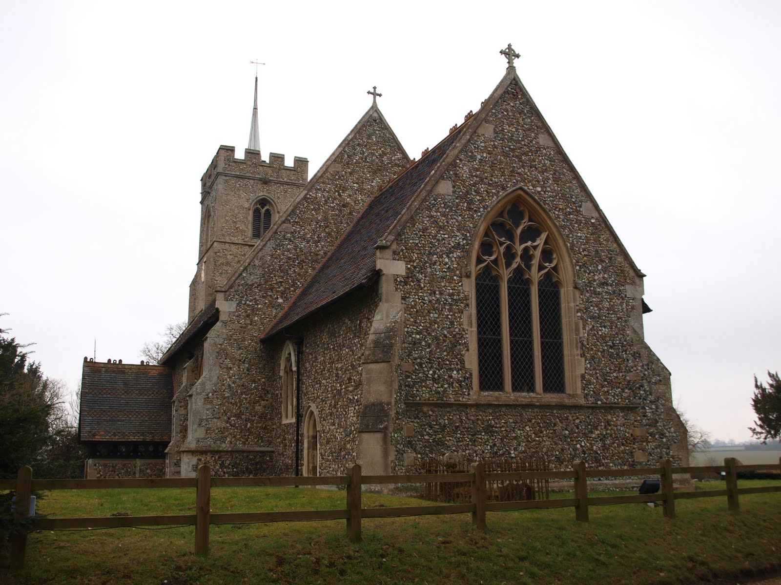
The church is going to be based around St marys, ashwell this church has alot of history around the 'black death' with many wall carving present still from around the time of the plague.

planning points
A few images to wet your beak.


Example of different brick
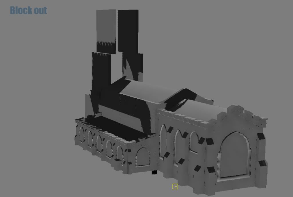
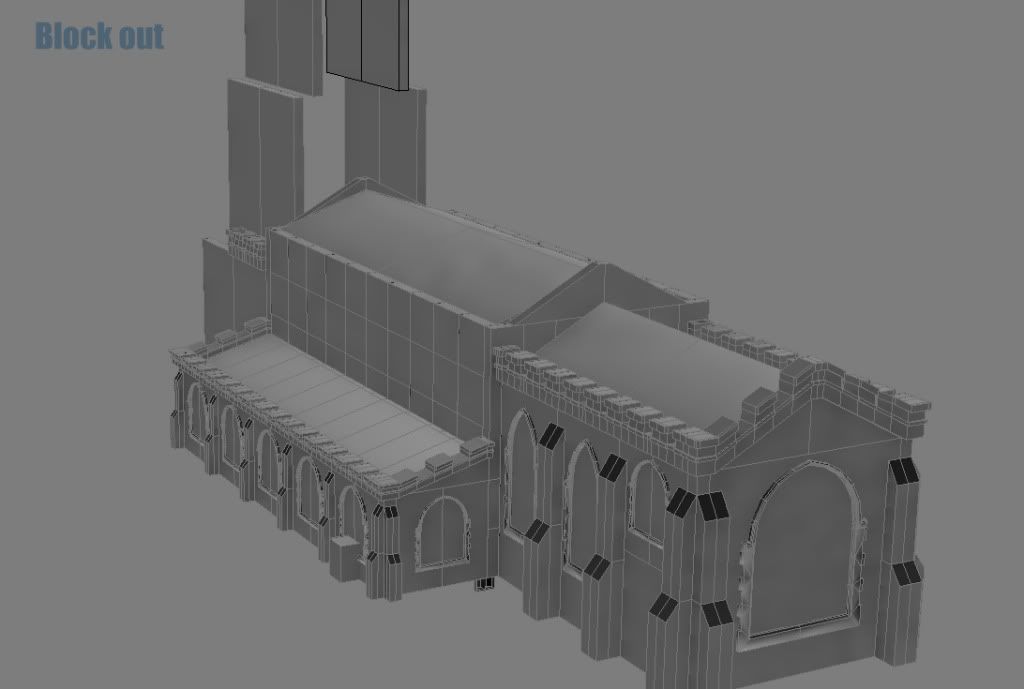
Block out
Progress has been really slow so far, way too many other modules going on. Feedback is really needed on this is anyone can point me in the right direction, thanks. Really been focusing on the outside of the church.. when really its the interior i need to focus on although i do want it to be visable from the outside aswell as the inside so i guess.. i have to :P
Outside shot.
Still have the tower to do.. such an annoying shape.
wire
Interior
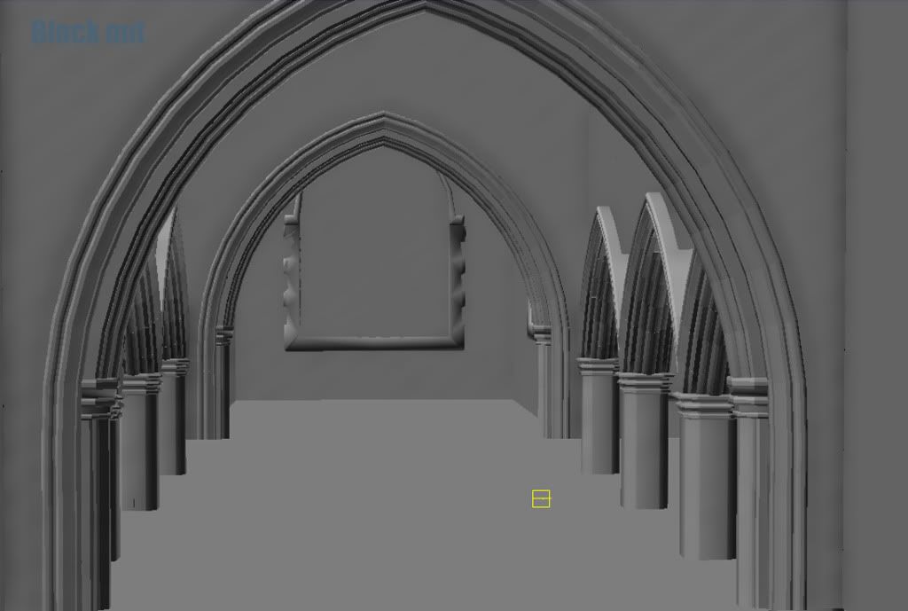
Sorry about the terrible image quailty.. so much to get done today a little rushed, feedback is most welcome
Project: Study into Modular environment design. (produce modular environment)
Theme: Medieval Chruch - Based around the 'Black death' aka the plague (Around 1350), the medieval church has been ran sacked by demons and they have spread the plague (linked in with horseman Pestilence the bringer of disease.) :P
The project will be mainly focused on the interior, but im also doing the exterior aswell
Project time: 1st may (including lots of written work
Project goals:
- Have a better understanding of modular environment design.
- Decrease overall development time for future projects.
- Ways to break up modulariy (vertex paint etc).
- Produce a fully function modular environment.
Concept.
The church is going to be based around St marys, ashwell this church has alot of history around the 'black death' with many wall carving present still from around the time of the plague.
planning points
- Blood on walls.
- Touched praying benches.
- Demon stratches on the walls.
- upside down crosses etc.
- low level lighting (candle light).
- Really want to get some nice light rays comming out from those windows, im not sure weather to have a day time lighting or nighttime lighting ( most likley will be moon lighting, used to pick up dust particles ETC).
A few images to wet your beak.
Example of different brick
Block out
Progress has been really slow so far, way too many other modules going on. Feedback is really needed on this is anyone can point me in the right direction, thanks. Really been focusing on the outside of the church.. when really its the interior i need to focus on
Outside shot.
Still have the tower to do.. such an annoying shape.
wire
Interior
Sorry about the terrible image quailty
Replies
I take it you're blocking the whole thing out inside 3DS Max / Maya before importing into UDK?
Personally, I like to do the main blockout in UDK, but then it's mainly because UDK feels more user-friendly than Max.
*Subscribed*
please crit as much as possible, i would really like some help on turning this into a game level, not just a flashy environment :Pi really want to try and bloke up the main walk way may be with some deadbodies? any ideas anyone
Maybe you can add some debris to block up the walk way along with some dead bodies. From your level plan, you put in broken benches. You can push some broken or unbroken benches off into the main walk way.
if you're going to put inverted crosses there then perhaps bodies could also be placed in more deliberate or ritualistic ways instead of just laying around.
Some real exorcist shit.
Yeah it does feel quite constricted and thats really the problem, i did find it pretty hard to get the shape of the church, but ill just have to suck it up and work around that.
As for blocking the walkway im concidering placing a whole in the roof, when have the debris and a few chairs block the way although this is really my back up plan for now im stilling with benches, deadbodies wrapped in linen (save on some modelling).
i was even thinking of having a central whole in the floor for blocking the path sort of a door way to hell but i think that might come across as bit too much for the environment, not sure if thats the style i want too go for? what you guys think? thanks again :poly121:
enventually i wanted to do some outside of the church but mainly im focusing on the interior
Heres some benches ive been doing, been a really slowww week
i think at the minute the stone is too big? and needs some TLC on the texturing side of things... what u guys think?
Looking at your reference image, there doesn't actually seem to be any place for this modular wall piece - as the walls here are plaster-covered.
If you intend on using this texture for the windows, I'd suggest just making modular window frames from scratch that could be duplicated over your scene.
Always keep referring to your source material - something which I know from experience is hard to remember.
I hope that helps
Thanks for the reply, i can see you point, i also think the bricks look to big, ill go in give that sculpt a tweak.
As for those references i was mainly looking at the different types of arches i wont be modelling that section of wall, i am a little big unsure on which brick types to use that will fit correctly with the century used materials and with the arches themselves, need to have anothe rlook at reference images (y)
im working on the floor at the minute ill get some sreenshots up later on
Lots of crits would be really awesome pleaseeee
a little update to the theme, Im sticking to my orginal theme around the black death but with a bit of a twist, the main center peice will now feature a beating heart instead of a cross, the cross just didn't look right.
Looks pretty good! I would say that your shadows are very dark. It helps to establish a good baseic lighning from the start, you should do that
On top of that, we're a long way from the 14th century, and churches have changed in the mean time too - don't think churches in the middle ages looked like modern churches, because as fashions and customs changed, so did the visuals. The crosses that would be placed when a bishop inaugurated the church, for example, have often been lost, and often all doors have been painted red when only one should be. And in general, they were gaudier than they are today.
Right now, you could make the most beautiful assets ever, but the scene would still look painful to anyone with even the slightest hint of knowledge of medieval architecture.
@ Zwebbie - thanks for the feedback, i completly agree with your statement many of the reference images iv found from around the 14th century are completly different and it makes it very hard to jugde whats right, i just dont have enough to go back and play around now im just planning to make the most out of what iv got. Going to have alook at some books see if i can get it looking better with minimal work.
date too come for today got the central heart done going to upload it later, needs some more veins, i also got it Beating which too the best part of a day haha.
iv'e changed the scale of the church so its alot taller now, mainly been working on getting some of the non modular assets into place, going to start working on a brick texture over the course of today
I can't wait to see the next update
if i could get some crits that would be great thanks
Yeah, I'd brighten it up quite a lot:
as for the tapestry its design is from when i was testing just havnt had time to revisit it, im thinking about maybe have a standard colour with more of a white design or something simple like a hand print or a guild sign for example. not sure how to explain what i mean haha, any ideas?
Try increasing the intensity of your moonlight just a little bit and then upping your light-bounce intensity to fill the rest of the scene with more light (View > World Properties > Lightmass > "Diffuse Boost [About 5]" and "Num Indirect Lighting Bounces [About 6]").
See where that gets you
Its still got some moody shadows and lighting, but there's a lot of colour from your props at the same time. Also, I like what your trying to do with the large window in front.. but try playing around with a different light direction.. see if you can get some light streaming in from the side and roof windows - might help light things up more.
Anyway, its coming along nicely. Just gotta stick with it and keep trying to push it more. Good luck
and thanks for the comment brandon yeah i agree i do prefer that lighting
I found out today that the hand in for the project is the 1st may and the showcase is the 24th may, my main focus is the showcase so a few things can be changed then iv been working mainly on the outside of the church getting everything together for may 1st mostly looking at things like vertex painting, still getting some nasty lighting seams cant get them to go away :poly127:
anyway here is some recent progress
Way to bright and it really needs a tower!!
There's an obvious butterfly effect in the middle of the building.
The vines could be using at least a better texture or better, actual foliage planes over the wall.
You need to pay attention to texture consistency, the vine color for example is to saturated and clashes with the rest, the mapping scale of it matters as well. The stained glass windows should show darker outside if not almost black, unless you have a very powerful sunlight inside your church but there's no light source inside anyways.
There's a big gap in texel ratio from some of your columns inside to the arches on top of them. That puts the scale off and doesn't look good.
The roof slates texture is off scale as well, and doesn't tile that well vertically it seems.
Lighting should be reworked also to give the interior more contrast. It's pretty evenly lit at the moment, and the very long shadows dont help. Create areas made of darkness and add some light sources be it real or fake to create interest for the eye.
Hint: start relighting your interior from absolute black.
seeing as i havn't got much time left on this project im most likly not going to get all the issues fixed , im just wondering which areas i should really focus on? whats going to produce the best overall, what do you guys think?
thanks again.
Btw! I dig the darker picture, it gives me the creeps! in a good way! And the Bricks on the Pillar (exterior) seems larger then the bricks on the building itself, shouldnt they be the same size?
Are there areas of interest that draw the eye? Or does it just blend into a grey blob?
@ParoXum
yeah im going to get to work on the lighting as soon as, im going to start from scratch like you suggested :P
@wirrexx
thanks man need a good pick me up on this project haha, and yeah they need to be scaled down a little, as for those texture shots ill upload them when i get a break in this write up :P
@SirCalalot
ill have look around the level :P i can see someone walking in my room while im staring at the screen cross eyed looking at me very confused haha :P
http://www.polycount.com/forum/showpost.php?p=1411329&postcount=99
haha well u add a new member to that :P, these evvironments are sexy :P
Thanks skillmister! :P :thumbup:
please let me know what you think there's a lot of issues mainly light seams,
just cant seem to get hem correct, i was rocking light maps at ridiculous light res as well, i've used a max of 256 on objects and the quality i feel is better or the same in areas which just seems weird but coool
please be as harsh as you can with feedback :P thank you
I like the idea of the window throwing a shadow down the middle of the church but that REALLY needs to be pumped up with contrast before it will work correctly. I only noticed it because I happened to see the window shape on the floor.
The exterior shots look better because of the strong moonlight, although those shadows could be darker as well.