UDK Demons Souls Based Environment
Hello everyone!
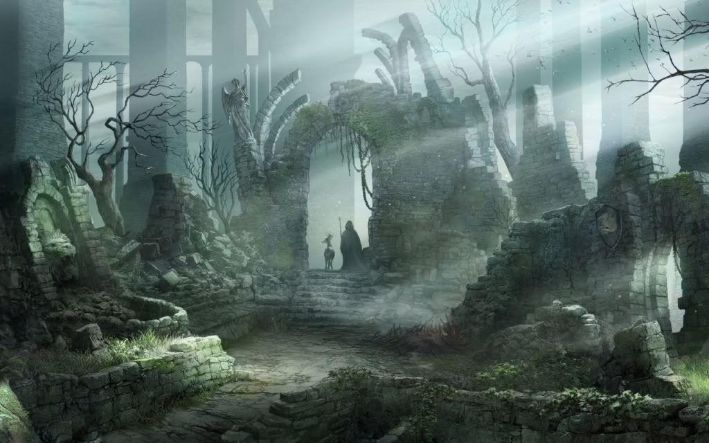
Im a third year university student that should be graduating in a couple of months and Im trying to get my portfolio together. Here is an environment Im building at the moment, its based on a piece of concept art from demons souls. The main things its missing at the moment are landscape textures and foliage and the lighting is far from right. Let me know what you think, any comments/crits would be much appreciated, thanks!
Concept:
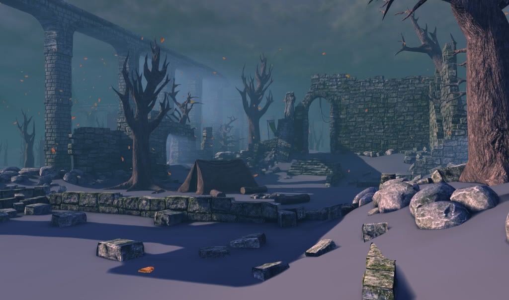
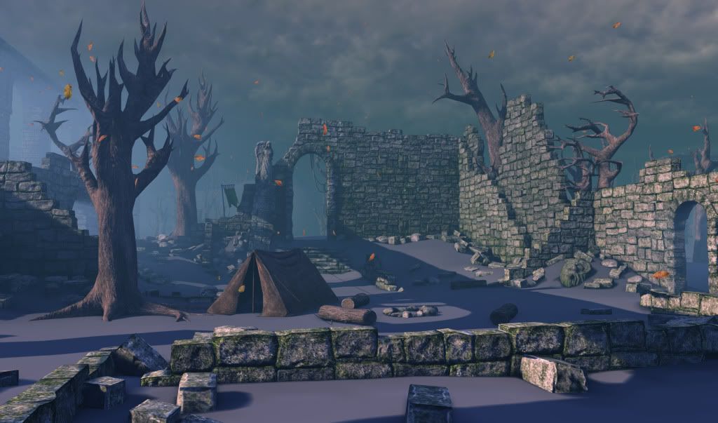
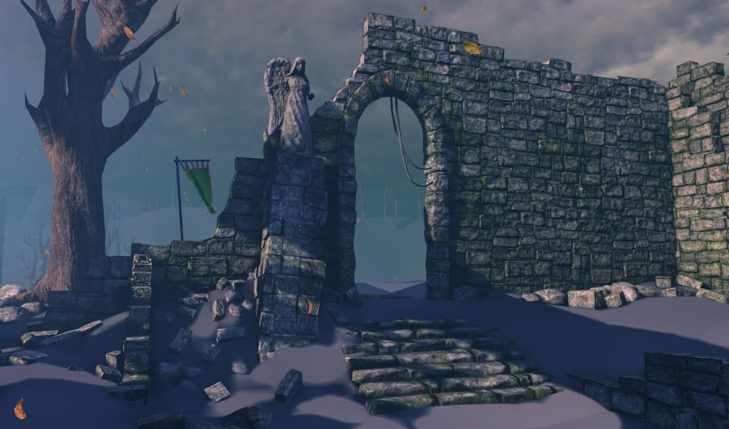
Screenshots:
Im a third year university student that should be graduating in a couple of months and Im trying to get my portfolio together. Here is an environment Im building at the moment, its based on a piece of concept art from demons souls. The main things its missing at the moment are landscape textures and foliage and the lighting is far from right. Let me know what you think, any comments/crits would be much appreciated, thanks!
Concept:
Screenshots:
Replies
and I agree with the branches. Its really thick
As I've asked in a few threads lately, how close are you wanting to mimic the style and feel of the concept?
If you look at the lighting of the original image, it is quite pale and cold - almost white (with a slight twinge of yellow). This picks up the greens and greys in the foreground and contrasts the cool (very pale) blue/greys of the background.
You current set-up looks a little bit too warm, further accentuated by your tree and leaf textures that contain a lot of red. Maybe desaturating your textures to be a lot more grey/brown will help this.
The lighting also comes at a bit more of a shallow angle in the concept, which seems to be a bit earlier on a grim morning than in your scene. As it is very overcast, this is creating very soft shadows too, rather than your current sharp ones.
The concept also has a thicker fog than you currently have with a white colour that has ever so slightly a hint of blue in it to compliment the scene greens.
Maybe make your own fog thicker and at a very-close-to-white blue colour, then up the contrast and intensity of your Light Shafts from your DominantDirectionalLight (maybe making them a bit yellow too, emphasising the light colour).
If you also add a lot more geometry to the side of the scene where the light is coming from, such as thin branches, you'll be able to notice the effect better. Similar to how the dead tree on the left side of the concept breaks up the fog, creating loads of little light shafts in the process.
I hope that helps, as this scene is looking really promising
*Subscribed*
To answer your question Im not exactly looking to mimic the concept. Primarily I want just want something that looks good, so Ill play around with different lighting and effects as I go and if mimicking it turns out to look the best then so be it.
Thanks again for the comments, Ill keep your advice in mind and Im sure it will help!
Other than that Ive finally done a first pass on the landscape textures and added a little bit of foliage. Currently I have 3 variations of grass and a rocky rubble texture and I plan to add dead leaves to the ground as they are falling from the sky. I seem to have reached the texture sample limit on my landscape material though so Im going to have do that a different way. Im thinking decals at the moment.
I can see two, maybe three diffuse textures. Assuming that they all have Normal maps, then that's six.
If you are using black and white specular maps, are they assigned to the Alpha channel of your Diffuse textures?
What you said did make me rethink the material though and I have gone back and derived the spec maps from the diffuses and it looks almost no different, so now I guess I have room for the leaves, thank you!
And some updates, redone the aqueducts, more lighting changes and Ive worked on the light shafts some.
That way you can keep similar colour harmonies and keep the same sort of subtle composition
Edit: Something like this?
Or if you are really wanting to change the mood :P
Having a concept image in-line with what you want to achieve is paramount. A lot of my own work has suffered from lack of reference, but I know it can be hard to realise that when working
Im having to call this finished for now other than minor tweaks if anyone notices anything, Ill come back to it later if I have the time but deadlines are calling me!
and a little video
[ame="