Sketchbook: XK0
Hi! I would love to have all of my stuff critiqued, I don't have any WIPs to post at this moment so here's just a few "completed" ones but any criticism and I'll be glad to change it or keep it in mind for the next one.
Bit of background, trying to get accepted into Gnomon school's 2 or 3 year program... Got about 3 weeks till I have to submit another application.. I was denied once already a few months ago =( but am continuing to go hard in the paint.. What a great pun.
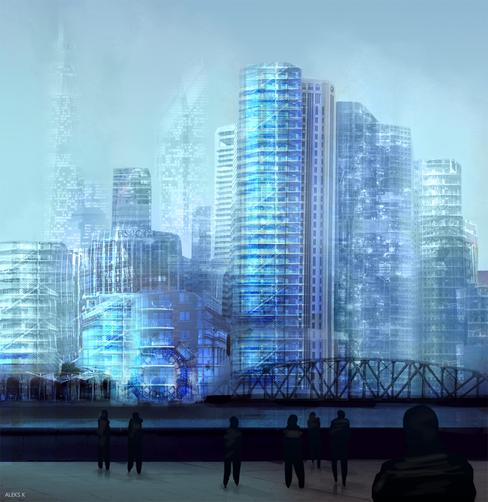
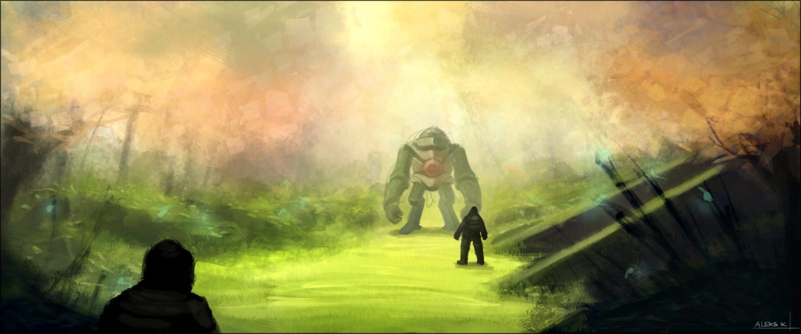
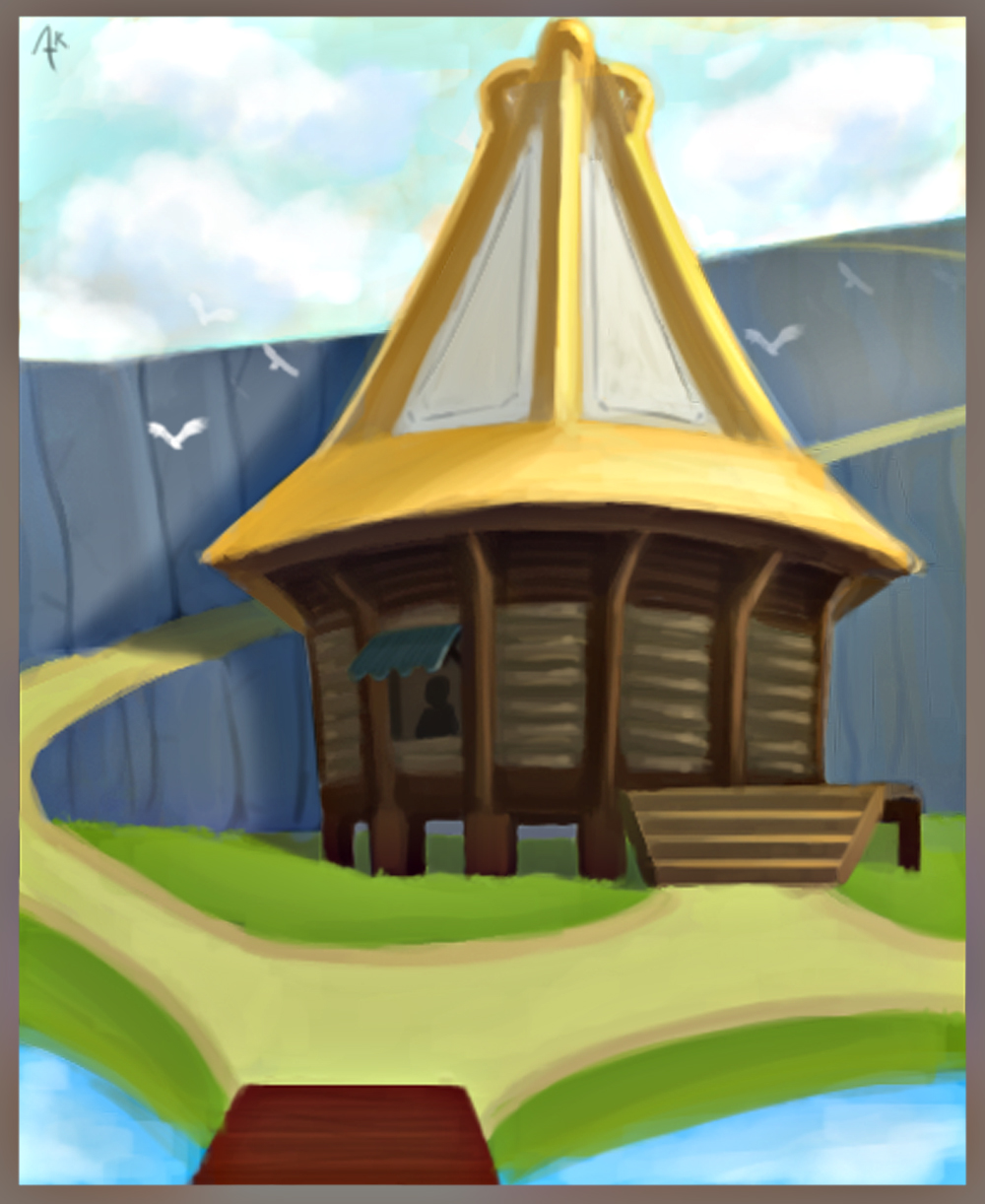
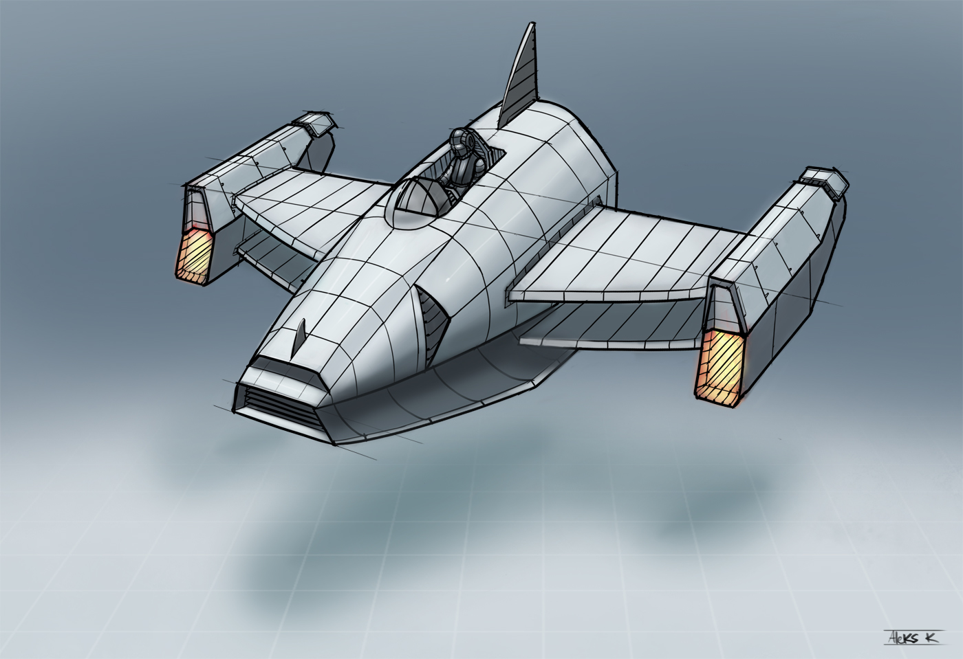
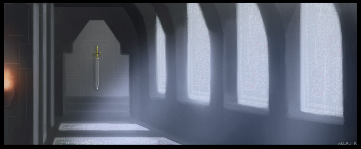
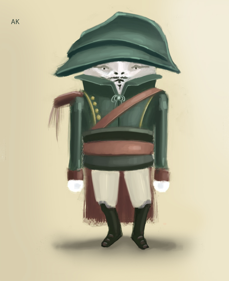

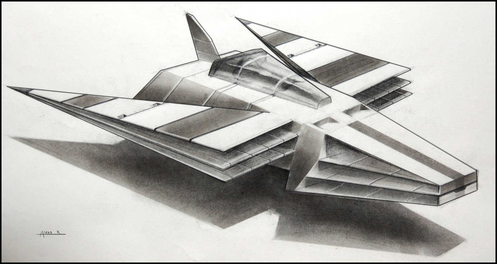
I believe this isn't the place for portfolio critique but the rest of my stuff is here: http://xk0art.blogspot.com/ ... I hope to have a new piece done once every 3 or 4 days and posted here. please destroy me with critiques :X I want to improve
Bit of background, trying to get accepted into Gnomon school's 2 or 3 year program... Got about 3 weeks till I have to submit another application.. I was denied once already a few months ago =( but am continuing to go hard in the paint.. What a great pun.


I believe this isn't the place for portfolio critique but the rest of my stuff is here: http://xk0art.blogspot.com/ ... I hope to have a new piece done once every 3 or 4 days and posted here. please destroy me with critiques :X I want to improve
Replies
word.
So, trying to take Gmons advice of going different directions with each drawing, I am working on this. Gonna tighten it up and change some colors, it almost hurts to look at the left side of the image (and the entire image, ho ho)... So yea toony colors this time, strange/random architecture... Some influences being tangled and zelda once again . Tons of work needed to make this presentable but thought I'd show anyways
turrible image redacted
Some crits of your work:
Everything you have here or in your portfolio so far is made out of incredibly simple geometric shapes. Cubes, spheres. Think more about the contours of your surfaces! Your compositions are the same way. EVERYTHING is centered! Vertically if not horizontally. Loosen up, get more comfortable drawing! And keep doing your thing!
If you'd like direction, i'd personally recommend:
I will try to make things less simple and go back in and break some things up... I am doing these last few environments as a sort of "last chance" type deal to see if I can get into gnomon's 3 year or not... So I'm not really doing any studies, kind of honed in on just trying to nail this basic stuff. Its something I'm gonna do eventually, one way or the other, but if Its do or die have like 2 weeks to either make 3 environments or do things I cannot put in a portfolio I gotta go with the former. But I'll definitely do studies soon...
Will stay away from low and soft and I'll be sure to go back and watch tuts and stuff. Just focusing on finishing these things up tho ATM, composition and not making things so simple.
revisited this to kind of fix it up, dont know how I did but for 20 minutes I think it looks a little better. Made things a little clearer but still it was so much better in my head lol.
I know this is pathetically simple, its a pretty old drawing that I just wanted to render up super fast and see what happens. Was just again super quick thing, just kinda going back into my old stuff and seeing if I can touch anything up in under 10 min before I do these last environments (next image) and email my new stuff to the school again..
and these..... are the sketches of the paintings that will make or break my chances. yikes. I feel like I'm doing things better with composition, throwing things off center now... Besides the 1st one obv, but I went with a camera angle I've never done before so hopefully it isn't more going in circles. I'm definitely gonna go back in and break up some of the shapes, still doing stuff thats way too simple.
Also, can a mod burn the image I had in 2nd post I had in this thread. o god.
Does anyone think I'm heading in the right direction at least w/ these envi's compared to the ones in 1st post? obv early but still..
I decided to not do the 1 pt persp I had in the last post, I have no idea if I'm crazy or not but I'm pretty sure theres no way I can see the side of that building unless its 2 point so its just totally messed up everythings wrong etc... Would rather spend my final days beasting the other 2. Its uh.. not looking good lol. But if I enjoy failing I can't wait to see how fun it is when I don't suck. Have to figure out a way to break up this building into something more complex
still lots o work left
Quite nspired by Makkon!! Looking forward to his tut.
bai. on to studies before i do any more imaginative things
-Does blurring it completely defeat the purpose?
-Does it fix or at least help the composition?
a. If it does, is it worth it to do something like this that isn't very logical just to better the composition? There's no real explanation for why a guy would be there that is dictated within the image itself, I could obv say theres some sort of ladder to a bridge then a secondary ladder which leads him around to the other side but nothing in the image implies that. For all you know he could be about to commit glorious suicide in the name of the Gold castle god.
b. why not?
gonna close my old stuff now forever and get started on only newstudies and sketches for a few days now..
wip
It took me a while to get the proportions and such right with the refs and multiple overlays to get it that clean. the following is what a first iteration looks like before I do any checking of how close i got and start fixing
are there any tips to get THAT stage looking right? or we talkin bout practice? I'm sure I could get it to the same quality as the first two if I just go back and do 3 drawings over it, but thats not gonna fly in a life drawing class... I mean I can't be taking too much time to measure all this stuff out if its a 2 min gesture.
and i prob finished this
altho its lost some energy along the way i think, too much blending at 50%
This isn't all the ones I've done in the last month obviously but I picked my better ones I think. Maybe should have taken pics of the ones that I REALLY struggled with... Hmm. Anyways any crits and advice would be great.
Computer and SB studies from pics and sites like pixelovely
After those I went to a life drawing, heres week 1
And the ones I did week 3:
I hope I improved. I dunno.
Oh man I wanna update this.
not quite sure how all of this is going to come together to help me model vehicles and weapons better in 3d lol but i trust da system i guess
progress pic just for fun:
oh also forgot: doing ortho as a base for a sculpture!
having trouble making it read as spidey tho, go too far he looks too bulky.. too small he is too average... even taking pics of spiderman from a game or comic or w/e in front view and silhouetting it doesnt make it look like spiderman. playing around with this is def making me appreciate how much pose and attitude and stuff can make a character.