UDK - Mountain Valley Environment
polycounter lvl 17
I've been posting on WAYWO but decided it was time to start a thread. I'm working on an realistic natural environment to learn the in's and outs of UDK and create an exterior portfolio piece. So far I've created a mountainous landscape with open plains and a lake in the middle.
I want to watch the 3Dmotive foliage tutorial, but have to wait until I get paid. Until then I've been watching the UDK tutorials and finding others online. I want to learn soon how to get the water looking realistic but I'm trying to push the entire environment at the same time. Anyways, here is the latest update.
Latest.


Replies
Looking good so far, if not a little noisy in the grass.
Do you have cloud shadows in the distant terrain? I dont know if that will work well with the foliage if you ever decide to add any back there.
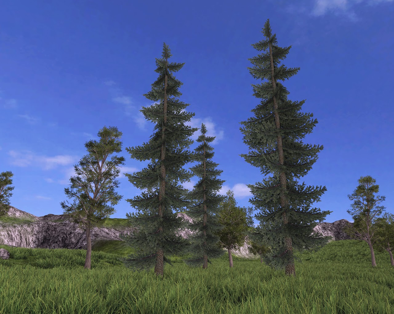
No grass in the distant terrain but I have added trees. I also created a distance fog so that adds a bit more atmospheric perspective to it. I've completely redone my pine tree because the new branches capture lighting better than the old style and look more natural. I also redid the textures and changed the lighting. I still want to create better rocks and ground plants.
1. Color variation in the foliage. A great way to add depth and break away from noisiness, is to add subtle color variations in the grass. Maybe some areas are more desaturated, yellowed from being too dry. Maybe others are slightly more blue. Exploring analogous colors in the foliage will help a lot. That same idea goes for the trees, of course.
2. If you're familiar with vertex blending in UDK, I'd start thinking about how you can use that to your advantage on the terrain. Breaking the grass up with areas of flat ground, rock, dirt, etc, will be easy to achieve with blending, and it will do so much for the scene.
Thanks guy's, these are awesome suggestions. The water is actually a bit of a problem for me. I tried following hourences water tutorial but it didn't work properly unless I deleted one section of it. So it works but i'm not sure if it could look better. There is also a huge streak of light going across it. I also think that it catches way too much light at some angles. The depth based alpha might be a good idea to add some more transparency to the waters edge.
I will add some color variation to my grass textures I keep going back and forth with more or less saturation so maybe a bit of both would be good. I'm not really familiar with vertex blending but I have been doing some texture blends in the terrain editor and that helps a bit. I'll do some research on vertex blending though and hopefully I can apply it.
I also have one more issue. This terrain will not capture shadows from anything except the grass which is a deco layer. The trees themselves all shade ok but don't cast shadow on the ground. If there were any way to fix that I would greatly appreciate it. Thanks!
I researched the terrain shadows on UDK and the situation sucks. Either I have cast shadows and no lightmaped trees or I have lightmaped trees but no cast shadows...
If you open the foliage map in UDK you will be able to see how that works in practice.
Keep at it, I like where this is going
teaandcigs: your suggestions are great! really changed the quality of shadows.
S2engine: My initial goal was to get it all to work, now I have to do some designing and drawing to see where I want to put my focus at and create a killer focal point.
I'm maybe too far from your point or goal but it really has a lot of potential to be "lost" creating a charming "mood" or atmosphere so keep it up!
Looking forward this one
The only part that tells the eye that what it is looking at isn't real is the edge of the lake (as I'm sure you know).
By going into the Water material, you can plug the entire Emissive set-up into the 'A' channel of a LERP (Hold 'L' and click in the Material Editor) and then a foamy material into the 'B' channel. Lastly you can add a DepthBiasedAlpha into the 'Alpha' channel of the LERP.
This should blend between the two materials based on how far away an object is behind the water - ie, the shallow shore will be foamy and the deep water will remain unchanged.
You can experiment with different mask settings too in order to make the transition less blurry
Can you show you're tree and grass wireframes>? Also branch closeups?
Cheers!
Here are some shots of my trees and I also wanted to try some deeper forest areas in this environment as well so here is a test of that.
Alternatively, you could set up some nodes in your shader to ramp a dark to light gradient from the bottom of the tree up to the top, using the world up vector.
Here you go, my new water!
Now with more rocks
Jessica: Thank you!
Onionhead_o: Thanks!
SasoChicken: It was pretty dead before but I'm going to continue to make it as lively as possible. I'll add a skylight so it's not so dark overall in certain areas. But I'm also going to be scaling the trees individually.
The_Blenderer: I am going to be making more tree and plant variations for color.I agree that there can be some warmer colors.
lincolnhuges: I added an emmisive texture for all of my vegitation and grass. The texture is darker than my diffuse and its job is to make sure I don't have completely black shadows. It takes a lot of trial and error though to get the look right. The grass does cast shadow though I might try the twosided lighting pass.
How did you go about creating the card textures for the fern trees? Did you bake that down? If so, how in the world did you create all the millions of needles?!
Looking forward to seeing more!
Toxic: We'll see after this next build lol. Takes about 9 mins with medium quality.
Thanks!
You shouldn't need to be adding emmissive values to your diffuse textures if lighting is set up properly though.
Try going into World Properties and adjusting the Environment Colour and Environment Intensity first of all.
As default this is black - nothing should ever be pure black in game design as a general rule, be it textures, shadows, lights (lol).
Change it to a complimentary colour of your light and adjust the brightness of the colour to be darker. So if your sunlight is a soft yellow, try an environment colour that's a darker blue. Obviously we're going for subtlety here and not trying to get a disco going on, so be sensible with the intensities.
Maybe adjusting the number of Indirect Lighting Bounces for Lightmass in World Properties too (I find six looks pretty nice). As well as this, you can adjust the Diffuse Boost to adjust the intensity of light that a ray keeps hold of after each bounce and accentuate the Radiance effect.
You can also have a fiddle with the Shadow colour in the Light's properties dialogue, but this will be mostly imposed by the Environment Colour in World Properties.
Hope that helps!
Edit, you could also adjust the leaf materials to have a Transmission Mask and Colour. The mask usually being your Alpha channel or Specular Texture and the 'Colour' being your Diffuse Texture.
My result was this
Are you going to do a detail pass on all of the foliage, adding little bits of dry grass or dead leaves on the trees? At the moment, every inch of plant life is looking 100% healthy.
But then this is me trying to nit-pick as it's looking sweet :P
The next part of my scene is to create a shack on the edge of the lake that will be my focal point. The goal is to create a believeable wilderness that has some human elements as well. My next step is to start asset creation including:
Wooden shack, boat, barrel, axe, logs, stump, ferns, wildflowers, pans, glass bottles, animal furs, daisies, and buckets. I also want to do nighttime lighting as well.
Ok, but seriously, nice touch haha xD
As a maya user I was wondering, how are you tweaking the normals in Maya?
As for the UDK implementation of modified vertex normals, you will have to export your models using the FBX format and check the custom normals option when exporting your model.
To improve your lighting of your vegetation in UDK, you will have to rebuild the Lambert shader in the material editor and use the custom lighting function.
As for the scene composition, adding a man made construction can help give a sense of scale (it could be a path with some cobble stones+old wood barriers, old ruines etc...can even be a natural path showing some grass patches and soil)
Also a quick crit regarding the rocks on the shorline, try less saturated colors to get some extra contrast between the rocks and the ground.
Other then that, keep up the good work, looks very promising.